Vivaldi VH - Full height for your webpages, now on version 1.4
-
Hello everyone! I'm proud to present Vivaldi VH!
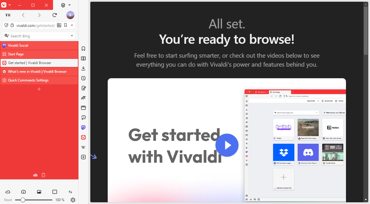
Vivaldi VH is a CSS modification that grants your webpages the entire vertical space of the browser window by moving the rest of the UI into a separate column.
There are two features that make it stand out:
- Vivaldi VH is designed to work with any combination of browser settings. If it detects incompatible settings, this mod will disable itself rather than breaking.
- Vivaldi VH can be further customized without modifying the CSS code of this mod by using Command Chain Flags.
Click here for download links and installation instructions!
Shoutout to @ChimeraLove for working on a similar mod (which I honestly didn't find out about until I was halfway done with mine) and for coming up with the extending address bar!
-
@HKayn Thanks and looks great!
I think that both of us developing a similar mod shows interest in this feature. So perhaps in the future Vivaldi's team will make it build in easily in the settings with drag and drop customizability. -
Great job @HKayn, looks awesome

-
@HKayn Yes, great! Thank you very much! I will use it every now and then. Not always, as I almost always have the sidebar open and the tab - with tab bar sideways - gets too narrow as a result.
In this respect a toggle function would be useful for the mod.
-
Very awesome mod @HKayn!
But is there a particular reason that the mod requires the setting "Show Title Bar" to be enabled in 5.8?
It seems like an unusual restriction to me. Of course removing
:not(.disable-titlebar)makes it "work", but I'm curious to know why you think having the title bar is necessary. -
@Dancer18 To alleviate this issue, I recommend binding the "Show Tab Bar" setting to a keyboard shortcut or preparing a Command Chain that toggles this setting in case a website momentarily requires more screen width.
Since Vivaldi VH will not apply itself without a visible tab bar, such a Command Chain button would effectively act as a toggle for Vivaldi VH. An alternative would be to set up Command Chains that change the tab bar position, but those currently can't be set up to have a single chain acting as an "on/off" toggle to my knowledge. (E.g. a chain that toggles between "tab bar: top" and "tab bar: left")
-
@AltCode Here's what Vivaldi VH would currently look like without a title bar:
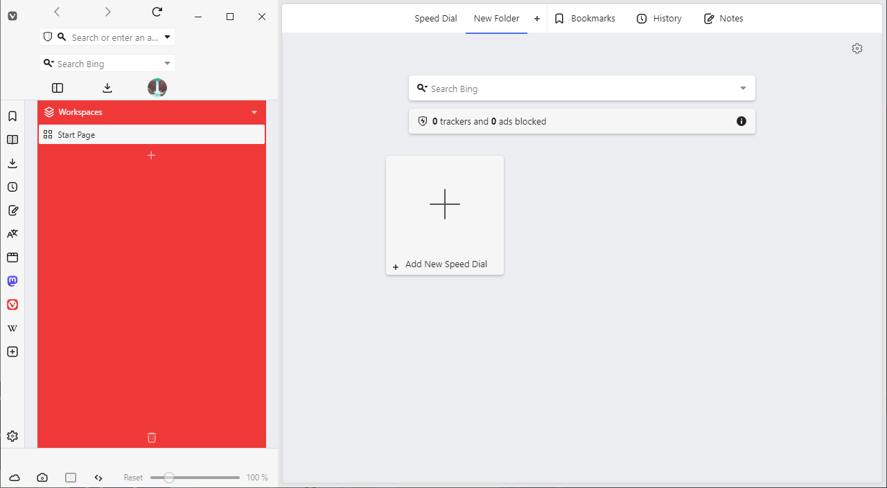
During development I used to believe that this can't be changed to look good. I would insist that the Vivaldi and window buttons need to be on opposite sides of the address bar (in addition to being on the top edge of the window), which wasn't feasible without building a crude imitation of what would effectively be an address bar without a window title:
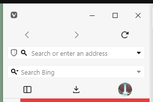
In this variant, the "Show Title Bar" setting would effectively only toggle the window title. Because this didn't make much sense to me, I had placed the restriction for the time being.
Your post got me to take another look at this, and a layout like the one below is something I could implement:
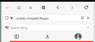
(I had fully forgotten that this is also where MacOS usually places window buttons)
The only drawback would be that there can't be any toolbar components between or before the window and Vivaldi buttons.
I'll need to test how this interacts with other settings like "Horizontal Menu", and once that's cleared I'd be happy to incorporate this layout into the mod!
-
Interesting mod. It’s nice to see new layouts. In my case it does appear to have limitations, I’m gonna write down a few things I noticed, but first a screenshot:
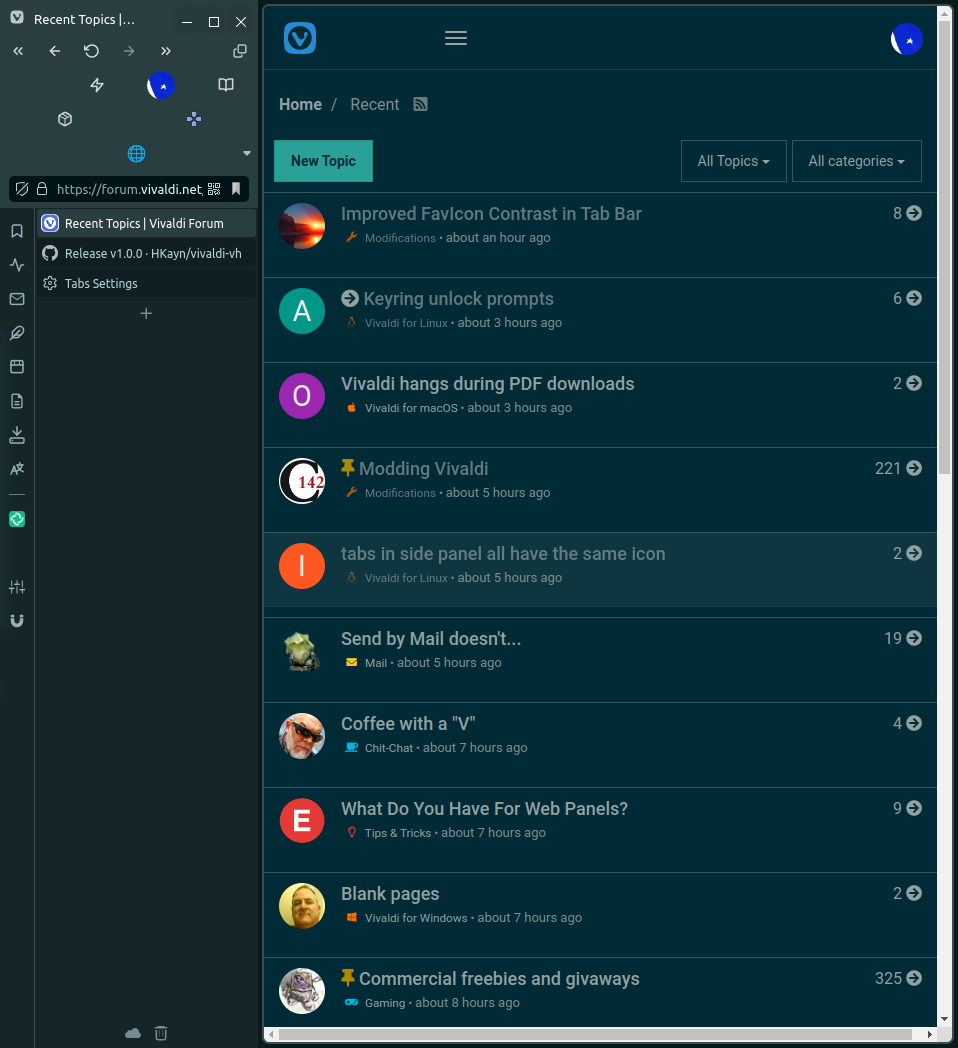
The address bar doesn’t take kindly to the modification. The buttons, except for the first row, are all over the place. The extension container and its toggle have a hard time. Elements can’t be adjusted either while in VH mode, because the toolbar editor doesn’t work/breaks and its default bar is affected too.
All panels should probably be set to floating and the general width should be that of the sidebar, except for a few web panels that might need more space, that’s of course a user preference. But generally I’d say it hurts not getting the full height on the panels, would be better to expand them fully.
🪺

-
@luetage These are good points, allow me to explain.
By default, any components inside the address "box" or status "box" grow to take up available space. You'll notice that when you hover over one of the buttons in the row that has only two of them, each of their click areas is half the address box width. I consider this to be the most visually pleasing "out-of-the-box" solution, rather than having components be justified to one side or centered.
(Can you post another screenshot without any custom icons? Recognizing the components will help me judge more accurately if they're supposed to grow like that.)
You can disable this growing behaviour by placing the Command Chain Flags
vvh-disable-addressbar-universal-flex-growandvvh-disable-statusbar-universal-flex-growrespectively, then use flexible spaces to adjust the gaps between the buttons to your liking: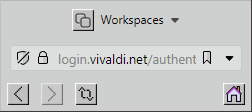
As for the extensions, since these have their own grid layout, the extensions component currently fills the entire width of the address box by necessity. It also exhibits the same growing behaviour when there aren't enough extensions to fill the row.
I'll work on a few visual touch-ups to properly communicate that the extensions component isn't meant to be inline with other toolbar components. In the long term, I might work on a solution to have the extensions component be inline anyway.
Regarding the panels, I assume that you're talking about non-floating panels stretching the Pillar (that's what I like to call the UI construct to the side). This is currently the intended behaviour, to enable layouts like this one:
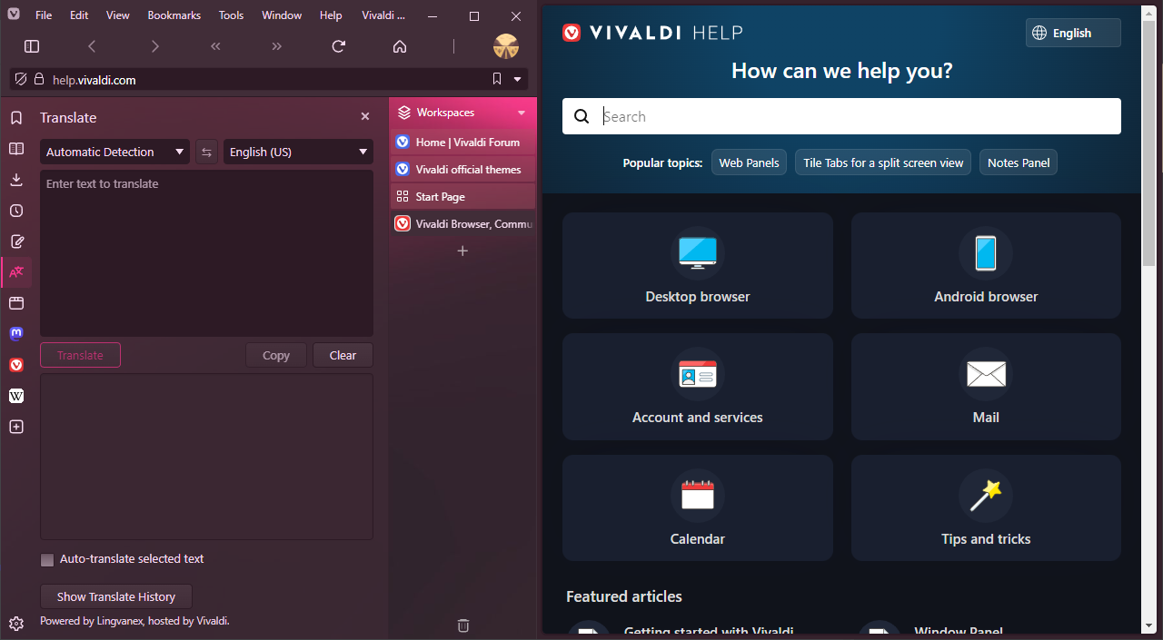
At the moment, you can avoid the panel stretching the Pillar by setting it to be on the opposite side of the tab bar. In the future, I will introduce an additional Command Chain Flag to enable the following:
When the panel is on the same side as the tab bar, it is no longer incorporated into the Pillar, but instead positioned at full height between the Pillar and the webpage.
For that Flag, I chose to place the full-height panel between the Pillar and the webpage (rather than between the Pillar and the edge of the browser window), since I want the draggable area of the browser window to touch one of the window corners at all times.
There are two known issues regarding the toolbar editor:
- Toolbar components cannot be removed by dragging them to the area between the toolbar and toolbar editor window.
- Toolbar component styling is partly applied to the demo toolbar inside the toolbar editor window.
I currently don't consider either one high enough of a priority to fix.
Besides that I'm not aware of any breakage of the toolbar editor modal on Windows. You should be able to drag in additional toolbar components and rearrange their order as normal. It looks like you're on Linux, can you send me a screenshot or a video of what seems to be broken?
-
@HKayn You seem to be aware of the issues. I just fired this up out of curiosity and don’t intend to switch to it, because I’m content with my current setup without tab and title bar. Maybe I’ll take a closer look at this in future.
-
Great mod @HKayn, thank you!
-
Version 1.1.0 is now available!
Changes:
- The button that toggles hidden extensions is now always to the right of the extensions grid.
- Command Chain Flags for inverting the position of the hidden extensions toggle are now available.
- The logic that calculates the width of an extending input field has been improved to take additional browser settings into account.
- The title bar height and address box row height have been changed to 25px and 34px respectively.
Click here to view the full changelog with additional thoughts behind specific changes.
Fixes:
- The height of title bar elements will no longer change in unintended ways when changing the user interface zoom setting.
- The default browser notification will no longer disrupt the UI layout.
- Fixed a case where the webpage would gain an unintended margin on specific browser settings.
-
@HKayn Is there any way to make this work with the Window panel instead of Tabs?
-
@JoaoPauloS This is on the roadmap and will be properly supported in the future.
Until then, you can make it work by doing the following:
- Make sure that your panels don't float and are on the same side as your tab bar.
- Apply the following piece of additional CSS to Vivaldi:
#main > .inner > :has(#tabs-tabbar-container) { width: 0; } -
@HKayn I never used vivaldi before, downloaded it just to try out this mod, and it's exactly what I needed! Thank you!
-
@BirkaVZ Glad to hear you enjoy it!
How did you find out about Vivaldi VH, if I may ask?
-
@HKayn I saw a video about the arc browser that has similar ui, but it's for mac only, so I started looking, checked out this forum and found this post.
It makes sense to me to move the whole ui to the side since almost all webpages are designed with legacy aspect ratios in mind, or scale to anything anyway.
-
This post is deleted! -
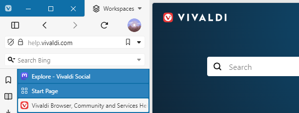
Just in time for Vivaldi 6.0, version 1.2 of Vivaldi VH is now available!
With this version, the title bar is no longer required to activate the Pillar layout. Additionally, you can now use toolbar linebreaks for more control over how toolbar components spread across the address bar and status bar.
Click here for the full release notes and downloads.
-
This post is deleted!
