(Address Bar + Title Bar + Status Bar) = Docked to side
-
Hello Everyone,
This design puts the horizontal bars to the side (address bar + title bar + status bar) and is a sequel to this discussion.This may be usable for people with wide screens who are interested in having all the controls docked to the side.
The buttons from the Status Bar which I use I put together with the navigation.
The Address Bar becomes wider with mouse hover and focus.
The Title Bar title area is usable for window dragging.
Enjoy
Design 1: Full Borders
Address Field mouse hover


/*Address Bar + Title Bar + Status Bar - Docked to side
Design 1: Full Borders
Version Date: 31 August 2023 */


:root {
	--minwidth: 316.4px; /* .4 for different dpi screens */
	--maxwidth: 800px;
}


#pagetitle {
	cursor: move;
	z-index: 1;
}

#header {
	position: absolute;
	width: 320px;
	height: 30px;
	z-index: 1;
	border: 2px solid var(--colorBorder);
	border-radius: var(--radius);
}

.mainbar {
	position: absolute;
	top: 35px;
	z-index: 10;
	width: 320px;
	height: 98px;
	border: 2px solid var(--colorBorder);
	border-radius: var(--radius);
}


.color-behind-tabs-off .toolbar-mainbar .toolbar-extensions, .color-behind-tabs-off .toolbar-mainbar {
	border-radius: var(--radius);
}


.toolbar > .button-textonly {
	position: absolute;
	top: 35px;
	width: var(--minwidth);
	z-index: 5;
	border-radius: 0px;
	margin-left: 0px;
}


.toolbar > .button-textonly:is(:hover, :focus-within) {
	width: var(--maxwidth);
}


.toolbar-extensions {
	position: absolute !important;
	top: 60px;
	width: 300px;
}

.OmniDropdown {
	top: calc(100% + -1px);
	border: 2px solid var(--colorAccentBgFadedMost); /*The color of the border is to match .UrlBar-AddressField:focus-within */
	border-radius: 0px;
	margin-left: -2px !important;
	margin-right: -1.5px !important;
	box-shadow: -6px 0px 0px 0px var(--colorBorder);
}

.address-top .mainbar > .toolbar-mainbar .toolbar-extensions:before, .address-top .mainbar > .toolbar-mainbar:before {
	height: 0px;
}


/*General Design*/

#tabs-tabbar-container {
	top: 138px;
	height: calc(100% - 138px) !important;
	margin-left: 3px;
	margin-right: 2px;
	min-width: 279px;
	max-width: 279px;
	border-radius: var(--radius);
}

#tabs-container {
	border: 2px solid var(--colorBorder);
	border-radius: var(--radius);
	padding: 5px;
}

#panels-container {
	top: 138px !important;
	height: calc(100% - 138px) !important;
	width: 36px !important;
	border: 2px solid var(--colorBorder) !important;
	border-radius: var(--radius);
	margin-right: 2px;
	padding-left: 0px;
	bottom: 0px !important;
	z-index: 1;
}

#switch {
	border-radius: var(--radius);
	backdrop-filter: none;
}

.panel-group {
	border-top-left-radius: var(--radius);
	border-top-right-radius: var(--radius);
	margin-top: -2px;
}

.panel {
	border: 2px solid var(--colorAccentBg);
	border-radius: var(--radius);
}

.button-popup {
	z-index: 10;
}


/* Fix Fullscreen*/

#browser.fullscreen .mainbar,
#browser.fullscreen #panels-container,
#browser.fullscreen #header
{
  display: none !important;
}


/* Color Changes to Theme */

#header {
	background: none !important;
}

.toolbar-mainbar {
	background: none !important;
}

.toolbar-extensions {
	background: none !important;
}

#panels-container {
	background: none !important;
}

#browser.transparent-tabbar #tabs-tabbar-container.left, #browser.transparent-tabbar #tabs-tabbar-container.right {
	background: none !important;
}

.color-behind-tabs-off.address-top .mainbar {
	background: none !important;
	border: 2px solid var(--colorBorder) !important;
}

.toolbar > .button-textonly {
	/* Option1 address field color lighter than background */
	border: 2px solid var(--colorBgLighter);
	background-color: var(--colorBgLighter);

	/* Option2 address field color darker than background */
	/* border: 2px solid var(--colorBgIntenser);
	background-color: var(--colorBgIntenser); */
}

.toolbar > .button-textonly:hover {
	/* Option1 address field mouse hover border color from theme accent */
	border: 2px solid var(--colorAccentBg);

	/* Option2 address field mouse hover border color from theme highlight */
	/* border: 2px solid var(--colorHighlightBg); */
}
Design 2: Minimal Borders

/*Address Bar + Title Bar + Status Bar - Docked to side
Design 2: Minimal Borders
Version Date: 31 August 2023 */


:root {
	--minwidth: 311px;
	--maxwidth: 800px;

	/* Change --PanelTabsCornerRadius to control the radius of their shared corner */
	--PanelTabsCornerRadius: 15px;
}


#pagetitle {
	cursor: move;
	z-index: 1;
}

#header {
	position: absolute;
	width: 313px;
	height: 30px;
	z-index: 1;

	/* Option 1 Header bottom border color regular */
	border-bottom: 2px solid var(--colorBorder);

	/* Option 2 Header bottom border color more intense */
	/* border-bottom: 2px solid var(--colorBorderIntense); */
}

.mainbar {
	position: absolute;
	top: 35px;
	z-index: 10;
	width: 313px;
	height: 98px;
}


.toolbar > .button-textonly {
	position: absolute;
	top: 35px;
	width: var(--minwidth);
	z-index: 5;
	margin-left: 0px;
}


.toolbar > .button-textonly:is(:hover, :focus-within) {
	width: var(--maxwidth);
	}


.toolbar-extensions {
	position: absolute !important;
	top: 60px;
	width: 300px;
	margin-top: 1px;
}


.OmniDropdown {
	top: calc(100% + -1px);
	border: 2px solid var(--colorAccentBgFadedMost); /*The color of the border is to match .UrlBar-AddressField:focus-within */
	margin-left: -2px !important;
	margin-right: -1.5px !important;
}


.address-top .mainbar > .toolbar-mainbar .toolbar-extensions:before, .address-top .mainbar > .toolbar-mainbar:before {
	height: 0px;
}


/*General Design*/

#tabs-tabbar-container {
	top: 131px;
	height: calc(100% - 131px) !important;
	min-width: 279px;
	max-width: 279px;
	margin-left: -4px;
	border-top-left-radius: var(--PanelTabsCornerRadius);
}

#tabs-container {

	/* Option 1 Border color regular */
	border: 2px solid var(--colorBorder);

	/* Option 2 Border color more intense */
	/* border: 2px solid var(--colorBorderIntense); */

	border-right: 0px;
	border-bottom: 0px;
	border-top-left-radius: var(--PanelTabsCornerRadius);
}

#tabs-container .resize {
	border-top-left-radius: var(--PanelTabsCornerRadius);
}

.tabs-left .tab-position .tab, .tabs-right .tab-position .tab {
	margin: 0px !important;
}

#panels-container {
	top: 131px !important;
	height: calc(100% - 131px) !important;
	width: 36px !important;

	/* Option 1 Border color regular */
	border: 2px solid var(--colorBorder) !important;

	/* Option 2 Border color more intense */
	/* border: 2px solid var(--colorBorderIntense); */

	border-left: 0px !important;
	border-bottom: 0px !important;
	border-top-right-radius: var(--PanelTabsCornerRadius);
	margin-right: 2px;
	padding-left: 0px;
	top: 131px !important;
	z-index: 1;
}


#switch {
	backdrop-filter: none;
	border-top-right-radius: var(--PanelTabsCornerRadius);
}


.panel-group {
	border-top-left-radius: var(--PanelTabsCornerRadius);
	border-top-right-radius: var(--PanelTabsCornerRadius);
	margin-top: -2px;
}

.panel {
	border: 4px solid var(--colorAccentBg);
	border-bottom: 0px;
	border-top-left-radius: var(--PanelTabsCornerRadius);
	border-top-right-radius: var(--PanelTabsCornerRadius);
}

.button-popup {
	z-index: 10;
}


/* Fix Fullscreen*/

#browser.fullscreen .mainbar,
#browser.fullscreen #panels-container,
#browser.fullscreen #header
{
  display: none !important;
}


/* Color Changes to Theme */

#header {
	background: none !important;
}

.toolbar-mainbar {
	background: none !important;
}

.toolbar-extensions {
	background: none !important;
}

#panels-container {
	background: none !important;
}

#browser.transparent-tabbar #tabs-tabbar-container.left, #browser.transparent-tabbar #tabs-tabbar-container.right {
    background: none !important;
}

.color-behind-tabs-off.address-top .mainbar {
	background: none !important;
	border: none !important;
}

.toolbar > .button-textonly {
	/* Option1 address field color lighter than background */
	border: 2px solid var(--colorBgLighter);
	background-color: var(--colorBgLighter);

	/* Option2 address field color darker than background */
	/* border: 2px solid var(--colorBgIntenser);
	background-color: var(--colorBgIntenser); */
}

.toolbar > .button-textonly:hover {
	/* Option1 address field mouse hover border color from theme accent */
	border: 2px solid var(--colorAccentBg);

	/* Option2 address field mouse hover border color from theme highlight */
	/* border: 2px solid var(--colorHighlightBg); */
}
Design 3: No Borders

/*Address Bar + Title Bar + Status Bar - Docked to side
Design 3: No Borders
Version Date: 31 August 2023 */


:root {
	--minwidth: 311px;
	--maxwidth: 800px;
}

#pagetitle {
	cursor: move;
	z-index: 1;
}

#header {
	position: absolute;
	width: 313px;
	height: 30px;
	z-index: 1;
}

.mainbar {
	position: absolute;
	top: 35px;
	z-index: 10;
	width: 313px;
	height: 98px;
}


.toolbar > .button-textonly {
	position: absolute;
	top: 35px;
	width: var(--minwidth);
	z-index: 5;
	margin-left: 0px;
}


.toolbar > .button-textonly:is(:hover, :focus-within) {
	width: var(--maxwidth);
}


.toolbar-extensions {
	position: absolute !important;
	top: 60px;
	width: 300px;
	margin-top: 1px;
}


.OmniDropdown {
	top: calc(100% + 0px);
}

.address-top .mainbar > .toolbar-mainbar .toolbar-extensions:before, .address-top .mainbar > .toolbar-mainbar:before {
	height: 0px;
}


/*General Design*/

#tabs-tabbar-container {
	top: 131px;
	height: calc(100% - 131px) !important;
}

#tabs-container {
	min-width: 279px;
	max-width: 279px;
}


.tabs-left .tab-position .tab, .tabs-right .tab-position .tab {
	margin: 0px !important;
}

#panels-container {
	top: 131px !important;
	height: calc(100% - 131px) !important;
	z-index: 1;
}

.toolbar-panel  {
 	margin-top: -8px;
}

.button-popup {
	z-index: 10;
}

/* Fix Fullscreen*/

#browser.fullscreen .mainbar,
#browser.fullscreen #panels-container,
#browser.fullscreen #header
{
  display: none !important;
}


/* Color Changes to Theme */

#header {
	background: none !important;
}

.toolbar-mainbar {
	background: none !important;
}

.toolbar-extensions {
	background: none !important;
}

#panels-container {
	background: none !important;
}

#browser.transparent-tabbar #tabs-tabbar-container.left, #browser.transparent-tabbar #tabs-tabbar-container.right {
    background: none !important;
}

.color-behind-tabs-off.address-top .mainbar {
	background: none !important;
	border: none !important;
}

.toolbar > .button-textonly {
	/* Option1 address field color lighter than background */
	border: 2px solid var(--colorBgLighter);
	background-color: var(--colorBgLighter);

	/* Option2 address field color darker than background */
	/* border: 2px solid var(--colorBgIntenser);
	background-color: var(--colorBgIntenser); */
}

.toolbar > .button-textonly:hover {
	/* Option1 address field mouse hover border color from theme accent */
	border: 2px solid var(--colorAccentBg);

	/* Option2 address field mouse hover border color from theme highlight */
	/* border: 2px solid var(--colorHighlightBg); */
}
Instructions
.
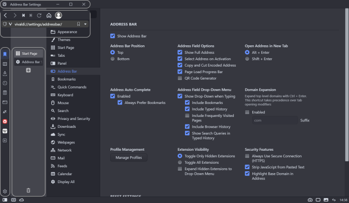
Settings:
These are the basic changes in Settings I use:- On - Open settings in a tab
- On - Tabs on the left
- On - Floating Panel
- On - Hide Status Bar (Or overlay)
- On - Transparent Tab Bar And Transparent Background Tabs (Themes->Editor->Settings)
- Off - Accent on window (Themes->Editor->Color Overrides)
- Color Contrast - adjust to taste (Themes->Editor->Colors)
- On - Show Title Bar (Needed since Vivaldi 6 update)
- Off - Enable Workspaces (Needed since Vivaldi 6 update)
.
Theme:
For me the second dark theme customized to taste worked well.
In the bottom of the CSS there is a section labeled /* Color Changes to Theme */ Which works with it.✱You can also download the theme here:
https://themes.vivaldi.net/themes/NOb716R5l1g.
Address
BarDock Customization:
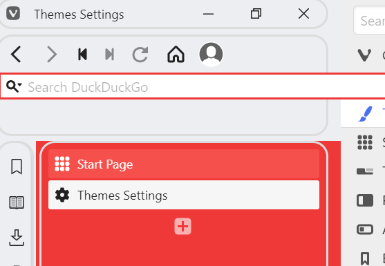
(As shown in the gif below)Right click navigation area -> Edit -> Customize Toolbar
Grab the "Search Field" and throw it into the void.
Behind it you'll find the Address field which can be used as a search field.
From toolbar editor grab the buttons you need from the Status Bar.

.
-
@ChimeraLove Hi! This looks really cool, so I had to try it. Unfortunately, it doesn't seem to work properly, testing from a clean profile. Looks like there are some things in your profile that's different from a new profile?
- Panels don't seem to work at all unless floated.
- For some reason the title bar does not appear until after another restart after CSS is applied.
- There's a large space below the address bar before the panel/tabs.
Video from my first testing: https://ttm.sh/0iY.mp4
I'm assuming there must be some prerequisites needed for it to work?
- Tabs must be set left side (pretty obvious I guess).
- Floating panels seems to be needed.
- Panels width needs to be dragged to match the 320px width of the header and mainbar elements, otherwise it will overlay the page.
- Search field as button/hidden, otherwise it will not show behind address field.
- Other settings needed?
Some more general CSS things:
- Border-radius needs to match the theme corner rounding otherwise you will get issues on corners (maybe leave it out?)
- Border-color is hardcoded, should match theme accent colour (maybe leave it out?)
- Background-color is hardcoded, should match theme background colour (maybe leave it out?)
Some of this might be due to my DPI scaling of 150% which sometimes causes havoc with hard-coded pixel values, so try to test that as well (if on Windows at least).
🎻Volunteer helper · Forum moderator · Sopranos tester 🛠️Troubleshooting 🐛Report a bug 📜Markdown help
🦆"With a rubber duck, one's never alone" -Douglas Adams🦆 -
Hi @Pathduck. Happy you like it
")
Allright, I installed Vivaldi standalone to recreate what is needed in settings.
- On - Open settings in a tab
- On - Tabs on the left
- On - Floating Panel
- On - Hide Status Bar (Or overlay)
- On - Transparent Tab Bar And Transparent Background Tabs (Themes->Editor->Settings)
- Off - Accent on window (Themes->Editor->Color Overrides)
- Color Contrast - adjust to taste (Themes->Editor->Colors)
For me the second dark theme worked well (Or edited a bit)
Address
BarDock Customization:-
Right click navigation area -> Edit -> Customize Toolbar
-
Grab the "Search Field" and throw it into the void
-
Behind it you'll find the Adress field which can be use as a search field
-
From toolbar editor grab the buttons you need from the Status Bar.
@Pathduck said in Address Bar + Title Bar + Status Bar - Docked to side:
For some reason the title bar does not appear until after another restart after CSS is applied.
I think that when changing the Status Bar settings to Hide or Overlay the title bar appears.
As for the hard-coded pixels, unfortunately I don't know yet how to make a more responsive version.
@Pathduck said in Address Bar + Title Bar + Status Bar - Docked to side:
There's a large space below the address bar before the panel/tabs.
As I don't know how to program this differently these values will be needed to be adjusted manually.
#tabs-container {
	margin-top: 138px;
}

#panels-container {
	margin-top: 138px;
}
I also updated to code above with a few fixes for the search suggestions in the address field.
I added .OmniDropdown and other z-index fixes.
@Pathduck said in Address Bar + Title Bar + Status Bar - Docked to side:
Some more general CSS things:
I'll look more into how it will work without the hard-coded parameters and update.
*Full screen (F11) is also not yet programed.
-
@Pathduck said in Address Bar + Title Bar + Status Bar - Docked to side:
Some more general CSS things:
Border-radius needs to match the theme corner rounding otherwise you will get issues on corners (maybe leave it out?)
Border-color is hardcoded, should match theme accent colour (maybe leave it out?)
Background-color is hardcoded, should match theme background colour (maybe leave it out?)Here is another version with a different design and
-This one doesn't have round corners other than top-left tabs and top-right panel.
-No colors in the CSS, everything is derived from the theme's var values.
Address Bar Hover
(in the code there are options to take the color from Accent or Highlight)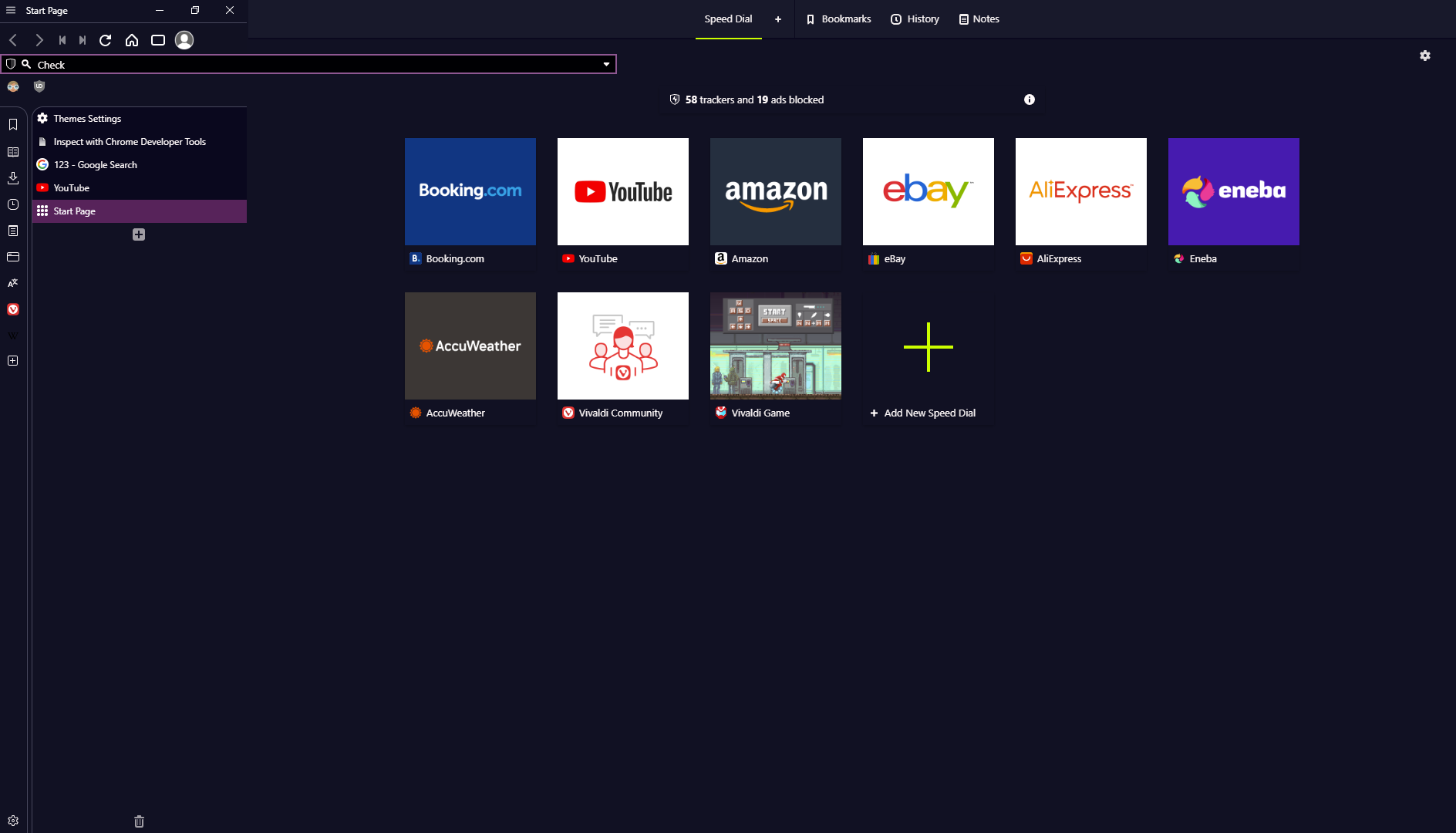
*I wonder why when I copy the code from Notepad++ the formatting looks wrong...
*Tab stacking also doesn't work, probably because of the same reason discussed here: https://forum.vivaldi.net/topic/29800/increase-max-width-of-vertical-tab-bar
-
@ChimeraLove said in Address Bar + Title Bar + Status Bar - Docked to side:
*I wonder why when I copy the code from Notepad++ the formatting looks wrong...
You're mixing up tabs and spaces
https://www.youtube.com/watch?v=JfEIkkDkrmE
This forum's tabstop is 8, which is insane
Code looks better, some suggestions though:
- Update your first post with the new code instead
- Maybe add a version number so users can tell what version they have
- Using a lot of
z-indexis probably not a good idea, can lead to problems down the line, so avoid unless you absolutely have to - Since this is mostly a mod of positioning consider dropping all styling of colours, borders, filters etc, should be unnecessary
This one doesn't make much sense, result would be the same (100%)?
.OmniDropdown { top: calc(100% + 0px); }🎻Volunteer helper · Forum moderator · Sopranos tester 🛠️Troubleshooting 🐛Report a bug 📜Markdown help
🦆"With a rubber duck, one's never alone" -Douglas Adams🦆 -
Hi, I'll look into it in a few days, I'm traveling for work
@Pathduck said in Address Bar + Title Bar + Status Bar - Docked to side:
This one doesn't make much sense, result would be the same (100%)?
The default code is .OmniDropdown { top: calc(100% + 4px); which makes the little space as can be seen on the left image.
This can also be solved with:
.OmniDropdown {margin-top: -2px !important;}
@Pathduck said in Address Bar + Title Bar + Status Bar - Docked to side:
You're mixing up tabs and spaces

-
@Pathduck said in Address Bar + Title Bar + Status Bar - Docked to side:
Code looks better, some suggestions though:
Update your first post with the new code instead
Maybe add a version number so users can tell what version they have
Using a lot of z-index is probably not a good idea, can lead to problems down the line, so avoid unless you absolutely have to
Since this is mostly a mod of positioning consider dropping all styling of colours, borders, filters etc, should be unnecessaryHi, Just updated the code in the first post, it's more refined now with 3 Designs.
I added in the bottom a section labeled /* Color Changes to Theme */ so if people want they can edit or delete it.
Honestly, I could never understood the behavior of the theme's Accent, Contrast and Background and I can't make it work for me without CSS...
I also add this for myself but removed it from the code here in case someone wants to use a background image.
It will make the background color in the color of the chosen background color...
#browser {background-color: var(--colorBg) !important;}There are few things visible when the screen is maximized to full screen (F11), do you have a suggestion how to solve it?
like "If screen is maximized then" I could do display:none for them. -
@ChimeraLove Hi - it still looks kind of strange when testing in a clean profile. I suggest you always test your mod in a clean profile with a default theme to make sure it works and looks good in the most common user scenario. No-one has your exact theme or setup.
Also make sure to note down what changes need to be set in the browser for the mod to work, like mentioned before.
Honestly, I could never understood the behavior of the theme's Accent, Contrast and Background and I can't make it work for me without CSS...
You can examine the colours in the elements inspector, by selecting for instance the
id="browser", and all the colour variables should show up in the Styles section. This lets you understand how the different colours change with the theme.There are few things visible when the screen is maximized to full screen (F11), do you have a suggestion how to solve it?
I don't really know, but it's a good idea to add code to handle the different "states" the window can be in - fullscreen, maximized etc - as well as the different states of UI elements like panels/tab location.
If you examine the class of the
browserid you will see a bunch of classes that can be used for different states. For instancefullscreen,maximized,tabs-left,tabs-topetc. This way you could make sure your mod is only active if tabs are set left, and that you properly handle fullscreen versus maximized and so on. But it's a lot of code to handle all possibilities -
@ChimeraLove After studying your CSS mod a bit, I think there are some improvement can be done. Here is my 2 cents.
- Maybe you can envelop your code with @media to exclude 'em from small width window, because this mod do take up about 300px of vertical space & it won't work very well during small width window:
@media only screen and (min-width: 820px) { YOUR CODE }- You can try using
:root {}to add global valued for min/max width when toolbars are in shrink/expand state. That way other user can customize all of 'em at once to any width they desired with ease.
:root { --minwidth: 300px; --maxwidth: 800px; } .toolbar > .button-textonly:hover { width: var(--maxwidth); }- You can also made toolbar expand when it's in focus/hover:
.toolbar > .button-textonly:is(:hover, :focus-within) {width: ...}- You can support visible statubar with:
#browser:has(footer > .toolbar-statusbar) #tabs-tabbar-container {margin-bottom: 25px;}- As for 2 level stacked tabs support, you can study this half-baked automate vertical tabbar mod I made for fun in the past, the weakness of this code is it doesn't perform very well with a few hundreds of tabs opened:
/* Automate Floating Big Vertical Tabbar */
:root {
	--tabbarwidth: 400px; /* full tabbar width */
	--tabbarwidth2: 600px; /* 2 columnns full tabbar width */
	--tabbarmargin: calc(-1 * var(--tabbarwidth) + 30px);
	--tabbarmargin2: calc(-1 * var(--tabbarwidth2) + 60px);
}

/* full width tabbar on hover */
#tabs-tabbar-container:is(.left, .right) {width: var(--tabbarwidth)!important; max-width: calc(100vw - 70px); transition: margin-left 0s .15s, width 0s .15s !important;}

/* shrink tabbar into favicon on mouseout */
#tabs-tabbar-container:is(.left, .right):not(:hover):not(:focus-within) {width: 30px !important; transition: width 0s .4s, margin-left 0s .4s !important;}

/* optional: always shrink tabbar into favicon when window is off-focus */
:has(.isblurred, :not(.hasfocus)) #tabs-tabbar-container:is(.left, .right):not(:hover):not(:focus-within) {width: 30px !important; transition: width 0s 0s, margin-left 0s 0s !important;}

/* emulating floating left tabbar */
.inner > div:has(#tabs-tabbar-container.left) {width: 30px !important; z-index:1;}

/* emulating floating rigth tabbar */
.hasfocus #tabs-tabbar-container.right:is(:hover, :focus-within), #browser.hasfocus:not(:hover) #tabs-tabbar-container.right:not(:hover) {margin-left: var(--tabbarmargin);}

/* overlay scrollbar when tabbar minimized */
#tabs-tabbar-container:is(.left, .right):not(:focus-within):not(:hover) > div.overflow .tab-strip {animation: ofh .4s .4s forwards !important;}
@keyframes ofh {to {overflow-y: hidden;}}
#tabs-tabbar-container:is(.left, .right) .tab.tab-mini:is(.tab-small, .pinned) .tab-header {justify-content: unset; padding-left: 6px; border:0;}


/* 2 Level/Column Tab Stacking */
/* add extra width during 2 columns */
#tabs-tabbar-container:is(.left, .right):has(#tabs-subcontainer) {width: var(--tabbarwidth2) !important;}

/* shrink tabbar into 2 columns on mouseout */
#tabs-tabbar-container:is(.left, .right):has(#tabs-subcontainer):not(:hover):not(:focus-within) {width: 60px !important; transition: width 0s .4s, margin-left 0s .4s !important;}

/* optional: shrink tabbar into 2 columns favicon when window is off-focus */
:has(.isblurred, :not(.hasfocus)) #tabs-tabbar-container:is(.left, .right):has(#tabs-subcontainer):not(:hover):not(:focus-within) {width: 60px !important; transition: width 0s 0s, margin-left 0s 0s !important;}

/* emulating floating left tabbar with 2 columns */
.inner > div:has(#tabs-tabbar-container.left > #tabs-subcontainer) {width: 60px !important; z-index:1;}

/* emulating floating rigth tabbar with 2 columns */
.hasfocus #tabs-tabbar-container.right:has(#tabs-subcontainer):is(:hover, :focus-within), #browser.hasfocus:not(:hover) #tabs-tabbar-container.right:not(:hover) {margin-left: var(--tabbarmargin2);}

/* shrink 2 columns into favicon when minimized */
#tabs-tabbar-container:is(.left, .right):not(:focus-within):not(:hover):not(:active) #tabs-subcontainer {max-width: 50% !important; transition: max-width .4s .4s !important;}


/* optional: remove small/mini tab effect to improve onhover performance */
#tabs-tabbar-container:is(.left, .right) .tab-header > :is(.stack-counter, span.title) {display: flex !important;}

/* optional: improve onhover performance */
#tabs-tabbar-container:is(.left, .right):not(:hover):not(:focus-within) { will-change: width;}
Hopefully this is helpful for you, you can study my other CSS code from the link in my sig. Keep up the good work!
Sorry, I'm currently hiatus from updating any of my CSS mod until further notice...
-
@dude99 said in Address Bar + Title Bar + Status Bar - Docked to side:
@ChimeraLove After studying your CSS mod a bit, I think there are some improvement can be done. Here is my 2 cents.
Thanks for looking into it and great suggestions!
I will incorporate them..
@Pathduck said in Address Bar + Title Bar + Status Bar - Docked to side:
Hi - it still looks kind of strange when testing in a clean profile.
Can you take a screenshot?
I'm afraid that if you are using windows with DPI scaling of 150% I don't know how to adjust for it..
@Pathduck said in Address Bar + Title Bar + Status Bar - Docked to side:
This lets you understand how the different colours change with the theme.
Not to change the subject too much, I love Vivaldi and converted more than 10 people to use it and laughed as each one of them struggled with the theme's color mumbling "Why the Accent effect the tabs and the title and other stuff and why is it not the color I chose and text color is changing and what is the interaction between these and background and contrast and foreground color etc..."
I do appreciate that there was much thought and work behind the design of it but I consider it as problematic if something that was designed to make things simpler now require learning and it's not intuitive for some people...
Luckily it's so easy to change with CSS.As for the code here, I couldn't make it work naturally with the theme without including a few changes to the color in the Color Changes to Theme, but I'm sure it can be done.
-
@ChimeraLove said in Address Bar + Title Bar + Status Bar - Docked to side:
Can you take a screenshot?
I'm afraid that if you are using windows with DPI scaling of 150% I don't know how to adjust for it.I'll do you one better, a video
This is basically launching a clean profile with only this CSS mod applied, using a cmd argument to override system DPI scaling to 1.0:
https://ttm.sh/0nr.mp4As you can see, if a user experiences this, they would just assume "this mod don't work" and remove it.
However, I know that tabs need to be set to left, panels need to be set to float, and the title bar won't show before toggling the status bar (weird case) - so I can fix it so it at least looks workable. Another user might not understand this at all and just think it's "broken".
-
@dude99 said in Address Bar + Title Bar + Status Bar - Docked to side:
You can support visible statubar with:
@Pathduck said in Address Bar + Title Bar + Status Bar - Docked to side:
and the title bar won't show before toggling the status bar (weird case)
@dude99 I just realized the status bar seem to be already supported with the last version, do you think the code is necessary?
@Pathduck The bug of the status bar and title bar now seem to be solved with the last version. Still a problem?@Pathduck said in Address Bar + Title Bar + Status Bar - Docked to side:
I'll do you one better, a video
Actually it looks good to me after you changed the settings.
(I added in my first post in the end the Instructions of what to do in settings)
But you are right, I need to include my theme file as well. I'll upload it.Edit: @Pathduck I added a link to the theme in the first post in the Instructions. Can you check how it works for you?
-
@ChimeraLove Looks much better now - and DPI Scaling has no effect on how it looks

Still get those "fugly" corners on the tabs unless Accent on Window is turned off:
Can be somewhat remedied by doing:
#tabs-container {margin-left: unset;}
#tabs-tabbar-container {border-radius: 15px; width: 279px !important;}
But the width of the tabs container will have to be set exactly the width of the tab bar which is tricky and I really don't know how to do this properly. You'll figure it out I'm sure
However, I recommend you don't hardcode value for corner rounding, and use:
border-radius: var(--radius);
This way the theme corner rounding setting will be respected.Like I said before you should not override the theme's border colours. For some reason thecolorBordervalue is not actually used for UI borders but this one:
var(--colorAccentBg);
Using this will make borders follow the theme colours (I guess might depend on settings...) This shows for instance when opening panels in different themes:Strike that, apparently the colorAccentBg is set in your mod
I don't think your theme is approved yet
But you can share the zip instead somewhere.🎻Volunteer helper · Forum moderator · Sopranos tester 🛠️Troubleshooting 🐛Report a bug 📜Markdown help
🦆"With a rubber duck, one's never alone" -Douglas Adams🦆 -
@Pathduck said in Address Bar + Title Bar + Status Bar - Docked to side:
Accent on Window is turned off:
Yes, this one is mentioned in the instructions.
@Pathduck said in Address Bar + Title Bar + Status Bar - Docked to side:
However, I recommend you don't hardcode value for corner rounding, and use: border-radius: var(--radius);
This way the theme corner rounding setting will be respected.Good Idea
I'll do it. -
@Pathduck I updated the code as you suggested with 2 exceptions:
- In the first design - Full Borders, I feel the address bar always looks nicer with 0 radius and fill the sides of the box.
This can be changed in this line:
.toolbar > .button-textonly {border-radius: 0px;}
.
- In the second design - Minimal Borders, I wanted to differentiate the cute corner where the tabs and panels meet, I think it gives small but nice visual information, and can be changed in this line:
/* Change --PanelTabsCornerRadius to control the radius of their shared corner */
--PanelTabsCornerRadius: 15px;
- In the first design - Full Borders, I feel the address bar always looks nicer with 0 radius and fill the sides of the box.
-
@Pathduck said in Address Bar + Title Bar + Status Bar - Docked to side:
Still get those "fugly" corners on the tabs unless Accent on Window is turned off:
This should be fixed now even if Accent on Window is On.
-
@ChimeraLove said in Address Bar + Title Bar + Status Bar - Docked to side:
I just realized the status bar seem to be already supported with the last version, do you think the code is necessary?
Great! Lesser code is always better for any mod.
-
Hi @ChimeraLove thanks a lot for this mod. I was looking for something like this to achieve 100% vertical screen estate usage. Please help me with my doubts
- how to apply this mod, i.e. where to put this code. I read sticky post on the mod homepage, but I am not clear. I just want to know that do i have to paste this code in a file and put that in a folder set for vivaldi custom ui in settings. And what should be the extension for this file? (.css?)
- can i customize it by setting tab bar on the upper side and the rest of the toolset at the bottom?
- can i keep both address bar and search field?
- I am currently using a mod for making title disappear and turning window minimize buttons transparent. I believe after using your mod i wont be requiring the existing one?
-
This post is deleted! -
@Abhimanyu said in Address Bar + Title Bar + Status Bar - Docked to side:
Hi @ChimeraLove thanks a lot for this mod. I was looking for something like this to achieve 100% vertical screen estate usage. Please help me with my doubts
- how to apply this mod, i.e. where to put this code. I read sticky post on the mod homepage, but I am not clear. I just want to know that do i have to paste this code in a file and put that in a folder set for vivaldi custom ui in settings. And what should be the extension for this file? (.css?)
- can i customize it by setting tab bar on the upper side and the rest of the toolset at the bottom?
- can i keep both address bar and search field?
Hi, happy you like it!
I believe tomorrow I will be able to answer with detail and create a version for you
Can you create a mockup image to illustrate what do you mean? To show your vision visually.