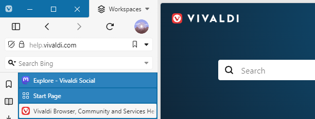
Vivaldi VH - Full height for your webpages, now on version 1.4
-
@HKayn You seem to be aware of the issues. I just fired this up out of curiosity and don’t intend to switch to it, because I’m content with my current setup without tab and title bar. Maybe I’ll take a closer look at this in future.
-
Great mod @HKayn, thank you!
-
Version 1.1.0 is now available!
Changes:
- The button that toggles hidden extensions is now always to the right of the extensions grid.
- Command Chain Flags for inverting the position of the hidden extensions toggle are now available.
- The logic that calculates the width of an extending input field has been improved to take additional browser settings into account.
- The title bar height and address box row height have been changed to 25px and 34px respectively.
Click here to view the full changelog with additional thoughts behind specific changes.
Fixes:
- The height of title bar elements will no longer change in unintended ways when changing the user interface zoom setting.
- The default browser notification will no longer disrupt the UI layout.
- Fixed a case where the webpage would gain an unintended margin on specific browser settings.
-
@HKayn Is there any way to make this work with the Window panel instead of Tabs?
-
@JoaoPauloS This is on the roadmap and will be properly supported in the future.
Until then, you can make it work by doing the following:
- Make sure that your panels don't float and are on the same side as your tab bar.
- Apply the following piece of additional CSS to Vivaldi:
#main > .inner > :has(#tabs-tabbar-container) { width: 0; } -
@HKayn I never used vivaldi before, downloaded it just to try out this mod, and it's exactly what I needed! Thank you!
-
@BirkaVZ Glad to hear you enjoy it!
How did you find out about Vivaldi VH, if I may ask?
-
@HKayn I saw a video about the arc browser that has similar ui, but it's for mac only, so I started looking, checked out this forum and found this post.
It makes sense to me to move the whole ui to the side since almost all webpages are designed with legacy aspect ratios in mind, or scale to anything anyway.
-
This post is deleted! -

Just in time for Vivaldi 6.0, version 1.2 of Vivaldi VH is now available!
With this version, the title bar is no longer required to activate the Pillar layout. Additionally, you can now use toolbar linebreaks for more control over how toolbar components spread across the address bar and status bar.
Click here for the full release notes and downloads.
-
This post is deleted! -
This post is deleted! -
Thanks for this, I'm really liking the mod so far. I like to use a pretty narrow sidebar, and that makes the URL on the address bar pretty much useless. I wonder if the URL bar could take "multiple rows" and word wrap?
-
@HKayn
Hi! Thanks for the best mod!
I really like this!
I addressed the problem where certain colors indicating selection were not displayed when multiple tabs were chosen. This has been resolved as follows.
Before:
:root:has(#browser:is(.tabs-left, .tabs-right):is(.address-top, .address-bottom)) #browser #header,
:root:has(#browser:is(.tabs-left, .tabs-right):is(.address-top, .address-bottom)) #browser #main,
:root:has(#browser:is(.tabs-left, .tabs-right):is(.address-top, .address-bottom)) #browser #main .mainbar,
:root:has(#browser:is(.tabs-left, .tabs-right):is(.address-top, .address-bottom)) #browser #main .inner {
  display: contents;
}
After:
:root:has(#browser:is(.tabs-left, .tabs-right):is(.address-top, .address-bottom)) #browser #header, :root:has(#browser:is(.tabs-left, .tabs-right):is(.address-top, .address-bottom)) #browser #main, :root:has(#browser:is(.tabs-left, .tabs-right):is(.address-top, .address-bottom)) #browser #main .mainbar, :root:has(#browser:is(.tabs-left, .tabs-right):is(.address-top, .address-bottom)) #browser #main .inner:not(rect) { // Modified. Specify a non-rectangle to represent the selection. display: contents; } -
Apologies for forgetting to check in here!
Vivaldi VH is now on version 1.2.2, which fixes several small issues, most notably one where the Vivaldi button could appear misplaced after Vivaldi 6.2. Read more: https://github.com/HKayn/vivaldi-vh/releases/tag/v1.2.2
I'm currently working on version 1.3.0, which will include some larger changes. Development is public on the main branch of my GitHub repo, so anyone who can't wait may clone the repo and compile it themselves to test v1.3.0 early.
-
@ppgm Thank you for the kind words!

And thanks for reporting this bug! A fix for this is already on my main branch on GitHub and will be released with version 1.3.0.
By the way, I've checked out your blog and your custom theme looks great!
-
@ITN007 Word wrap inside the URL bar might work, but there would be many design aspects to consider.
Where do you place the buttons in the URL bar once the text starts wrapping? And are these placements feasible with a CSS-only mod?
I might take this on in the far future, but no promises.
Out of curiosity, how much did the extending URL bar help with viewing long URLs, if at all?
-

Version 1.3 of Vivaldi VH is now available!
This release changes some default behaviors of Vivaldi VH, enables resizing of the search field and fixes a lot of bugs.
Most importantly, the panel will no longer be inside the Pillar by default. More info on why this change was made can be found in the full changelog. Rest assured that you are able to revert this change.
Click here for the full release notes and downloads.
Next up on the roadmap: The ability to replace the tab bar with the Window panel.

-
Version 1.3.1 of Vivaldi VH is now available, fixing a few more bugs.
Click here for full release notes and downloads.
-
@HKayn I have no knowledge of css, can u make it please be possible for the tab menu to auto hide to view the webpages in fullscreen. i am using this mainly to be a replacement of the arc browser lookwise...
please help
