Dedicated status page for Vivaldi services
-
@luetage I didn't notice it. I guess I'm not spending too much time on the user's page, but which top margin are you talking about?

-
Spoiler
-
@luetage Oh, so you're talking about the cover images. I must admit, I didn't pay any attention to it, as I didn't notice the change. Still, the reason behind this change remains a mystery...

-
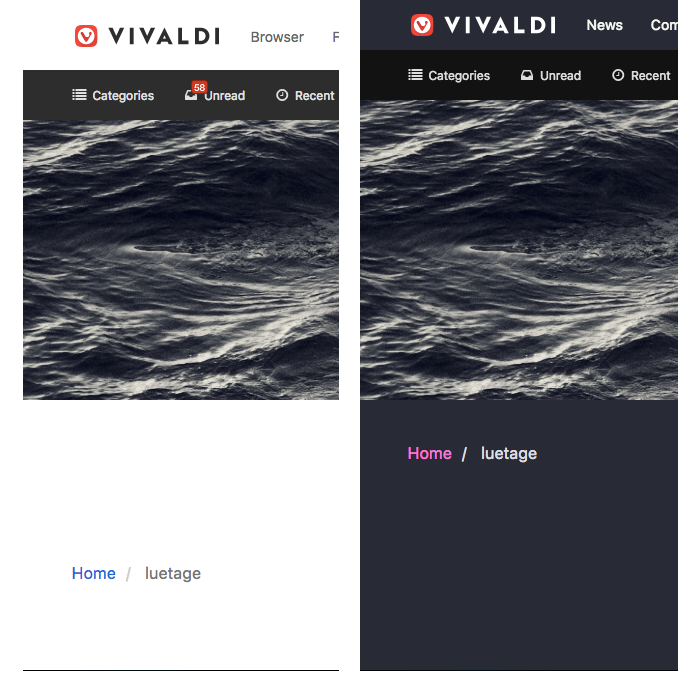
@pafflick No, not the cover images. Part of the cover being hidden is a long standing bug on Vivaldi forum that's fixed in the forum extension (right). What I'm talking about is the top margin of the content (take a look at home/user).
-
Thanks for your request. This is something we're also discussing internally and hope to be able to provide soon.

-
@luetage I thought it might be caused by your custom CSS. Here the margin is significantly smaller than in your screenshot. But as it turned out, actually, there must be something in my custom CSS, that influences the margin. Strangely, I don't even remember ever fiddling with it...

-
@pafflick You changed nothing special. Turns out the content is pushed down by the notification. Hiding it fixes the margin on account pages. Curiously all account pages with exception of the settings page are influenced by this.
Updooded request so we get rid of the notifications. Else Vivaldi devs would have to fix this part of the nodeBB code, which will likely never happen.
-
@luetage I've checked this and you're right. So, we get back to the topic (kind of)...

-
-
💻 Windows 10 64-bit Sopranos Builds • en-GB • 🗳 vote for features • 🕵️♀️ Code of Conduct • 🐞 Report bugs
-
@LonM
The help tooltips display is horrible, but the page itself is fine.