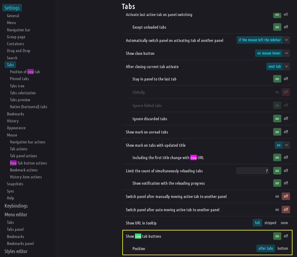
V 6.7 | Vertical Tabs | New tab button moved to end of side tab bar
-
@brinkbolt New tab on top might be easy as long you move the whole buttons block. Unsure if easy to move it where it was before:
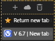
#tabs-container .resize {order: 1;} -
See Return new tab button to the old address. As I pointed out there, just reverting the bug fix will not solve the issue.
New Tab button on top is fine, until a user has a full vertical tab bar, then the problem of excessive cursor movement returns.
I have yet to hear or think of a perfect solution. One can place a custom command chain button on the Address Bar.
-
@Pesala said in V 6.7 | New tab button removed:
There are too many changes in the update to highlight every bug fix
I agree that a full list of all changes on that page would not be appropriate.
But again, we are talking about what is possibly the MOST clicked button in the app.
When changing something like that, it deserves to be mentioned here.@Pesala said in V 6.7 | New tab button removed:
I have yet to hear or think of a perfect solution
Some people like the floating button. Some people like a fixed button. The closest you are going to get to a perfect solution is to 1) Present both all the time, or 2) Put an option to choose the method you like within the settings options.
-
@Edward802 Well said! Such a fundamental change should not be made lightly.
-
Are you kidding me??? You exiled the new tab button to Kazakhstan lol. Please put a setting in to restore it to the old position, this is downright silly UX wise.
-
I feel the same way about this change as when Microsoft broke the taskbar in Windows 11.
Vivaldi, like Opera once, should be a user-configurable browser, and changing the position of the button should therefore have a setting somewhere.
Muscle memory is poorly unlearned (and yes, I use mouse gestures, but that's not what this topic is about)... -
@krtektm If it was about muscle memory, then a fixed position would be best.
It is not. It is about the distance of mouse cursor travel to the button.
Fixing the New Tab button together with the Synced Tabs and Closed Tabs Trash Can is a good improvement.
The linked feature request should be to have the buttons move as a group after the last tab, until the tab bar is full, then additional tabs should scroll. Previously, the New Tab button scrolled out of sight, which was a bug. That bug was fixed.
Perhaps there is a better solution, but reverting an old bug that was finally fixed after several years is unlikely to happen.
-
@Pesala Good, I downgraded back to 6.5 and disabled updates, because I also experienced that 6.7 was stuck on loading tabs after Vivaldi was closed and opened again (I had to close it several times until it unstuck and started loading tabs and pages, Chrome and Firefox worked without any issue at that time) so it's not usable for me in this state...
BTW thanks to the tab grouping, possibility of opening new window or now with workspaces I never had so much tabs in the tab bar (I use it on the right side) which would lead to the hiding New tab bar...
However I still can't understand why there can't be two buttons (so have them in both positions) with possibility of hiding them in configuration?
-
@krtektm Downgrading is not a solution. It leaves your system unprotected from the latest exploits, and probably broke your profile already.
-
Not happy with this change. I use that button a lot.
-
to simply remove this ADD TAB button was a pretty ignorant and not clever decision by the developers or just one super bright of them, which is usually the cause. i thought the vivaldi devs are smarter and wiser than that.
I used this button a lot, now it has just been removed. honestly?
The Vivaldi Developers seem to move into the ignorant Microsoft, Google direction.
"We do what we want, its our product, you shut up and take what we give to you!!"
Bring back that little CROSS to add a new Tab please or add an option for it.
-
@Sodokin The button was not removed, but rather anchored to the bottom of the tab bar. As a lot of people aren't happy with this, it will b doubtless be changed.
In the meantime, a double-click in the empty space below the tabs generates a new tab.
Volunteer Mod and tester on Windows 11 Home X64, i7-13700 @ 5.4 GHz turbo; Intel UHD 770 graphics; 1TB NV2 PCIe 4.0 NVMe SSD; 32 GB DDR4-3200 RAM. Community Code of Conduct
-
@Ayespy said in V 6.7 | New tab button moved to end of side tab bar:
@Sodokin The button was not removed, but rather anchored to the bottom of the tab bar. As a lot of people aren't happy with this, it will b doubtless be changed.
In the meantime, a double-click in the empty space below the tabs generates a new tab.
It is doubtless this will be changed, but in the meantime…?
The logic here is an absolute slap in the face. It’s stuff like this that makes newer users like me want to run for the hills. I’ll be watching this more closely now from the developers and how they react to a few upset users, but blatant disregard like this in the community is ridiculous.
Some posters have made a decent attempt explaining that it was a bug and whatnot, and said bug was fixed, etcetera. The OP wasn’t asking about alternatives explicitly, they were talking about choice.
Is it possible to bring this back? Through an extension? Through a UX update that still has the mentioned bug squashed? Is it possible that the choice, not alternative means, to return this function to its user(s) without disrupting others having to deal with bugs?
Although I’m not upset too much about the change, I liked the button where it was. A lot. But I also use keyboard shortcuts so no big deal in the long run for me. But for people who used it, myself included for just shy of a year, not having it so suddenly is a drag and not a subtle change for their productivity. I’ll adapt, overcome, it’ll be a long lost memory. But the sheer anxiety to some, the abrupt change with no announcement, no notice or the ability to turn it back on for at least three more updates or something along those lines before it becomes permanent? A phase out? Something, anything. Not everyone adjusts the same. They lost their right to choose. In an environment built on choice. It’s a big deal to them; huge. Don’t brush them off, help them understand and see if real answers can be found. You may not be hurt by this, but others are.
-
OK so for those of you desperate to have the new tab button in a more logical place - I agree having it on the bottom is a bit of a stretch - and for some reason unable or unwilling to use
Ctrl+There's a workaround in CSS until they add an option to change the position:#browser:not(.tabs-top, .tabs-bottom) .toolbar-tabbar.sync-and-trash-container { order: -1; } #tabs-tabbar-container:has(.separator-wsbutton) { padding-top: 0px !important; } #tabs-tabbar-container .separator.separator-wsbutton { top: 0px; }HOW TO: https://forum.vivaldi.net/topic/10549/guide-modding-vivaldi
The last two selectors are cosmetic, just removes some IMO unnecessary blank space.
This might break in unforeseen ways but seems to work ok.
No rights given or implied.🎻Volunteer helper · Forum moderator · Sopranos tester 🛠️Troubleshooting 🐛Report a bug 📜Markdown help
🦆"With a rubber duck, one's never alone" -Douglas Adams🦆 -


Look, you've got it all wrong! You don't need to follow me. You don't need to follow anybody! You've got to think for yourselves! You're all individuals!
-
@Pathduck Kindly asked, can you rewrite this code so that it works when you have placed your table bar on the right?
🍀 Before you ask, use Vivaldi Help (F1)🍀Ambassador🍀Search Engine Collection🍀My Themes🍀Windows11 23H2*Samsung A54 Android14🍀
-
@stardepp Works fine with tabs on the right.
If it doesn't work for you I don't know what's wrong. You might have some special setup or existing custom CSS that interferes.
-
-
As far as I am concerned, this is broken. I get the whole "it was actually a bug" but I can see no way that this is the better option. The + after the last tab makes sense, even having it fixed at the top makes more sense, after I realised my install wasn't just broken, down the bottom of the tabs list was the last place I looked.
I've rolled back to the last good version and turned off auto-updating until this is fixed, a good solution is found, or I move on to another browser. -
@Pesala said in V 6.7 | Vertical Tabs | New tab button moved to end of side tab bar:
@krtektm Downgrading is not a solution. It leaves your system unprotected from the latest exploits, and probably broke your profile already.
Nope, profile from 6.7 works as expected in 6.5 after downgrade, no issues spotted. And security state of my system is not your business
")


 *
*