Solved Combine Window Title and Address Bar when Tabs are on the Side
-
Hi,
I love to have the tabs on the (left) side. However, with side tabs there is the mostly empty window title bar shown above the address bar.
This is not the case when tabs are on the top (and the Vivaldi button is chosen as menu position), where the tabs, the Vivaldi button and the window max/min/close buttons are combined into a single bar.Similarly, in order to kind of harmonize the appearance of side and top tabs, and to avoid wasting precious vertical space, I suggest to combine the window title and the addresss bars when tabs are on the side and the Vivaldi button is chosen as menu position.
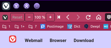
So this:

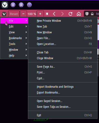
Should look like:

I am using this awesome CSS mod to achieve this but have to redo the mod after every update: https://github.com/Sporif/CustomHooks/blob/master/hooks/combine-header-toolbar.css
-
The title bar is no longer shown with vertical tabs as of Vivaldi 6.0, which was released today.
 You can always enable it back if you prefer. Just go to Settings > Appearance > Window Appearance:
Show Title Bar -
I like the idea, but with a little modification:

If only the address field is in the tab bar, there will be more room for tabs. Buttons (back, forward, refresh) can be hidden if you set up a shortcut or mouse gesture to toggle the (original) addressbar.

Since the buttons can already be freely moved, I don't see a big obstacle to putting the addressfield in the tab bar.
-
@mathiasbr this is exactly what i wanted! although it doesn't work if the window isn't maximised. any fixes for that?
-
I'm also using the 'combine-header-toolbar.css'
div#header {
    margin-bottom: -25px !important;
    z-index: 5 !important;
    pointer-events: none !important;
}

div.toolbar-addressbar {
    padding-left: 34px !important;
    padding-right: 135px !important;
}

div#pagetitle {
    display: none !important;
}

.toolbar .button-toolbar {
    height: 35px !important;
}

.button-toolbar > button[title="Suchmaschine ändern"] {
    transform: translate(0,0) !important;
}

.sdwrapper .iconmenu-container.searchfield {
    height: 36px !important;
}

.addressfield {
    transform: translate(0,-1px) !important;
}

.toolbar-insideinput button {
    transform: translate(0,7px) !important;
}

.tabs-right#browser.win.win10 .tabs-bottom#browser.win.win10 .tabs-left#browser.win.win10, #browser.win.win10 #header #titlebar .window-buttongroup button {
    height: 34px !important;
}

#browser.win.win10 .window-buttongroup button {
    width: 44px !important;
}

#browser.win .window-buttongroup button.window-close {
    margin-right: 0 !important;
}
and I would like to be able to drag the window at the vivaldi button
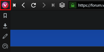
I usually open the vivaldi menu via hotkey and there for disabled the 'pointer-events' on that button
.vivaldi {
    pointer-events: none !important;
}

#titlebar > button > span.application-icon > svg > path:nth-child(1),
#titlebar > button > span.application-icon > svg > path:nth-child(2) {
	display: none !important;
}

#titlebar > button > span.application-icon > svg {
    width: 22px !important;
    height: 22px !important;
    transform: translate(0,2px) !important;
    background-image: url(data:image/png;base64, 'very long base64 string' ) !important;
}
does anyone know how to make the button or rather the background-image able to drag the window from?
-
@yians said in Combine Window Title and Address Bar when Tabs are on the Side:
@mathiasbr this is exactly what i wanted! although it doesn't work if the window isn't maximised. any fixes for that?
Any fix for this one work not only in maximize mode?
-
Hi, does anybody have an updated version of the mod? for me on latest vivaldi snapshot version it's not working, thanks!
-
Blockquote Combine Window Title and Address Bar when Tabs are on the Side
Not for the Side position only, but for Tabs on Bottom position too!

It's very annoying the Title bar on top.

-
I couldn't make it work, needs an update?
-
@bimlas Can you share this css code
-
The code at
https://github.com/Sporif/CustomHooks/blob/master/hooks/combine-header-toolbar.css
was working perfectly wonderful for me for almost the past year. But, today..... I clicked Update on my browser to bring it up to 3.3.2022.36, and now, it looks silly. The Vivaldi Menu and Minimize, Maximize, and Exit buttons are overlaying on top of some of the other items. I attempted to modify the code on my side to see about fixing it, but to no avail, b/c I'm no programmer/developer. If any one has any insight to get this back to proper appearance, I would not be sad for you to take a crack at it.After failing at modifying the css, I thought to try to customize the toolbar, and add spacers to each end of the toolbar itself, but couldn't find how to do that. Otherwise, that'd've been a reasonable solution.
Thanks everyone! -
I have been using @LonM's piece of magic since 5/6/20, & it continues to work brilliantly for my Snapshots & Stables.
-
@Steffie
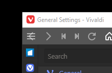
I just tried that, thanks, but the V icon (and the hamburger) are still laying on top of the Back button.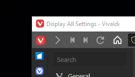
-
-
@geektbee said in Combine Window Title and Address Bar when Tabs are on the Side:
the V icon (and the hamburger) are still laying on top of the Back button
Aha, now i see what you mean, but it's simple to work around via a kludge.
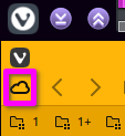
- I temporarily disabled Native Window & relaunched so i could see what's happening -- this showed me:what you said is true & i'd not noticed before, coz i long ago customised this bar.
- So i Shift-dragged a useless-to-me icon up from the Status Bar, & placed it where the V will end up.
- Re-enabled NW then relaunched.
- Huzzah!

-
@Steffie
Yeah, that's takes care of the left side.... but not the right Minimize, Restore, & Exit are overlaying the end of the address bar, Profile options, and Extension Expander. I can't win.....
-
@geektbee I'm not seeing that effect here, so i'll bow out. Good luck.
-
@geektbee I'm using the same css as you and getting the same issue (both left and right). Did you find any fix?
-
I've also been using the script from the first post for a long time and it stopped working with 3.3. The reason is that some of the elements in the browser were renamed.
I just had a look, and for me, the fix was as simple as replacing all instances of the following in the base script:
.toolbar.toolbar-addressbarwith:
.UrlBar.toolbar.toolbar-mainbar.toolbar-largeNow (everything that I use) looks just like it did before 3.3.
I hope that helps you both.
-
This kept them from completely overlapping, thanks.
They were still pretty crowded, but tweaking padding-left from 24px to 40px under "Reduce toolbar size for vivaldi button" gave them a comfortable margin. Probably dependent on screen resolution.
-
@zo1d Unfortunately this doesn’t work on macOS. Is there any way to merge the window title & address bar into one on the Mac?

