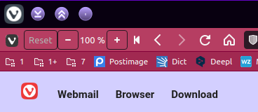
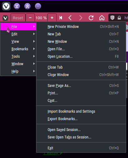
Solved Combine Window Title and Address Bar when Tabs are on the Side
-
I have been using @LonM's piece of magic since 5/6/20, & it continues to work brilliantly for my Snapshots & Stables.
-
@Steffie
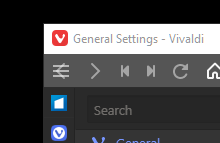
I just tried that, thanks, but the V icon (and the hamburger) are still laying on top of the Back button.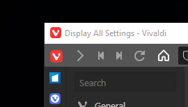
-
-
@geektbee said in Combine Window Title and Address Bar when Tabs are on the Side:
the V icon (and the hamburger) are still laying on top of the Back button
Aha, now i see what you mean, but it's simple to work around via a kludge.
- I temporarily disabled Native Window & relaunched so i could see what's happening -- this showed me:what you said is true & i'd not noticed before, coz i long ago customised this bar.
- So i Shift-dragged a useless-to-me icon up from the Status Bar, & placed it where the V will end up.
- Re-enabled NW then relaunched.
- Huzzah!

-
@Steffie
Yeah, that's takes care of the left side.... but not the right Minimize, Restore, & Exit are overlaying the end of the address bar, Profile options, and Extension Expander. I can't win.....
-
@geektbee I'm not seeing that effect here, so i'll bow out. Good luck.
-
@geektbee I'm using the same css as you and getting the same issue (both left and right). Did you find any fix?
-
I've also been using the script from the first post for a long time and it stopped working with 3.3. The reason is that some of the elements in the browser were renamed.
I just had a look, and for me, the fix was as simple as replacing all instances of the following in the base script:
.toolbar.toolbar-addressbarwith:
.UrlBar.toolbar.toolbar-mainbar.toolbar-largeNow (everything that I use) looks just like it did before 3.3.
I hope that helps you both.
-
This kept them from completely overlapping, thanks.
They were still pretty crowded, but tweaking padding-left from 24px to 40px under "Reduce toolbar size for vivaldi button" gave them a comfortable margin. Probably dependent on screen resolution.
-
@zo1d Unfortunately this doesn’t work on macOS. Is there any way to merge the window title & address bar into one on the Mac?
-
@chiefsucker It's better to ask for a mod on Modification forum board than on FR board.
-
This is a great request to make Vivaldi stand out in the browser wars. Should be marketed as Laptop Mode, as it's most usable on laptops with limited vertical pixels, like 1920x1080. I'm using combine-header-toolbar.css with the bookmarks and tabs to the left, with the regular tabs panel removed. Absolutely love it!
-
This worked great for me on macOS:
#browser #header { display: none; } -
This post is deleted! -
@cubeapril now when you open the preferences you cannot close it !!!
-
@mzayani add
:not(.is-settingspage)after#browser -
I have made some modifications to the original based on comments in this thread and posted it in a github repo. You can see it here: https://github.com/ngburke/vivaldi-custom-ui. Only tested on windows so far.
-
@ngburke This works fine on Linux (XFCE). Thank you.
-
@ngburke,
is there any way to make it work on any window size, not only when maximized? -
@valsuraev yes, you can. Replace everything that says ".maximized" with ".normal". However, it is not very usable because there is no way to grab the window and move it. If you find out a way to keep the window movable, let me know and I'll publish a version.

