Feature requests for Vivaldi's new forum
-
Block a user: hide all posts/topics of a specific user, switch on/off by visiting their profile.
-
@Quinca71 You could argue that, but I don't think the ladies would be too happy about it.
"His" used to be a gender-neutral pronoun until recently. Usage was formal as well as informal. It isn't wrong per se, but it's not modern anymore, and already considered bad etiquette? I don't know, nowadays you are on the safe side if you use "their" instead of "his". Other options are "hisorher", "her", "his/her and "its". I like none of these though, and they aren't common either.
-
@Gwen-Dragon You misunderstand the context. We are not talking about a known user male/female, but about the usage of his/her/its/their in a sentence, where the gender of the user cannot be known, because we are not addressing any user in particular (see my initial post and the usage of their).
The usage of "his" or "her" is still deemed acceptable, because "his" and "her" are gender-neutral pronouns in this context. I already explained why I still wouldn't use it, but it isn't incorrect, and shouldn't be considered offensive. "Their" is likely the better choice nowadays, but one could argue it's grammatically even incorrect (plural instead of singular).
-
@Gwen-Dragon said in Feature requests for Vivaldi's new forum:
And people who do not like to be sorted in binary sex assignment would not be lucky with his or her. gender neutral is not easy
In Canada a war has been launched against Professor Jordan Peterson because he refuses to address non-binary students with their preferred pronouns (I believe there are 66 non-binary states presently). The screaming and anger hurled at him is amazing: it's all on YouTube. And for the first time in years he was refused government money for research so it's getting serious.
-
In good old times those crazy ppl were confined in asylums.
Now can we stop about this bs and talk about Vivaldi problems? thank you.http://iancoog.altervista.org/
--=[]=-----------------------------------------------------------------------=[]=--
Windows10 64bits - 8core i9-9900K @ 3.60GHz - 16Gb RAM - nVidia GT1030 -
@iAN-CooG Indeed. Off-topic. My apologies for joining in. Back to regularly scheduled programming.
-
Hi folks, it's possible to add an option not to duplicate the reply's?
It really confusing to me and I don't see the utility.
I add a screenshots to see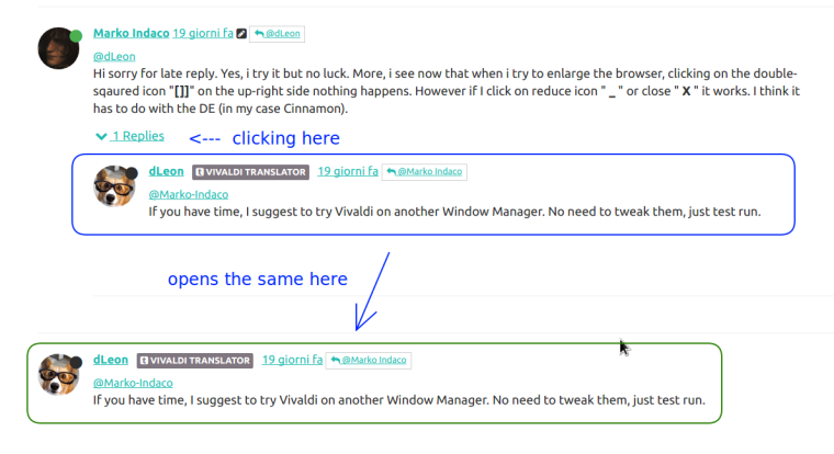
Strangely, very few times, it don't show the duplicate reply and I don't understand why this happens...
-
@Marko-Indaco it's a bit confuse to me too.
-
The Big Red Plus
I had no idea what this was until I asked on this forum.
Please add a tool tip to the big red plus that appears when writing a post in this forum.Also, why is it a plus? It would make more sense if it was a ^, >, or a v like in bookmarks. The first time you press it, it takes things away, so plus doesn't make sense.
-
Huh... Oddly, despite it being big and red, I don't recall noticing that button it until you mentioned it. (Or maybe I did, but forgot about it.) Has that always been there since the forum switched to NodeBB?
Maybe it's a white "+" on a red background because it temporarily folds away the post/reply form, like a Swiss Army knife folds away its tools? That's the best explanation I can come up with.

DIY userstyle fix:
/* Change FontAwesome "+" to FontAwesome expand/contract arrows */ .taskbar-composer .fa-plus:before {content: "\f065" !important;} .taskbar-composer.active .fa-plus:before {content: "\f066" !important;} /* Make a tooltip */ .taskbar-composer:hover::after { position:absolute; text-align:center; top: -4ex; left: 0; background:cornsilk; padding: 0.1em 0.4em; opacity:0.8; box-shadow: .3em .3em .3em rgba(0,0,0,0.2); content: "Restore\A composer"; } .taskbar-composer.active:hover::after { content: "Hide\A composer"; } -
@Quinca71 Maybe it's a plus because it means I want to go looking for something I want to add to my post.
Yes, it's a white plus in a red circle, but that was too many words.
")
It still needs a tool tip.
-
@Quinca71 I was just saying I was too lazy to spell it out with as many words as my later explanation contained.
You make a good point though about remembering that English isn't everybody's first language. Just another reason to keep statements simple and clear.
-
Highlighting the up- or downvote button based on which one you've used
-
@VincentVdh Like this?
-
@duarte.framos Exactly like that. Let's push it up in the queue
-
@duarte.framos Yes, yes and yes. To both the upvote coloration and the hamburger.
-
@g_bartsch Thanks guys
")
I have since noticed that under the mobile version of the forum software (when visited from an Android phone for example) the icon is indeed displayed as the three-dot alternative.
In a desktop browser however, it displays the blue i icon instead, which while totally OK, I find somewhat less descriptive of what it actually does. -
I think the markdown code in forum is great, but as far as I know there is no way to make a button to show/hide content (e.g. for big images or code). Could be useful and help prevent individual posts cluttering up the page.
-
@luetage said in Feature requests for Vivaldi's new forum:
I think the markdown code in forum is great, but as far as I know there is no way to make a button to show/hide content (e.g. for big images or code). Could be useful and help prevent individual posts cluttering up the page.
As I mentioned in another thread, one hacky way to do a spoiler in the current forum (although the collapsing isn't evident in preview) is to nest two block quotes as a spoiler like so:
spoiler
...
...> > spoiler > > ... > > ...Spoiler tags would be nice, though.
-
@Isildur Ahh, I never read that. And thanks, that's a clever trick and shall suffice for the time being.