Return new tab button to the old place.
-
@Pesala Yes, that's true, but I'm a big fan of mouse gestures.
-
OK so for those of you desperate to have the new tab button in a more logical place - I agree having it on the bottom is a bit of a stretch - and for some reason unable or unwilling to use
Ctrl+There's a workaround in CSS until they add an option to control the location.#browser:not(.tabs-top, .tabs-bottom) .toolbar-tabbar.sync-and-trash-container { order: -1; } #tabs-tabbar-container:has(.separator-wsbutton) { padding-top: 0px !important; } #tabs-tabbar-container .separator.separator-wsbutton { top: 0px; }HOW TO: https://forum.vivaldi.net/topic/10549/guide-modding-vivaldi
The last two selectors are cosmetic, just removes some IMO unnecessary blank space.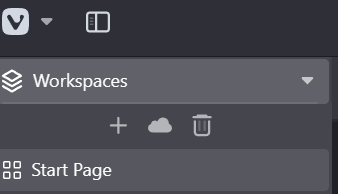
This might break in unforeseen ways but seems to work ok.
No rights given or implied. -
It's always weird when a feature, past choice, characteristic or whatever you want to call it, is changed without the option to revert back. This is not Chrome, it's Vivaldi, we are here for Options! Looking forward to see a position control!!
-
@nekokun A bug was fixed, and bugs are not reverted, nor are options given to revert them.
I think they could come up with a better solution, but it is hard to please everyone.
Some will be happy with Pathduck’s solution, but others will complain that the button is now too far away when the mouse cursor is at the bottom of the page.
A floating position after the last tab may again disappear when the tab bar overflows.
Good luck with inventing a perfect feature, then implementing it on all Operating Systems and devices.
Blog • Vivaldi Review • Server Status
Specs: AMD Ryzen 5 3400G, 8 Gb • Win 10 64-bit build 19045.2486 • Snapshot 6.8.3381.3 (64-bit) -
@Pesala Usually, a bug occurs unexpectedly as a consequence of something else.
A poor choice or a badly considered ux element is not a bug. I can argue that I never have more than three tabs open, so it wasn't a problem (I don't, by the way).
So this sounds to me like someone realized this behavior, the '+' being unreachable if you have too many tabs open, and put it back at the end of the bar. Problem solved right? Not quite, and here we are!
The new tab "+" should be after the last tab on the bar, and when you saturate the bar with tabs, it stays at the end of the bar.
OR, give the users the options: a) sticky b) before c) after Done! -
@Pesala said in Return new tab button to the old place.:
@breadoflife It was a bug, and an old one at that.
- [Tabs] When the tab bar is on the left or right, the new tab button isn’t fixed (VB-17646)
The new tab button scrolled out of sight if the tab bar was full.
There is no way that the placement of the new tab button was a bug. It's been like that since the first releases and If it was, the one for horizontal tabs would no longer be floating after the last tab, but it still does. The problem was that the new tab button was in a container that would go out of view. All they have done is to have moved it to the sync and trash container as a lazy fix.
The new placement is awful for people who don't make it a habit of running 50+ tabs at a time
-
Call it what you like. It was a bug.
The horizontal tab bar is different because the tabs shrink when more tabs are added.@Pesala said in Return new tab button to the old place.:
More thought is needed.
Blog • Vivaldi Review • Server Status
Specs: AMD Ryzen 5 3400G, 8 Gb • Win 10 64-bit build 19045.2486 • Snapshot 6.8.3381.3 (64-bit) -
They shrink on the vertical tab bar as well when using thumbnails
-
@Pesala you keep saying this is a bug, this is not a bug you're just a dumbass that doesn't understand basic GUI. As others have kept stating to your ignorant ass. This is a feature that's been in Vivaldi since it's inception back in 2016. They removed a founding element of the software and you're trying to gaslight longtime users into thinking it's a bug.
-
@Tomtim567 Lose your temper and you lose the argument. The bug number is listed on the changelog.
The bug was that the New Tab Button scrolled out of view.
Blog • Vivaldi Review • Server Status
Specs: AMD Ryzen 5 3400G, 8 Gb • Win 10 64-bit build 19045.2486 • Snapshot 6.8.3381.3 (64-bit) -
@Pesala I just can't with you. You refuse to see there is a problem. There's no use talking with someone that doesn't even acknowledge there's something wrong and lives in ignorance.
-
@Pesala said in Return new tab button to the old place.:
In the old place (after the last tab), the button scrolled out of view if many tabs were opened, which is often the case for users who have vertical tabs.
The bug was fixed to prevent this. Bug fixes are not usually reverted.
The feature request should ask for a different solution.
-
As I've already said, the bug is that the toolbar would go out of view if you have 100 tabs open. That's not a problem with the button placement.
Every browser has the new tab button next to the last tab for a reason. It's much more natural when interacting with tabs. Placing it at the bottom simply because that toolbar is static is impractical and inefficient if you don't have 100 tabs open. It makes interacting with tabs much slower than it needs to be not to mention completely altering the muscle memory people have formed over years of having it in it's previous position
They should have done more testing to get feedback before making such a drastic change to something that had barely a handful of people complaining over a 4 year period. This thread has more than half the votes of that one in just a few days
-
i had to relearn to open a new tab (a doubleclick works instead) - and absolutely hated that
-
The correct fix would have been to to keep the button floating after the last tab, and sticky at the bottom only when the tab bar overflows available space.
This needs to be fixed, and fast - right now it's death by papercuts. Every time I open a new tab there's frustration, years of muscle memory have me move the mouse below the last tab, only to realize "oh wait, it's not there anymore".
-
I am a foreign user and for this tab button I first came on this forum to reflect my thoughts. I do not like the previous way to be called a bug, It is accustomed to the way of use for a long time. The problem you call a bug occurs I think the above users are very seriously expressed, It is just the lack of UI design, but should not be completely modified. With my knowledge of vivaldi, when I first know that the tag button had been changed, I thought there would be a customized way for me to use the old style tag button, but there wasn't, so I'm disappointed. Users should be given more access to this setting,although it doesn't affect browser functionality, but it is an important UIUX setting, it's not a bug by any means, whether it is or not, it should be treated with respect by past users, even if you guys think it's a bad bug, let the users who have been using it for a long time get used to it, I thought I'd see a very open exchange on this forum, but all I see is stubborn insistence, I'm very disappointed, I hope that customization buttons will be provided.
-
Came here to add my vote to fixing this, people can go on about "it's a bug fix....blah blah blah" but the fact is that the bug was not the placement, but the behaviour on many tabs and for many (majority?) of users Vivaldis chosen solution is incompatible with logical workflows.
Initial reaction from few official accounts on the forum seems dismissive, so I might get an early start on looking for an alternative browser.
As for people suggesting other methods, might be helpful for some, but I have actively been using the + button because it always felt the most natural and logical way to do it and using one of the other existing options, or mousing down to the least used and least functional area of the browser window, is just a downgrade IMO. -
@pappabosley said in Return new tab button to the old place.:
Initial reaction from few official accounts on the forum seems dismissive, so I might get an early start on looking for an alternative browser.
None of us old users are being dismissive. We just try to explain why the bug was fixed, and suggest other solutions to the new problem of excessive mouse movement. Note that Moderators and Ambassador’s are just volunteers who do not work for Vivaldi. None of our replies are officially from Vivaldi. Since we have been around for so long, we have seen this cycle of complaining, and blaming the developers, many times before whenever a change is made.
@Ayespy said in V 6.7 | Vertical Tabs | New tab button moved to end of side tab bar:
To be clear, the "add" button at the bottom of the tabs that was hidden with overflow was never a feature. It was always a bug - one that received several bug reports. So moving the button to the immovable space at the bottom of a vertical column where it would always be visible (specifically requested in more than one report) was an effort to deal with that bug. I feel that was a non-optimum effort. While it did eliminate scrolling and searching for the button, it replaced it, in the case of low numbers of vertical tabs, with mouse movement. There's a better way to do it.
Blog • Vivaldi Review • Server Status
Specs: AMD Ryzen 5 3400G, 8 Gb • Win 10 64-bit build 19045.2486 • Snapshot 6.8.3381.3 (64-bit) -
@Pesala Relying on volunteers to moderate their forums, makes the volunteers as good as official, no issue with Vivaldi doing so, it's just the outcome.
As to your previous comments about bugs not being reverted, in my software experience, bug fixes are often reverted if the solution produces worse outcomes or other bugs.
Given that the request to revert their solution has gained almost as much traction in 6 days as the original report did in 4 years, clearly shows this bug is not fixed. Many of the replies to the original bug fix actually suggest several other preferences to the provided solution. -
What I did not know was the ability to create a new tab by simply double-clicking on the empty space below the vertical tabs. That’s great!
However, regarding the position of the “new tab” button (and also the trash bin!), the most reasonable solution would be to position them at the end of the tabs. But as soon as the tabs occupy all the space on the screen, these buttons should jump to the extra space where they are currently located - so that they are always visible, but also close to the tabs.