Multi state buttons
-
Hi,
Now that Vivaldi snapshots let you define your own icons for buttons I'm finally trying to create my first theme
")
However, I can't figure out the buttons that have multiple states. For example, in the Mail toolbar there are some of these buttons with multiple states, each state represented by a different icon:
- switch layout has three different states (list on top, list on left, large list on left)
- threaded and unthreaded view has 2 different states
- Html / Text view has 2 different states
For examples, these buttons
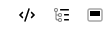 are exactly the same as these buttons
just on a different state.
Now, how do I define the different icons for the different possible states?I tried downloading some themes to see how they're doing it, but even the themes I found which have icons for these buttons only have one icon, so when I click the button something changes in the mail view but the icon of the button is the same, it doesn't represent button state anymore.
I'm using SVG, so I thought maybe having different graphics in the button, with different IDs, each one visible for a specific state would be the way to go. But I find no information on how to do this anywhere. Nor can I find Vivaldi's default icons to see how it's done.
I even tried changing the theme while the icon was in a certain state, to see if that might associate it with a different button, but I'm always shown the default state for these buttons, so there's only one image I can change.For the moment I'm planning to go with a multi-state representation for these cases, but if someone can tell me a better way to do this, I'd appreciate it very much
(or if someone can confirm that there is no way to do it, I'll gladly create the feature request") )
) -
@pauloaguia Yes, the buttons have no states when using custom icons. This is collateral damage.
-
@pauloaguia Ah, as someone that doesn't use mail in Vivaldi, I didn't even realize those icons had more than one state. I just went through making a full icon set that respected the different states that Vivaldi currently allows with custom icons. You can look at my icons if you want to see all the buttons for which we can currently customize all their states: https://themes.vivaldi.net/themes/RqZvdAQJ9oN
Not too many currently. Think it is only the
image toggle,tab tiling, andstatus bar clockicons.The main example of how they should treat all buttons with multiple states is the
image togglebutton that is on the status bar by default. They use thestyleattribute and CSS variables to control thedisplayof the various elements.Default Image Toggle SVG
<svg width="28" height="28" viewBox="0 0 28 28" fill="none" xmlns="http://www.w3.org/2000/svg">
  <g style="display: var(--displayImagesCached)">
    <path opacity="0.3" d="M13 16L11 14L7.5 18.5L8.5 19H19.5L20.5 18.5L16 12L13 16Z" fill="currentColor"></path>
    <path
      d="M7.75 10.75C7.75 9.64543 8.64543 8.75 9.75 8.75H18.25C19.3546 8.75 20.25 9.64543 20.25 10.75V17.25C20.25 18.3546 19.3546 19.25 18.25 19.25H9.75C8.64543 19.25 7.75 18.3546 7.75 17.25V10.75Z"
      stroke="currentColor" stroke-width="1.5"></path>
    <path
      d="M18 22C20.2091 22 22 20.2091 22 18C22 15.7909 20.2091 14 18 14C15.7909 14 14 15.7909 14 18C14 20.2091 15.7909 22 18 22Z"
      fill="var(--colorWarningBg)"></path>
    <path d="M17 16H18V18H20V19H17V16Z" fill="var(--colorWarningFg)"></path>
  </g>
  <g style="display: var(--displayImagesAll)">
    <path d="M13 16L11 14L7.5 18.5L8.5 19H19.5L20.5 18.5L16 12L13 16Z" fill="currentColor"></path>
    <path
      d="M7.75 10.75C7.75 9.64543 8.64543 8.75 9.75 8.75H18.25C19.3546 8.75 20.25 9.64543 20.25 10.75V17.25C20.25 18.3546 19.3546 19.25 18.25 19.25H9.75C8.64543 19.25 7.75 18.3546 7.75 17.25V10.75Z"
      stroke="currentColor" stroke-width="1.5"></path>
  </g>
  <g style="display: var(--displayImagesNever)">
    <path opacity="0.3" fill-rule="evenodd" clip-rule="evenodd"
      d="M9 9.5H19C19.2761 9.5 19.5 9.72386 19.5 10V17.0556L16 12L13 16L11 14L8.5 17.2143V10C8.5 9.72386 8.72386 9.5 9 9.5ZM7 10C7 8.89543 7.89543 8 9 8H19C20.1046 8 21 8.89543 21 10V18C21 19.1046 20.1046 20 19 20H9C7.89543 20 7 19.1046 7 18V10Z"
      fill="currentColor"></path>
    <path
      d="M18 22C20.2091 22 22 20.2091 22 18C22 15.7909 20.2091 14 18 14C15.7909 14 14 15.7909 14 18C14 20.2091 15.7909 22 18 22Z"
      fill="var(--colorWarningBg)"></path>
    <path d="M20 17.25H16V18.75H20V17.25Z" fill="white"></path>
  </g>
  <g style="display: var(--displayAnimationNever)">
    <path
      d="M10 14C12.2091 14 14 12.2091 14 10C14 7.79086 12.2091 6 10 6C7.79086 6 6 7.79086 6 10C6 12.2091 7.79086 14 10 14Z"
      fill="var(--colorErrorBg)"></path>
    <g>
      <path d="M8 8H9.5V12H8V8Z" fill="white"></path>
      <path d="M10.5 8H12V12H10.5V8Z" fill="white"></path>
    </g>
  </g>
  <g style="display: var(--displayAnimationOnce)">
    <path
      d="M10 14C12.2091 14 14 12.2091 14 10C14 7.79086 12.2091 6 10 6C7.79086 6 6 7.79086 6 10C6 12.2091 7.79086 14 10 14Z"
      fill="var(--colorWarningBg)"></path>
    <path d="M9 7V13L12 10L9 7Z" fill="var(--colorWarningFg)"></path>
  </g>
</svg>
I also noticed that the
break modedoesn't have any states we can use. I am compiling a list of things to bring up this next week after the vacations are over with the devs that handle all this custom icon stuff. I will add the mail buttons to the list. -
I think this is a bug that was overlooked. The "mark read/mark unread" button has two separate icons, I guess someone forgot to add the icons for the other buttons.
💻 Windows 10 64-bit Sopranos Builds • en-GB • 🗳 vote for features • 🕵️♀️ Code of Conduct • 🐞 Report bugs
-
@LonM I did create the bug report over the weekend, but stupidly Shift-deleted the email when it arrived, so now I don't know the report code

Either way, the theme has been uploaded ( https://themes.vivaldi.net/themes/0WV7A6A8laX ). I did run into a few other problems, regarding a limited SVG implementation for icons (maybe due to security concerns?) but I didn't feel like redesigning all the icons again, so I just went with what I had...
-
@pauloaguia Thanks, it is in the system as VB-96517
-
@pauloaguia Nice icons! I have plans to make some icons for a neon theme as well.
Test neon icon
<svg xmlns="http://www.w3.org/2000/svg" width="28" height="28" fill="none">
  <defs>
    <filter id="a" width="1.436" height="1.343" x="-.218" y="-.172" color-interpolation-filters="sRGB">
      <feGaussianBlur stdDeviation="1.18"/>
    </filter>
    <filter id="b" width="1.246" height="1.192" x="-.123" y="-.096" color-interpolation-filters="sRGB">
      <feGaussianBlur stdDeviation=".637"/>
    </filter>
    <filter id="c" width="1.111" height="1.085" x="-.055" y="-.042" color-interpolation-filters="sRGB">
      <feGaussianBlur stdDeviation=".263"/>
    </filter>
  </defs>
  <path fill="#d40055" d="M11.25 5.963A3.302 3.302 0 0 0 7.963 9.25v10.756c0 1.222 1.465 1.96 2.45 1.236L14 18.598l3.588 2.644c.984.725 2.45-.014 2.45-1.236V9.25a3.302 3.302 0 0 0-3.288-3.287zm0 2.574h5.5c.418 0 .713.295.713.713v8.703l-3.145-2.316a.536.536 0 0 0-.636 0l-3.145 2.316V9.25c0-.418.295-.713.713-.713z" color="#000" enable-background="accumulate" filter="url(#a)"/>
  <path fill="#f06" d="M11.25 6.5C9.74 6.5 8.5 7.74 8.5 9.25v10.756c0 .774.97 1.263 1.594.805L14 17.93l3.906 2.88c.623.458 1.594-.031 1.594-.805V9.25c0-1.51-1.24-2.75-2.75-2.75Zm0 1.5h5.5c.7 0 1.25.55 1.25 1.25v9.766l-4-2.948-4 2.948V9.25c0-.7.55-1.25 1.25-1.25Z" color="#000" enable-background="accumulate" filter="url(#b)"/>
  <path fill="#f59" d="M11.25 6.188A3.075 3.075 0 0 0 8.187 9.25v10.756c0 1.036 1.258 1.67 2.092 1.057L14 18.32l3.72 2.742c.835.615 2.093-.02 2.093-1.056V9.25a3.075 3.075 0 0 0-3.063-3.063zm0 2.125h5.5c.535 0 .938.402.938.937v9.146l-3.502-2.58a.313.313 0 0 0-.372 0l-3.502 2.58V9.25c0-.535.403-.938.938-.938z" color="#000" enable-background="accumulate" filter="url(#c)"/>
  <path fill="#000" fill-opacity=".2" d="M11.992 7.871a2.243 2.243 0 0 0-2.234 2.234v10.303c0 .406.561.688.888.45l3.74-2.758a.4.4 0 0 1 .475 0l3.743 2.757c.327.241.89-.042.89-.449V10.105a2.243 2.243 0 0 0-2.234-2.234zm0 .637h5.268a1.6 1.6 0 0 1 1.597 1.597v9.356a.4.4 0 0 1-.638.322l-3.594-2.65-3.592 2.65a.4.4 0 0 1-.638-.322v-9.356a1.6 1.6 0 0 1 1.597-1.597z" color="#000" enable-background="accumulate" transform="translate(-.126 -.165)"/>
  <path fill="#fff" d="M11.25 6.5C9.74 6.5 8.5 7.74 8.5 9.25v10.756c0 .774.97 1.263 1.594.805L14 17.93l3.906 2.88c.623.458 1.594-.031 1.594-.805V9.25c0-1.51-1.24-2.75-2.75-2.75Zm0 1.5h5.5c.7 0 1.25.55 1.25 1.25v9.766l-4-2.948-4 2.948V9.25c0-.7.55-1.25 1.25-1.25Z" color="#000" enable-background="accumulate"/>
</svg>
@pauloaguia said in Multi state buttons:
I did run into a few other problems, regarding a limited SVG implementation for icons (maybe due to security concerns?)
Scriptandstyletags are stripped from uploaded/installed themes. I am trying to get them to add backstyletags in a safe way, but I don't really know what I am talking about. There are also some limitations with animations, but they are now aware of the problem.Can you share the text of one of your SVGs, so I can see what might be the problem?
And I did get my list of notes to the devs.
-
@nomadic said in Multi state buttons:
Script and style tags are stripped from uploaded/installed themes. I am trying to get them to add back style tags in a safe way, but I don't really know what I am talking about. There are also some limitations with animations, but they are now aware of the problem.
On top of that Vivaldi also strips the contents of the filters. So my feDropShadow filter, that I had on every single icon, became empty which is why there's no neon glow around them. At first I thought it was just the rendering that was limited but since then I've looked at the contents of the exported theme and realized the filter is just plain empty - I even tried updating the icons in the ZIP file, but when importing them, Vivaldi simply strips it down again.
I submited a couple of tickets to the bug tracker regarding this and animation issues but I don't have any expectations that they'll be solved before the release of the stable version.Here's the original code for one of the buttons:
<svg xmlns="http://www.w3.org/2000/svg" xmlns:xlink="http://www.w3.org/1999/xlink" viewBox="0 0 28 28"
		shape-rendering="geometricPrecision" text-rendering="geometricPrecision"
		stroke="currentColor" stroke-width="1" stroke-linecap="round" stroke-linejoin="round"
		fill="none" filter="url(#neonGlow)">
	<defs>
		<filter id="neonGlow">
			<feDropShadow in="enlarged" dx="0" dy="0" stdDeviation="20" flood-color="#00cfffff" result="neonBordered" />
		</filter>
	</defs>

	<g id="btnBack">
		<path d="M 16,14 v-6 a1,1 0,0,0 -1,-1 l -7,6 a1,1 0,0,0 0,1 l 7,6 a1,1 0,0,0 1,-1"/>
	</g>
</svg>
(the code I submited is actually a minified version of this, but it'll be similar enough).
As you can see from any of the icons in the theme, the filter element has been stripped of all its content (you can right click on one of the icons from the theme page, open image in a new tab and then View Source, if you don't feel like downloading and opening the Zip file).
By the way, when opening this same code directly on Vivaldi (as a file, not importing as an icon), it displays perfectly as intended...
-
I just got a reply to my bug report about the filter stripping issue (VB-96531):
Thanks for reporting this issue.
Our mechanism to sanitize SVG is stripping "feDropShadow" filter element both on themes.vivaldi.net site and in the browser. Theme website import is already updated, and a fix to Vivaldi browser was committed to the stable branch.
Thank you for your time helping us, and for taking the effort to share your awesome Vivaldi theme!
Which means this theme should soon see the light of day in its originally intended look
EDIT: I manually changed the theme zip to include my icons again (as opposed to the ones generated by the browser) and uploaded it again. Indeed, this time the feDropShadow elements did not get stripped out but they got written as fedropshadow instead (all lowercase) which is pretty much the same as them not being there. I already replied with a comment to the email I received (just posting it here, in case someone else tries to do it and wanders why it's still not working)
EDIT2: This is getting way off topic, as I started the thread because of the multiple state buttons, so I'll stop posting about SVG filters here...