Forum has been updated
-
For those who dislike to view this:

h2.title:first-of-type:first-letter

{text-transform: uppercase!important;}
-
-
-
Not important but for those wanting to approach the sun of perfection (Icarus) :
")
I don't know if this is a NodeBB bug or something related to Persona (don't remember if that was the name of the Vivaldi fork of it) but, when the message There are X new topics... appears, the buttons aren't correctly aligned in their respective box.

Aligned to bottom for the left elements :
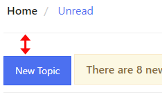
Aligned to the top for the right elements :
-
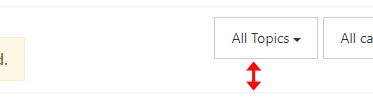
@hlehyaric I think I saw that (orange) message box at the bottom right of the forum...
-
@ornorm Someone has forgotten to remove top margin on an
.alertwhen it is#new-topics-alert. -
I'll check.
On mobile is also slower.
Previously,on Lost , the list appeared as fast as now the Text box, now is in the second step.
Maybe it's related to Moderators since the management buttons location / type has changed.
Older version / plugins were faster.
-
@potmeklecbohdan Thank you for that one!!!!
(I couldn't find what was affecting that alignment for hours) -
The
Mrk as Readanimation is faster now on Mobile.Not sure whether they tweaked or somehow saw the older hours ago.
-
@ornorm Icarus again
A small inconsistency that I don't understand. There is a white
box-shadow(box-shadow: 0 0 0 0.5rem #fff;) around the avatars when going into a thread which doesn't exist when navigating in other pages of the forum (e.g. Unread, Users, Popular, Categories, etc.)It's strange because the background of the forum is white by default so that
box-shadowdoesn't seem to have any use.(I've changed the background color of the forum temporarily to make that
box-shadowvisible :box-shadowapplied to avatar when navigating into a thread :

Usual avatar everywhere else on the forum :

-
It’s unimportant. It’s probably something added by nodeBB and you can safely ignore it.
-
@ornorm Say bye to the box-shadow:
.topic .posts>[component=post] .avatar {box-shadow: none;} -
@hlehyaric @luetage Thanks. I know it's not important and I know how to fix it.
I just wanted to report small inconsistencies, nothing more...This is why I wrote :
Icarus again
Not important but for those wanting to approach the sun of perfection (Icarus)
(and, you know... nothing is important here)
-
@ornorm Here’s probably why (but it doesn’t look good anyway)
-
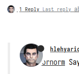
@potmeklecbohdan Fun fact? The box shadow cuts out part of each avatar when multiple people reply to a post. Check out first post of this topic for example.
-
@luetage I don’t see that happening

-
@potmeklecbohdan Look closely. Forum without any mods:

-
@luetage Yes, I see it now. I have my default fonts forced, & the spaces between the avatars are wider with that CSS enabled.
-
I see only a border in my phone, but not in the PC

-
@jane-n said in Forum has been updated:
It's now possible to flag users in addition to single posts.
How can I flag this user (
 ️
️  NSFW)?
@Gwen-Dragon @Ayespy @Folgore101 @Zalex108
