Window buttons mod for macOS and Linux
-
@raed The panel container is the element enclosing the panels (bookmarks, history, notes, webpanels, etc). Click somewhere between the
+button and the settings button to test dragging. -
@raed That's the tabbar, I am talking about the panels container. This one:
panels

-
@raed Yeah, I can select text.
My question wasn't related to this mod, but to find the differences in the implementation of draggable regions on elements between macOS and Windows. Seems like the same underlying issues exist, but the unrecognized hover and click is likely contained to macOS only.
-
For people under linux, I have adapted it :
/* window */ body { border-radius: 0; } .win.normal #tabs-tabbar-container.top, .linux.normal #tabs-tabbar-container.top { padding-top: 5px; } /* SVG disposition */ button.window-minimize svg { transform: translate(-4px, -3px); } button.window-close svg, button.window-maximize svg { transform: translate(-4px, 0); } /* Layout of buttons */ #browser.linux .window-buttongroup button svg { display: none; z-index: 2; fill: black; opacity: 0.75; height: 9px !important; } #browser.linux .window-buttongroup button { margin: 0 5px 0 3px; } #browser.linux #titlebar { height: 100%; } #browser.linux .window-buttongroup { -webkit-app-region: no-drag; height: 100%; margin: 0; padding: 7px 6px 0 6px; } .stacks-off.fullscreen#browser.linux .window-buttongroup, .tabs-at-edge#browser.linux .window-buttongroup { margin: 0; padding-top: 3px; } #browser.linux .window-buttongroup button, #browser.linux .window-buttongroup button:hover { margin-top: 8px 5px 5px 6px; height: 16px; width: 16px; opacity: 0.2; background-color: var(--colorFg); border: 1px solid rgba(0, 0, 0, 0.15); border-radius: 100%; transition-duration: 150ms; transition-property: margin, height, border-radius; } :not(.fullscreen).hasfocus#browser.linux .window-buttongroup.graphite button.window-minimize, .hasfocus#browser.linux .window-buttongroup.graphite button.window-maximize, .hasfocus#browser.linux .window-buttongroup.graphite button.window-close { opacity: 1; background-color: #8e8e93; border-color: #727277; } :not(.fullscreen).hasfocus#browser.linux .window-buttongroup:not(.graphite) button.window-minimize { opacity: 1; background-color: #f7bb3f; border-color: #dc9e34; } .hasfocus#browser.linux .window-buttongroup:not(.graphite) button.window-maximize { opacity: 1; background-color: #34c749; border-color: #1fa42d; } .hasfocus#browser.linux .window-buttongroup:not(.graphite) button.window-close { opacity: 1; background-color: #f8625e; border-color: #de4947; } /* Animation */ #browser.linux .window-buttongroup button:hover svg { display: block; } -
@clementlyara Looks nice, good job. A suggestion: you could post an image for preview purposes. Have added a link to your post to OP.
-
Thanks, here are some previews after adding the stylesheet :


-
Tried porting it to Windows with the help of GPT, would love help from someone who actually understands custom.css to make it even better

Tab position: LeftPossible improvements:
- Move the buttons to the left
When Vivaldi is not on foreground the close button has a sort of red tint to it when I believe it's supposed to be a shade of gray
Here are some previews:


Here is the code:
/* window */ body { border-radius: 0; } .win.normal #tabs-tabbar-container.top { padding-top: 5px; } /* SVG disposition */ button.window-minimize svg { transform: translate(-4px, -1px); } button.window-close svg { transform: translate(0px, -1px); /* Adjust the translation values as needed */ } button.window-maximize svg { transform: translate(-4px, 0); } /* Layout of buttons */ #browser.win .window-buttongroup button svg { display: none; z-index: 2; fill: black; opacity: 0.75; height: 9px !important; } #browser.win .window-buttongroup button { margin: 0 5px 0 3px; position: relative; /* Add this line */ top: -1px; /* Add this line */ } #browser.win #titlebar { height: 100%; } #browser.win .window-buttongroup { height: 100%; margin: 0; padding: 7px 6px 0 6px; } .stacks-off.fullscreen#browser.win .window-buttongroup, .tabs-at-edge#browser.win .window-buttongroup { margin: 0; padding-top: 3px; } #browser.win .window-buttongroup button, #browser.win .window-buttongroup button:hover { margin-top: 8px 5px 5px 6px; height: 16px; width: 16px; opacity: 0.2; background-color: var(--colorFg); border: 1px solid rgba(0, 0, 0, 0.15); border-radius: 100%; transition-duration: 150ms; transition-property: margin, height, border-radius; } #browser.win .window-buttongroup button.window-close { background-color: #f8625e; border-color: #de4947; border-radius: 50%; padding: 0; display: flex; align-items: center; justify-content: center; width: 16px; } :not(.fullscreen).hasfocus#browser.win .window-buttongroup button.window-minimize, .hasfocus#browser.win .window-buttongroup button.window-maximize, .hasfocus#browser.win .window-buttongroup button.window-close { opacity: 1; background-color: #8e8e93; border-color: #727277; border-radius: 50%; } :not(.fullscreen).hasfocus#browser.win .window-buttongroup:not(.graphite) button.window-minimize { opacity: 1; background-color: #f7bb3f; border-color: #dc9e34; } .hasfocus#browser.win .window-buttongroup:not(.graphite) button.window-maximize { opacity: 1; background-color: #34c749; border-color: #1fa42d; } .hasfocus#browser.win .window-buttongroup:not(.graphite) button.window-close { opacity: 1; background-color: #f8625e; border-color: #de4947; } /* Animation */ #browser.win .window-buttongroup button:hover svg { display: block; } #browser.win .window-buttongroup button.window-close:hover { background-color: #f8625e; border-color: #de4947; } - Move the buttons to the left
-
@clementlyara said in Window buttons mod for macOS and Linux:
Thanks, here are some previews after adding the stylesheet :
-
Hi,
Does not work here W11 22H2 / 23H2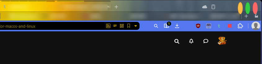
I guess I'll need to tweak it, let's what can be done.
"You cannot know the meaning of your life until you are connected to the power that created you" · Shri Mataji Nirmala Devi
-
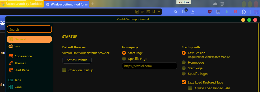
For some reason it looks good at the Settings PopUp but not on the Window.
Just noticed,
Not touched yet