Window background across the whole window
-
By the way, I've also made the following changes to my custom .css:
.bookmark-bar {
    font-size: 13px;
}
The above restores the font size of the bookmarks. The script below modifies the pagetitle text but leaves in the display script in case I were to want to change it to 'none' at a later date.
.topmenu .horizontal-menu-pagetitle {
  display: flex;
  margin-top: 0px;
  font-size: 13px;
  font-weight: 600;
}
This script tightens the padding between the menu items:
.menubar button {
  padding: 3px 6px;
}
The following removes the unsightly column lines in certain mailviews in Linux:
.sortselector .SlideBar--FullHeight.alternate {
  background-color: transparent !important;
}
And lastly, the following script modification adjusts the fonts in the email list more to my liking. Now, if I could only add Gravatars, it would be perfect!
.webpageview #mail_view.vertical .mail_entry { grid-row-gap: 1px !important; } .mail_entry.mail_entry.unread .subject, .mail_entry.mail_entry.unseen .subject { font-weight: 400; .mail_entry.mail_entry.unread .from, .mail_entry.mail_entry.unseen .from { font-weight: 700; } -
@DarylO said in Window background across the whole window:
the extensions toolbar is still not translucent (I'm talking about the drawer that pulls out)
Just add
.ExtensionIcon--Hiddento the selector for thebackground: transparentchunk of CSS.Also, the window buttons for the Settings window are no longer visible.
This is really going to depend on your theme. I prefer to have settings open in a tab rather than a popup window. This can be found in:
Settings→Appearance→Window Appearance→Open Settings in a Tab. This also has the benefit of being translucent and showing the background image behind settings with this mod.If you still want the windowed settings, you could change their color with this:
.tabless .window-buttongroup {
  --colorFg: black;
}
As for the side panel, I'd prefer that it not match the Switch bar exactly. Would it be possible to adapt that script to keep the panel white but just faintly transparent?
The acrylic effect was supposed to serve this purpose by blurring the background slightly. You could increase the
blur()orbrightness()value or hard code a color with an alpha value with a transparency of your choosing. This is too dependent on different themes, so you will have to create this one on your own.Just hard code it to a color value like
rgba(255, 255, 255, 0.7);rather than using a CSS variable.
As @LonM alluded to in the first post of this thread, it is sort of hard to make a polished version of this mod that will work with all settings and themes, so it requires some amount of tweaking for each particular instance.
For this reason, I suggest you familiarize yourself with inspecting the UI (if you aren't already aware, seems you might be), so you can make the tweaks that are necessary for your setup.
Some good resources for CSS are:
I normally just use my search engine of choice and type something like "
css blur" and click on the relevant result from those 2 sources. It isn't worth trying to memorize all CSS properties when you can quickly find reference documentation.Hopefully this helps you tweak this mod to your liking

-
@nomadic Sad about selector removal. Wouldn't be better to have a js mod to have it back like the one for toolbar buttons?
-
@nomadic Thanks, but the .tabless script you had given me didn't work. I've tried to move it around and I've also tried 'white', but it doesn't do anything. I have a translucent extension toolbar now, though! I'll look into the CSS for the panel, but I want to adjust the transparency, not the blur.
-
@nomadic Thanks for the tip about the CSS. I've modified the script for the panel to my liking:
.panel-group:after {
  content: "";
  width: 100%;
  height: 100%;
  background-color: rgba(255, 255, 255, 0.9);
  backdrop-filter: brightness(1.1) blur(5px);
  z-index: 0;
  position: absolute;
}
I'd like to have this match the active button background on the Switch, however, and I'm not sure how I would do that. Would you happen to know? Also, how is the menu panel in Vivaldi Settings configured? I couldn't figure out how to duplicate that appearance in the panel, for instance. The settings-sidebar appears to have the same configuration as the Switch, but it looks different, and I don't understand why. Thanks!
-
@DarylO Glad you got the panel how you wanted it!
Sorry the
.tablessselector didn't work. Did you try adding an!importantafter thewhite?If that doesn't work, what CSS classes do you see when you inspect the UI for the window controls on the settings window?
For the other tweaks, I am a bit confused what you are referring to. Could you provide some screenshots describing what you want to change?
-
@nomadic Yes, I had, and it still didn't work. I played around with the script, however, and came up with something that did work:
#browser.linux .tabless .window-buttongroup button {
    background-color: rgba(255, 255, 255, 0.15) !important;
    fill: var(--colorImageForeground, inherit);
}
As for the panel button, here's a screencap showing you what I'm talking about:
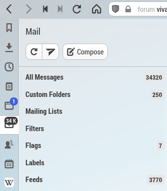
I want the background of the highlighted panel button (in this case, Mail) to match with the panel. I'm also curious about how one would customise the panel to match the Settings sidebar:
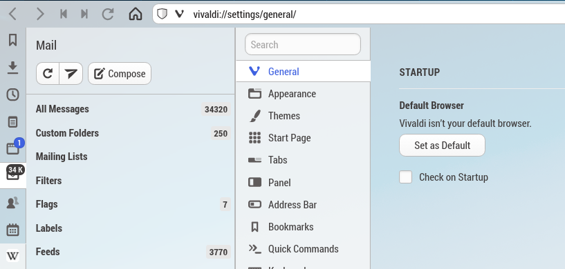
According to the modified CSS, the .settings-sidebar appears to share the same customisation as the Switch, but it looks different for some reason.
-
@DarylO Thanks for the pictures, helps a lot.
The issue with using all these colors with partial transparency is that if elements stack on top of each other, the colors add up, resulting in more opaque colors. The
.settings-sidebarand the active panel button both have this issue.Fixing Settings Sidebar:
-
Added
.vivaldi-settingsand.vivaldi-settings .settings-sidebarto the transparent background selector. -
Removed
.vivaldi-settingsand.vivaldi-settings .settings-sidebarfrom thevar(--colorBgAlpha)background selector. -
Added
.vivaldi-settings .settings-contentto thevar(--colorBgAlpha)background selector. -
Added this:
/* Needed to place the :after pseudo element behind sidebar*/ .vivaldi-settings .settings-sidebar { position: relative; } -
And added onto the
.panel-group:afterselector and decreased the z-index like so (changed to match previous post where modification was made to this segment):.panel-group:after, .settings-sidebar:after { content: ""; width: 100%; height: 100%; background-color: rgba(255, 255, 255, 0.9); backdrop-filter: brightness(1.1) blur(5px); z-index: -1; position: absolute; }
Here is the compiled changes using my version of
.panel-group:after:Expand for CSS
#tabs-container,
.toolbar,
.inner,
#main,
.vivaldi-settings,
.vivaldi-settings .settings-sidebar,
.vivaldi-settings .settings-content,
.startpage,
.startpage .manager,
.active.internal.visible.webpageview,
#webview-container,
.color-behind-tabs-on .tab.active .tab-indicator.active,
#header,
.bookmark-bar .observer,
.color-behind-tabs-on .bookmark-bar button,
.color-behind-tabs-off .bookmark-bar button,
.ExtensionIcon--Hidden {
  background: transparent !important;
}

.tab.active,
.UrlBar,
#switch,
#footer,
.vivaldi-settings .settings-content,
.startpage .manager > div,
.button-toolbar:hover button,
#switch button:hover,
.startpage-navigation,
.toolbar-statusbar,
.toolbar-mailbar,
.bookmark-bar {
  background: var(--colorBgAlpha) !important;
  background-color: var(--colorBgAlpha) !important;
}

.private-intro {
  background: var(--colorBgAlphaHeavy);
}

/* Remove border between address bar and bookmark bar */
.address-top .toolbar-mainbar:after {
  content: unset;
}

/* Remove startpage nav borders */
button.button-startpage:after {
  content: unset;
}

.startpage .startpage-navigation .startpage-navigation-group:last-of-type {
  border-left: unset;
}

/* Add "acrylic" effect to panel (slight blur) */
.panel-group {
  background-color: transparent;
}

.vivaldi-settings .settings-sidebar {
  position: relative;
}

.panel-group:after,
.settings-sidebar:after {
  content: "";
  width: 100%;
  height: 100%;
  background-color: var(--colorBgAlpha);
  backdrop-filter: brightness(1.1) blur(11px);
  z-index: -1;
  position: absolute;
}
Fixing Active Panel Button:
This one is harder to fix...
Best you can probably do is mess with the color until it sort of looks like it matches. I don't think there is a good way to make the background color not appear only under the active button.
-
So, you would add
#switch .addwebpanel-wrapper > button.activeand#switch > button.activeto the transparent background chunk to clear out the old coloring. -
And then add this and mess with the
background-colorandbrightness()values:#switch .addwebpanel-wrapper > button.active:after, #switch > button.active:after { content: ""; width: 100%; height: 100%; background-color: rgba(255, 255, 255, 0.9); backdrop-filter: brightness(1.1) blur(5px); z-index: -1; position: absolute; left: 0; /* I also needed to add this to get the pseudo element to line up better, but I don't know if it is necessary for everyone */ /* top: -0.1px; */ }I basically made
background-colortransparent and increased thebrightness()to1.15to try and get my colors to match.
-
-
@nomadic Thank you very much for your efforts, but these changes really messed things up, so I had to return to my configuration file from yesterday. I need to get to bed now so I can't work any more on troubleshooting this. I guess I'll just leave things as is.
-
@DarylO Did you go through and make the changes or just copy the bulk hidden CSS? Because I left the combined CSS with my styling for the panel because it is more general for other people that want to us this mod in the future.
Only difference should be the background color and blur for the settings sidebar.
Or what sort of issues did you see? It looked like your settings were in a tab, so that is what I tested. I can test the windowed settings option tomorrow.
-
@nomadic I had copied and pasted the changes and guessed on how you would add "#switch .addwebpanel-wrapper > button.active and #switch > button.active to the transparent background chunk to clear out the old coloring", but maybe I messed something up. Anyway, it didn't have the desired effect, and upon simulating a browser restart, I noticed a bunch of weird chrome extension text in the settings sidebar, too.
-
@nomadic I updated my Vivaldi installation and it broke my CSS. Might you know what changed between versions?
-
@DarylO Sorry, I don't use this, so I am not too sure what changed. What exactly is broken?
The panel toolbar lost it's transparency, so I added it back. Vivaldi might have added a blur to it also, but I don't remember if that was there before or not.
You will have to tweak the CSS to fit what you want. That is the only change I noticed.
I tested on a standalone install of
Snapshot 3.8.2238.3.Changed from this:
  .tab.active,
  .UrlBar,
  #switch,
  #footer,
  .vivaldi-settings .settings-content,
  .startpage .manager > div,
  .button-toolbar:hover button,
  #switch button:hover,
  .startpage-navigation,
  .toolbar-statusbar,
  .toolbar-mailbar,
  .bookmark-bar {
    background: var(--colorBgAlpha) !important;
    background-color: var(--colorBgAlpha) !important;
  }
To this:
.tab.active, .UrlBar, #panels-container, /* Change Here */ #footer, .vivaldi-settings .settings-content, .startpage .manager > div, .button-toolbar:hover button, #switch button:hover, .startpage-navigation, .toolbar-statusbar, .toolbar-mailbar, .bookmark-bar { background: var(--colorBgAlpha) !important; background-color: var(--colorBgAlpha) !important; } -
@nomadic Thank you. That somewhat fixed the switch (it still doesn't look quite the same), but the mail panel no longer has the same transparency that it once had. I wish I had known to do a screencap of how the browser looked most recently. Below was my original custom.css:
* { font-family: system-ui, sans-serif !important; } #browser.linux .tabless .window-buttongroup button { margin-top: 2px; background-color: rgba(255, 255, 255, 0.15) !important; fill: var(--colorImageForeground, inherit); } #tabs-container, .toolbar, .inner, #main, .vivaldi-settings, .vivaldi-settings .settings-sidebar, .vivaldi-settings .settings-content, .startpage, .startpage .manager, .active.internal.visible.webpageview, #webview-container, .color-behind-tabs-on .tab.active .tab-indicator.active, #header, .bookmark-bar .observer, .color-behind-tabs-on .bookmark-bar button, .color-behind-tabs-off .bookmark-bar button, .ExtensionIcon--Hidden { background: transparent !important; } .tab.active, .UrlBar, #switch, #footer, .vivaldi-settings .settings-content, .startpage .manager > div, .button-toolbar:hover button, #switch button:hover, .startpage-navigation, .toolbar-statusbar, .toolbar-mailbar, .bookmark-bar { background: var(--colorBgAlpha) !important; background-color: var(--colorBgAlpha) !important; } .private-intro { background: var(--colorBgAlphaHeavy); } /* Remove border between address bar and bookmark bar */ .address-top .toolbar-mainbar:after { content: unset; } .menubar { font-size: 12px; } .bookmark-bar { font-size: 13px; } /* Remove startpage nav borders */ button.button-startpage:after { content: unset; } .startpage .startpage-navigation .startpage-navigation-group:last-of-type { border-left: unset; } /* Add "acrylic" effect to panel (slight blur) */ .panel-group { background-color: transparent; } .vivaldi-settings .settings-sidebar { position: relative; } .panel-group:after, .settings-sidebar:after { content: ""; width: 100%; height: 100%; background-color: rgba(251, 251, 251, 0.9); backdrop-filter: brightness(1.1) blur(5px); z-index: -1; position: absolute; } .topmenu .horizontal-menu-pagetitle { display: flex; margin-top: 0px; font-size: 14px; font-weight: 600; } .menubar button { padding: 3px 7px; } .sortselector .SlideBar--FullHeight.alternate { background-color: transparent !important; } .webpageview #mail_view.vertical .mail_entry { grid-row-gap: 1px !important; } .mail_entry.mail_entry.unread .subject, .mail_entry.mail_entry.unseen .subject { font-weight: 400; .mail_entry.mail_entry.unread .from, .mail_entry.mail_entry.unseen .from { font-weight: 700; } -
@DarylO Maybe that blur is new and is what is making the
#switchlook different. It seems like this update brought some of the changes that this mod was trying to do.I didn't go through and refactor it to see what isn't needed anymore, but I might have returned the panels to their old behavior?
Give this a try
* { font-family: system-ui, sans-serif !important; } #browser.linux .tabless .window-buttongroup button { margin-top: 2px; background-color: rgba(255, 255, 255, 0.15) !important; fill: var(--colorImageForeground, inherit); } #tabs-container, .toolbar, .inner, #main, .vivaldi-settings, .vivaldi-settings .settings-sidebar, .vivaldi-settings .settings-content, .startpage, .startpage .manager, .active.internal.visible.webpageview, #webview-container, .color-behind-tabs-on .tab.active .tab-indicator.active, #header, .bookmark-bar .observer, .color-behind-tabs-on .bookmark-bar button, .color-behind-tabs-off .bookmark-bar button, .ExtensionIcon--Hidden { background: transparent !important; } .tab.active, .UrlBar, #panels-container, #footer, .vivaldi-settings .settings-content, .startpage .manager > div, .button-toolbar:hover button, #switch button:hover, .startpage-navigation, .toolbar-statusbar, .toolbar-mailbar, .bookmark-bar { background: var(--colorBgAlpha) !important; background-color: var(--colorBgAlpha) !important; } .private-intro { background: var(--colorBgAlphaHeavy); } /* Remove border between address bar and bookmark bar */ .address-top .toolbar-mainbar:after { content: unset; } .menubar { font-size: 12px; } .bookmark-bar { font-size: 13px; } /* Remove startpage nav borders */ button.button-startpage:after { content: unset; } .startpage .startpage-navigation .startpage-navigation-group:last-of-type { border-left: unset; } /* Add "acrylic" effect to panel (slight blur) */ .panel-group { background-color: transparent; } .vivaldi-settings .settings-sidebar { position: relative; } .settings-sidebar:after { content: ""; width: 100%; height: 100%; background-color: rgba(251, 251, 251, 0.9); backdrop-filter: brightness(1.1) blur(5px); z-index: -1; position: absolute; } .topmenu .horizontal-menu-pagetitle { display: flex; margin-top: 0px; font-size: 14px; font-weight: 600; } .menubar button { padding: 3px 7px; } .sortselector .SlideBar--FullHeight.alternate { background-color: transparent !important; } .webpageview #mail_view.vertical .mail_entry { grid-row-gap: 1px !important; } .mail_entry.mail_entry.unread .subject, .mail_entry.mail_entry.unseen .subject { font-weight: 400; } /* Fixed bad formatting */ .mail_entry.mail_entry.unread .from, .mail_entry.mail_entry.unseen .from { font-weight: 700; } /* Fixes for update */ .panel-group { backdrop-filter: blur(5px); } #switch { backdrop-filter: unset; box-shadow: -1px 0 var(--colorBorder) inset; } -
Thanks. That's a lot better, but now, the panel is looking just like the switch and URL bar (whereas before the latter two weren't as transparent).
-
@DarylO You could change the
.panel-group'sbackdrop-filterto something like this:backdrop-filter: brightness(1.1) blur(5px);The best solution is for you to play around with the UI inspector and make something you are happy with. I can't make the perfect version for what you want, so hopefully you can go from here and work it out.
Feel free to direct message me if you are having issues.
-
@nomadic Thanks. That didn't seem to do anything, though. I'd just like it to look like how it did before the update.
-
@DarylO Just mess with the brightness value or add a background color until it looks good.
Send me a message if you can't figure it out. I don't think these posts are going to help anyone else, so messaging is better.
-
[EDIT: Seem to have made a mistake when fixing mods that no longer work in latest stable v3.8.2259.37. Ignore previous comment.]