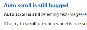
Descenders are Cropped in Forum Thread Titles
-
The lowercase g is cropped on the Feature Request forum.
It happens elsewhere too. Line-spacing is too tight.

-
Strange ... looks fine here. Any forum styling extension?
-
Looks fine for me too, I think I even found the the forum thread title you made a screenshot off to check.
-
@sgunhouse No. Minimum font size was set to 12, in Settings, Webpages, Default zoom is 120%, but changing these makes no difference.
-
No such issues here (Mac)
-
On most forum titles I seem to be missing 1-2 pixels on the bottom of characters like g, j and y - not enough to break the letter (as they are in your photos), but enough so that they have a flat spot on the bottom. (I can't judge if p or q is shortened.) On longer titles they seem fine.
-
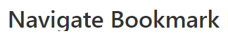
Looks like tha same for me on Windows 7 - zooming does not makes sense. The search results are affected too: