We will be doing maintenance work on Vivaldi Translate on the 11th of May starting at 03:00 (UTC) (see the time in your time zone).
Some downtime and service disruptions may be experienced.
Thanks in advance for your patience.
Changing icons with CSS / part II
-
@nparekh Here you are:
/* All these lines should select the first path */ #switch > button.downloads svg path:first-of-type #switch > button.downloads svg path:nth-of-type(1) #switch > button.downloads svg path[d="M7.293 12.725a1 1 0 …(all the long code goes here)… 1.413l5 5z"] /* And the second one */ #switch > button.downloads svg path:last-of-type #switch > button.downloads svg path:nth-of-type(2) #switch > button.downloads svg path[d="m 13,14 a 1,1 0 1 1 0,2 h -10 a 1,1 0 1 1 0,-2 z'"] -
@potmeklecbohdan that doesn't seem to work for me. I use VS Code, and it just formats it into a straight line
-
@nparekh Do you use all of them (bad), or only one of them (good)?
-
@potmeklecbohdan all. what was I supposed to do?
-
@nparekh Use only one of them. You could read it from my previous post. You wanted examples, I didn't want to write all the text below more than once.
```css ``` -
@potmeklecbohdan I'm really confused. Which one am I meant to use?
-
@nparekh It's your choice. If you want to select the first one, use
:first-of-type,:first-child,:nth-of-type(1)or:nth-child(1).If you want to select the second one, use
:nth-of-type(2)or:nth-child(2). If you want the last one (which is now also second) there's:last-of-typeand:last-child.If you want the one that has attribute
dset e. g. toM0 0h10v10h-10v-10z, use[d="M0 0h10v10h-10v-10z"]. -
@potmeklecbohdan man I don't get this at all. I'm just learning CSS and I don't understand what that means or how to use it. If it doesn't involve just changing the element style of the class, I'm stumped
-
- nth-of-type (similar with the others, you can find them here
- attribute
-
Ok guys, I need some help.
I want to put a background on the back and forward buttons to make them look as native macOs buttons.
When the buttons are active, it works great. When they're disabled/inactive, however, this happens:
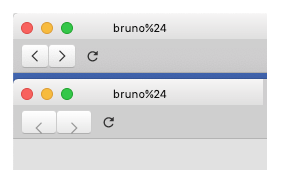
(Top is how I want it, bottom is how they behave when inactive)
Here is my code:
.button-toolbar > button[disabled][title~="anterior"],
.button-toolbar[disabled][title~="anterior"]
{
	background: linear-gradient(to bottom, rgba(255,255,255,1) 0%,rgba(232,232,232,1) 100%) !important;
	border-top: 1px solid #d3d3d3 !important;
	border-bottom: 1px solid #b0b0b0 !important;
	border-right: 1px solid #cccccc !important;
	border-left: 1px solid #cccccc !important;
	max-height: 24px !important;
	min-width: 28px !important;
	border-radius: 4px !important;
	margin-left: 8px !important;
	padding-top: -3px;
}


.button-toolbar > button[title~="próxima"],
.button-toolbar[title~="próxima"]
{
	background: linear-gradient(to bottom, rgba(255,255,255,1) 0%,rgba(232,232,232,1) 100%) !important;
	border-top: 1px solid #d3d3d3 !important;
	border-bottom: 1px solid #b0b0b0 !important;
	border-right: 1px solid #cccccc !important;
	border-left: 1px solid #cccccc !important;
	max-height: 24px !important;
	min-width: 28px !important;
	border-radius: 4px !important;
	margin-left: -1px !important;

}
Any help? Thanks in advance!
-
@BohemiaDrinker I did some small changes to your code:
- the common part is only once (for both selectors)
- if you want this only for disabled buttons, the
titleis set on thediv.button-toolbars anddisabledon thebuttons themselves - the
svgs are incorrectly sized, so I changed their size to100%and so the buttons had to be also sized (look forwidth) to not expand to hundreds of pixels - (just to be able to test) text of the titles — don't forget to revert this change
.button-toolbar[title~="previous"] > button[disabled], .button-toolbar[title~="forward"] > button[disabled] { background: linear-gradient(to bottom, rgba(255,255,255,1) 0%,rgba(232,232,232,1) 100%) !important; fill: #000; border-top: 1px solid #d3d3d3 !important; border-bottom: 1px solid #b0b0b0 !important; border-right: 1px solid #cccccc !important; border-left: 1px solid #cccccc !important; max-height: 24px !important; min-width: 28px !important; width: 28px; border-radius: 4px !important; } .button-toolbar[title~="previous"] > button[disabled] svg, .button-toolbar[title~="forward"] > button[disabled] svg { height: 100%; width: 100%; } .button-toolbar[title~="previous"] > button[disabled] { margin-left: 8px !important; padding-top: -3px; } .button-toolbar[title~="forward"] > button[disabled] { border-radius: 4px !important; margin-left: -1px !important; } -
@potmeklecbohdan
Thanks for the help. Adding your code put things on the right track, but generated some weird effects.
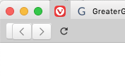
Disabled back button has a button "behind" it:
If back is enabled and forward is disabled, they're one or two pixels unaligned vertically:
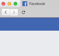
And vice versa.
I tried to mesas around with some values, and chaos ensued. :smiling_face_with_open_mouth_closed_eyes:
Any suggestions? And thanks again!
-
@BohemiaDrinker About the misalignment: try applying the size change also to
svgs in enabled buttons (and also to the buttons if you don't want them really wide). Btw., you should again try to use all common styles only once to avoid errors when you make changes.About the doubled button — I don't know as I don't see it (I do see it on your picture, of course). If the above doesn't help, please post all code you use (or a link to it).
-
@potmeklecbohdan
I messed with the code and almost fixed it by now, thank you!I have one small issue, but will clean up things a bit to see if it solves it. Thank you"
ANNNNNNNND it's fixed. You've been a huge help, man, thank you very much!
-
Animated recent tabs bin:
.toggle-trash:hover .trashicon-lid {
    transform: rotateZ(30deg) translate(-1px, -1px);
}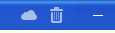
💻 Windows 10 64-bit Sopranos Builds • en-GB • 🗳 vote for features • 🕵️♀️ Code of Conduct • 🐞 Report bugs
-
Quick alternative to the windows‐logo like favicon on startpage tabs, exchanged it with an underscore because less is less
.favicon.jstest-favicon-image.svg [d="M0 2C0 1.44772 0.447715 1 1 1H6C6.55228 1 7 1.44772 7 2V6C7 6.55228 6.55228 7 6 7H1C0.447715 7 0 6.55228 0 6V2ZM8 2C8 1.44772 8.44772 1 9 1H14C14.5523 1 15 1.44772 15 2V6C15 6.55228 14.5523 7 14 7H9C8.44772 7 8 6.55228 8 6V2ZM0 9C0 8.44772 0.447715 8 1 8H6C6.55228 8 7 8.44772 7 9V13C7 13.5523 6.55228 14 6 14H1C0.447715 14 0 13.5523 0 13V9ZM8 9C8 8.44772 8.44772 8 9 8H14C14.5523 8 15 8.44772 15 9V13C15 13.5523 14.5523 14 14 14H9C8.44772 14 8 13.5523 8 13V9Z"] {
    d: path("M7,12h9v2h-9Z");
}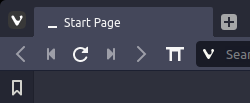
We can also go bigger, but I didn’t really favor it:
.favicon.jstest-favicon-image.svg [d="M0 2C0 1.44772 0.447715 1 1 1H6C6.55228 1 7 1.44772 7 2V6C7 6.55228 6.55228 7 6 7H1C0.447715 7 0 6.55228 0 6V2ZM8 2C8 1.44772 8.44772 1 9 1H14C14.5523 1 15 1.44772 15 2V6C15 6.55228 14.5523 7 14 7H9C8.44772 7 8 6.55228 8 6V2ZM0 9C0 8.44772 0.447715 8 1 8H6C6.55228 8 7 8.44772 7 9V13C7 13.5523 6.55228 14 6 14H1C0.447715 14 0 13.5523 0 13V9ZM8 9C8 8.44772 8.44772 8 9 8H14C14.5523 8 15 8.44772 15 9V13C15 13.5523 14.5523 14 14 14H9C8.44772 14 8 13.5523 8 13V9Z"] {
    d: path("M 0 0 h4 v4 h-4 Z M 0 6 h4 v4 h-4 Z M 0 12 h4 v4 h-4 Z M 6 0 h4 v4 h-4 Z M 6 6 h4 v4 h-4 Z M 6 12 h4 v4 h-4 Z M 12 0 h4 v4 h-4 Z M 12 6 h4 v4 h-4 Z M 12 12 h4 v4 h-4 Z");
}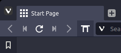
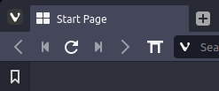
Current favicon for comparison:
The second version could probably be edited to look like the old startpage favicon, I just didn’t put the time into it.
-
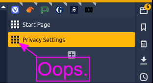
@luetage Ta, but... collateral damage afaik:
-
@Steffie Far more than that, basically all internal pages with an svg as favicon get exchanged, including notes, bookmarks, history.
-
@luetage Ah wow. In that case i might just remove this css again, thanks all the same

-
@Steffie Could be done with javascript, at the moment I don’t see an obvious way to discern the different pages with css. This is more about making and sharing the svg path than anything else.