Why the new Vivaldi icon? Here's why.
-
@naderi
Windows- Right click the icon on the taskbar (Jump list opens)
- Right click the first option titled Vivaldi from the bottom
- Choose properties (First option from the bottom)
- There's a big button on the bottom saying "Change Icon"
-
I was looking for any thread relating to this. I know it's a year old topic, but maybe still relevant?
I don't dislike the icon, I think it looks ok. However seeing how the old one was and/or some of those discarded iterations (the red V looks SICK) I wish we had an option to change them to different designs? If that could even be possible, I wouldn't know. At least on Windows. Right now I'm seeing this current icon (ver 2.0) on page thumbnails however the Vivaldi Icon on the left of "Vivaldi" here on forums AND the Icon menu on the top left on the browser are all red BG with White V. I like that one much more. And I wish it was a little square. I always hated the round trend we've been having for the past years, it makes no sense to me.
I don't know what it is, but the current icon doesn't look appealing to me to click it (unlike Firefox one, i.e or even Edge which looks plain boring BUT looks consistent with the rest of the OS - but I can't use Edge compared to Vivaldi. Vivaldi is just too good!) -
@latisullivan You can also switch the Vivaldi icon to a menu icon if your prefer in Settings, Appearance, Menu.

Blog • Vivaldi Review • Server Status
Specs: AMD Ryzen 5 3400G, 8 Gb • Win 10 64-bit build 19045.2486 • Snapshot 6.7.3329.14 (64-bit) -
@pesala said in Why the new Vivaldi icon? Here's why.:
@latisullivan You can also switch the Vivaldi icon to a menu icon if your prefer in Settings, Appearance, Menu.
Thanks for the suggestion! I knew that already, and that is not a problem. I don't even use that menu. In fact I have it as "icon" because it looks better than the menu imo. I said it just as an example that in some places the icon doesn't have the white circle BG and it looks better.
-
I like the squircle, but I don't like the circle inside of it, and I think it's because the negative space casts a shadow. I percieve the white space as a hole, so it's a bit strange. I would keep the white circle without the shadow or get rid of it entirely.
(pic done with MS Paint, that's all I got on this PC)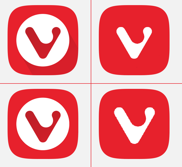
-
@DavidBevi Vivaldi did create a version without the circle inside the squircle, it was up for some time on the main vivaldi.com site. They seem to have decided against it. In my opinion the logo looks better without the circle – the circle makes it look like some kind of retro TV set / computer screen.
-
 P pafflick locked this topic on