Colorful Download Panel for v4.3 CSS Mod Collection
-

In celebration of a new & improved Download Panel for Vivaldi v4.3, here is my enhanced collection for Colorful Download Panel CSS mod!
This collection consist of my updated old CSS mod for:
- Colorful Download List Buttons
- Colorful Download List Progressbar
- Colorful Download Panel Button Progressbar
- Download Panel Button Animated Loading Icon
- Download Panel Button Global Progress Counter
- Ergonomic Colorful Download Popup List (New, not included in below CSS code)
ReadMe
-
You can enable blinking yellow font effect animation for the global progress counter under Global Progress Counter section (begin in line 36). Simply remove both
/*&*/in line 37 to enabled it. -
You can alter the blinking font color in line 38, the hex value
#ffff8edefined the font color. References: https://html-color-codes.info -
You can pick between animated Downward Arrow icon, or hide the Downloading Arrow icon inside the Download panel button via line 46 to 49 (the last 4 lines). Simply remove
/in the beginning of each line of the code to enabled 'em. (both are disabled by default)
CSS Code (v5.1)
/* colorful download panel list buttons */
.panel.downloads .DownloadItem button[title="Show in File Manager"] svg {fill: white; background: limegreen; box-shadow: 0 0 0 3px limegreen; border-radius: 8px;}
.panel.downloads .DownloadItem button[title="Resume Download"] svg {fill: black; background: yellow; box-shadow: 0 0 0 1px black; border-radius: 2px;}
.panel.downloads .DownloadItem button[title="Remove"] svg { fill: white; background: tomato; box-shadow: 0 0 0 1px red; border-radius: 2px;}
.panel.downloads .DownloadItem button:hover {transform: scale(1.18);}

/* colorful download panel list progressbar */
.panel.downloads .DownloadItem-ProgressBar.visible .value {filter: hue-rotate(137deg) brightness(.98); transition: filter 300ms ease-out 0s !important;}
.panel.downloads .DownloadItem-ProgressBar[aria-valuenow^='1']:not([aria-valuenow^='1.']):not([aria-valuenow^='100']) .value {filter: hue-rotate(150deg);}
.panel.downloads .DownloadItem-ProgressBar[aria-valuenow^='2']:not([aria-valuenow^='2.']) .value {filter: hue-rotate(165deg);}
.panel.downloads .DownloadItem-ProgressBar[aria-valuenow^='3']:not([aria-valuenow^='3.']) .value {filter: hue-rotate(180deg) brightness(1.1);}
.panel.downloads .DownloadItem-ProgressBar[aria-valuenow^='4']:not([aria-valuenow^='4.']) .value {filter: hue-rotate(200deg) brightness(1.25);}
.panel.downloads .DownloadItem-ProgressBar[aria-valuenow^='5']:not([aria-valuenow^='5.']) .value {filter: hue-rotate(210deg) brightness(1.3);}
.panel.downloads .DownloadItem-ProgressBar[aria-valuenow^='6']:not([aria-valuenow^='6.']) .value {filter: hue-rotate(230deg) brightness(1.25);}
.panel.downloads .DownloadItem-ProgressBar[aria-valuenow^='7']:not([aria-valuenow^='7.']) .value {filter: hue-rotate(270deg) brightness(1.1);}
.panel.downloads .DownloadItem-ProgressBar[aria-valuenow^='8']:not([aria-valuenow^='8.']) .value {filter: hue-rotate(325deg);}
.panel.downloads .DownloadItem-ProgressBar[aria-valuenow^='9']:not([aria-valuenow^='9.']) .value {filter: hue-rotate(360deg);}
.panel.downloads .DownloadItem-ProgressBar[aria-valuenow^='100'] .value {filter: brightness(1.3);}

/* colorful download progress button */
#switch > button.downloads.loading .progress {background-color: black !important;}

#switch > button.downloads.loading .progress .loaded {transition: background-color 300ms ease-out 0s !important;}
#switch > button.downloads.loading .progress .loaded:is([style^='width: 0.'], [style^='width: 1.'], [style^='width: 2.'], [style^='width: 3.'], [style^='width: 4.'], [style^='width: 5.'], [style^='width: 6.'], [style^='width: 7.'], [style^='width: 8.'], [style^='width: 9.']) {background-color: magenta;}
#switch > button.downloads.loading .progress .loaded[style^='width: 1']:not([style^='width: 1.']):not([style^='width: 100%']) {background-color: #ff0080;}
#switch > button.downloads.loading .progress .loaded[style^='width: 2']:not([style^='width: 2.']) {background-color: darkorange;}
#switch > button.downloads.loading .progress .loaded[style^='width: 3']:not([style^='width: 3.']) {background-color: orange;}
#switch > button.downloads.loading .progress .loaded[style^='width: 4']:not([style^='width: 4.']) {background-color: gold;}
#switch > button.downloads.loading .progress .loaded[style^='width: 5']:not([style^='width: 5.']) {background-color: yellow;}
#switch > button.downloads.loading .progress .loaded[style^='width: 6']:not([style^='width: 6.']) {background-color: greenyellow;}
#switch > button.downloads.loading .progress .loaded[style^='width: 7']:not([style^='width: 7.']) {background-color: limegreen;}
#switch > button.downloads.loading .progress .loaded[style^='width: 8']:not([style^='width: 8.']) {background-color: mediumturquoise;}
#switch > button.downloads.loading .progress .loaded[style^='width: 9']:not([style^='width: 9.']) {background-color: deepskyblue;}
#switch > button.downloads.loading .progress .loaded[style^='width: 100'] {background-color: lightcyan !important;}

/* download panel button global progress counter */
#switch > button.downloads.loading .loaded::before, #switch > button.downloads.loading .loaded::after {position: absolute; color: white; -webkit-text-stroke: .2px; text-shadow: -.5px -.5px 1px cyan, .5px .5px 1px red, -1px 0 1px black, 1px 0 1px black, 0 -.5px 1px black, .5px 1.5px 1px black; /* animation: tic 1.5s ease-in-out 0s infinite !important; */}
@keyframes tic {50% {color: #ffff8e;}} /* optional: enable previous line animation for blinking yellow effect */
/* number */
#switch > button.downloads.loading .progress .loaded:not([style^='width: 100%']):not([style^='width: 0%'])::before {content: attr(style); left: -3px; bottom: 1px; width: 13px; height: 30px; font-size: 10px; clip-path: inset(13px 0 0 0);}
#switch > button.downloads.loading .progress .loaded:not([style^='width: 100%']):not([style^='width: 0%']):not([style^='width: 0.']):not([style^='width: 1.']):not([style^='width: 2.']):not([style^='width: 3.']):not([style^='width: 4.']):not([style^='width: 5.']):not([style^='width: 6.']):not([style^='width: 7.']):not([style^='width: 8.']):not([style^='width: 9.'])::before {left: -2.5px; width: 11.5px;}
/* percent */
#switch > button.downloads.loading .progress .loaded:not([style^='width: 100%']):not([style^='width: 0%'])::after {content: '%'; left: 11px; bottom: 6.5px; font-size: 8px;}
#switch > button.downloads.loading .progress .loaded:not([style^='width: 100%']):not([style^='width: 0%']):not([style^='width: 0.']):not([style^='width: 1.']):not([style^='width: 2.']):not([style^='width: 3.']):not([style^='width: 4.']):not([style^='width: 5.']):not([style^='width: 6.']):not([style^='width: 7.']):not([style^='width: 8.']):not([style^='width: 9.'])::after {left: 9px;}

/* option A: animated downloading icon (remove / in the begining of next line to enable) */
/#switch > button.downloads.loading svg {animation: CalendarNotificationFadeDown 2s steps(6) infinite !important;}
/* option B: or hide it (remove / in the begining of next line to enable) */
/#switch > button.downloads.loading svg {opacity:0; transition: 10s;}
If you like the colorful rainbow download progressbar, please remember to UPVOTE my ancient request! Because I still pretty much like to have this colorful request as a native feature.

Sorry, I'm currently hiatus from updating any of my CSS mod until further notice...
-
@dude99 Thank you very much for your effort. So even with a closed download panel you can see how far the download. I very grateful for this.


-
@dude99 This mod no longer works with Vivaldi 5.1

-
@stardepp Fixed! Sorry for the long wait, I'm a bit too obsessed with Ukraine war recently... LOL
Let's pray together things will go well with Ukraine, & end this stupid mindless war soon!


Sorry, I'm currently hiatus from updating any of my CSS mod until further notice...
-
@dude99 Thanks for your effort
-
@dude99 still doesn't work today...v5.5
-
@gkaravidas However this works with Vivaldi 5.5.2805.38 see here:

🍀 Before you ask, use Vivaldi Help (F1🍀Search Engine Collection🍀My Themes🍀Windows11 24H2🍀Samsung Galaxy A55 5G Android 14🍀
-
@stardepp Sorry, I am trying to make work the "global icon" and I have no luck..
-
@gkaravidas said in Colorful Download Panel for v4.3 CSS Mod Collection:
"global icon"
What do you mean by "global icon"?
-
@gkaravidas Pls explaining in details what's not working properly, I can't understand your mind with just a sentence without much information to work with.
Pls test the mod without other mod or extension that might affecting the panel buttons.
If it really doesn't work without other interference, pls list your OS & post a animated gif or video of the download panel & button (with this mod applied) when it's downloading something.
-
Sorry for my enigmatic topic guys, I really thought it was understandable that the global download icon is not animating while downloading.
Personally I do not care about the rest of the mods, I only find useful the global download icon, because it permits to see the progress without having the window constantly open. By Global download icon I mean the "5. Download Panel Button Global Progress Counter"
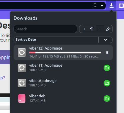
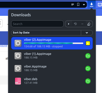
In any way, I've tried all the above css code from @dude99 (for v5.1) and what seems to be working out of all is- Colorful Download List Buttons
- Colorful Download List Progressbar
Colorful Download Panel Button ProgressbarDownload Panel Button Animated Loading IconDownload Panel Button Global Progress CounterErgonomic Colorful Download Popup List (New)
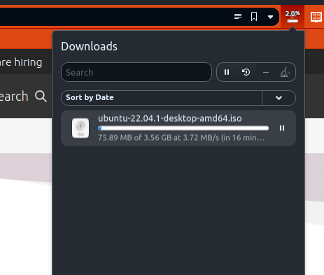
Sorry, I do not have animated video, but I guess you can clearly see from the pictures.
The blue color around the selection, is my chosen highlight color (vivaldi themes).
I am running vivaldi 5.5 on Ubuntu 22.04.
Thanks for the help and interest.
-
@gkaravidas Hi, can u show me screenshot of the Download Panel & it's Panel Button during downloading?
Just to be clear, this CSS mod initially is develop mostly for the Download Panel, except the no.6 mod is for download popup list. However, for some unknown reason some of 'em also work with the popup list too for Windows user. I never tested 'em with Linux, so maybe it doesn't work with it.
I will try to optimize the code so that it might also work with the popup list in Linux. But first I need you to confirm if the mod is working properly with the download panel & panel button for linux.
-
Oh! You can see on the screenshot that the download global counter does work on the side panel. I hadn't noticed that, mainly because the side panel is hidden usually.
Here, take a look:
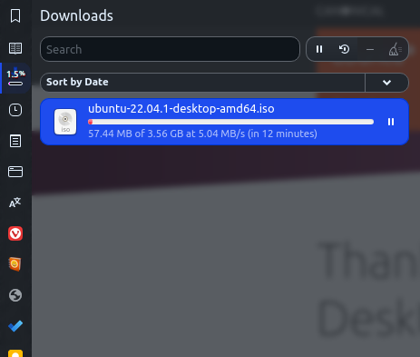
Would be nice if you could also make it work for the button next to the address bar (my previous topic screenshots).
I remind you that I just copy/pasted your CSS code from above without changing anything else than the "/" in line 47.
Thanks!
-
@gkaravidas OK. It's good that it works in the panel as expected. I will try to made it work for the mainbar's download button & popup list later. But it probably will take awhile because I won't be able to work on this for the next few days.
")
-
Many thanks for your time and efforts!
-
@gkaravidas Pls test this code to see if it works with linux version, this is a quick solution I just made:
/* download popup button counter */
.button-toolbar .progress .loaded::before, .button-toolbar .progress .loaded::after {position: absolute; color: white; -webkit-text-stroke: .2px; text-shadow: -.5px -.5px 1px cyan, .5px .5px 1px red, -1px 0 1px black, 1px 0 1px black, 0 -.5px 1px black, .5px 1.5px 1px black;}
/* number */
.button-toolbar .progress .loaded:not([style^='width: 100%']):not([style^='width: 0%'])::before {content: attr(style); left: -3px; bottom: 1px; width: 13px; height: 30px; font-size: 10px; clip-path: inset(13px 0 0 0);}
.button-toolbar .progress .loaded:not([style^='width: 100%']):not([style^='width: 0%']):not([style^='width: 0.']):not([style^='width: 1.']):not([style^='width: 2.']):not([style^='width: 3.']):not([style^='width: 4.']):not([style^='width: 5.']):not([style^='width: 6.']):not([style^='width: 7.']):not([style^='width: 8.']):not([style^='width: 9.'])::before {left: -2.5px; width: 11.5px;}
/* percent */
.button-toolbar .progress .loaded:not([style^='width: 100%']):not([style^='width: 0%'])::after {content: '%'; left: 11px; bottom: 6.5px; font-size: 8px;}
.button-toolbar .progress .loaded:not([style^='width: 100%']):not([style^='width: 0%']):not([style^='width: 0.']):not([style^='width: 1.']):not([style^='width: 2.']):not([style^='width: 3.']):not([style^='width: 4.']):not([style^='width: 5.']):not([style^='width: 6.']):not([style^='width: 7.']):not([style^='width: 8.']):not([style^='width: 9.'])::after {left: 9px;}
/* faded download icon */
.button-toolbar > button[title="Downloads"] > span > svg {opacity:0.4;}
I won't be able to work on this code after tonight, so pls let me know asap.
-
-
@gkaravidas just paste it under the op code, they aren't contradict in anyway. As for the animated arrow during downloading, I will need more time to figure it out...
EDIT: Sorry, I forgot about this part...
/* colorful download progress popup button */ .button-toolbar .progress {background-color: black !important;} .button-toolbar .progress .loaded {transition: background-color 300ms ease-out 0s !important;} .button-toolbar .progress .loaded:is([style^='width: 0.'], [style^='width: 1.'], [style^='width: 2.'], [style^='width: 3.'], [style^='width: 4.'], [style^='width: 5.'], [style^='width: 6.'], [style^='width: 7.'], [style^='width: 8.'], [style^='width: 9.']) {background-color: magenta;} .button-toolbar .progress .loaded[style^='width: 1']:not([style^='width: 1.']):not([style^='width: 100%']) {background-color: #ff0080;} .button-toolbar .progress .loaded[style^='width: 2']:not([style^='width: 2.']) {background-color: darkorange;} .button-toolbar .progress .loaded[style^='width: 3']:not([style^='width: 3.']) {background-color: orange;} .button-toolbar .progress .loaded[style^='width: 4']:not([style^='width: 4.']) {background-color: gold;} .button-toolbar .progress .loaded[style^='width: 5']:not([style^='width: 5.']) {background-color: yellow;} .button-toolbar .progress .loaded[style^='width: 6']:not([style^='width: 6.']) {background-color: greenyellow;} .button-toolbar .progress .loaded[style^='width: 7']:not([style^='width: 7.']) {background-color: limegreen;} .button-toolbar .progress .loaded[style^='width: 8']:not([style^='width: 8.']) {background-color: mediumturquoise;} .button-toolbar .progress .loaded[style^='width: 9']:not([style^='width: 9.']) {background-color: deepskyblue;} .button-toolbar .progress .loaded[style^='width: 100'] {background-color: lightcyan !important;} -
déjà vu, it seems I already wrote these exact code long time ago...
 LOL
LOL
This is what @gkaravidas was asking all along: https://forum.vivaldi.net/post/567399 -
@gkaravidas Here is the animated icon during downloading, you can remove the dimmed effect by remove the last line from
/* faded download icon */; or keep using 'em of both together./* Download button animate download icon */ .button-toolbar:has(.progress) > button[title="Downloads"] > span > svg > path:nth-child(1) {animation: CalendarNotificationFadeDown 2s steps(6) infinite !important;}