Changing icons with CSS / part II
-
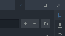
The problem with drag and drop on the toolbar is that buttons are locked to the left side. I like having the button on the same side as my panel (which is the right). That's why I kept updating the mod, but aside from getting some help from @nomadic I thought there might be an easier way if I could just get those selectors.
All is well now
Interestingly, the
toolbar-mailbarspans across and has a spacertoolbar .toolbar-spacer-flexiblethat allows us to move buttons to either side of it. I don't know why it isn't available on theUrlBar. I would think many would like to move buttons to either side of theUrlField -
@sjudenim Moving the actual button to the right side leads to trouble, since it’s missing when Vivaldi tries to move/remove it. One way to tackle this would be to hide the original button, make a new one on the right side that is being introduced on address bar creation and then simulate a click on the real button.
-
@luetage said in Changing icons with CSS / part II:
Moving the actual button to the right side leads to trouble, since it’s missing when Vivaldi tries to move/remove it.
One mod I helped @sjudenim update moves the window control buttons to the address bar. That issue came up as switching to the mail bar would effectively delete the buttons from the UI with Vivaldi not knowing it needs to bring it back when the URL bar version of the address bar came back (also the buttons would be missing on the mail bar).
The solution I used to get it working was to just store the windows buttons in a variable that could be added back later.
I wasn't sure the listeners would still work after doing that, but they did.
Here is that method:
(function () { function moveButtonsGroup() { function buttonsGroup(windowButtons) { let toolBar = document.querySelector(".toolbar-mainbar.UrlBar") || document.querySelector(".toolbar-mainbar.toolbar-mailbar"); // make sure the buttons are not already added if (toolBar.querySelector(".window-buttongroup")) return; toolBar.appendChild(windowButtons); } // save the window button group for later usage. const windowButtons = document.querySelector(".window-buttongroup"); let main = document.getElementById("main"); let observer = new MutationObserver(function (mutations) { mutations.forEach(function (mutation) { // only re-add on new nodes added. The list addedNodes will only have a length attribute when it contains added nodes if (mutation.addedNodes.length) { buttonsGroup(windowButtons); } }); }); // only need to check childList for added nodes observer.observe(main, { childList: true }); buttonsGroup(windowButtons); } let intervalID = setInterval(() => { const browser = document.getElementById("browser"); if (browser) { clearInterval(intervalID); moveButtonsGroup(); } }, 300); })(); -
LOL I can't delete my reply after he deleted his question...
-
I have sucessfully changed the Panel Toggle icon into the Download icon but now I want to change its title so that it says "Downloads" instead of "Show Panel".
https://streamable.com/7tq1unAny help would be appreciated.
-
@ruulrskybound You can do that with Javascript. Changing text is generally not possible with CSS, although we can hack our way around that and hide the text and make a
:beforeor:afterpseudo element taking its place. As far as I know that’s not possible with title attributes. You could try to hide the title altogether and make a new hover pseudo element with CSS with your desired text. Then you just have to style it in a way that it emulates your system’s style. In my opinion not worth it. If you’ve already got a Javascript mod running, do it from there, if not, let it be. -
@lonm Hi. Thanks , it works fine.
But with the default color at my theme the trash icon looks like this :
:
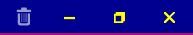
Is there a way to change the color of the trash icon ?
Thanks.
-
@buglocker
.toggle-trash.button-toolbar button svg path {fill: pink;} -
@luetage Thanks for your response.
It changed it but ..... , I have set the color of Window's buttons (min/max-restore/close) and Trash icon both to yellow. But they appear with that way (trash is dull) :
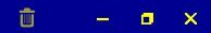
In addition, after a few mods of Window buttons, the distance between Trash and the other buttons is very long. Can I make it smaller?
The code for Window's buttons , if it helps you :#browser.win .window-buttongroup {stroke: yellow !important;} .window-close:hover { background-color: red !important; border: 2px solid yellow !important; } .window-minimize:hover {background-color: red !important; border: 2px solid yellow !important;} .window-maximize:hover { background-color: red !important; border: 2px solid yellow !important; } #browser.win .window-buttongroup button.window-close{width:36px !important;} #browser.win .window-buttongroup button.window-minimize{width:36px !important;} #browser.win .window-buttongroup button.window-maximize{width:36px !important;}Thanks.

-
@buglocker It’s toned down, the trash button highlights when you hover it. As for the margins, inspect and play with them. Be aware that the trash button has nothing to do with the window buttons, they aren’t children of the same element.
-
@luetage To be honest, I have no idea how to change the margins
 . Anyway thanks.
 -
Alternative fontawesome icon for reading list (new experiment).
/* reading list */ .profile-popup + .button-toolbar button svg path { d: path( "M 18.41562,7.91813 16.08344,5.58563 C 15.70625,5.21069 15.19687,5 14.66875,5 H 9 C 7.89531,5 7,5.89531 7,7 l 2e-4,12 c 0,1.10438 0.89532,2 2,2 H 17 c 1.1,0 2,-0.9 2,-2 V 9.33125 C 19,8.80313 18.79062,8.29375 18.41562,7.91813 Z M 17.5,19 c 0,0.27613 -0.22388,0.5 -0.5,0.5 H 9.00063 c -0.27619,0 -0.5,-0.22387 -0.5,-0.5 L 8.5,7.00407 c 0,-0.27613 0.22387,-0.5 0.5,-0.5 h 5 V 9 c 0,0.55219 0.44781,1 1,1 h 2.47187 v 9 z M 10,13.75 c 0,0.41563 0.3375,0.75 0.75,0.75 h 4.5 C 15.66562,14.5 16,14.16563 16,13.75 16,13.33438 15.66562,13 15.25,13 h -4.5 C 10.3375,13 10,13.3375 10,13.75 Z M 15.25,16 h -4.5 C 10.3375,16 10,16.3375 10,16.75 c 0,0.4125 0.33594,0.75 0.75,0.75 h 4.5 C 15.66406,17.5 16,17.16407 16,16.75 16,16.33594 15.66562,16 15.25,16 Z" ); } -
Trying to "re-icon" a command chain icon with a title of "Restart", what do I use for the selector? Here's what I have
.ToolbarButton-Button button[title="Restart"] svg path {
  d: path(
    "M288 256C288 273.7 273.7 288 256 288C238.3 288 224 273.7 224 256V32C224 14.33 238.3 0 256 0C273.7 0 288 14.33 288 32V256zM80 256C80 353.2 158.8 432 256 432C353.2 432 432 353.2 432 256C432 201.6 407.3 152.9 368.5 120.6C354.9 109.3 353 89.13 364.3 75.54C375.6 61.95 395.8 60.1 409.4 71.4C462.2 115.4 496 181.8 496 255.1C496 388.5 388.5 496 256 496C123.5 496 16 388.5 16 255.1C16 181.8 49.75 115.4 102.6 71.4C116.2 60.1 136.4 61.95 147.7 75.54C158.1 89.13 157.1 109.3 143.5 120.6C104.7 152.9 80 201.6 80 256z"
  );
}

/* icon from FontAwesome */
For the record I'm awful at CSS
-
@legobuilder26 Try this, I just used a comet. I think your svg path has issues, but selector doesn’t work either.
.toolbar-command button[title="Restart"] svg path {
  d: path(
    "m 22.218088,4.7505648 c -0.409806,1.3633933 -1.209716,3.9357145 -2.160742,6.6110782 0.246277,0.07881 0.470883,0.137916 0.656084,0.198993 0.157617,0.0394 0.295533,0.157617 0.35661,0.321146 0.05911,0.157617 0.05911,0.334937 -0.0197,0.484674 -0.778238,1.487517 -2.908836,5.379099 -5.016382,7.547525 -0.0394,0.0394 -0.07881,0.07881 -0.09851,0.118213 -2.675364,2.680092 -7.0195051,2.680092 -9.6984152,0.0045 -2.6798953,-2.680092 -2.6798953,-7.023052 0,-9.705508 0.039404,-0.0394 0.078809,-0.07881 0.1182133,-0.09851 2.1629091,-2.1067581 6.0493679,-4.2375526 7.5138339,-5.0165782 0.157618,-0.078809 0.325086,-0.078809 0.478764,-0.019702 0.157617,0.059107 0.277801,0.1989923 0.325086,0.3566101 0.05911,0.1773199 0.118213,0.409806 0.197022,0.6560837 2.671227,-0.9496467 5.241578,-1.7515269 6.603986,-2.1562104 0.202933,-0.059107 0.417687,-0.00867 0.567424,0.1379155 0.17732,0.1379155 0.202933,0.364491 0.17732,0.5634834 z M 15.448604,15.25421 c 0,-2.486223 -2.019872,-4.505897 -4.505897,-4.505897 -2.4905573,0 -4.5058969,2.020068 -4.5058969,4.505897 0,2.490951 2.0153396,4.506093 4.5058969,4.506093 2.516958,0.0394 4.505897,-1.982042 4.505897,-4.506093 z m -4.505897,-1.126967 c 0,0.62062 -0.506347,1.126967 -1.1269665,1.126967 -0.6245607,0 -1.1269672,-0.506347 -1.1269672,-1.126967 0,-0.62062 0.5024065,-1.126967 1.1269672,-1.126967 0.2994735,0 0.5851555,0.118214 0.7959695,0.330998 0.210813,0.210813 0.329026,0.528019 0.329026,0.795969 z m 1.154549,2.816235 c 0,0.313265 -0.254158,0.563483 -0.561513,0.563483 -0.313265,0 -0.563483,-0.250218 -0.563483,-0.563483 0,-0.313265 0.250218,-0.563484 0.561513,-0.563484 0.309325,0 0.563483,0.281742 0.563483,0.563484 z"
  );
}
The starting point of your svg is
288, which isn’t visible. You would need to adjust the viewbox to use the svg code unaltered, which is only possible with Javascript. Therefore you need to edit the svg to scale it directly, with Inkscape for example. -
@luetage Thanks for your help, I figured it out


It doesn't quite match the thickness/style/design of the other icons, but what can I say, I'm not a graphic designer.Here's my code
.toolbar-command button[title="Restart"] svg path { d: path( "m 14.032257,13.258065 c 0,0.570967 -0.461289,1.032257 -1.032256,1.032257 -0.570968,0 -1.032258,-0.46129 -1.032258,-1.032257 V 6.0322579 C 11.967743,5.4622579 12.429033,5 13.000001,5 c 0.570967,0 1.032256,0.4622579 1.032256,1.0322579 z m -6.7096759,0 c 0,3.135485 2.541934,5.677417 5.6774199,5.677417 3.135482,0 5.677417,-2.541932 5.677417,-5.677417 0,-1.75484 -0.796772,-3.325808 -2.048386,-4.3677427 -0.43871,-0.3645154 -0.499999,-1.015161 -0.135485,-1.4535481 0.364517,-0.4383871 1.016131,-0.4980645 1.45484,-0.1335485 1.703227,1.4193549 2.793548,3.5612913 2.793548,5.9258063 C 20.741935,17.532257 17.274193,21 13.000001,21 8.7258071,21 5.2580649,17.532257 5.2580649,13.229032 c 0,-2.364517 1.0887096,-4.5064514 2.7935483,-5.9258063 0.4387092,-0.364516 1.0903229,-0.3048386 1.4548389,0.1335485 0.335484,0.4383869 0.303226,1.0890327 -0.135484,1.4535481 C 8.1193552,9.932257 7.322581,11.503225 7.3225811,13.258065 Z" ); } /* icon from FontAwesome */ -
@legobuilder26 It’s appropriate for a restart button. I thought about changing the look of the command chain buttons myself, but I’m only using a single one at the moment and it isn’t confusing yet.
-
I copied and adjusted @sjudenim 's code from this post, and surprisingly it still works.
My code (just changed the svg)
#tabs-container .newtab svg path {
    d: path(
	"m 19,13 a 1,1 0 0 1 -1,1 h -4 v 4 a 1,1 0 0 1 -2,0 V 14 H 8 a 1,1 0 0 1 0,-2 h 4 V 8 a 1,1 0 0 1 2,0 v 4 h 4 a 1,1 0 0 1 1,1 z"
	);
}
My question is: how do I apply this to the 2nd level tab bar for tab stacks?
-
@legobuilder26 If you want to change both new tab buttons with the same CSS, then use this:
.newtab svg path {
    d: path(
	"m 19,13 a 1,1 0 0 1 -1,1 h -4 v 4 a 1,1 0 0 1 -2,0 V 14 H 8 a 1,1 0 0 1 0,-2 h 4 V 8 a 1,1 0 0 1 2,0 v 4 h 4 a 1,1 0 0 1 1,1 z"
	);
}
If you want to change the the 2nd level icon specifically, then use this:
#tabs-subcontainer .newtab svg path { d: path( "m 19,13 a 1,1 0 0 1 -1,1 h -4 v 4 a 1,1 0 0 1 -2,0 V 14 H 8 a 1,1 0 0 1 0,-2 h 4 V 8 a 1,1 0 0 1 2,0 v 4 h 4 a 1,1 0 0 1 1,1 z" ); } -
@nomadic thanks for making up for my complete lack of skill with CSS selectors
-
Copy Page Address button svg. Currently not a command, but we can create a custom command chain ☛ https://forum.vivaldi.net/post/509249
.toolbar-command button[title="Copy Page Address"] svg path {
  d: path(
    "m 6.5607295,12.172913 c 0,-0.895773 0.7270223,-1.624062 1.6240636,-1.624062 h 1.6240628 v 3.248125 c 0,1.344928 1.0683301,2.436095 2.4360961,2.436095 h 3.248126 v 1.624065 c 0,0.895772 -0.728291,1.624063 -1.624063,1.624063 H 8.1847931 c -0.8970413,0 -1.6240636,-0.728291 -1.6240636,-1.624063 z m 5.6842225,3.248127 c -0.895772,0 -1.624064,-0.728292 -1.624064,-1.624064 V 8.1127543 c 0,-0.8970413 0.728292,-1.6240636 1.624064,-1.6240636 h 5.68422 c 0.895773,0 1.624065,0.7270223 1.624065,1.6240636 v 5.6842217 c 0,0.895772 -0.728292,1.624064 -1.624065,1.624064 z"
  );
}