Vivaldi Forum mod
-
@luetage I have a question concerning changing font colors of the "Theme machines".
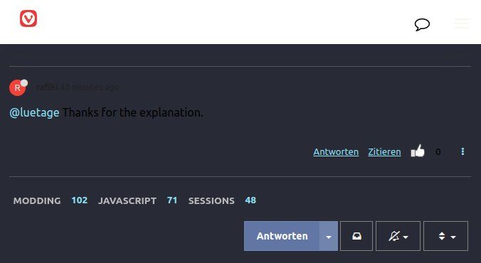
When I chose a dark version, ie. "Dracula", the font is black and nearly unreadable:

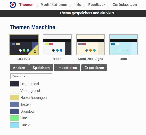
However - the settings don't provide changing of font color although there is a list of 7 color-settings:

How can I change the font color?
-
@Dancer18 Vordergrund ändern. Oh, you mean the black text, that’s simply a bug introduced by a Vivaldi update, you will need to inspect the element with devtools and use CSS to change it. You can input your changes in the Modifikationen tab.
-
@luetage It doesn't work. I insert
body {
  color: var(--colorFg) !important;
}
that is working while in dev tools inspect, but not live.
Without changing user.css it is
body {
  color: black;
}
that is obviously wrong as you mentioned. But why doesn't the correction fix it?
-
@Dancer18 Because that’s no correction, the body color is already set by the mod. You gotta inspect the specific element in question.
-
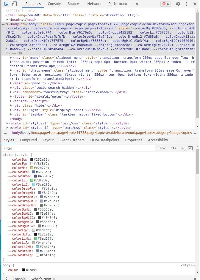
@luetage Sorry I don't understand. If I inspect one of the elements (there are more than 1 element that need to be changed) I see highlighted
id="body"If I take the actual color #f8f8f2 it would be OK for that theme but not for others, that's why there is
var(--colorFg) !important;instead of
color: #f8f8f2 !important;
the culprit is
body {  color: black; } -
How can I make the page full width?
Right now I have a lot of left and right paddingAndy
-
@ch3f You would need to write custom CSS for it. In Vivaldi the main content has a maximum width to keep posts easily readable. The longer lines are, the more likely it is to get lost while reading. Of course that has the downside of leaving unused space, especially on wide screens and high resolution.
-
/* just the main content */ #content, /* or more generic */ .container { width: unset; margin-left: 30px; margin-right: 30px; } #vivaldi-header .row { width: 100%; } -
@guigirl I had it for some time already

-
@luetage AWESOME! Thank you!
Is it possible to change the alignment of the Categories, Unread etc?nvm..got it done.
-
Just something I noticed by coincidence after updating Vivaldi a few minutes ago (which, sometimes, gives me the basic forum view instead of the customized one...)
I don't know if others have the issue or not but, anyway, if this can be useful to anyone...I noticed that the message in the header of the forum wasn't displayed with my CSS applied.
We will do some maintenance work on the forum on May 6th (09:00-12:00 UTC). During this time there will be some downtime. Thank you for being patient with us.
I just added
/* Forum warning messages box */
.shadow-box3 {
    display : block !important;
}
to fix it.
-
@Ornorm That’s the mod’s doing. I wrote a script to show the header on first run and the possibility to dismiss it afterwards.
-
@luetage Thank you. I didn't know that.
I never saw the message so I thought... ok let's display it because I rarely have a first run on the forum... -
@Ornorm You would see the message every time a new one is posted, I suspect the mod broke with a Vivaldi update. It’s also not a mod you can disable, it runs for everyone.
-
@luetage said in Vivaldi Forum mod:
every time a new one is posted
Hey! That's nice!
I don't know if someone still has that feature working... like you said maybe broken by the update. -
-
Just a quick fix for those who don't want to search for the correct CSS selector.
The last forum update (announced here) did have side effects on the way the forum is displayed.One thing I noticed was the white box in the topic list header (Home>Unread and Home>Popular ... not available in Home>Recent) which seems to have no utility at all since the background of the forum by default is white as well...
Default :

Same with "There is a new topic..." message (buggy alignment)

With another background color (that white box is visible and oddly - personal opinion - aligned with the buttons = no margin no padding) :

Anyway, if you want to change that to your taste, do not hesitate to use the following code as a starting point and change it as you like (it just changes the color of the background and adds margins to the buttons to have them better aligned with the structure of the forum) :
(For illustration purpose only - the colors might be different if applied on your own forum mod)
The final result of the below code is :
Same with "There is a new topic..." message (I couldn't find a way to fix the alignment).

/* Forum Topic header */ .topic-list-header { background-color: transparent; /* Change the background with the color/image of your choice or delete this part of code if you prefer to leave the background transparent */ background: linear-gradient(to bottom, #ebf1f67a 0%,#abd3ee82 50%,#89c3eb80 51%,#d5ebfb70 100%); margin: 0px -25px 0px -25px; } div.topic-list-header.btn-toolbar > div.pull-left { margin-left: 25px; } div.topic-list-header.btn-toolbar > div.markread.btn-group.pull-right { margin-right: 25px; } -
Sorry... me again...
An additional quick fix for the new progress bar that seemed to be broken for the Vivaldi Forum mods users :
@juanvase said in Heart Of Gold


 :
:@luetage, please edit you forum mod soonest we're feeling blacklisted

@ornorm said in Heart Of Gold


 :
:@guigirl You use Vivaldi Forum mod don't you?
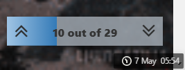
This is what I have with Vivaldi Forum mod :


This is what I have without Vivaldi Forum mod :


It should work with the following code :
/* Progress bar */
.progress-bar {
    background: linear-gradient(to right, rgb(160, 196, 228), rgb(51, 122, 183)) !important;
    transition: width .6s ease-in-out !important;
}
.pagination-block.text-center.ready {
    background-color: #b8c3ccb5 !important;
    /* this last part is optional for those who are using Status Bar by dude99 and sjudenim */
    right: 15px;
    bottom: 35px;
}
The last part of the code concerns the ones using the following mod Automate Status Bar into a Clock button. They'll need to have the progress bar being placed above the Status bar in order to have no interference between both (without the
rightandbottomsmall fixes, the progress bar would be placed behind the Status bar)
-
@juanvase Yes, visit
default.cssand comment out or delete the paragraph starting with the comment “threaded reply cleanup.”In the next iteration I will probably show the avatars, but still leave the timestamp of last reply out, it’s badly styled and not really that useful, because the timestamps are being shown on the replies anyway. Matter of taste.
Here an example with current styling:

-
compact version, turn the box into a line at the bottom of the window.

Code
.pagination-block.text-center.ready {background: transparent !important; width: 100vw; height:4px;}
.topic .pagination-block .progress-bar {background: linear-gradient(#4c70f0, #5bc0de 75%, transparent 80%) !important;}
.topic .pagination-block .wrapper {transform: translateY(-25px); z-index: -9; width: fit-content; margin-left: auto;}
.topic .pagination-block .wrapper:hover {padding-right: 5px;}
.topic .pagination-block .wrapper > i.fa {font-size: 100%; transition: .13s;}
.topic .pagination-block .wrapper > i.fa:hover { transform: scale(1.5);}
.topic .pagination-block .wrapper:not(:hover) > i.fa {font-size: 0;}
.topic .pagination-block .wrapper > a.dropdown-toggle > .pagination-text, .topic .pagination-block .wrapper > i.fa:hover {filter: drop-shadow(0 0 2px #fff) drop-shadow(0 0 3px #ece7c5) drop-shadow(0 0 4px #ece7c5) drop-shadow(0 0 5px #ece7c5);}
EDIT: updated on 30 sep 2021.

