We will be doing maintenance work on Vivaldi Translate on the 11th of May starting at 03:00 (UTC) (see the time in your time zone).
Some downtime and service disruptions may be experienced.
Thanks in advance for your patience.
Vivaldi Forum mod
-
Just something I noticed by coincidence after updating Vivaldi a few minutes ago (which, sometimes, gives me the basic forum view instead of the customized one...)
I don't know if others have the issue or not but, anyway, if this can be useful to anyone...I noticed that the message in the header of the forum wasn't displayed with my CSS applied.
We will do some maintenance work on the forum on May 6th (09:00-12:00 UTC). During this time there will be some downtime. Thank you for being patient with us.
I just added
/* Forum warning messages box */
.shadow-box3 {
    display : block !important;
}
to fix it.
-
@Ornorm That’s the mod’s doing. I wrote a script to show the header on first run and the possibility to dismiss it afterwards.
-
@luetage Thank you. I didn't know that.
I never saw the message so I thought... ok let's display it because I rarely have a first run on the forum... -
@Ornorm You would see the message every time a new one is posted, I suspect the mod broke with a Vivaldi update. It’s also not a mod you can disable, it runs for everyone.
-
@luetage said in Vivaldi Forum mod:
every time a new one is posted
Hey! That's nice!
I don't know if someone still has that feature working... like you said maybe broken by the update. -
-
Just a quick fix for those who don't want to search for the correct CSS selector.
The last forum update (announced here) did have side effects on the way the forum is displayed.One thing I noticed was the white box in the topic list header (Home>Unread and Home>Popular ... not available in Home>Recent) which seems to have no utility at all since the background of the forum by default is white as well...
Default :

Same with "There is a new topic..." message (buggy alignment)

With another background color (that white box is visible and oddly - personal opinion - aligned with the buttons = no margin no padding) :

Anyway, if you want to change that to your taste, do not hesitate to use the following code as a starting point and change it as you like (it just changes the color of the background and adds margins to the buttons to have them better aligned with the structure of the forum) :
(For illustration purpose only - the colors might be different if applied on your own forum mod)
The final result of the below code is :
Same with "There is a new topic..." message (I couldn't find a way to fix the alignment).

/* Forum Topic header */ .topic-list-header { background-color: transparent; /* Change the background with the color/image of your choice or delete this part of code if you prefer to leave the background transparent */ background: linear-gradient(to bottom, #ebf1f67a 0%,#abd3ee82 50%,#89c3eb80 51%,#d5ebfb70 100%); margin: 0px -25px 0px -25px; } div.topic-list-header.btn-toolbar > div.pull-left { margin-left: 25px; } div.topic-list-header.btn-toolbar > div.markread.btn-group.pull-right { margin-right: 25px; } -
Sorry... me again...
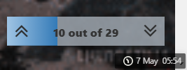
An additional quick fix for the new progress bar that seemed to be broken for the Vivaldi Forum mods users :
@juanvase said in Heart Of Gold


 :
:@luetage, please edit you forum mod soonest we're feeling blacklisted

@ornorm said in Heart Of Gold


 :
:@guigirl You use Vivaldi Forum mod don't you?
This is what I have with Vivaldi Forum mod :


This is what I have without Vivaldi Forum mod :


It should work with the following code :
/* Progress bar */
.progress-bar {
    background: linear-gradient(to right, rgb(160, 196, 228), rgb(51, 122, 183)) !important;
    transition: width .6s ease-in-out !important;
}
.pagination-block.text-center.ready {
    background-color: #b8c3ccb5 !important;
    /* this last part is optional for those who are using Status Bar by dude99 and sjudenim */
    right: 15px;
    bottom: 35px;
}
The last part of the code concerns the ones using the following mod Automate Status Bar into a Clock button. They'll need to have the progress bar being placed above the Status bar in order to have no interference between both (without the
rightandbottomsmall fixes, the progress bar would be placed behind the Status bar)
-
@juanvase Yes, visit
default.cssand comment out or delete the paragraph starting with the comment “threaded reply cleanup.”In the next iteration I will probably show the avatars, but still leave the timestamp of last reply out, it’s badly styled and not really that useful, because the timestamps are being shown on the replies anyway. Matter of taste.
Here an example with current styling:

-
compact version, turn the box into a line at the bottom of the window.

Code
.pagination-block.text-center.ready {background: transparent !important; width: 100vw; height:4px;}
.topic .pagination-block .progress-bar {background: linear-gradient(#4c70f0, #5bc0de 75%, transparent 80%) !important;}
.topic .pagination-block .wrapper {transform: translateY(-25px); z-index: -9; width: fit-content; margin-left: auto;}
.topic .pagination-block .wrapper:hover {padding-right: 5px;}
.topic .pagination-block .wrapper > i.fa {font-size: 100%; transition: .13s;}
.topic .pagination-block .wrapper > i.fa:hover { transform: scale(1.5);}
.topic .pagination-block .wrapper:not(:hover) > i.fa {font-size: 0;}
.topic .pagination-block .wrapper > a.dropdown-toggle > .pagination-text, .topic .pagination-block .wrapper > i.fa:hover {filter: drop-shadow(0 0 2px #fff) drop-shadow(0 0 3px #ece7c5) drop-shadow(0 0 4px #ece7c5) drop-shadow(0 0 5px #ece7c5);}
EDIT: updated on 30 sep 2021.
-
@dude99 Good effort, but that’s not clean. The arrows can disappear and it overlays the footer, making links unclickable. But again a matter of taste. I don’t think Vivaldi’s implementation is that bad. It has the added advantage of being able to scroll through the replies, like on mobile view and to go to a specific reply directly. All functionality that is lost.
-
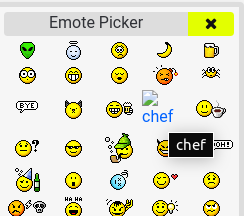
@lonm I noticed the chef emoji has disappeared, the link 404s. Did you remove it from your uploads?
-
@luetage To be fair, when window size is smaller than 768px the footer are also overlay by the thicc progressbar. I bet 99% of vivaldi users never click on those links, because they never notice 'em...

I could move the GUI to the right corner, but I'm using floating statusbar at bottom corner so it's getting in my way. & also, I hate the arrows getting too much attention when it's glowing for no reason.
EDIT:
For those who want the GUI at the side, just addtext-align: right;under.topic .pagination-block .wrapperto move it to bottom right corner. -
@luetage No change. should still be there.

-
@lonm Server responded with a status of 404 for https://lonm.vivaldi.net/wp-content/uploads/sites/1533/2018/10/1539692893639-chef.gif


Strange, maybe it only works for you? Or it only breaks for me, someone gotta check.
-
@luetage Weird. You need to be logged in as me to see that image. I haven't changed anything, so I have no idea why that happens.
-
@lonm Maybe reupload it? Then we can just include the fresh link. Probably some server error.
-
https://forum.vivaldi.net/assets/uploads/files/1620378615905-1162cfde-2319-4b5f-8ebe-4cc9d50ce99f-image.png -
@lonm Got issues. Look at the differences in the link and format:
- Alien: https://lonm.vivaldi.net/wp-content/uploads/sites/1533/2018/10/1539692482285-alien.gif
- Chef: https://forum.vivaldi.net/assets/uploads/files/1620378615905-1162cfde-2319-4b5f-8ebe-4cc9d50ce99f-image.png
Vivaldi changed something in the back and saves new uploads differently. Or did you upload the former to your blog, while the latter is uploaded from the forum?
@juanvase Yes, a lot is broken in the theming because of Vivaldi’s updates. Yesterday’s update brought in a heap of new issues. No point in telling me, I know it. Community themes will be removed anyway, instead I will make it easier to load your own full custom themes, without them breaking because of specific mods (hopefully).
-
@luetage Yes. I uploaded it from the forum instead this time.


