Vivaldi Forum mod
-
@Steffie said in Vivaldi Forum mod:
am frequently finding new posts / new replies without V actually alerting me to them.
One cause of this could be leaving a browser tab open on the thread. If active, there would have been the "live" notification that appears momentarily in the lower right of the page, and the new post actually displays in the page. When you close the tab, navigate away, or scroll a little on it, something like that triggers it as seen.
-
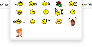
Testing a new emoticon picker, which lets you add all the custom ones you want for easy access. Still needs some work to make it publicly usable though. Dev branch is lonmcgregor/moreEmotes

-
@LonM I wonder whether there’s a way to prevent forum emoji from displaying locally. I’m kinda annoyed seeing all the substitutions when I have a perfectly fine emoji font installed.
edit: not talking about the custom emoticons, but about the official Vivaldi forum ones.
-
Just a mini mod to share if someone's interested (change the There is a new post... alert) :
Change the color or the gradient to your own needs.

/* New topics alert */ .alert-warning { background-color: transparent; background: linear-gradient(to bottom, rgba(184,225,252,1) 0%,rgba(169,210,243,1) 10%,rgba(144,186,228,1) 25%,rgba(144,188,234,1) 37%,rgba(144,191,240,1) 50%,rgba(107,168,229,1) 51%,rgba(162,218,245,1) 83%,rgba(189,243,253,1) 100%); color: white; border-radius: 10px; } -
@Ornorm I made it transparent, same as There are no unread topics.

-
@hlehyaric I'm quite jealous about the fact you have no unread topics...
-
@Ornorm I have no unread topics right now… Btw, I didn't have that many this morning.
-
@Ornorm I modded the popup window.

.alert-window .alert.alert-warning, .alert-window .alert.alert-danger, .alert-window .alert.alert-success, .alert-window .alert.alert-info { background-color: rgba(0,15,26,0.8) !important; color: #46cdff !important; border-radius: 4px !important; } -
@hlehyaric Interesting one. Now I'm dreaming of a progress bar on the top changing its color based on the progression of the line...

-
@luetage They all have the right
alt.Edit: I tried playing with it a little & ~ an hour after giving up I remembered that
imgs can’t have::before&::afteror what… -
@luetage I would love that. I'm pretty sure I made some kind of
users riotuserscript for that ages ago. I could try anddiddig it up again.edit: phone IMEs suck
-
@LonM I can remember we had forum emoji, then we didn’t, then some user complained about it, then they got reintroduced and here we are now.
-
@luetage Turns out to be fairly easy to do - https://github.com/LonMcGregor/vivaldi_forum_mod/blob/moreEmotes/mods/undoMoji.js
-
@LonM FYI there’s also this option:
$(window).on('action:ajaxify.end', checkDocument), though it doesn’t solve cases such as the post editor. -
@LonM Where do I insert this .jss code? In custom.js ? And what does this code do?
-
@stardepp I think the easiest way is to load the lonm vfm fork as unpacked extension
(but then you have to load the custom css in the "new" extension and choose the same mods+the new ones) -
@LonM Undomoji is a bit awkard on windows 10 as the default&replaced emoji are the same, only smaller


Custom emoji only via upload or load url is planned? ^^
Linkify bugs, sadly, is useful only for sopranos
-
@Hadden89 I need to figure out a way to load via URL. Extension permissions are very strict. I also don't want to overload the extension itself. If you want, you can change the size of the emojis. In the forum mod's custom css area, I added this:
span.vm-emoji { font-size: x-large; } -
@LonM Introducing the tabs permission would be enough. I’ll think about that, other mods would benefit from it too, currently we do all these things with click listeners.
-
Why did I do that? I don't know...

but if you want to reuse it, be my guest
.btn-default, .btn-primary {
    color: #edf6f9;
    background-color: #71afc4;
    border-color: #0a7193;
    position: relative;
}
.btn-default.active, .btn-default.focus, .btn-default:active, .btn-default:focus, .btn-default:hover, .open>.dropdown-toggle.btn-default {
    color: #edf6f9;
    background-color: #0bb2ea;
    border-color: #0bea86;
}
/* Ripple effect */
button.btn.btn-default:after, .btn-primary:after {
    content: '';
    position: absolute;
    left: 0px;
    top: 0px;
    width: 100%;
    height: 100%;
    background-color: white;
    border-radius: 100%;
    opacity: 0;
    transform: scale(1, 1);
    transition: transform 0.5s, opacity 1s;
}
button.btn.btn-default:active:after, .btn-primary:active:after {
    opacity: 0.4;
    transform: scale(0, 0);
    transition: 0s;
}
