Further Toolbar customization – Vivaldi Browser snapshot 1476.4
-
@Gwen-Dragon I think only the bookmarks icon is smaller, other icons seem normal. The base is still 34x34.
-
@xyzzy That's fine, but this should immediately go up as known issue on the blog, so people don't update without unhiding all extension icons first.
-
@Gwen-Dragon It's a squircle clock, I think that's on purpose. I dare you to call the Vivaldi Logo ugly

-
Well, good job.
I love the feature of the calculator and i'm interested in add more features how this.PD: This is not a bug

-
@lonm: The Settings icon is fixed internally and will be in the next snapshot. I'll see what we can do about the small history icon to make it render better at small sizes.
-
New tab button +is not affected by changing the roundeness of buttons. It is rounded all the time.
Regarding icons, I hate rounded things, so I prefer squared icons in status bar :). -
first I enabled profile manager in a snapshot and had the burger icon (
 ) on white (transparent?) background.
in the last snapshot it was the burger on a black background and now the background from the icon is black but not round but square.
I wonder what it get next time (please, don't "squirkle" it, it's the strangest name in the near past)
 -
@luetage: You are correct
 There will be a blog post later on to explain why and what has been done to the UI icons.
 -

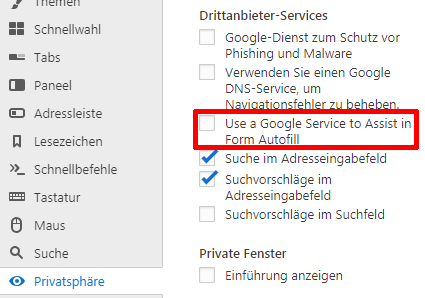
this new "Google Service" is enabled by default (as info for the security conscious user) -
@derDay Good find!
It doesn't look like the page at https://vivaldi.com/privacy/browser/ contains any explanation for what this does. That should be fixed before this feature reaches stable.
-
@LonM perhaps it came with the chromium part

-
@atlemo The new icons certainly look much sleeker now, imo. Nice change, but it seems that their favicon counterparts were left out.

-
@luetage I've asked them to list this as a known issue and to warn users to unhide any hidden extension buttons before updating.
-
Great snapshot, it feels snappier than the previous one! Keyboard shortcut for tab stacking was definitely missing, thanks for that.
Where is that "prioritize stacking by host" thing? There is still some work to be done when stacking by host as in the case of searching a term using duckduckgo.com for example. You click on 5 different results to be opened in the background but they are different hosts, I don't want them to be stacked!
-
@ruario I can't seem to find any setting to enable this.
-
@altcode: This is noted, thanks.
-
@altcode: I think it means the situation where:
- you have multiple tabs open from the same host
- you use the command to create a new stack
- without manually selecting any tabs
It will stack by host as a fall-back
-
@LonM Ah, I see. I though it would behave more like the way I described in this feature request: https://forum.vivaldi.net/topic/34494/more-complex-tab-auto-stacking
-
@Gwen-Dragon not yet, wait some minutes
€dit: Done VB-50410
-
Hmm, interesting.

FYI, if the navigation bar or the status bar is left empty by either removing the buttons or moving them all to one bar, then they cannot be returned, unless it is reset through settings, which results in duplicate buttons.


 *
*