Vivaldi’s forum has been updated
-
Here are a few features that you might find interesting:
- emojis are back

- Improved look and feel of chat features on both desktop and mobile,
- You can now see all your uploads by visiting https://forum.vivaldi.net/me/uploads ,
- and block/ignore users. You should be able to manage your personal blocklist by heading to: https://forum.vivaldi.net/me/blocks
- Vivaldi's top menu is now translated for some languages
On top of that, many bugs were fixed so if you run into any that have slipped through, please let us know so that we can look into them.
In most cases, you might want to report them to nodebb directlyeither on their forum orin their github repository.Thanks to everyone who made this update possible and to those who are helping us maintaining and using it everyday.

☝️ Vote for new features | 🕵️♀️ Code of Conduct | 🐛 Report bugs | 📨 Contact support
- emojis are back
-
New toys to play with I see


(Looks as though some of the ZWJs on the emoji don't combine fully though - that should be a female scientist). I think I prefer the windows Segoe emoji, but that's personal preference, at least this has support for those without an emoji font installed.Also, edit history is a nice one (click the
 next to the post timestamp)
Thanks for providing a link to the github repo for the forum software - I guess most bugs
 should be reported there instead?
https//forum.vivaldi.net/me/uploads,
You're missing a colon there
Thanks for the update.
💻 Windows 10 64-bit Sopranos Builds • en-GB • 🗳 vote for features • 🕵️♀️ Code of Conduct • 🐞 Report bugs
-
@gaelle Oh well, the bookmarks link on profile works now, so that's something. But there are some new issues, which couldn't have been introduced by nodeBB.
-
@LonM thanks a mil for your prompt and helpful feedback
")
I added their community for the non github users. I striked it for now so that if people are reluctant to report something on github they can still do it via nodeBB's community. -
@luetage which issues that couldn't have been introduced by nodeBB are you referring to?
-
yay!!


-
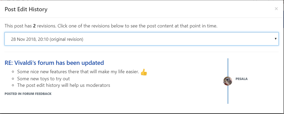
- Some nice new features there that will make my life easier.

- Some new toys to try out
- The post edit history will help us moderators. The way that it is implemented is better than any other I have come across.
- Some nice new features there that will make my life easier.
-
Just to name a few:
Misaligned login entry
Dropdown menus cut at top and bottom. Might be intentional, doesn't look good though in my personal opinion, especially when they're kept spacious otherwise.
No left margin/padding on notification entries in the dropdown.
Big top margin on user profiles until text starts. Might be intentional too, but questionable for small screens. User avatar still misaligned. It's
left: 50%; margin-left: -64pxBut that doesn't take into account the 4px border on each side. -68px is needed to center it, I reported this numerous times. Also the account pictures seem still cut off at top. They're larger really.
-
Sooo, blue is the new color now? Red was better, IMHO.
💻 Intel i3-6006U • 8 GB DDR4 • 256 GB SATA
🖥️ Ryzen 5 4600G • 32 GB DDR4 • 512 GB NVMe
📱 Samsung Galaxy A20e -
@Nekomajin It was black though.
-
It seems the bugs i reported (
CW-806, CW-805, CW-686) are all still broken, as far as my testing find them.💻 Windows 10 64-bit Sopranos Builds • en-GB • 🗳 vote for features • 🕵️♀️ Code of Conduct • 🐞 Report bugs
-
Wow! I like. The blue is so cool. The blue is less harsh than the red was.
For some the blue will take a little getting use to.No emojis here.
-
@LonM said in Vivaldi’s forum has been updated:
I prefer the windows Segoe emoji
Now I miss the Segoe UI Emoji too...
 Not that I have anything against EmojiOne - well, maybe except for the fact that it's not the latest version and it translates the emoji that it does not support at all...
Also, the blue top bar...
 I hope that it's temporary. Thank goodness we have custom CSS...
But other than that, the update is a great improvement, thank you for that!
-
@Nekomajin said in Vivaldi’s forum has been updated:
Sooo, blue is the new color now? Red was better, IMHO.
I miss red too
-
If having the inline emoji menu scroll with the page while the chat window remains static is not a design choice, then it's bugged.
Also, the peach looks like an ass, but that's not a complaint

-
@LonM thanks for the feedback, will check it out as well and get back to you ASAP.
-
@luetage said in Vivaldi’s forum has been updated:
No left margin/padding on notification entries in the dropdown.
That avatar pic is also 1px off of the left side of the menu itself

-
The font used in notifications seems to be bold. It looks cramped and is not as easy to read as it might be with a regular font.
Blog • Vivaldi Review • Server Status
Specs: AMD Ryzen 5 3400G, 8 Gb • Win 10 64-bit build 19045.2486 • Snapshot 6.7.3329.19 (64-bit) -
@Pesala It's always been bold, it just looks bolder now because the padding is missing. But that's not a change that came with this update.
-
@gaelle said in Vivaldi’s forum has been updated:
You can now see all your uploads by visiting https://forum.vivaldi.net/me/uploads ,
I assume that this is only going to refer to uploads going forwards, I see I only have a single upload listed.
💻 Windows 10 64-bit Sopranos Builds • en-GB • 🗳 vote for features • 🕵️♀️ Code of Conduct • 🐞 Report bugs