About that "Giving you the browser you want" - is there multiple rows bookmarks bar already?
-
As tittle says. I am checking here time to time, don't want to download just another browser just to find out that there are no multiple rows bookmarks.
To clarify - why? I think it is obvious, but if not, answer is - it is one-click-browsing. One click opening of pages that I care about. Not going into some folders, not typing in (like I would remember what to type), just one mouse click.
I got used to it since Opera12, and now I have to stick with old version of Firefox + Roomy Toolbars (or, use new Firefox with manual config files hack). Hope for some good news here?") Thank You.
Thank You. -
@juris3d Nope out of the box the bookmarks bar gets an arrow on the right side when it's full. But you can have a look in the modifications forum part to see if somebody may have an answer for you with a few lines of code.
https://forum.vivaldi.net/category/52/modifications -
@zaibon , Thank you for hint. But, makes me wonder, why all browsers authors are conspired against this feature, feature that makes you essential bookmarks one-click accessible, and also serves as a "reminder" about web pages I should check time to time.
-
@juris3d No one conspires here. The feature simply isn't popular enough to warrant immediate attention.
-
@luetage To be clear, nearly all features "warrant" immediate attention. Unfortunately, the size of the development crew dictates when, and how many things, can be taken up.
-
I have my bookmarks in the bar in several folders, which are equivalent to the pages of the speed dial, i don´t use. These also appear in the bookmarks bar

>Laptop ACER, AMD Ryzen, GPU AMD Radeon RAM 16GB, SSD 512GB -Win11 Home 64 v24H2| Vivaldi last stable|
-
@catweazle ...which is how I do it - but some users want to see sixty or seventy bookmarks on their open tab at all times - which would require a multiple-row bookmarks bar, not available yet.
-
@juris3d said in About that "Giving you the browser you want" - is there multiple rows bookmarks bar already?:
... makes me wonder, why all browsers authors are conspired against this feature, feature that makes you essential bookmarks one-click accessible, and also serves as a "reminder" about web pages I should check time to time.
Perhaps it's because, for some time now, many browser designs have been fixated on a model of browsing usage that emphasizes a simplistic, "streamlined" user interface with as few controls as possible and with as few browser panels and bars as possible. Instead, users were presented with one-click SpeedDials and background tab capabilities. The philosophy underlying that approach focuses on the habits of one class of browser users deemed to be the 'mainstream' of users, and the other classes of users have been told to live with the resulting browser or else employ some kind of extension to get the detail functionality they needed.
This all played out quite visibly a few years ago in the turmoil that resulted when Olde Opera was redesigned to adopt the Blink/chromium rendering engine. A highly-customizeable, feature-rich browser suddenly became what was essentially a take-it-or-leave-it bare browser, having no bookmarks bar or eMail feature. After protracted debate and criticism in its MyOpera forums, Opera finally returned an optional, primitive bookmarks bar to the browser well after the initial New Opera releases, and which has since been refined into what it is today. An eMail feature remains missing, by design and intent. Regardless, rich user customization of the browser is no longer a highlighted focus of Opera's design... which is to say, the focus remains upon not providing native controls/functionality for non-"mainstream" users, but instead telling them to find and use extensions instead - if they even exist. This case example reflects the same design approach of many other browsers besides Opera today.
Then Vivaldi arrived on the scene with a "browser for our friends", intentionally designed to incorporate into the browser various features and increased degrees of user customization without the user having to install extensions to acquire them or worse, forego them. As a work in progress, Vivaldi still has a long way to go in some areas, but its design focus remains on providing its 'friends' with the ability to make the browser work as the 'friends' need it to, rather than forcing the users to conform their usage to the browser's view of some amorphous 'mainstream' usage pattern. Because these features and customizations don't exist per se in the chromium rendering engine used by Vivaldi, the developers must incorporate each of them within the User Interface layer resting upon the rendering engine. It all takes time and involves design effort, and since there are so many possible features and customization elements, as well as a limited design staff, these must all be prioritized. The result is that a given feature/customization, though agreed upon as important, simply has to wait its turn until other things deemed more important or less time-consuming by the designers can be attended to.
I too, seek greater flexibility in the bookmarks bar: increased editing capability for bookmarks on the bar and a capability for multiple bars... but I realize I'll have to wait until some other more important things are incorporated into the browser.
-
I do not see so desirable multiple bookmark bars, Vivaldi still remains enough space to Web pages. Perhaps it would be more practical to have a slide bar, if the markers in folders are not enough
-
One can fit a lot more bookmarks with the "Icons only" setting, but one then relies on tooltips to see the folder names. I think a Bookmarks Menu is more appropriate.
@pesala said in Feature requests for Vivaldi 1.14:
Bookmark Menu
Blog • Vivaldi Review • Server Status
Win 10 64-bit build 19045.2486 • Snapshot 7.4.3671.3 (64-bit) -
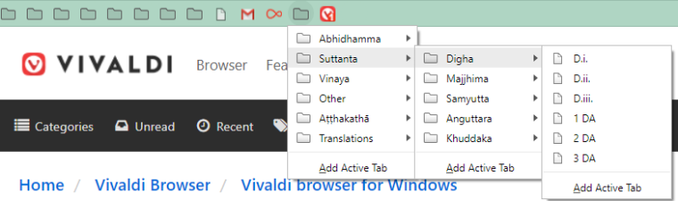
@pesala Or, you can use short abbreviations for each bookmark, with the Bar Display set to Text Only. In this case, I use a carat ( ^ ) in the title to tell me a folder is represented. From years of usage with the same system in Olde Opera, I know instinctively what each abbreviation means... each text character and bookmark placement has a specific meaning:

-
I appreciate all thoughts here. Just want to point that folders, sliders pop-up, pop-down something are not a solution to usability I described in my initial post/question. Point is - ONE CLICK opening, and all pages (icons) in those multiple rows are right in my face. To click-and-open, and also to remind places I probably forgot to check too long. It is usability question, i am not making some fancy crazy feature request, am I?
Just rows of icons that i can click immediately.
Oh, here is an idea: when Vivaldi version with this feature comes out, make it in headline everywhere. "Vivaldi - now with multiple bookmark rows!". And see reactions. You might be surprised. -
@juris3d said in About that "Giving you the browser you want" - is there multiple rows bookmarks bar already?:
You might be surprised
I think you might be surprised at how many users would consider multiple rows of bookmarks to be a waste of screen real-estate. Consider that most are using wide aspect monitors, where vertical pixels are precious. My setup is unusual, with a 1200x1600 pixel portrait monitor. For me, horizontal real-estate is more critical.
Others are requesting Autohide of the address bar, or using Quick Commands (F2) instead of the address bar to save vertical space.
-
Illustration, what I use for now (old-ish Firefox version with Roomy plugin):
-
@juris3d The bookmarks a user employs at any given time are a reflection of their browsing habits. My own habits tend to be more task-focused, wherein I'm doing certain kinds of things at any given time. For that purpose, I've created multiple named bookmarks bars (one of which I've imaged in an earlier post) for the specific kinds of browsing I do. By swapping out these bookmarks bars, I can refocus to an entirely different set of bookmarks, merely by: Settings - Bookmarks - Bookmark Bar: Select Bookmark Bar Folder: select the desired named bar. Some of my more important bookmarks are the same (and in the same place) on each bar, but the more purpose-oriented ones vary widely from bar to bar.
Another thing I've done is to create an HTML 'homepage' which contains links both to other topic-specific, HTML 'nested homepages' as well as to massive numbers of specific URLs that function exactly as bookmarks. Through that mechanism and at any time, I can access within 3 clicks over 1,000 'bookmarks' whose URLs I've entered into those HTML files.
Even if a multiple bookmarks bar option was available, I doubt I would use it, largely for the reason @pesala mentioned: vertical real-estate is precious, and I personally don't routinely need instant access to more than 50-60 bookmarks (which I can place right now on any given bar). I do, however, understand that others use a browser differently, so an option for multiple bars would indeed add browser usage flexibility... it's just that I also believe the priority of creating that feature would rank low in the list of things yet to be done in this browser.
-
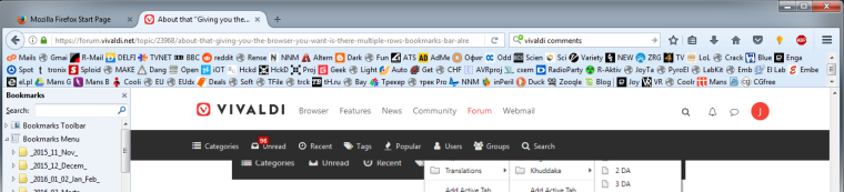
I'm afraid I would have to sue if someone did to my screen what we see in Juris3D's image. I have 41 bookmarks with room for more across the top of Vivaldi on this 14" laptop screen, and it's all I need. It's 8 more than I used to always have before I was testing Vivaldi full-time. And I'm afraid I could never tolerate the icon+text approach on a toolbar.
Volunteer Mod and tester on Windows 11 Home X64, i7-13700 @ 5.4 GHz turbo; Intel UHD 770 graphics; 1TB NV2 PCIe 4.0 NVMe SSD; 32 GB DDR4-3200 RAM. Community Code of Conduct
-
There are some extensions in the Chrome Store that allow multiple or scrollable bookmarks bars and some that add extra features. Although according to the comments do not seem to work very well and therefore I have not wanted to try them.
>Laptop ACER, AMD Ryzen, GPU AMD Radeon RAM 16GB, SSD 512GB -Win11 Home 64 v24H2| Vivaldi last stable|
-
@catweazle UI-related extensions designed for Chrome are unlikely to work well (if at all) in Vivaldi, due to the difference in achitecture.
-
To each their own. If people need this it should be implemented. Personally, I'd say do away with the ancient bookmarks bar altogether, it's a waste of space. I summon bookmarks solely with keyboard without all the slow and cumbersome looking and pointing and clicking.
-
@luetage Aha! A keyboard snob! I knew it!!
No, I agree. There cannot be too many options. This one I fear, however, is unlikely to gain a high priority. It's not that a user should not be able to do it, but there are other more urgent matters.