Vivaldi 1.11 – Focus on accessibility
-
@JSJB Appearance from a different email client:
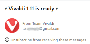
-
@JSJB From the GMail interface:
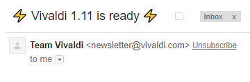
-
@JSJB Another client:
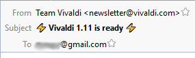
So your email provider deserves congratulations for having been able to produce that effect!
")
-
@Nekomajin It does really stand out - black on white on the page I'm looking at. I think it should be different enough to look like a toolbar, but, like most things, the details should be user configurable. For now, though, I'm just happy it's there at all.
-
@CptGuapo Can't see why you would not do so. Anyway, is it already fixed? At least when I tried to go to mail.yahoo.com it showed a login page.
-
@karst124
You absolutely right. The old icon was better than the new one. -
Thanks for the new release!
But where is the email client that you have promised for several years?
It might be worth mentioning that the old Vivaldi icon was much better than the new one. -
@gruz7848 The email client is still under use, testing and refinement internally. It's not a big project. It's a huge one. It will be released when it's ready.
Thank you for your PERSONAL OPINION on the icon. Unless/until the designers decide on something different, it will remain.
-
@Ayespy
This is not only my PERSONAL OPINION. Read carefully this blog and you will see that most people have the same opinion. -
@gruz7848 That's a vocal minority. If you really dislike the icon that much you can easily exchange it wherever it is used.
-
@gruz7848 There is no right and wrong in matters of personal taste. You're entitled to your personal opinion, but you're in the minority. Most users could not care less.
Save this to your desktop and make a shortcut.

-
@gruz7848 Then i'm in your "minority", coz i like the squircle [even its name pleases me].
-
The new icon's fine, I think a new icon can just take a while to get used to - I grew quite attached to the old one mainly because not being based on a circle made it stand out from other browsers; but I didn't think it was anything particularly special at first - and it's the same with this new icon, it's fine and I'm sure it'll grow on people.
-
@Gwen-Dragon I think people like me who do not like the squircle (I think it's too messy and much less clear what it's showing - especially when it's small) probably don't care enough to actually complain.
But I bet if you ran a poll, there would be quite a lot of us.
-
Gratz with update! Old clean square design icon I liked more. (new looks like android or iPhone) app Still waiting sync.
-
@josephj11
Some kind of floating look, with some transparency would be fine too. -
@luetage
Do you count? 'Vocal minority', 'silent majority'. All of this bullshit usually said by people who have nothing more to say. ))
Forgive my bad english. -
@gruz7848 You are angry because a few pixels got changed. Get your priorities together. And as said, if it is really that important to you, just go on and change the icon yourself. Your complaints will lead to nothing.
-
Sorry to be so direct, I'm testing vivaldi 2 months ago, but if you consume more RAM than Google Chrome, why choose it as an internet browser?
-
@Xandher20 Because it does things for me that Chrome can't do. Further, if I added enough extensions to Chrome to accomplish (most of) the things I need, it would use far more resources than Vivaldi does.
Volunteer Mod and tester on Windows 11 Home X64, i7-13700 @ 5.4 GHz turbo; Intel UHD 770 graphics; 1TB NV2 PCIe 4.0 NVMe SSD; 32 GB DDR4-3200 RAM. Community Code of Conduct