New Vivaldi app icon looks dirty
-
Begs to be wiped or fixed or whatever. An eye sore. It is also smaller than typical icons in the Dock. Please bring back a clean looking icon of regular size.

-
The change is to reflect the new macOS 11 design style
"Update application icon to reflect Big Sur visual direction (VB-75254)" -
@Chas4 said in New Vivaldi app icon looks dirty:
The change is to reflect the new macOS 11 design style
"Update application icon to reflect Big Sur visual direction (VB-75254)"What is VB? The only VB I know is Visual Basic, but that was for Windows.
-
@Streptococcus That’s the Vivaldi Bug Tracker…
-
+1 looks f#cking terrible
Sincerely
-
@ldexterldesign You can easily change app icons on macos, if you care that much. It’s not a big deal.
-
Hi @luetage,
I don't care that much
I thought Vivaldi('s designer(s)) would do that on my behalf

Sincerely
-
@ldexterldesign You posted on social media about it and asked Vivaldi to drop their designer responsible for the icon. But when there is a possibility to simply fix what apparently annoys you so much, you suddenly don’t care and at the same time expect Vivaldi’s designer to do something about it on your behalf. By the way the same designer, who should be “dropped” according to your post. I don’t get it.
-
-
@ldexterldesign I forgive you, all good.
-
@ldexterldesign (and others):
There's an old Mac "trick" that might help.- Quit Vivaldi
- Open your Applications folder in the Finder
- Select Vivaldi.app with a right-click and choose Get Info
- In the info window, select the icon with a left-click and then type Backspace...
- With your cursor focused on the icon, paste -- whatever you'd like there and press Enter
- Remove the old icon from your Dock (if you've had it persistent...) and place your new one there! (Opening the app will, of course, place whatever icon the app uses...)
To return to the original icon, follow steps 1. thru 4. and press Enter. Et víola!

Enjoy!
-
@alik55 I too noticed this a while back when Vivaldi updated itself to the new, improved version. The icon looks "dirty", like it needs to be cleaned. I guessed it might have something to do with "updating" the app for Big Sur, though I don't believe the soiled look is part of the spec for Big Sur icons. Well, I'm not running Big Sur, and I don't care for Big Sur-style icons, which don't look right in the Dock with my other Sierra apps. So what to do?
You can replace an app's icon by digging into its innards, but that's more complicated – for one thing, you have to have an actual .icns file – and given how often Vivaldi updates itself – replacing the old app with a new one – it's not worth the effort when there's an easier way to correct at least the visual appearance in the Finder.
As OakdaleFTL notes above (though his graphics are a bit confusing), for as long as I can remember you've been able to apply a custom icon to anything in macOS – app, file, folder – by pasting a graphic file onto the icon in the item's ⌘I Get Info window.
I couldn't find any place to download an old version of Vivaldi to get its icon, then remembered I had a backup from last June, and found it there. So I extracted the .icns file from v.3.0 (can explain how to do that if anyone wants to know), opened it in Preview, ⌘C Copied one of the set of Vivaldi icons, then selected File>New from Clipboard ⌘N, which created a new simple graphic file (not a complex .icns file), and saved it as a .png.
(Note that the .icns file contains a series of icons, from a 1024x1024 size down to 16x16. You certainly don't need the 1024x1024; the 512 or 256 version will do just fine. Also, save the extracted graphic as a .png, not the default .tiff – which will work okay but is a huge file you don't need.)
I could then open the Vivaldi.png file I'd created, ⌘C Copy its content, select Vivaldi.app in the /Applications folder, open its ⌘I Get Info (File menu) window, press Tab to select the icon in the upper left of the window, and ⌘P Paste the old icon onto it. Voilà: icon is like it used to be.
The Vivaldi icon in the Dock doesn't change immediately, but once you open the app, it will change after a bit to reflect the change on the app.
Doing this with Vivaldi alerted me that other apps would be changing their icons to fit in Big Sur, so I went back to my June 2020 backup and extracted the icons from all the apps that would be likely to update, so I can do the same with them. For instance, Brave has a new iOS style icon now, so I've done the same retrofitting to it.
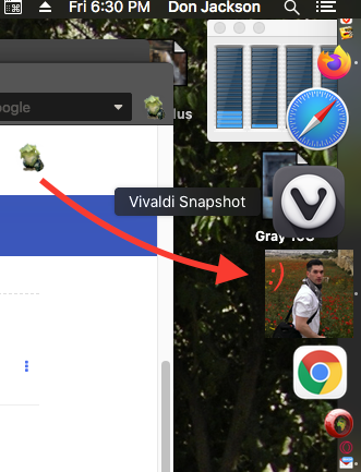
I'm attaching the Vivaldi3.png file to this post, in case anybody wants to do the same; I think you can just put the cursor on it, press Control to get a contextual menu, then select Save Image As… to save it to your drive.
Though it's unlikely you can do any damage to the application by this procedure, to be perfectly safe you can select Vivaldi.app, then File>Duplicate ⌘D (or Duplicate in the contextual menu) it to make a copy for a backup before you work on the original.

-
That worked perfectly! I used to know about this, but totally forgot it was possible. Thank you for the detailed instructions and posting the icon here. Now back to good and clean Vivaldi icon.
I liked that the new Vivaldi icon had the 3D look to it as I dislike the flat design that every OS got in the last few years, I just did not like the dirty smudge on it.

-
@HandyMac The press kit is a good resource for the standard icon ☛ https://vivaldi.com/press/.
-
@luetage said in New Vivaldi app icon looks dirty:
The press kit is a good resource for the standard icon
Well, yeah. Except…
The icon pic in the Press Kit, when downloaded, turns out to be a .webp file, rather than the .png I uploaded above:

A .webp file won't open in Preview as described in my instructions. See the post Download .webp images from Web pages for how to download .webp files as .png files.
Furthermore, when the Vivaldi icon in the Press Kit is converted to .png, it is seen that it was created with a large rectangular (1416 × 1166 pixels) white background (why?), rather than the square transparent background in the .png extracted from the .icns file as described in my instructions above. When converted from .webp to .png, it retains the white background as part of the image.
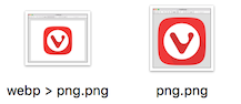
Here are the two, as opened in Preview:
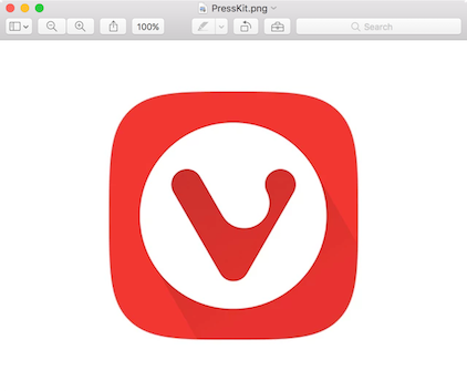

Thus if the Press Kit version is used to paste onto the .app icon, the result will be:

Rather than:

The icon from the Press Kit page is really not suitable.
I note that the other images in the Press Kit page also seem to be .webp files – including those of "Jon S. von Tetzchner, Vivaldi co-founder & CEO". Which should be .jpgs, if somebody in the "press" is going to use them.
Oh, I see if I download the Press Kit, it does contain a number of different files of the icon (including the actual macOS .icns file, from which a suitable .png can be extracted), as well as .pngs of the screenshots and .jpgs of the photos. But it's a 50MB download.
All in all, it's probably easier just to grab the .png I uploaded, and use that. It's a 512x512 pixel version, which is certainly about as big as anybody would need
") (but only 46KB). I was going to replace it with a 256KB version, but the post is no longer editable.
(but only 46KB). I was going to replace it with a 256KB version, but the post is no longer editable. -
@HandyMac Yeah, it’s a massive download and of course easier to download the icon from above. But years down the line, when the logo has changed and someone finds this topic they will still get the link to an always up to date version. Probably superfluous, but who knows.
-
@luetage said in New Vivaldi app icon looks dirty:
But years down the line, when the logo has changed and someone finds this topic they will still get the link to an always up to date version. Probably superfluous, but who knows.
I briefly wondered why the Press Kit contains the "old" Vivaldi icon instead of the new one – then realized that all this applies only to the macOS version of Vivaldi, not the Windows and Linux versions. So the "old" icon is actually how Vivaldi appears in those OSes. And the "new" Mac icon is liable to remain the same (unless "cleaned up" a little – something to do with the shading apparently) for the foreseeable future, since it seems that most Mac users are happy with the new iOS-style look of macOS – or at least willing to put up with a change that was made, as usual, without asking anybody who will have to live with it every day.
Anyway, thanks for the tip; good to know about the Press Kit.
-
@HandyMac I don’t know what happened internally, but it’s likely a bug was filed by someone saying the application icon doesn’t follow the new macOS design guidelines and therefore a designer took care of it. What you can do is issue a feature request to change the new icon again. Would probably help to write what you don’t like about it specifically and what should be changed. Whether this will lead to a change in the end is another question altogether.
edit: I’m dumb see the reply by @Chas4 at the start of the topic, that’s exactly what happened
-
@luetage said in New Vivaldi app icon looks dirty:
…likely a bug was filed by someone saying the application icon doesn’t follow the new macOS design guidelines and therefore a designer took care of it. What you can do is issue a feature request to change the new icon again.
I don't have any argument with the new icon; can't stop "progress" after all. It fits with the "new look" in Big Sur, everybody's doing it:

Except for the "dirty" look of the Vivaldi icon*, of course. But I'm not using Big Sur, have no intention "upgrade" – the "new look" being only one of many things I don't want to hassle with. Maybe somebody who is using it will get on the issue of the "dirty" look. Or maybe somebody at Vivaldi will notice and clean it up.
*"5 o'clock shadow"?
-
 Ppafflick moved this topic from Vivaldi for macOS on