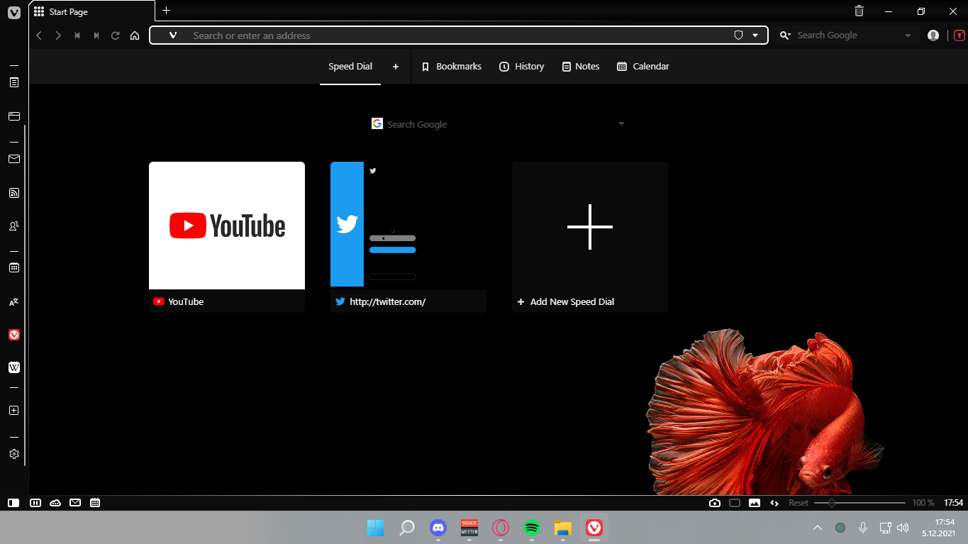
Opera GX Mod
-
@nomadic Yeah, but now I think he took them out for 3.8. I added them back in.
-
@code3 In fact, I just changed the svg of the bookmark and removed the other svg parts that were broken, I saw that the other original icons also looked good, I personally also saw and matched the history moon mod by @luetage , now my panel looks like this
-
@code3 said in Opera GX Mod:
I added them back in.
If you fixed them, can you show us your corrected code
-
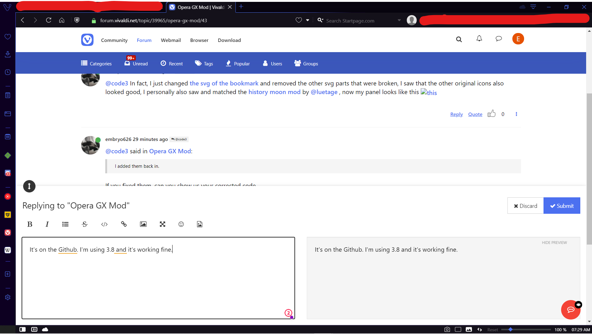
It's on the Github. I'm using 3.8 and it's working fine.

Just download GX for 3.8.cssEDIT: Actually, there is one small bug, I have take theme color from active page on, and it's not changing the color for some elements.

Would be nice if you could fix that! -
@EpixyDaksh11 I have fixed it and you can use it again, thanks for your feedback
-
@embryo626 I will.
-
@embryo626 You may want to use snapshot to catch these errors ahead of release. This should work:
/* --- */
#switch button.notes svg path, button[data-id="notes"] svg path{
  d: path("M22,5.567a1.549,1.549,0,0,0-1.44-1.44,1.494,1.494,0,0,0-1.17.45L16.969,7a3.714,3.714,0,0,0-1.49-.31H7.709A3.709,3.709,0,0,0,4,10.4v7.77a3.709,3.709,0,0,0,3.71,3.71h7.77a3.709,3.709,0,0,0,3.71-3.71V10.4a3.459,3.459,0,0,0-.18-1.12l2.54-2.54A1.558,1.558,0,0,0,22,5.567Zm-3.81,4.83v7.77a2.719,2.719,0,0,1-2.71,2.71H7.709A2.719,2.719,0,0,1,5,18.167V10.4a2.719,2.719,0,0,1,2.71-2.71h7.77a2.324,2.324,0,0,1,.7.1l-4.15,4.15a1.2,1.2,0,0,0-.35.63l-.33,1.53a.563.563,0,0,0,.16.52l.26.21,1.79-.38a1.317,1.317,0,0,0,.63-.35l3.99-3.99C18.179,10.2,18.189,10.3,18.189,10.4Zm2.65-4.37-2.28,2.29-.73.74-4.37,4.38-1,.22.2-.93,4.47-4.47.71-.72,2.25-2.25a.546.546,0,0,1,.38-.16h.03a.538.538,0,0,1,.5.5A.5.5,0,0,1,20.839,6.027Z");
}
#switch button.tabs svg path {
  d: path("M20.31,3.69H9.02a2.006,2.006,0,0,0-2,2V7.02H5.69a2.006,2.006,0,0,0-2,2V20.31a2,2,0,0,0,2,2H16.98a2,2,0,0,0,2-2V18.98h1.33a2,2,0,0,0,2-2V5.69A2,2,0,0,0,20.31,3.69ZM17.98,20.31a1,1,0,0,1-1,1H5.69a1,1,0,0,1-1-1V9.02a1,1,0,0,1,1-1H16.98a1,1,0,0,1,1,1Zm3.33-3.33a1,1,0,0,1-1,1H18.98V9.02a2.006,2.006,0,0,0-2-2H8.02V5.69a1,1,0,0,1,1-1H20.31a1,1,0,0,1,1,1Z");
}

button.panelbtn.notes {
    padding-left: 8px !important;
}
#switch button.tabs.active svg path {
    d: path("M 20.31 3.69 H 9.02 a 2.006 2.006 0 0 0 -2 2 V 7.02 H 5.69 a 2.006 2.006 0 0 0 -2 2 V 20.31 a 2 2 0 0 0 2 2 H 16.98 a 2 2 0 0 0 2 -2 V 18.98 h 1.33 a 2 2 0 0 0 2 -2 V 5.69 A 2 2 0 0 0 20.31 3.69 Z M 17.98 20.31 Z m 3.33 -3.33 a 1 1 0 0 1 -1 1 H 18.98 V 9.02 a 2.006 2.006 0 0 0 -2 -2 H 8.02 V 5.69 a 1 1 0 0 1 1 -1 H 20.31 a 1 1 0 0 1 1 1 Z");
}

#switch button.bookmarks.active svg path {
    d: path("M 8.4 4.54 Z m 4.115 -3.424 c 2.379 0.589 3.863 2.9 3.4 5.994 c -0.284 1.9 -1.708 3.7 -3.973 5.493 q -0.839 0.66 -1.722 1.258 c -0.237 0.162 -0.473 0.32 -0.755 0.506 l -0.629 0.414 a 1.512 1.512 0 0 1 -1.668 0 l -0.629 -0.414 c -0.282 -0.186 -0.518 -0.343 -0.755 -0.506 q -0.883 -0.6 -1.722 -1.258 C 1.793 10.809 0.37 9.012 0.085 7.111 C -0.379 4.017 1.1 1.707 3.479 1.118 A 3.854 3.854 0 0 1 8 3.127 a 3.852 3.852 0 0 1 4.52 -2.009 Z");
}

#switch button.notes.active svg path {
    d: path("M 22 5.567 a 1.549 1.549 0 0 0 -1.44 -1.44 a 1.494 1.494 0 0 0 -1.17 0.45 L 16.969 7 a 3.714 3.714 0 0 0 -1.49 -0.31 H 7.709 A 3.709 3.709 0 0 0 4 10.4 v 7.77 a 3.709 3.709 0 0 0 3.71 3.71 h 7.77 a 3.709 3.709 0 0 0 3.71 -3.71 V 10.4 a 3.459 3.459 0 0 0 -0.18 -1.12 l 2.54 -2.54 A 1.558 1.558 0 0 0 22 5.567 Z m -3.81 4.83 v 7.77 a 2.719 2.719 0 0 1 -2.71 2.71 H 7.709 A 2.719 2.719 0 0 1 5 18.167 V 10.4 a 2.719 2.719 0 0 1 2.71 -2.71 h 7.77 a 2.324 2.324 0 0 1 0.7 0.1 l -4.15 4.15 a 1.2 1.2 0 0 0 -0.35 0.63 l -0.33 1.53 a 0.563 0.563 0 0 0 0.16 0.52 l 0.26 0.21 l 1.79 -0.38 a 1.317 1.317 0 0 0 0.63 -0.35 l 3.99 -3.99 C 18.179 10.2 18.189 10.3 18.189 10.4 Z Z");
}
.panelbtn.history svg, .panelbtn.notes svg, .panelbtn.tabs svg, button[data-id="notes"] svg {padding-top: 2px !important; width: 26px !important; height: auto !important;}
button[data-id="notes"] svg {
	width: 22px !important;
}
This is the main part that fixes it, taken from 3.7:
.panelbtn.history svg, .panelbtn.notes svg, .panelbtn.tabs svg, button[data-id="notes"] svg {padding-top: 2px !important; width: 26px !important; height: auto !important;}
button[data-id="notes"] svg {
	width: 22px !important;
}
Do you think you'd be able to update the calendar icon? Thanks!
-
@code3 Thanks for the code, I've restored the download, notes and window icons in the mod, now it looks like this, about the calendar icon, I don't know how to design it to fit the mod better, can you give me a suggestion or an example?
-
@embryo626 I think just simplify it a bit, and maybe round the calendar events.
Or maybe reuse one of these:
https://www.flaticon.com/free-icons/calendar -
Seems like the original creator of this mod has been updating it. Works, as of 4.0, but Accent Color from Active Page is broken. You might want to take some stuff from this, it's pretty good.
Here's the Github link, just check out releases or download it manually. -
How do I enable the "Unexpected Christmas Gift" in the image? I didn't see anything about it in the readme file, nor did I see any JavaScript to install normally.
-
Why is this mod not working properly for me?

I can't edit because I don't know coding -
@alifidan Yeah 5.0 had another UI revision so the mod is broken for the time being.

-
@supra107 When will it be fixed?

-
@alifidan Whenever someone decides to patch it up for 5.0. That's how it is with Vivaldi mods, no one is getting paid to keep them up to date so they get updated whenever.

-
@supra107 I guess I should learn css myself

-
@alifidan Looks proper to me…
-
Just tried this out recently and looks pretty good. There are a few glitches but it's quite nice. Since our Vivaldi settings can be different for most of us (ex. the tab bar location and the side bar location), you may have a slightly different experience - some glitches are a bigger problem with some settings.
The best part, by far, is the address bar. The minimalism there is perfect.
The tabs are nice, but not perfect. The outlines could stand out a bit more and on horizontal scrolling tabs, there is a bunch of space after the last tab.
The sidebar is interesting. I really like the larger icons, which makes them easier to see and looks cleaner, but sadly it means I need to scroll to get to my web panels. Also, for some reason I can't open any web panels until I click some of the buttons above them. This part could use the most work in my opinion, the most annoying glitches are here. (at least for me - I have the sidebar on the right)
Finally, the toolbar at the bottom has a nice gradient border. Again, the border could be thicker for a bolder look.
Overall, this is a very nice mod. Some parts of it could use work, but I can confidently say that this could be the inspiration for future design changes in Vivaldi. (On second thought, maybe not, as Opera has already done this)
-
Hey, where do we get the background? That way we have the logo instead of a hole in the browser
-
Has anybody updated the Opera GX skin for Vivaldi yet? The browser's amazing, but not quite as beautiful as GX, so when i found the mod, it was the best of both worlds. The problem's the mod's not working well after the 5.0 update... Well, since i'm a rock at programming and can't do anything tweaking-wise on my own, i was hoping a kind soul in a similar condition to mine (Minus the programming inability) has updated it. If not, can anyone do it?

