Downloads panel - resizable from bottom of page
-
Downloads-It is something i've never understood why developers have not put any thought into.
There are only two methods browsers use, the most common was an individual downloads window. second was a side bar downloads panel, then Apple come along with the stupid idea of a tiny little tag that drops down from the Downloads button in the toolbar.
Visual information needed to be seen in full are the following when it comes to file transfers of any type
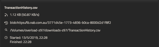
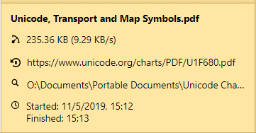
1-full path to file name
2-full url
3-transfer rate
4-time stamp info started finished etcThis data needs ALOT of horizontal space.
The only practical place to display this in a web browser is at the bottom of the browser window in a panel that is expanded upward to view more lines , each line being each download.
For most cases only the currently downloaded file is of importance and thus default visible size of this panel can be set to show one download line. If we keep a history of downloads in the panel we only have to slide up the panel to see the rest of them and slide it back down again when finished.
The side panel and all other approaches are not suitable and I do not know why developers insisting on following/copying the same old bad concepts and not explore a new way to do things.
And I mean for the sake of usability NOT for the sake of doing something different without considering usability. Example being Googles' stupid 'tabs in titlebar' that everyone blindly copied. Practically, it's the most poorly thought out concept that has no value and significantly retards the ability to move a window.
Even this History panel has no practical value being in a side bar. That too could be in a panel raised up from the bottom of the browser window to view as much as required, a double click of a URL to load it could auto collapse the pane out of view.
So so simple.
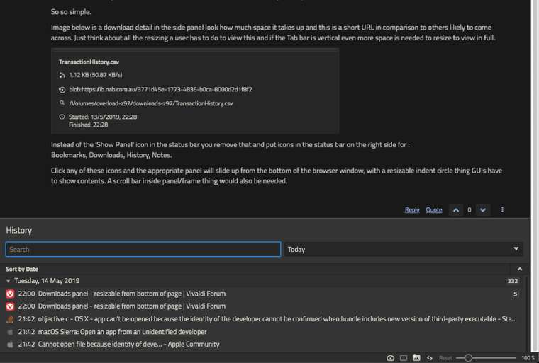
Image below is a download detail in the side panel look how much space it takes up and this is a short URL in comparison to others likely to come across. Just think about all the resizing a user has to do to view this and if the Tab bar is vertical even more space is needed to resize to view in full.
Instead of the 'Show Panel' icon in the status bar you remove that and put icons in the status bar on the right side for :
Bookmarks, Downloads, History, Notes.Click any of these icons and the appropriate panel will slide up from the bottom of the browser window, with a resizable indent circle thing GUIs have to show contents. A scroll bar inside panel/frame thing would also be needed.
i'm guessing would look something like this: (history panel)
-
@GenXstarX The Downloads Panel already shows the information quite well.
All that is needed in my opinion is to fix these two bugs that I reported a long time ago.
- (VB-32723) Select URL in Downloads Info Panel with Click (Confirmed)
- (VB-32724) Download URLs do not wrap (Confirmed)
-
@GenXstarX said in Downloads panel - resizable from bottom of page:
And I mean for the sake of usability NOT for the sake of doing something different without considering usability. Example being Googles' stupid 'tabs in titlebar' that everyone blindly copied. Practically, it's the most poorly thought out concept that has no value and significantly retards the ability to move a window.
Just activate native window and you have the annoying title bar back. Personally I think the title bar is just dead space, so putting the tabs there opens more screen space for actually useful stuff (like, you know, the website).
As for the downloads panel, just right-click it and choose "Separate width". Then you can make it wider when you need it. IMO it is more practical to have it in a sidebar than at the bottom of the screen. The sidebar is much more accessible for me (as I have the Windows task bar at the bottom), and height is more important than width for most websites (so sacrificing height for the downloads panel would not be worth it). This goes for all the other panels too (especially the bookmarks and history panel, since height is the most important thing for lists, so a side bar is the best option).
-
Look similar Option to move the side panel to the bottom. I think that Unanchor panel / Free floating panel / Pop-up panel suggestion generalizes this problem considering all panels as only windows that can be anchored or not on every toolbar according the user's will.
-
@Seasonly Good find. This does look similar. Perhaps @GenXstarX you may want to add your suggestion to the bottom of that other thread. This would help avoid duplication if they are similar enough, and that request already has more votes so it will have higher traction.
-
@Pesala said in Downloads panel - resizable from bottom of page:
@GenXstarX The Downloads Panel already shows the information quite well.
All that is needed in my opinion is to fix these two bugs that I reported a long time ago.
- (VB-32723) Select URL in Downloads Info Panel with Click (Confirmed)
- (VB-32724) Download URLs do not wrap (Confirmed)
The content provided is NOT in dispute here, read carefully lets' not derail.
The contention is, the location (side panel) is not a practical place to display the info nor is the accessibility. -
@Komposten said in Downloads panel - resizable from bottom of page:
@GenXstarX said in Downloads panel - resizable from bottom of page:
And I mean for the sake of usability NOT for the sake of doing something different without considering usability. Example being Googles' stupid 'tabs in titlebar' that everyone blindly copied. Practically, it's the most poorly thought out concept that has no value and significantly retards the ability to move a window.
Just activate native window and you have the annoying title bar back. Personally I think the title bar is just dead space, so putting the tabs there opens more screen space for actually useful stuff (like, you know, the website).
Dude, you know, this useful stuff you talk about is the 'page title' this is what the titlebar is supposed to be used for to display this in full un truncated.
Secondly, put you tabs vertically in the sidebar.
images below, should help you 'get it':

-
This post is deleted! -
@GenXstarX said in Downloads panel - resizable from bottom of page:
The contention is, the location (side panel) is not a practical place to display the info nor is the accessibility.
I disagree. The side panel is the most practical place. If you think a panel at the bottom is better, vote for the linked feature request.
-
@GenXstarX said in Downloads panel - resizable from bottom of page:
Dude, you know, this useful stuff you talk about is the 'page title' this is what the titlebar is supposed to be used for to display this in full un truncated.
Secondly, put you tabs vertically in the sidebar.
images below, should help you 'get it':
- If you don't have the tabs at the top of the page, why are you complaining about tabs at the top being in the title bar?
- I don't want the tabs in a sidebar because that takes up too much of my screen space. Having them at the top (in the title bar) sacrifices a small amount of space in favour of not losing 10% or more of the width of the screen. And I don't have a need to see the full page title; if I ever need that I just hover the mouse over the active tab.
@GenXstarX said in Downloads panel - resizable from bottom of page:
Dude, your head is naturally 'broken'!
Go to the Bookmarks menu, select Manage Bookmarks
What do you see?? All the bookmarks displayed in in the browser window area, not in a side bar why?
Because the content cannot fit practically in the sidebar.
Why?
Because the sidebar cannot be made wide enough for the content, it is limited fixed width.
Why 2, because also the user may have a vertical tab bar taking it's own width.
That, (why i even need to explain something so logically simply is beyond me) is what makes the actual browser window area the ideal location and to disclose this information, is best suited to raising a curtain from the bottom to expose.
Do you put any thought into anything or do you just 'off the cuff' resist things for arguments sake?
Ok, so I think i've been babysitter for too long in this thread, bye.
First of all, I stated my opinion. There is no reason for you to outright attack me by calling me stupid, calling me a babysitter and saying I'm just a troll. Best case it will simply take away credibility from your arguments, and worst case it will get you banned.
Secondly, press
F6. What do you see? All the bookmarks displayed in a side panel, and not in a browser tab. Why? Because the content fits in a side panel. Why? Because you don't need all the available information about the bookmarks and features for managing them at all times; if you need that you can open the bookmarks page.Again, I don't use a vertical tab bar since that takes up way more screen space than a horizontal tab bar. I do use side panels since they allow me to view content on the page while using the panel, without sacrificing any more height, and with the option to close them when they are not needed anymore.
I'm not simply arguing for the sake of it. I'm stating my personal preferences, as a contrast to yours. I do this to make it clear that some people prefer things the way they currently are, so that if the Vivaldi team makes any changes they will know to do something that will please us both.
-
Hi, Thanks for your feature request.
This looks like a duplicate of https://forum.vivaldi.net/topic/52396/add-a-download-status-bar-at-bottom Please vote & discuss at that thread, thank you.
You can use the forum search first to see if you can find similar requests. If that doesn't work, I've catalogued all the requests here.
-
 L LonM moved this topic from Desktop Feature Requests on
-
Thank you for your request. As this post has had less than 5 votes over 4 years it will now be archived.