Accent Color Everywhere (More Colorful Vivaldi)
-
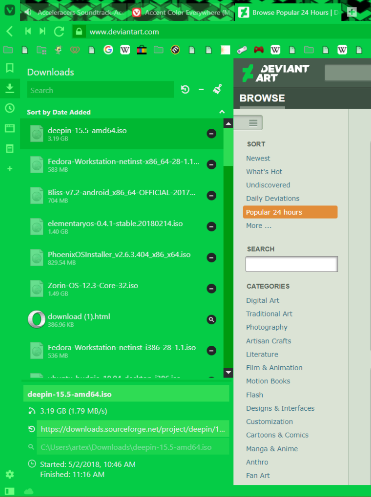
Finally finished my mod of making Vivaldi more colorful with accent color. For those curious and interested to give it a try, the mod will be pasted below. I have add some other mods from the forum, which I took a liking too as well. When using this mod be sure to "Apply accent to window" for the full effect. This mod works very well with applying the accent color from the active page. Hope you guys like it

/* Obselete v1.0*/
.toolbar.toolbar-addressbar, .button-toolbar {
  background:var(--colorAccentBg)
}
#browser.color-behind-tabs-on .tab-position .tab.active.active {
  background: var(--colorAccentBg);
}
.bookmark-bar,.bookmark-bar button {
  background-color: var(--colorAccentBg) !important
}
.tab.active.active {
  background-color: var(--colorAccentBg) !important
}
.button-toolbar:hover{
  background-color:var(--colorAccentBgFadedMore) !important
}
.bookmark-bar button:hover {
  background: var(--colorAccentBgDark) !important;
}
.tree-item:hover{
  background: var(--colorAccentBgDark) !important;
}
.panel {
  background:var(--colorAccentBg) !important;
}
.sortselector-button {
  background:var(--colorAccentBg) !important;
}
.sortselector, .sortselector-dropdown {
  background:var(--colorAccentBg) !important;
}
.notes-cardwrapper, .downloads-cardwrapper, .download-editor,.addbookmark-cardwrapper .upper-half, .notes-cardwrapper .upper-half, .addbookmark-cardwrapper .lower-half, .notes-cardwrapper .lower-half,.toolbar.icons button + button, .toolbar.text button + button,.toolbar.icons button:first-of-type,#panels-container.left #switch .addwebpanel-wrapper .addwebpanelcallout{
  background: var(--colorAccentBg) !important;
}
.notes-add-area-capture:hover,.notes-toggle-md:hover,.button-toolbar.add:hover,.notes-add-attachment:hover,.notes-editor .note,.panel#downloads input.title, .cardview input[type=text],.manager-editor .fieldset > input[type=text], .manager-editor .fieldset > textarea, .manager-editor .fieldset > select,.panel > header input,.sortselector-button:hover,#browser .sortselector .sortselector-dropdown:hover,.toolbar.icons button + button:hover, .toolbar.text button + button:hover, .toolbar.icons button:first-of-type:hover {
  background: var(--colorAccentBgDark) !important;
}
.notes-new-folder, #switch .addwebpanel-wrapper .addwebpanelcallout .add:hover {
  background: var(--colorAccentBgDark) !important;
}
.tree-row[data-selected] {
  background: var(--colorAccentBgDark) !important;
}
#switch button:focus, #footer button:open{
  background: var(--colorAccentBgFaded) !important;
}
.notes-add-area-capture,.notes-add-attachment, .notes-toggle-md,.note-new, .button-toolbar.add {
  background: var(--colorAccentBg) !important;
}
#footer, #panels-container.left, #switch, button.button-addressfield:hover {
  background: var(--colorAccentBg) !important;
}
#footer button:hover, #switch button:hover, #switch .addwebpanel-wrapper .addwebpanelcallout .add:active, .cardview textarea, .toolbar .button-toolbar:hover {
  background: var(--colorAccentBgFadedMore) !important;
}
#webpage-capture-button {
  background: var(--colorAccentBg) !important;
}
#webpage-capture-button:hover,#switch button.active {
  background: var(--colorAccentBgDark) !important;
}
#webpage-capture-button:active,.notes-add-area-capture:active,.notes-toggle-md:active,.button-toolbar.add:active,.notes-add-attachment:active,.notes-editor .note,.panel#downloads input.title, .cardview input[type=text],.manager-editor .fieldset > input[type=text], .manager-editor .fieldset > textarea, .manager-editor .fieldset > select,.sortselector-button:active,#browser .sortselector .sortselector-dropdown:active,.toolbar.icons button + button:active, .toolbar.text button + button:active, .toolbar.icons button:first-of-type:active,.button-toolbar-small:active {
  background: var(--colorAccentBgFaded) !important;
}
#footer .callout,.pageactions .capture-container .active, .imageactions .capture-container .active, .captureactions .capture-container .active, .dialog-footer,.dialog-javascript{
  background: var(--colorAccentBgDark) !important;
}
.pageactions header, .imageactions header, .captureactions header,.find-in-page, #switch button:focus:not(.active) {
  background: var(--colorAccentBg) !important;
}
.toolbar .button-toolbar, .dialog-content, .addressfield-popup-container .addressfield-popup{
  background: var(--colorAccentBg) !important;
}
#browser.win.win10.tabs-top #header #titlebar .window-buttongroup button:not(.vivaldi):hover,.urlSearch section > div:hover,.searchfield:hover{
  background: var(--colorAccentBg) !important;
}
/* .addressfield .pageload .pageload-indicator {
  background-color: var(--colorHighlightBg) !important;
  (This does not work right now) .tab-position .tab {
      transform: skewX(-25deg);
 }
  .tab-position .tab .tab-header {
      transform: skewX(25deg);
 }
}
*/
.addressfield-popup-container .addressfield-popup .addressfield-popup-header, .addressfield-popup-container .addressfield-popup .dialog-footer{
  background: var(--colorAccentBg) !important;
}
.addressfield {
  background: var(--colorAccentBgDark) !important;
}
.color-behind-tabs-on .addressfield, .color-behind-tabs-on .searchfield, .color-behind-tabs-on .addressfield:focus-within, .color-behind-tabs-on .searchfield:focus-within, .addressfield:focus-within, .searchfield:focus-within {
  border-color: none !important;
  box-shadow: none !important;
}
#footer {
  box-shadow: inset 0 1px var(--colorAccentBg)!important;
}
#browser #main, #browser #footer {
  background: var(--colorAccentBg);
  color: var(--colorAccentBg);
  fill: var(--colorAccentBg);
}
.address-top .toolbar-addressbar:after, .address-top .toolbar-mailbar:after {
  background: var(--colorAccentBg) !important;
}
.bookmark-bar {
  border-color: var(--colorAccentBg) !important;
}
.tab-group-indicator .tab-indicator.active {
  background-color: goldenrod !important;
}
.tab-group-indicator .tab-indicator {
  background-color: #fff !important;
}
.tab-group-indicator .tab-indicator:hover:not(.active) {
  background-color: #000 !important;
}
.tabs-bottom .tab-group-indicator .tab-indicator.active {
  padding-top: 3px;
}
.color-behind-tabs-on .addressfield, .color-behind-tabs-on .searchfield {
  border-color: var(--colorAccentBg) !important;
}
@keyframes fade {
  from {
      opacity: 1
 }
  to {
      opacity: 0.4
 }
}
.button-toolbar.reload.loading svg {
  animation-name: fade;
  animation-duration: 857ms !important;
  animation-iteration-count: infinite;
  animation-timing-function: ease-in-out;
  animation-direction: alternate;
}
button.button-toolbar[disabled] {
  display: none;
}
button.button-toolbar.home {
  display: none;
}
/* Speed dial thumbnails opacity */
.thumbnail {
  opacity: 0.4;
}
/* Speed dial thumbnails opacity on hover */
.thumbnail:hover {
  opacity: 1.0;
}
.addressfield .pageload .pageload-indicator::-webkit-progress-value {
  background-color: var(--colorAccentBgDark) !important;
}
.addressfield .pageload:not(.unstarted).progress-done {
  opacity: 0 !important;
  border: none !important;
}
.addressfield .pageload .pageload-indicator {
  height: 24px !important;
  bottom: 0 !important;
  opacity: .5 !important;
}
.omni-clickable.highlight {
  background-color: var(--colorAccentBgDark) !important;
}
.urlSearch {
  background-color: var(--colorAccentBgDarker) !important;
}
#browser:not(.private) .addressfield .addressfield-siteinfo .siteinfo-symbol{
  background-color: var(--colorAccentBgDarker) !important;
}
.toolbar.toolbar-addressbar svg, .button-addressfield.bookmark svg .bookmark-outline, #tabs-container > div.resize > div.tab-strip > div > div > div.tab-header > span.close > svg, #switch svg, #footer svg, #footer svg g {
  fill: var(--colorAccentBgFadedMost) !important;
}
@keyframes show-startpage-navigation {
  from {
      top: -45px;
 }
  to {
      top: 0;
 }
}
@keyframes hide-startpage-navigation {
  from {
      top: 0;
 }
  to {
      top: -45px;
 }
}
.startpage-navigation {
  animation: hide-startpage-navigation 1s ease forwards;
}
.startpage-navigation:hover {
  animation: show-startpage-navigation 1s ease forwards;
}
.startpage .startpage-navigation {
  background-color: #111;
  opacity: 0.6;
  box-shadow: none;
  color: #fff;
}
.startpage .button-startpage.active {
  background-color: #222;
  color: #fff;
}
.toolbar.icons input[type=search] {
 border: background-color: var(--colorAccentBg) !important;
  box-shadow: background-color: var(--colorAccentBg) !important;
}
.sortselector{
 border-color: var(--colorAccentBg)!important;
}
.sortselector.sortselector-compact .sortselector-button{
 border-left: 0px solid var(--colorAccentBg)!important;
}
.toolbar.icons button, .toolbar.text button{
  border-top-color: transparent !important;
  border-bottom-color: transparent !important;
  border-left-color: transparent !important;
  border-right-color: transparent !important;
}
.theme-dark input[type=radio], .theme-dark input[type=checkbox] {
  border-color: transparent!important;
}
input[type=radio], input[type=checkbox] {
  background-color: var(--colorAccentBgDark)!important;
}
#panels-container.left #switch {
  box-shadow: inset -1px 0 var(--colorAccentBg)!important;
}
#panels button.fullwidth.alternate:after {
  background-image: linear-gradient(var(--colorAccentBg), var(--colorAccentBgDark))!important;
 border: solid var(--colorAccentBg)!important;
}
#switch button.active {
 border-color: var(--colorAccentBg)!important;
}
#switch button:hover:not(.active), #switch button:focus:not(.active) {
 box-shadow: inset -1px 0 0 var(--colorAccentBg)!important;
}
.button-toolbar-small:hover, .button-toolbar-small:focus:not([tabindex='-1']) {
 box-shadow: inset 0 1px 0 var(--colorAccentBg)!important;
}
#footer .zoom-control {
 border-left: 1px solid var(--colorAccentBg)!important;
}
#panels-container:after {
 background-color: var(--colorAccentBg)!important;
}
.addressfield, .searchfield {
  border: 1px solid var(--colorAccentBg)!important;
}
button.button-addressfield:hover {
 border-color: var(--colorAccentBg)!important;
}
.urlSearch section + section {border-top: 1px solid transparent!important;}

#notes-panel .notes-editor .editor {border-color: transparent !important;}
#notes-panel .notes-editor .notes-add-attachment, #notes-panel .notes-editor .notes-add-area-capture, #notes-panel .notes-editor .notes-toggle-md  {border: 1px solid var(--colorAccentBg)!important;}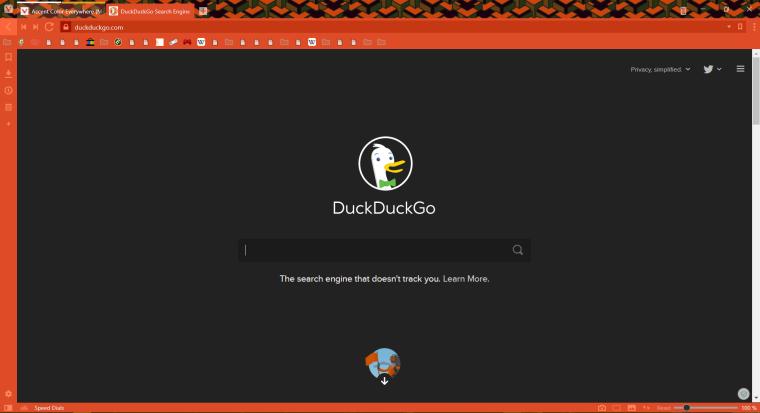
-
@artex You surely put a lot of work into this. But this isn't useable for anyone with just a slightly different setup or preferences than yourself. For one it makes modifications not everyone wants (e.g. hiding home button, startpage navigation mod). Then it isn't consistent between dark and light themes everywhere. And lastly there is very little explanation/structure to the mod and this makes it very hard for anyone trying to adapt it/fix it. Otherwise good job.
-
@luetage Yea I know about the explanation/structure part, I was just trying to get used to editing CSS files for Vivaldi so I changed whatever I could at once XD. And yes there are modifications that not everyone wants, which I could point out where they are if they would want that. I have tested this mod with all the stock ones, and they all work well. What I can tell it is quite consistent with the light theme although there is a chance some things may not have been modded properly there, as I did make it with the dark theme in mind. I'll reup the code with labels to differentiate what is what soon, if people really want it.
If for some reason this mod does not work with your theme, tell me and I will try to fix as well as label everything in the mod(to make it a bit easier to understand what to edit).
Completely disagree with theming object as well as stating that this theme isn't usable.
-
Version 2.1 of my code will be uploaded soon! Found some small bugs and doing some spring cleaning in the code to make it more readable. Tough work, especially since I did mine all messy.
-
@artex Just add commented description like: "this hides X button" or something. Nice work, even I dont like too many colors.
-
Where from is the background image? Did you do it? It is good!
-
@burbuja I took it from giphy and edited it to me black and white to fit with the colors better.
If you'd like i can share it with you. I think it the background gif works well with my colorful mod as it will all be one uniform color or make the color change depending on the webpage and enjoy the color everywhere.And I will be posting the organized version soon.... so hard, as I have to recheck what everything does.
-
Version 2.2 is here! Vivaldi completely colored. It's all arranged and has description of what it does!
Feel free to criticize and rate it, feel free to use any part of my mod to help you work out yours. This version does not feature the transition of colors when switching tabs or visiting another website./* The Colorful Mod*/ /*V2.2 A*/ /*Created by Artex*/ /*Vivaldi Button*/ .vivaldi{background: var(--colorAccentBg)!important; } /*Vivaldi Button hover*/ .vivaldi:hover{background: var(--colorAccentBgDark)!important; } /*Trash Can hover*/ #tabs-container .toggle-trash:hover{background: var(--colorAccentBg)!important; } /*Trash can active*/ #tabs-container .toggle-trash:active{background: var(--colorAccentBgDark)!important; } /*Addressbar outside borders color*/ .toolbar.toolbar-addressbar, .button-toolbar { background:var(--colorAccentBg) } /*Bookmark bar color*/ .bookmark-bar,.bookmark-bar button { background-color: var(--colorAccentBg) !important } /*Active tab color*/ .tab.active.active { background-color: var(--colorAccentBg) !important } /*Bookmark bar hover*/ .bookmark-bar button:hover { background: var(--colorAccentBgDark) !important; } /*Sidebar tree sort selector hover*/ .tree-item:hover{ background: var(--colorAccentBgDark) !important; } /*sidebar panel*/ .panel { background:var(--colorAccentBg) !important; } /*Sidebar sort selector color*/ .sortselector, .sortselector-dropdown { background:var(--colorAccentBg) !important; } /*Sidebar description section color*/ .notes-cardwrapper, .downloads-cardwrapper, .download-editor,.addbookmark-cardwrapper .upper-half, .notes-cardwrapper .upper-half, .addbookmark-cardwrapper .lower-half, .notes-cardwrapper .lower-half,.toolbar.icons button + button, .toolbar.text button + button,.toolbar.icons button:first-of-type,#panels-container.left #switch .addwebpanel-wrapper .addwebpanelcallout{ background: var(--colorAccentBg) !important; } /*sidebar notes icons hover + sidebar search color*/ .notes-add-area-capture:hover,.notes-toggle-md:hover,.button-toolbar.add:hover,.notes-add-attachment:hover,.notes-editor .note,.panel#downloads input.title, .cardview input[type=text],.manager-editor .fieldset > input[type=text], .manager-editor .fieldset > textarea, .manager-editor .fieldset > select,.panel > header input,.sortselector-button:hover,#browser .sortselector .sortselector-dropdown:hover,.toolbar.icons button + button:hover, .toolbar.text button + button:hover, .toolbar.icons button:first-of-type:hover { background: var(--colorAccentBgDark) !important; } /*Sidepanel tree sort select color*/ .tree-row[data-selected] { background: var(--colorAccentBgDark) !important; } /*sidebar notes button*/ .notes-add-area-capture,.notes-add-attachment, .notes-toggle-md,.note-new, .button-toolbar.add { background: var(--colorAccentBg) !important; } /*sidebar + bottombar color*/ #footer, #panels-container.left, #switch, button.button-addressfield:hover { background: var(--colorAccentBg) !important; } /*sidepanel hover icons*/ #footer button:hover, #switch button:hover, #switch .addwebpanel-wrapper .addwebpanelcallout .add:active, .cardview textarea, .toolbar .button-toolbar:hover { background: var(--colorAccentBgFadedMore) !important; } /*webpage capture button color*/ #webpage-capture-button { background: var(--colorAccentBg) !important; } /*Webpage capture button hover + sidebar active button color fix*/ #webpage-capture-button:hover,#switch button.active { background: var(--colorAccentBgDark) !important; } /*Sidebar notes icons + web capture button active*/ #webpage-capture-button:active,.notes-add-area-capture:active,.notes-toggle-md:active,.button-toolbar.add:active,.notes-add-attachment:active,.notes-editor .note,.panel#downloads input.title, .cardview input[type=text],.manager-editor .fieldset > input[type=text], .manager-editor .fieldset > textarea, .manager-editor .fieldset > select,.sortselector-button:active,#browser .sortselector .sortselector-dropdown:active,.toolbar.icons button + button:active, .toolbar.text button + button:active, .toolbar.icons button:first-of-type:active,.button-toolbar-small:active { background: var(--colorAccentBgFaded) !important; } /*color callout*/ #footer .callout,.pageactions .capture-container .active, .imageactions .capture-container .active, .captureactions .capture-container .active{ background: var(--colorAccentBgDark) !important; } /*Javascript dialogue*/ .dialog-footer,.dialog-javascript,.dialog-content{border-top: 1px solid var(--colorAccentBgDark)!important; background: var(--colorAccentBgDark) !important; } /*fixes some color issue with certain sidebar icons, color header of callout, the find bar color*/ .pageactions header, .imageactions header, .captureactions header,.find-in-page, #switch button:focus:not(.active) { background: var(--colorAccentBg) !important; } /*Fixes a color issue to this theme with certain buttons*/ .toolbar .button-toolbar, .addressfield-popup-container .addressfield-popup{ background: var(--colorAccentBg) !important; } /*URL Icon fix*/ button.button-addressfield{ background-color: var(--colorAccentBgDarker) !important; } /*Close, Minimize, etc color hover*/ #browser.win.win10.tabs-top #header #titlebar .window-buttongroup button:not(.vivaldi):hover,.urlSearch section > div:hover,.searchfield:hover{ background: var(--colorAccentBg) !important; } /*Addressbar Color*/ .addressfield { background: var(--colorAccentBgDark) !important; } /* Addressbar highlight*/ .color-behind-tabs-on .addressfield, .color-behind-tabs-on .searchfield, .color-behind-tabs-on .addressfield:focus-within, .color-behind-tabs-on .searchfield:focus-within, .addressfield:focus-within, .searchfield:focus-within { border-color: none !important; box-shadow: none !important; } /*Description bar top border*/ #footer { box-shadow: inset 0 1px var(--colorAccentBg)!important; } /*Addressbar bottom border*/ .address-top .toolbar-addressbar:after, .address-top .toolbar-mailbar:after { background: var(--colorAccentBg) !important; } /*Bookmark bar border*/ .bookmark-bar { border-color: var(--colorAccentBg) !important; } /*stacked tabs indicator and a bit bigger for bottom tabs*/ .tab-group-indicator .tab-indicator.active { background-color: goldenrod !important; } .tab-group-indicator .tab-indicator { background-color: #fff !important; } .tab-group-indicator .tab-indicator:hover:not(.active) { background-color: #000 !important; } .tabs-bottom .tab-group-indicator .tab-indicator.active { padding-top: 3px; } /*Addressfield Border*/ .color-behind-tabs-on .addressfield, .color-behind-tabs-on .searchfield { border-color: var(--colorAccentBg) !important; } @keyframes fade { from { opacity: 1 } to { opacity: 0.4 } } /*Blinking reload/stop button when active*/ .button-toolbar.reload.loading svg { animation-name: fade; animation-duration: 350ms !important; animation-iteration-count: infinite; animation-timing-function: ease-in-out; animation-direction: alternate; } /*Hide Disabled button*/ button.button-toolbar[disabled] { display: none; } /*Home Button*/ button.button-toolbar.home { display: none; } /*addressfield pageload indicator*/ .addressfield .pageload .pageload-indicator::-webkit-progress-value { background-color: var(--colorAccentBgDarker) !important; } .addressfield .pageload:not(.unstarted).progress-done { opacity: 0 !important; border: none !important; } .addressfield .pageload .pageload-indicator { height: 24px !important; bottom: 0 !important; opacity: .5 !important; } /*URL dropdown color & highlight*/ .urlSearch { background-color: var(--colorAccentBgDarker) !important; } .omni-clickable.highlight { background-color: var(--colorAccentBgDark) !important; } /*Icon Fill color*/ .toolbar.toolbar-addressbar svg, .button-addressfield.bookmark svg .bookmark-outline, #tabs-container > div.resize > div.tab-strip > div > div > div.tab-header > span.close > svg, #switch svg, #footer svg, #footer svg g { fill: var(--colorAccentBgFadedMost) !important; } /*Startpage navigation*/ @keyframes show-startpage-navigation { from { top: -45px; } to { top: 0; } } @keyframes hide-startpage-navigation { from { top: 0; } to { top: -45px; } } .startpage-navigation { animation: hide-startpage-navigation 1s ease forwards; } .startpage-navigation:hover { animation: show-startpage-navigation 1s ease forwards; } .startpage .startpage-navigation { background-color: #111; opacity: 0.6; box-shadow: none; color: #fff; } .startpage .button-startpage.active { background-color: #222; color: #fff; } /*Sidebar searchfield*/ .toolbar.icons input[type=search] { border: background-color: var(--colorAccentBg) !important; box-shadow: background-color: var(--colorAccentBg) !important; } /*Sidebar icons borders*/ .toolbar.icons button, .toolbar.text button{ border-top-color: transparent !important; border-bottom-color: transparent !important; border-left-color: transparent !important; border-right-color: transparent !important; } .sortselector.sortselector-compact .sortselector-button{ border-left: 0px solid var(--colorAccentBg)!important; } .sortselector{ border-color: var(--colorAccentBg)!important; } /*radio & checkboxes color + border*/ input[type=radio], input[type=checkbox] { background-color: var(--colorAccentBgDarker)!important; } .theme-dark input[type=radio], .theme-dark input[type=checkbox] { border-color: transparent!important; } /*Sidebar border*/ #panels-container.left #switch { box-shadow: inset -1px 0 var(--colorAccentBg)!important; } /*Sidebar description resizer*/ #panels button.fullwidth.alternate:after { background-image: linear-gradient(var(--colorAccentBg), var(--colorAccentBgDark))!important; border: solid var(--colorAccentBg)!important; } /*Sidebar icons active*/ #switch button.active { border-color: var(--colorAccentBg)!important; } /*Sidebar Hover buttons sideborder*/ #switch button:hover:not(.active), #switch button:focus:not(.active) { box-shadow: inset -1px 0 0 var(--colorAccentBg)!important; } /*Hover Toolbar buttons topBorder*/ .button-toolbar-small:hover, .button-toolbar-small:focus:not([tabindex='-1']) { box-shadow: inset 0 1px 0 var(--colorAccentBg)!important; } /*Zoom Control Border*/ #footer .zoom-control { border-left: 1px solid var(--colorAccentBg)!important; } /*Panel Border*/ #panels-container:after { background-color: var(--colorAccentBg)!important; } /*url history & bookmark button border*/ button.button-addressfield:hover { border-color: var(--colorAccentBg)!important; } /*Note Editor Border needs to be edited*/ #notes-panel .notes-editor .editor {border-color: transparent !important;} #notes-panel .notes-editor .notes-add-attachment, #notes-panel .notes-editor .notes-add-area-capture, #notes-panel .notes-editor .notes-toggle-md {border: 1px solid var(--colorAccentBg)!important;} /*Scrollbar on Panel*/ #browser ::-webkit-scrollbar-thumb {border: 2px solid var(--colorAccentBgDark)!important; background-color: var(--colorAccentBgDark)!important;} #browser ::-webkit-scrollbar-thumb:hover {border: 2px solid var(--colorAccentBgFaded)!important;background-color: var(--colorAccentBgFaded)!important;} #browser ::-webkit-scrollbar-thumb:active {border: 2px solid var(--colorAccentBgFadedMost)!important;background-color: var(--colorAccentBgFadedMost)!important;} #browser ::-webkit-scrollbar-track{background-color: var(--colorAccentBgDarker)!important;} /*Find Page Borders*/ .find-in-page {border-top: 1px solid var(--AccentcolorBg)!important; border-bottom: 1px solid var(--AccentcolorBg)!important;} /* Speed dial thumbnails opacity */ .thumbnail { opacity: 0.4; } /* Speed dial thumbnails opacity on hover */ .thumbnail:hover { opacity: 1.0; } /*Seperators in URL dropdown*/ .urlSearch section + section {border-top: 1px solid transparent!important;}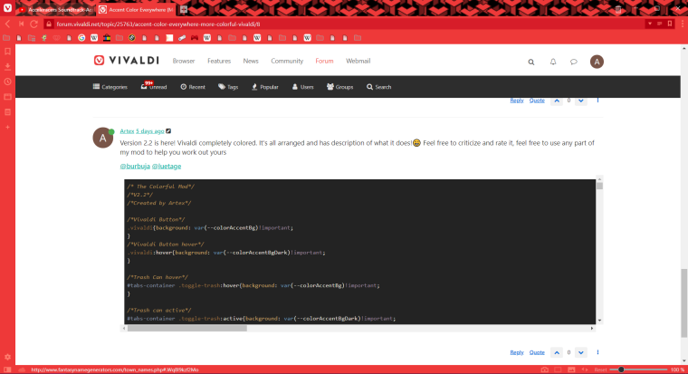
-
Just like v2.2A except that this features the transition of colors. A more vibrant and colorful browsing experience, and I even would say that this theme is compatible with practically any mods, unless demonstrated.
/* The Colorful Mod*/ /*V2.2 B*/ /*Created by Artex*/ /*Vivaldi Button*/ .vivaldi{background: var(--colorAccentBg)!important; } /*Vivaldi Button hover*/ .vivaldi:hover{background: var(--colorAccentBgDark)!important; } /*Trash Can hover*/ #tabs-container .toggle-trash:hover{background: var(--colorAccentBg)!important; } /*Trash can active*/ #tabs-container .toggle-trash:active{background: var(--colorAccentBgDark)!important; } /*Addressbar outside borders color*/ .toolbar.toolbar-addressbar, .button-toolbar { background:var(--colorAccentBg) } /*Bookmark bar color*/ .bookmark-bar,.bookmark-bar button { background-color: var(--colorAccentBg) !important } /*Active tab color*/ .tab.active.active { background-color: var(--colorAccentBg) !important } /*Bookmark bar hover*/ .bookmark-bar button:hover { background: var(--colorAccentBgDark) !important; } /*Sidebar tree sort selector hover*/ .tree-item:hover{ background: var(--colorAccentBgDark) !important; } /*sidebar panel*/ .panel { background:var(--colorAccentBg) !important; } /*Sidebar sort selector color*/ .sortselector, .sortselector-dropdown { background:var(--colorAccentBg) !important; } /*Sidebar description section color*/ .notes-cardwrapper, .downloads-cardwrapper, .download-editor,.addbookmark-cardwrapper .upper-half, .notes-cardwrapper .upper-half, .addbookmark-cardwrapper .lower-half, .notes-cardwrapper .lower-half,.toolbar.icons button + button, .toolbar.text button + button,.toolbar.icons button:first-of-type,#panels-container.left #switch .addwebpanel-wrapper .addwebpanelcallout{ background: var(--colorAccentBg) !important; } /*sidebar notes icons hover + sidebar search color*/ .notes-add-area-capture:hover,.notes-toggle-md:hover,.button-toolbar.add:hover,.notes-add-attachment:hover,.notes-editor .note,.panel#downloads input.title, .cardview input[type=text],.manager-editor .fieldset > input[type=text], .manager-editor .fieldset > textarea, .manager-editor .fieldset > select,.panel > header input,.sortselector-button:hover,#browser .sortselector .sortselector-dropdown:hover,.toolbar.icons button + button:hover, .toolbar.text button + button:hover, .toolbar.icons button:first-of-type:hover { background: var(--colorAccentBgDark) !important; } /*Sidepanel tree sort select color*/ .tree-row[data-selected] { background: var(--colorAccentBgDark) !important; } /*sidebar notes button*/ .notes-add-area-capture,.notes-add-attachment, .notes-toggle-md,.note-new, .button-toolbar.add { background: var(--colorAccentBg) !important; } /*sidebar + bottombar color*/ #footer, #panels-container.left, #switch, button.button-addressfield:hover { background: var(--colorAccentBg) !important; } /*sidepanel hover icons*/ #footer button:hover, #switch button:hover, #switch .addwebpanel-wrapper .addwebpanelcallout .add:active, .cardview textarea, .toolbar .button-toolbar:hover { background: var(--colorAccentBgFadedMore) !important; } /*webpage capture button color*/ #webpage-capture-button { background: var(--colorAccentBg) !important; } /*Webpage capture button hover + sidebar active button color fix*/ #webpage-capture-button:hover,#switch button.active { background: var(--colorAccentBgDark) !important; } /*Sidebar notes icons + web capture button active*/ #webpage-capture-button:active,.notes-add-area-capture:active,.notes-toggle-md:active,.button-toolbar.add:active,.notes-add-attachment:active,.notes-editor .note,.panel#downloads input.title, .cardview input[type=text],.manager-editor .fieldset > input[type=text], .manager-editor .fieldset > textarea, .manager-editor .fieldset > select,.sortselector-button:active,#browser .sortselector .sortselector-dropdown:active,.toolbar.icons button + button:active, .toolbar.text button + button:active, .toolbar.icons button:first-of-type:active,.button-toolbar-small:active { background: var(--colorAccentBgFaded) !important; } /*color callout*/ #footer .callout,.pageactions .capture-container .active, .imageactions .capture-container .active, .captureactions .capture-container .active{ background: var(--colorAccentBgDark) !important; } /*Javascript dialogue*/ .dialog-footer,.dialog-javascript,.dialog-content{border-top: 1px solid var(--colorAccentBgDark)!important; background: var(--colorAccentBgDark) !important; } /*fixes some color issue with certain sidebar icons, color header of callout, the find bar color*/ .pageactions header, .imageactions header, .captureactions header,.find-in-page, #switch button:focus:not(.active) { background: var(--colorAccentBg) !important; } /*Fixes a color issue to this theme with certain buttons*/ .toolbar .button-toolbar, .addressfield-popup-container .addressfield-popup{ background: var(--colorAccentBg) !important; } /*URL Icon fix*/ button.button-addressfield{ background-color: var(--colorAccentBgDarker) !important; transition: background-color 1s, border-color 1s; } /*Close, Minimize, etc color hover*/ #browser.win.win10.tabs-top #header #titlebar .window-buttongroup button:not(.vivaldi):hover,.urlSearch section > div:hover,.searchfield:hover{ background: var(--colorAccentBg) !important; } /*Addressbar Color*/ .addressfield { background: var(--colorAccentBgDarker) !important; } /* Addressbar highlight*/ .color-behind-tabs-on .addressfield, .color-behind-tabs-on .searchfield, .color-behind-tabs-on .addressfield:focus-within, .color-behind-tabs-on .searchfield:focus-within, .addressfield:focus-within, .searchfield:focus-within { border-color: none !important; box-shadow: none !important; } /*Description bar top border*/ #footer { box-shadow: inset 0 1px var(--colorAccentBg)!important; } /*Addressbar bottom border*/ .address-top .toolbar-addressbar:after, .address-top .toolbar-mailbar:after { background: var(--colorAccentBg) !important; } /*Bookmark bar border*/ .bookmark-bar { border-color: var(--colorAccentBg) !important; transition: border-color 1s; } /*stacked tabs indicator and a bit bigger for bottom tabs*/ .tab-group-indicator .tab-indicator.active { background-color: goldenrod !important; } .tab-group-indicator .tab-indicator { background-color: #fff !important; } .tab-group-indicator .tab-indicator:hover:not(.active) { background-color: #000 !important; } .tabs-bottom .tab-group-indicator .tab-indicator.active { padding-top: 3px; } /*Addressfield Border*/ .color-behind-tabs-on .addressfield, .color-behind-tabs-on .searchfield { border-color: var(--colorAccentBg) !important; } @keyframes fade { from { opacity: 1 } to { opacity: 0.4 } } /*Blinking reload/stop button when active*/ .button-toolbar.reload.loading svg { animation-name: fade; animation-duration: 350ms !important; animation-iteration-count: infinite; animation-timing-function: ease-in-out; animation-direction: alternate; } /*Home Button*/ button.button-toolbar.home { display: none; } /*Hide unused buttons*/ button.button-toolbar[disabled] { display: none; } /*addressfield pageload indicator*/ .addressfield .pageload .pageload-indicator::-webkit-progress-value { background-color: var(--colorAccentBgDarker) !important; } .addressfield .pageload:not(.unstarted).progress-done { opacity: 0 !important; border: none !important; } .addressfield .pageload .pageload-indicator { height: 24px !important; bottom: 0 !important; opacity: .5 !important; } /*URL dropdown color & highlight*/ .urlSearch { background-color: var(--colorAccentBgDarker) !important; } .omni-clickable.highlight { background-color: var(--colorAccentBgDark) !important; } /*Icon Fill color*/ .toolbar.toolbar-addressbar svg, .button-addressfield.bookmark svg .bookmark-outline, #tabs-container > div.resize > div.tab-strip > div > div > div.tab-header > span.close > svg, #switch svg, #footer svg, #footer svg g { fill: var(--colorAccentBgFadedMost) !important; } /*Startpage navigation*/ @keyframes show-startpage-navigation { from { top: -45px; } to { top: 0; } } @keyframes hide-startpage-navigation { from { top: 0; } to { top: -45px; } } .startpage-navigation { animation: hide-startpage-navigation 1s ease forwards; } .startpage-navigation:hover { animation: show-startpage-navigation 1s ease forwards; } .startpage .startpage-navigation { background-color: #111; opacity: 0.6; box-shadow: none; color: #fff; } .startpage .button-startpage.active { background-color: #222; color: #fff; } /*Sidebar searchfield*/ .toolbar.icons input[type=search] { border: background-color: var(--colorAccentBg) !important; box-shadow: background-color: var(--colorAccentBg) !important; } /*Sidebar icons borders*/ .toolbar.icons button, .toolbar.text button{ border-top-color: transparent !important; border-bottom-color: transparent !important; border-left-color: transparent !important; border-right-color: transparent !important; } .sortselector.sortselector-compact .sortselector-button{ border-left: 0px solid var(--colorAccentBg)!important; } .sortselector{ border-color: var(--colorAccentBg)!important; } /*radio & checkboxes color + border*/ input[type=radio], input[type=checkbox] { background-color: var(--colorAccentBgDarker)!important; } .theme-dark input[type=radio], .theme-dark input[type=checkbox] { border-color: transparent!important; } /*Sidebar border*/ #panels-container.left #switch { box-shadow: inset -1px 0 var(--colorAccentBg)!important; } /*Sidebar description resizer*/ #panels button.fullwidth.alternate:after { background-image: linear-gradient(var(--colorAccentBg), var(--colorAccentBgDark))!important; border: solid var(--colorAccentBg)!important; } /*Sidebar icons active*/ #switch button.active { border-color: var(--colorAccentBg)!important; } /*Sidebar Hover buttons sideborder*/ #switch button:hover:not(.active), #switch button:focus:not(.active) { box-shadow: inset -1px 0 0 var(--colorAccentBg)!important; } /*Hover Toolbar buttons topBorder*/ .button-toolbar-small:hover, .button-toolbar-small:focus:not([tabindex='-1']) { box-shadow: inset 0 1px 0 var(--colorAccentBg)!important; } /*Zoom Control Border*/ #footer .zoom-control { border-left: 1px solid var(--colorAccentBg)!important; } /*Panel Border*/ #panels-container:after { background-color: var(--colorAccentBg)!important; } /*url history & bookmark button border*/ button.button-addressfield:hover { border-color: var(--colorAccentBg)!important; } /*Note Editor Border needs to be edited*/ #notes-panel .notes-editor .editor {border-color: transparent !important;} #notes-panel .notes-editor .notes-add-attachment, #notes-panel .notes-editor .notes-add-area-capture, #notes-panel .notes-editor .notes-toggle-md {border: 1px solid var(--colorAccentBg)!important;} /*Scrollbar on Panel*/ #browser ::-webkit-scrollbar-thumb {border: 2px solid var(--colorAccentBgDark)!important; background-color: var(--colorAccentBgDark)!important;} #browser ::-webkit-scrollbar-thumb:hover {border: 2px solid var(--colorAccentBgFaded)!important;background-color: var(--colorAccentBgFaded)!important;} #browser ::-webkit-scrollbar-thumb:active {border: 2px solid var(--colorAccentBgFadedMost)!important;background-color: var(--colorAccentBgFadedMost)!important;} #browser ::-webkit-scrollbar-track{background-color: var(--colorAccentBgDarker)!important;} /*Find Page Borders*/ .find-in-page {border-top: 1px solid var(--AccentcolorBg)!important; border-bottom: 1px solid var(--AccentcolorBg)!important;} /* Speed dial thumbnails opacity */ .thumbnail { opacity: 0.4; } /* Speed dial thumbnails opacity on hover */ .thumbnail:hover { opacity: 1.0; } /*Seperators in URL dropdown*/ .urlSearch section + section {border-top: 1px solid transparent!important;} ::selection { background-color: var(--colorHighlightBg) !important; color: white; } @keyframes fade{ from {opacity:1} to {opacity:0.4} } /*===================Transition color ready=============*/ /* Adds transition to the window accent */ .color-behind-tabs-on #tabs-container { transition: background-color 1s, border-color 1s; } #tabs-container.top, #tabs-container.bottom { transition: background-color 1s, border-color 1s; } /*Adds transition to the vivaldi icon*/ #titlebar > button { transition: background-color 1s, border-color 1s; } /*Address bar & icons transition*/ #main > div.toolbar-addressbar.toolbar { transition: background-color 1s, border-color 1s; } .toolbar-addressbar .button-toolbar.browserAction-button, .toolbar-mailbar .button-toolbar.browserAction-button { transition: background-color 1s, border-color 1s; } .toolbar .button-toolbar{ transition: background-color 1s, border-color 1s; } .toolbar .button-toolbar:hover{ transition: background 0s; } #main > div.toolbar-addressbar.toolbar > div.addressfield { transition: background-color 1s, border-color 1s; } #main > div.toolbar-addressbar.toolbar > div.addressfield > span { transition: background-color 1s, border-color 1s; } #main > div.toolbar-addressbar.toolbar > div.addressfield > button.button-addressfield.addressfield-siteinfo.secure { transition: background-color 1s, border-color 1s; } #main > div.toolbar-addressbar.toolbar > div.addressfield > button.button-addressfield.addressfield-siteinfo.internal > div > svg { transition: background-color 1s, border-color 1s; } /*Addressbar bottom border*/ .address-top .toolbar-addressbar:after, .address-top .toolbar-mailbar:after { transition: background-color 1s, border-color 1s; } /*Bookmarks transition*/ button.button-addressfield{ transition: background-color 1s, border-color 1s; } .bookmark-bar { transition: border-color 1s; } #main > div.bookmark-bar.icon > div , .bookmark-bar button { transition: background-color 1s, border-color 1s; } .bookmark-bar button:hover { transition: background 0s; } /*Sidepanel Transition*/ .panel, .sortselector, .sortselector-dropdown, .notes-cardwrapper, .downloads-cardwrapper, .download-editor,.addbookmark-cardwrapper .upper-half, .notes-cardwrapper .upper-half, .addbookmark-cardwrapper .lower-half, .notes-cardwrapper .lower-half,.toolbar.icons button + button, .toolbar.text button + button,.toolbar.icons button:first-of-type,#panels-container.left #switch .addwebpanel-wrapper .addwebpanelcallout, .notes-add-area-capture:hover,.notes-toggle-md:hover,.button-toolbar.add:hover,.notes-add-attachment:hover,.notes-editor .note,.panel#downloads input.title, .cardview input[type=text],.manager-editor .fieldset > input[type=text], .manager-editor .fieldset > textarea, .manager-editor .fieldset > select,.panel > header input,.sortselector-button:hover,#browser .sortselector .sortselector-dropdown:hover,.toolbar.icons button + button:hover, .toolbar.text button + button:hover, .toolbar.icons button:first-of-type:hover,.tree-row[data-selected] { transition: background 1s; } .notes-add-area-capture,.notes-add-attachment, .notes-toggle-md,.note-new, .button-toolbar.add, #footer, #panels-container.left, #switch { transition: background 1s; } #footer { transition: background-color 1s, border-color 1s; } #panels-container:after { transition: background-color 1s, border-color 1s; } .sortselector.sortselector-compact{ transition: background-color 1s, border-color 1s; } #panels-container.left #switch { box-shadow: inset 0px 0 var(--colorAccentBg)!important; } #switch button.active { transition: background-color 1s, border-color 1s; } /*Status Bar*/ #footer .zoom-control{ transition: background-color 1s, border-color 1s; } #notes-panel > div > div > div.add-attachments-wrapper > button, #notes-panel > div > div > div.add-attachments-wrapper > label{ transition: background-color 1s, border-color 1s; } -
@Artex Good job. Still has issues though.
-
You are using var(--colorAccentFadedMost) for foreground colors, which doesn't give enough contrast in my opinion. Instead var(--colorAccentFgFaded) would give better and more fitting contrast.
-
You are also using a fixed white for the foreground of highlights, but there is a calculated foreground color for highlighted backgrounds available – var(--colorHighlightFg).
-
I haven't looked into it that much, but it seems the foreground colors for panels and bookmark bar seems to be white always?
-
The search field has a different highlight background than the address field.
Moreover I would suggest to take out the modifications of the toolbar buttons and the startpage header. Most modders already have these parts edited to their liking and it has nothing to do with this mod in the first place.
Anyway, nice effort and a lot of work for sure.
-
-
@luetage I will look into the forground thing, keep in mind i made this with super limited knownledge lol.
Search field I haven't touched much actually that's why it has different highlight color or anything. IMO is a redundant field to have, but ill look at it and see what i can do
As for the forground colors being always white do you have any suggestions how i may fix that? I noticed that too but I don't have any clue on what to do to fix it. I'll try to play around and check or if you could direct at what i should be looking for that would be great.
-
@Artex You have to make it compatible with background. Since you use the accent color as background, using the accent foreground color is the logical step. Since you will likely use var(--colorAccentFgFaded) for the panel/address-bar buttons, you can probably use var(--colorAccentFg) for the text.
-
Broken on v2.4.1476.4
/* The Colorful Mod*/
/*V2.3 A*/
/*Created by Artex*/

/*Vivaldi Button*/
.vivaldi{background: var(--colorAccentBg)!important;
}
/*Vivaldi Button hover*/
.vivaldi:hover{background: var(--colorAccentBgDark)!important;
}

/*Trash Can hover*/
#tabs-container .toggle-trash:hover{background: var(--colorAccentBg)!important;
}

/*Trash can active*/
#tabs-container .toggle-trash:active{background: var(--colorAccentBgDark)!important;
}

/*Addressbar outside borders color*/
.toolbar.toolbar-addressbar, .button-toolbar {
  background:var(--colorAccentBg)
}

/*Bookmark bar color*/
.bookmark-bar,.bookmark-bar button {
  background-color: var(--colorAccentBg) !important
}

/*Active tab color*/
.tab.active.active {
  background-color: var(--colorAccentBg) !important
}

/*Bookmark bar hover*/
.bookmark-bar button:hover {
  background: var(--colorAccentBgDark) !important;
}

/*Sidebar tree sort selector hover*/
.tree-item:hover{
  background: var(--colorAccentBgDark) !important;
}

/*sidebar panel*/
.panel {
  background:var(--colorAccentBg) !important;
}

/*Sidebar sort selector color*/
.sortselector, .sortselector-dropdown {
  background:var(--colorAccentBg) !important;
}

/*Sidebar description section color*/
.notes-cardwrapper, .downloads-cardwrapper, .download-editor,.addbookmark-cardwrapper .upper-half, .notes-cardwrapper .upper-half, .addbookmark-cardwrapper .lower-half, .notes-cardwrapper .lower-half,.toolbar.icons button + button, .toolbar.text button + button,.toolbar.icons button:first-of-type,#panels-container.left #switch .addwebpanel-wrapper .addwebpanelcallout{
  background: var(--colorAccentBg) !important;
}

/*sidebar notes icons hover + sidebar search color*/
.notes-add-area-capture:hover,.notes-toggle-md:hover,.button-toolbar.add:hover,.notes-add-attachment:hover,.notes-editor .note,.panel#downloads input.title, .cardview input[type=text],.manager-editor .fieldset > input[type=text], .manager-editor .fieldset > textarea, .manager-editor .fieldset > select,.panel > header input,.sortselector-button:hover,#browser .sortselector .sortselector-dropdown:hover,.toolbar.icons button + button:hover, .toolbar.text button + button:hover, .toolbar.icons button:first-of-type:hover {
  background: var(--colorAccentBgDark) !important;
}

/*Sidepanel tree sort select color*/
.tree-row[data-selected] {
  background: var(--colorAccentBgDark) !important;
}

/*sidebar notes button*/
.notes-add-area-capture,.notes-add-attachment, .notes-toggle-md,.note-new, .button-toolbar.add {
  background: var(--colorAccentBg) !important;
}

/*sidebar + bottombar color*/
#footer, #panels-container.left, #switch, button.button-addressfield:hover {
  background: var(--colorAccentBg) !important;
}

/*sidepanel hover icons*/
#footer button:hover, #switch button:hover, #switch .addwebpanel-wrapper .addwebpanelcallout .add:active, .cardview textarea, .toolbar .button-toolbar:hover {
  background: var(--colorAccentBgFadedMore) !important;
}

/*webpage capture button color*/
#webpage-capture-button {
  background: var(--colorAccentBg) !important;
}

/*Webpage capture button hover + sidebar active button color fix*/
#webpage-capture-button:hover,#switch button.active {
  background: var(--colorAccentBgDark) !important;
}

/*Sidebar notes icons + web capture button active*/
#webpage-capture-button:active,.notes-add-area-capture:active,.notes-toggle-md:active,.button-toolbar.add:active,.notes-add-attachment:active,.notes-editor .note,.panel#downloads input.title, .cardview input[type=text],.manager-editor .fieldset > input[type=text], .manager-editor .fieldset > textarea, .manager-editor .fieldset > select,.sortselector-button:active,#browser .sortselector .sortselector-dropdown:active,.toolbar.icons button + button:active, .toolbar.text button + button:active, .toolbar.icons button:first-of-type:active,.button-toolbar-small:active {
  background: var(--colorAccentBgFaded) !important;
}

/*color callout*/
#footer .callout,.pageactions .capture-container .active, .imageactions .capture-container .active, .captureactions .capture-container .active{
  background: var(--colorAccentBgDark) !important;
}

/*Javascript dialogue*/
.dialog-footer,.dialog-javascript,.dialog-content{border-top: 1px solid var(--colorAccentBgDark)!important;
  background: var(--colorAccentBgDark) !important;
}

/*fixes some color issue with certain sidebar icons, color header of callout, the find bar color*/
.pageactions header, .imageactions header, .captureactions header,.find-in-page, #switch button:focus:not(.active) {
  background: var(--colorAccentBg) !important;
}

/*Fixes a color issue to this theme with certain buttons*/
.toolbar .button-toolbar,  .addressfield-popup-container .addressfield-popup{
  background: var(--colorAccentBg) !important;
}

/*URL Icon fix*/
button.button-addressfield{
  background-color: var(--colorAccentBgDarker) !important;
}

/*Close, Minimize, etc color hover*/
#browser.win.win10.tabs-top #header #titlebar .window-buttongroup button:not(.vivaldi):hover,.urlSearch section > div:hover,.searchfield:hover{
  background: var(--colorAccentBg) !important;
}

/*Addressbar Color*/
.addressfield {
  background: var(--colorAccentBgDarker) !important;
}

/* Addressbar highlight*/
.color-behind-tabs-on .addressfield, .color-behind-tabs-on .searchfield, .color-behind-tabs-on .addressfield:focus-within, .color-behind-tabs-on .searchfield:focus-within, .addressfield:focus-within, .searchfield:focus-within {
  border-color: none !important;
  box-shadow: none !important;
}

/*Description bar top border*/
#footer {
  box-shadow: inset 0 1px var(--colorAccentBg)!important;
}

/*Addressbar bottom border*/
.address-top .toolbar-addressbar:after, .address-top .toolbar-mailbar:after {
  background: var(--colorAccentBg) !important;
}

/*Bookmark bar border*/
.bookmark-bar {
  border-color: var(--colorAccentBg) !important;
}

/*stacked tabs indicator and a bit bigger for bottom tabs*/
.tab-group-indicator .tab-indicator.active {
  background-color: goldenrod !important;
}
.tab-group-indicator .tab-indicator {
  background-color: #fff !important;
}
.tab-group-indicator .tab-indicator:hover:not(.active) {
  background-color: #000 !important;
}

.tabs-bottom .tab-group-indicator .tab-indicator.active {
  padding-top: 3px;
}

/*Addressfield Border*/
.color-behind-tabs-on .addressfield, .color-behind-tabs-on .searchfield {
  border-color: var(--colorAccentBg) !important;
}
@keyframes fade {
  from {
      opacity: 1
 }
  to {
      opacity: 0.4
 }
}

/*Blinking reload/stop button when active*/
.button-toolbar.reload.loading svg {
  animation-name: fade;
  animation-duration: 350ms !important;
  animation-iteration-count: infinite;
  animation-timing-function: ease-in-out;
  animation-direction: alternate;
}
/*Hide Disabled button*/
button.button-toolbar[disabled] {
  display: none;
}

/*Home Button*/
button.button-toolbar.home {
  display: none;
}

/*addressfield pageload indicator*/
.addressfield .pageload .pageload-indicator::-webkit-progress-value {
  background-color: var(--colorAccentBgDarker) !important;
}
.addressfield .pageload:not(.unstarted).progress-done {
  opacity: 0 !important;
  border: none !important;
}
.addressfield .pageload .pageload-indicator {
  height: 24px !important;
  bottom: 0 !important;
  opacity: .5 !important;
}

/*URL dropdown color & highlight*/
.urlSearch {
  background-color: var(--colorAccentBgDarker) !important;
}
.omni-clickable.highlight {
  background-color: var(--colorAccentBgDark) !important;
}

/*Icon Fill color*/
.toolbar.toolbar-addressbar svg, .button-addressfield.bookmark svg .bookmark-outline, #tabs-container > div.resize > div.tab-strip > div > div > div.tab-header > span.close > svg, #switch svg, #footer svg, #footer svg g {
  fill: var(--colorAccentBgFadedMost) !important;
}

/*Startpage navigation*/
@keyframes show-startpage-navigation {
  from {
      top: -45px;
 }
  to {
      top: 0;
 }
}
@keyframes hide-startpage-navigation {
  from {
      top: 0;
 }
  to {
      top: -45px;
 }
}
.startpage-navigation {
  animation: hide-startpage-navigation 1s ease forwards;
}
.startpage-navigation:hover {
  animation: show-startpage-navigation 1s ease forwards;
}
.startpage .startpage-navigation {
  background-color: #111;
  opacity: 0.6;
  box-shadow: none;
  color: #fff;
}
.startpage .button-startpage.active {
  background-color: #222;
  color: #fff;
}

/*Sidebar searchfield*/
.toolbar.icons input[type=search] {
 border: background-color: var(--colorAccentBg) !important;
  box-shadow: background-color: var(--colorAccentBg) !important;
}

/*Sidebar icons borders*/
.toolbar.icons button, .toolbar.text button{
  border-top-color: transparent !important;
  border-bottom-color: transparent !important;
  border-left-color: transparent !important;
  border-right-color: transparent !important;
}
.sortselector.sortselector-compact .sortselector-button{
  border-left: 0px solid var(--colorAccentBg)!important;
}
.sortselector{
  border-color: var(--colorAccentBg)!important;
}

/*radio & checkboxes color  + border*/
input[type=radio], input[type=checkbox] {
  background-color: var(--colorAccentBgDarker)!important;
}
.theme-dark input[type=radio], .theme-dark input[type=checkbox] {
  border-color: transparent!important;
}

/*Sidebar border*/
#panels-container.left #switch {
  box-shadow: inset -1px 0 var(--colorAccentBg)!important;
}

/*Sidebar description resizer*/
#panels button.fullwidth.alternate:after {
  background-image: linear-gradient(var(--colorAccentBg), var(--colorAccentBgDark))!important;
 border: solid var(--colorAccentBg)!important;
}

/*Sidebar icons active*/
#switch button.active {
 border-color: var(--colorAccentBg)!important;
}

/*Sidebar Hover buttons sideborder*/
#switch button:hover:not(.active), #switch button:focus:not(.active) {
 box-shadow: inset -1px 0 0 var(--colorAccentBg)!important;
}

/*Hover Toolbar buttons topBorder*/
.button-toolbar-small:hover, .button-toolbar-small:focus:not([tabindex='-1']) {
 box-shadow: inset 0 1px 0 var(--colorAccentBg)!important;
}

/*Zoom Control Border*/
#footer .zoom-control {
 border-left: 1px solid var(--colorAccentBg)!important;
}

/*Panel Border*/
#panels-container:after {
 background-color: var(--colorAccentBg)!important;
}

/*url history & bookmark button border*/
button.button-addressfield:hover {
 border-color: var(--colorAccentBg)!important;
}

/*Note Editor Border needs to be edited*/
#notes-panel .notes-editor .editor {border-color: transparent !important;}
#notes-panel .notes-editor .notes-add-attachment, #notes-panel .notes-editor .notes-add-area-capture, #notes-panel .notes-editor .notes-toggle-md  {border: 1px solid var(--colorAccentBg)!important;}

/*Scrollbar on Panel*/
#browser ::-webkit-scrollbar-thumb {border: 2px solid var(--colorAccentBgDark)!important; background-color: var(--colorAccentBgDark)!important;}
#browser ::-webkit-scrollbar-thumb:hover  {border: 2px solid var(--colorAccentBgFaded)!important;background-color: var(--colorAccentBgFaded)!important;}
#browser ::-webkit-scrollbar-thumb:active  {border: 2px solid var(--colorAccentBgFadedMost)!important;background-color: var(--colorAccentBgFadedMost)!important;}
#browser ::-webkit-scrollbar-track{background-color: var(--colorAccentBgDarker)!important;}

/*Find Page Borders*/
.find-in-page {border-top: 1px solid var(--AccentcolorBg)!important;
  border-bottom: 1px solid var(--AccentcolorBg)!important;}

  /* Speed dial thumbnails opacity */
.thumbnail {
  opacity: 0.4;
}
/* Speed dial thumbnails opacity on hover */
.thumbnail:hover {
  opacity: 1.0;
}
/*Seperators in URL dropdown*/
.urlSearch section + section {border-top: 1px solid transparent!important;}

::selection {
    background-color: var(--colorHighlightBg) !important;
    color: white;
}
@keyframes fade{
    from {opacity:1}
    to {opacity:0.4}
}
/*Hide People icon*/
#main > div.toolbar-addressbar.toolbar > div:nth-child(3){
 display: none;
}
/* The Colorful Mod*/ /*V2.3 B*/ /*Created by Artex*/ /*Vivaldi Button*/ .vivaldi{background: var(--colorAccentBg)!important; } /*Vivaldi Button hover*/ .vivaldi:hover{background: var(--colorAccentBgDark)!important; } /*Trash Can hover*/ #tabs-container .toggle-trash:hover{background: var(--colorAccentBg)!important; } /*Trash can active*/ #tabs-container .toggle-trash:active{background: var(--colorAccentBgDark)!important; } /*Addressbar outside borders color*/ .toolbar.toolbar-addressbar, .button-toolbar { background:var(--colorAccentBg) } /*Bookmark bar color*/ .bookmark-bar,.bookmark-bar button { background-color: var(--colorAccentBg) !important } /*Active tab color*/ .tab.active.active { background-color: var(--colorAccentBg) !important } /*Bookmark bar hover*/ .bookmark-bar button:hover { background: var(--colorAccentBgDark) !important; } /*Sidebar tree sort selector hover*/ .tree-item:hover{ background: var(--colorAccentBgDark) !important; } /*sidebar panel*/ .panel { background:var(--colorAccentBg) !important; } /*Sidebar sort selector color*/ .sortselector, .sortselector-dropdown { background:var(--colorAccentBg) !important; } /*Sidebar description section color*/ .notes-cardwrapper, .downloads-cardwrapper, .download-editor,.addbookmark-cardwrapper .upper-half, .notes-cardwrapper .upper-half, .addbookmark-cardwrapper .lower-half, .notes-cardwrapper .lower-half,.toolbar.icons button + button, .toolbar.text button + button,.toolbar.icons button:first-of-type,#panels-container.left #switch .addwebpanel-wrapper .addwebpanelcallout{ background: var(--colorAccentBg) !important; } /*sidebar notes icons hover + sidebar search color*/ .notes-add-area-capture:hover,.notes-toggle-md:hover,.button-toolbar.add:hover,.notes-add-attachment:hover,.notes-editor .note,.panel#downloads input.title, .cardview input[type=text],.manager-editor .fieldset > input[type=text], .manager-editor .fieldset > textarea, .manager-editor .fieldset > select,.panel > header input,.sortselector-button:hover,#browser .sortselector .sortselector-dropdown:hover,.toolbar.icons button + button:hover, .toolbar.text button + button:hover, .toolbar.icons button:first-of-type:hover { background: var(--colorAccentBgDark) !important; } /*Sidepanel tree sort select color*/ .tree-row[data-selected] { background: var(--colorAccentBgDark) !important; } /*sidebar notes button*/ .notes-add-area-capture,.notes-add-attachment, .notes-toggle-md,.note-new, .button-toolbar.add { background: var(--colorAccentBg) !important; } /*sidebar + bottombar color*/ #footer, #panels-container.left, #switch, button.button-addressfield:hover { background: var(--colorAccentBg) !important; } /*sidepanel hover icons*/ #footer button:hover, #switch button:hover, #switch .addwebpanel-wrapper .addwebpanelcallout .add:active, .cardview textarea, .toolbar .button-toolbar:hover { background: var(--colorAccentBgFadedMore) !important; } /*webpage capture button color*/ #webpage-capture-button { background: var(--colorAccentBg) !important; } /*Webpage capture button hover + sidebar active button color fix*/ #webpage-capture-button:hover,#switch button.active { background: var(--colorAccentBgDark) !important; } /*Sidebar notes icons + web capture button active*/ #webpage-capture-button:active,.notes-add-area-capture:active,.notes-toggle-md:active,.button-toolbar.add:active,.notes-add-attachment:active,.notes-editor .note,.panel#downloads input.title, .cardview input[type=text],.manager-editor .fieldset > input[type=text], .manager-editor .fieldset > textarea, .manager-editor .fieldset > select,.sortselector-button:active,#browser .sortselector .sortselector-dropdown:active,.toolbar.icons button + button:active, .toolbar.text button + button:active, .toolbar.icons button:first-of-type:active,.button-toolbar-small:active { background: var(--colorAccentBgFaded) !important; } /*color callout*/ #footer .callout,.pageactions .capture-container .active, .imageactions .capture-container .active, .captureactions .capture-container .active{ background: var(--colorAccentBgDark) !important; } /*Javascript dialogue*/ .dialog-footer,.dialog-javascript,.dialog-content{border-top: 1px solid var(--colorAccentBgDark)!important; background: var(--colorAccentBgDark) !important; } /*fixes some color issue with certain sidebar icons, color header of callout, the find bar color*/ .pageactions header, .imageactions header, .captureactions header,.find-in-page, #switch button:focus:not(.active) { background: var(--colorAccentBg) !important; } /*Fixes a color issue to this theme with certain buttons*/ .toolbar .button-toolbar, .addressfield-popup-container .addressfield-popup{ background: var(--colorAccentBg) !important; } /*URL Icon fix*/ button.button-addressfield{ background-color: var(--colorAccentBgDarker) !important; transition: background-color 1s, border-color 1s; } /*Close, Minimize, etc color hover*/ #browser.win.win10.tabs-top #header #titlebar .window-buttongroup button:not(.vivaldi):hover,.urlSearch section > div:hover,.searchfield:hover{ background: var(--colorAccentBg) !important; } /*Addressbar Color*/ .addressfield { background: var(--colorAccentBgDarker) !important; } /* Addressbar highlight*/ .color-behind-tabs-on .addressfield, .color-behind-tabs-on .searchfield, .color-behind-tabs-on .addressfield:focus-within, .color-behind-tabs-on .searchfield:focus-within, .addressfield:focus-within, .searchfield:focus-within { border-color: none !important; box-shadow: none !important; } /*Description bar top border*/ #footer { box-shadow: inset 0 1px var(--colorAccentBg)!important; } /*Addressbar bottom border*/ .address-top .toolbar-addressbar:after, .address-top .toolbar-mailbar:after { background: var(--colorAccentBg) !important; } /*Bookmark bar border*/ .bookmark-bar { border-color: var(--colorAccentBg) !important; transition: border-color 1s; } /*stacked tabs indicator and a bit bigger for bottom tabs*/ .tab-group-indicator .tab-indicator.active { background-color: goldenrod !important; } .tab-group-indicator .tab-indicator { background-color: #fff !important; } .tab-group-indicator .tab-indicator:hover:not(.active) { background-color: #000 !important; } .tabs-bottom .tab-group-indicator .tab-indicator.active { padding-top: 3px; } /*Addressfield Border*/ .color-behind-tabs-on .addressfield, .color-behind-tabs-on .searchfield { border-color: var(--colorAccentBg) !important; } @keyframes fade { from { opacity: 1 } to { opacity: 0.4 } } /*Blinking reload/stop button when active*/ .button-toolbar.reload.loading svg { animation-name: fade; animation-duration: 350ms !important; animation-iteration-count: infinite; animation-timing-function: ease-in-out; animation-direction: alternate; } /*Home Button*/ button.button-toolbar.home { display: none; } /*Hide unused buttons*/ button.button-toolbar[disabled] { display: none; } /*addressfield pageload indicator*/ .addressfield .pageload .pageload-indicator::-webkit-progress-value { background-color: var(--colorAccentBgDarker) !important; } .addressfield .pageload:not(.unstarted).progress-done { opacity: 0 !important; border: none !important; } .addressfield .pageload .pageload-indicator { height: 24px !important; bottom: 0 !important; opacity: .5 !important; } /*URL dropdown color & highlight*/ .urlSearch { background-color: var(--colorAccentBgDarker) !important; } .omni-clickable.highlight { background-color: var(--colorAccentBgDark) !important; } /*Icon Fill color*/ .toolbar.toolbar-addressbar svg, .button-addressfield.bookmark svg .bookmark-outline, #tabs-container > div.resize > div.tab-strip > div > div > div.tab-header > span.close > svg, #switch svg, #footer svg, #footer svg g { fill: var(--colorAccentBgFadedMost) !important; } /*Startpage navigation*/ @keyframes show-startpage-navigation { from { top: -45px; } to { top: 0; } } @keyframes hide-startpage-navigation { from { top: 0; } to { top: -45px; } } .startpage-navigation { animation: hide-startpage-navigation 1s ease forwards; } .startpage-navigation:hover { animation: show-startpage-navigation 1s ease forwards; } .startpage .startpage-navigation { background-color: #111; opacity: 0.6; box-shadow: none; color: #fff; } .startpage .button-startpage.active { background-color: #222; color: #fff; } /*Sidebar searchfield*/ .toolbar.icons input[type=search] { border: background-color: var(--colorAccentBg) !important; box-shadow: background-color: var(--colorAccentBg) !important; } /*Sidebar icons borders*/ .toolbar.icons button, .toolbar.text button{ border-top-color: transparent !important; border-bottom-color: transparent !important; border-left-color: transparent !important; border-right-color: transparent !important; } .sortselector.sortselector-compact .sortselector-button{ border-left: 0px solid var(--colorAccentBg)!important; } .sortselector{ border-color: var(--colorAccentBg)!important; } /*radio & checkboxes color + border*/ input[type=radio], input[type=checkbox] { background-color: var(--colorAccentBgDarker)!important; } .theme-dark input[type=radio], .theme-dark input[type=checkbox] { border-color: transparent!important; } /*Sidebar border*/ #panels-container.left #switch { box-shadow: inset -1px 0 var(--colorAccentBg)!important; } /*Sidebar description resizer*/ #panels button.fullwidth.alternate:after { background-image: linear-gradient(var(--colorAccentBg), var(--colorAccentBgDark))!important; border: solid var(--colorAccentBg)!important; } /*Sidebar icons active*/ #switch button.active { border-color: var(--colorAccentBg)!important; } /*Sidebar Hover buttons sideborder*/ #switch button:hover:not(.active), #switch button:focus:not(.active) { box-shadow: inset -1px 0 0 var(--colorAccentBg)!important; } /*Hover Toolbar buttons topBorder*/ .button-toolbar-small:hover, .button-toolbar-small:focus:not([tabindex='-1']) { box-shadow: inset 0 1px 0 var(--colorAccentBg)!important; } /*Zoom Control Border*/ #footer .zoom-control { border-left: 1px solid var(--colorAccentBg)!important; } /*Panel Border*/ #panels-container:after { background-color: var(--colorAccentBg)!important; } /*url history & bookmark button border*/ button.button-addressfield:hover { border-color: var(--colorAccentBg)!important; } /*Note Editor Border needs to be edited*/ #notes-panel .notes-editor .editor {border-color: transparent !important;} #notes-panel .notes-editor .notes-add-attachment, #notes-panel .notes-editor .notes-add-area-capture, #notes-panel .notes-editor .notes-toggle-md {border: 1px solid var(--colorAccentBg)!important;} /*Scrollbar on Panel*/ #browser ::-webkit-scrollbar-thumb {border: 2px solid var(--colorAccentBgDark)!important; background-color: var(--colorAccentBgDark)!important;} #browser ::-webkit-scrollbar-thumb:hover {border: 2px solid var(--colorAccentBgFaded)!important;background-color: var(--colorAccentBgFaded)!important;} #browser ::-webkit-scrollbar-thumb:active {border: 2px solid var(--colorAccentBgFadedMost)!important;background-color: var(--colorAccentBgFadedMost)!important;} #browser ::-webkit-scrollbar-track{background-color: var(--colorAccentBgDarker)!important;} /*Find Page Borders*/ .find-in-page {border-top: 1px solid var(--AccentcolorBg)!important; border-bottom: 1px solid var(--AccentcolorBg)!important;} /* Speed dial thumbnails opacity */ .thumbnail { opacity: 0.4; } /* Speed dial thumbnails opacity on hover */ .thumbnail:hover { opacity: 1.0; } /*Seperators in URL dropdown*/ .urlSearch section + section {border-top: 1px solid transparent!important;} ::selection { background-color: var(--colorHighlightBg) !important; color: white; } @keyframes fade{ from {opacity:1} to {opacity:0.4} } /*===================Transition color ready=============*/ /* Adds transition to the window accent */ .color-behind-tabs-on #tabs-container { transition: background-color 1s, border-color 1s; } #tabs-container.top, #tabs-container.bottom { transition: background-color 1s, border-color 1s; } /*Adds transition to the vivaldi icon*/ #titlebar > button { transition: background-color 1s, border-color 1s; } /*Address bar & icons transition*/ #main > div.toolbar-addressbar.toolbar { transition: background-color 1s, border-color 1s; } .toolbar-addressbar .button-toolbar.browserAction-button, .toolbar-mailbar .button-toolbar.browserAction-button { transition: background-color 1s, border-color 1s; } .toolbar .button-toolbar{ transition: background-color 1s, border-color 1s; } .toolbar .button-toolbar:hover{ transition: background 0s; } #main > div.toolbar-addressbar.toolbar > div.addressfield { transition: background-color 1s, border-color 1s; } #main > div.toolbar-addressbar.toolbar > div.addressfield > span { transition: background-color 1s, border-color 1s; } #main > div.toolbar-addressbar.toolbar > div.addressfield > button.button-addressfield.addressfield-siteinfo.secure { transition: background-color 1s, border-color 1s; } #main > div.toolbar-addressbar.toolbar > div.addressfield > button.button-addressfield.addressfield-siteinfo.internal > div > svg { transition: background-color 1s, border-color 1s; } /*Addressbar bottom border*/ .address-top .toolbar-addressbar:after, .address-top .toolbar-mailbar:after { transition: background-color 1s, border-color 1s; } /*Bookmarks transition*/ button.button-addressfield{ transition: background-color 1s, border-color 1s; } .bookmark-bar { transition: border-color 1s; } #main > div.bookmark-bar.icon > div , .bookmark-bar button { transition: background-color 1s, border-color 1s; } .bookmark-bar button:hover { transition: background 0s; } /*Sidepanel Transition*/ .panel, .sortselector, .sortselector-dropdown, .notes-cardwrapper, .downloads-cardwrapper, .download-editor,.addbookmark-cardwrapper .upper-half, .notes-cardwrapper .upper-half, .addbookmark-cardwrapper .lower-half, .notes-cardwrapper .lower-half,.toolbar.icons button + button, .toolbar.text button + button,.toolbar.icons button:first-of-type,#panels-container.left #switch .addwebpanel-wrapper .addwebpanelcallout, .notes-add-area-capture:hover,.notes-toggle-md:hover,.button-toolbar.add:hover,.notes-add-attachment:hover,.notes-editor .note,.panel#downloads input.title, .cardview input[type=text],.manager-editor .fieldset > input[type=text], .manager-editor .fieldset > textarea, .manager-editor .fieldset > select,.panel > header input,.sortselector-button:hover,#browser .sortselector .sortselector-dropdown:hover,.toolbar.icons button + button:hover, .toolbar.text button + button:hover, .toolbar.icons button:first-of-type:hover,.tree-row[data-selected] { transition: background 1s; } .notes-add-area-capture,.notes-add-attachment, .notes-toggle-md,.note-new, .button-toolbar.add, #footer, #panels-container.left, #switch { transition: background 1s; } #footer { transition: background-color 1s, border-color 1s; } #panels-container:after { transition: background-color 1s, border-color 1s; } .sortselector.sortselector-compact{ transition: background-color 1s, border-color 1s; } #panels-container.left #switch { box-shadow: inset 0px 0 var(--colorAccentBg)!important; } #switch button.active { transition: background-color 1s, border-color 1s; } /*Status Bar*/ #footer .zoom-control{ transition: background-color 1s, border-color 1s; } #notes-panel > div > div > div.add-attachments-wrapper > button, #notes-panel > div > div > div.add-attachments-wrapper > label{ transition: background-color 1s, border-color 1s; } /*Hide People icon*/ #main > div.toolbar-addressbar.toolbar > div:nth-child(3){ display: none; } -
 Ppafflick moved this topic from Modifications on