Vivaldi Forum mod
-
@Hadden89 Would have to be done with javascript, not sure if it's worth it.
-
@luetage Correct me if I'm wrong, but why shouldn't a
lazysimple solution like this work?
.col-lg-6 { width: 100% !important; } .col-lg-6:first-of-type { display: none; } -
@pafflick Because no one can guarantee that this is the only place in nodeBB where this selector is being or will be used, it's general not specific. But you can of course put this in as custom css and use it if you so please.
-
@luetage I'm aware of that, I looked at all the most common places here and it was actually the only occurrence that I was able to find - though I wouldn't mind if you'd prove me wrong on this if you can...

Using JavaScript may seem like a more proper and failproof solution, but since we're talking about Vivaldi forum specifically (and not nodeBB in general), I can't see why this shouldn't be sufficient enough. If something can be fixed with two lines of code there's hardly any reason to put a vast amount of labor just to end up with pretty much the same results.
After all, it's not like you wouldn't have to adjust your code again anyway if they decided to change the header id for the n-th time, for example.
-
@luetage If you don't trust it,
bodyhaspage-userin its classlist. -
@potmeklecbohdan First off, I can't do anything about anything for the time being. And anyone who really dislikes the second column can load this as custom css easily, as mentioned previously. I won't introduce this as default modification, independent of javascript or css solution. The only question is, if it's worth it including as default mod and right now I would say no. But hey, I'm neither using a chromium browser nor the forum mod at the moment so what do I know.
-
BTW, the bookmarks icon doesn't show anymore in navigation bar, though I have
Bookmarks in navigationmod checked. However, I'm able to access bookmarks through the profile menu (three dots on the right side of profile page), thanks to a change in forum. -
@hlehyaric Bookmarks have been on the profile page for a relatively long time, the reason for the mod was to make them directly accessible. The mod worked when I last tried it, could be something changed over the last 2 weeks, not sure.
Anyway, I'm gonna assemble a computer this weekend, so will be back in action soon.
-
Sorry if this has been reported before. The details are over my head.
The main menu line at the top (Webmail Browser Download ...) has been showing up white when the rest is dark as desired for awhile now. It would be great if it can be fixed.
I have used this extension for so long that I have forgotten it's not the default. Thanks so much for providing it.
-
This is a known issue, a recent forum update has broken the header in all of the themes. You are just going to have to wait until the extension is updated.
In the meantime however you could use my dark theme which I've updated, but you will need Stylus to run it
-
My user CSS wrote on top the sprucey theme.
You probably need only the first four blocks.
Add the other ones if you like what they do.
Uncheck auto-hide header mod in VFM settings.//EDIT: Updated 12/Oct/2020
/* Fix sprucey header/menu */ #vivaldi-header {background: #2e3539;} #vivaldimenu a.current, #vivaldimenu a:hover {color: #ff0e00;} #vivaldimenu a:not(:active):not(:focus):not(:hover):not(.current) {color: #fff;} /* Fix poor contrast areas */ .topic .posts>li .post-footer a, .topic .posts>li .post-header a, .breadcrumb a {color: #24948c;} .topic .posts>li .post-footer a:hover, .topic .posts>li .post-header a:hover, .breadcrumb a:hover, .chat-modal .chat-content li.chat-message .message-body-wrapper:hover .message-body, div[widget-area=header] a, a:focus, a:hover {color: #30c3b9;} .navbar-default .navbar-toggle:hover, .navbar-default .navbar-toggle:focus {background-color: #211;} .category .category-item.highlight,.topic .topic-item.highlight { background-color: #333; } /*Fix search gear*/ #search-form #search-fields .form-group .advanced-search-link .fa-cogs:before, .fa-gears:before {filter: invert(1);} /* Sub-thread text is too gray */ .categories .category-children small:not(hover), .category .category-children small:not(hover), .subcategory .category-children small:not(hover) {Color:#999 !important;} .category-children a small:hover {color: #aa242e !important;} /* Compact threads */ li[component="post"] { border-bottom: 1px solid !important; border-radius: 0px !important; margin-bottom: 1px !important; } .container {width: 99% !important;} /*more space*/ /* Hide best posts */ .col-lg-6 {width: 100% !important;} .col-lg-6:first-of-type {display: none;} /* Hide deleted posts */ /*li.deleted[component="post"]{display: none;}*/ /* I like necro-ing */ .necro-post {display: none;} -
@luetage
Hi, I use your mod for a long time and have a feature request.
Me and many other user want to help but post in the wrong forum category.
Today I reply to a user in the Android area but thought I am in the desktop area so my answer was not helpful at all (Gwen deleted it carefully).
I start a thread about some time ago, may you can have a look if you have time.
May it is possible to add an icon or something so a user is aware where he/she actually is in a thread to the forum mod.https://forum.vivaldi.net/topic/46951/marker-for-android-forum?_=1593941225867
Thanks, mib
-
@mib2berlin It’s not a bad idea to make this more obvious, but what would you suggest exactly? The forum board can be viewed on top of page and the boards already have icons in the overview.
-
@luetage
The first I do in a thread is reading the text and scroll down to read further.
I usually open 15-20 threads with middle mouse button start reading a tab and close it so I am not aware where I am at tab 6, for example.
OK, in my mockup I place a small icon of the OS on the right side of a post, position is in line of the headline or the line between posts.
Better place would be left in line with the "Reply - Quote ..." text, under the user avatar.
My web design times was long time ago so I am not up to date, I fear.
Important for me is I can see it before I answer to a post but this is may be only me.
To get not to much noise in your thread it is may better to discuss this in the other thread?Cheers, mib
-
@mib2berlin Something like this? (this is for Android)
.page-topic-category-136 [component="post"]:not(.deleted) .post-tools::before,
.page-topic-category-147 [component="post"]:not(.deleted) .post-tools::before,
.page-topic-category-150 [component="post"]:not(.deleted) .post-tools::before,
.page-topic-category-151 [component="post"]:not(.deleted) .post-tools::before {
    content: "\f17b";
    color: #a4c639;
    margin-right: 10px;
    vertical-align: middle;
    display: inline-block;
    font: normal normal normal 14px/1 FontAwesome;
    font-size: 17px;
    text-rendering: auto;
    -webkit-font-smoothing: antialiased;
    -moz-osx-font-smoothing: grayscale;
}
Edit:
ajaxify.data.categoryandajaxify.data.breadcrumbscould help automating this a little. -
@potmeklecbohdan
Hi and yes, looks good.
I meant left aligned and changed to margin-left but I guess it is not the only line to change.
My css knowledge is very basic, as I work on the web it was not even born.")
Thank you for looking in to, mib
EDIT: These are marginal changes, most important is the user noticed it.
-
@mib2berlin For this, I’d use
[component="post"] {
    position: relative;
}
and in the original CSS, replace the
margin-rightline withposition: absolute; left: 10px; -
@potmeklecbohdan
Ah thanks, this is working.
I will try to find out for other OS as well.@luetage
May I can ask if you are interested to include this to your forum mod in one of the next versions?
I know it is more work to do as position of the icon change with different themes of the mod, for example.Thank you both, I will look in to CSS next days if I find out how to manage it for all OS.
Have a nice day, mibOpensuse Tumbleweed x86_64 KDE 6 X11, Windows 11 Pro, Vivaldi latest
HP Probook Intel(R) i5-8350U 16 GB, GPU UHD 620, SSD 256 GB
Miniforum-B550 AMD Ryzen 7 4700G 16 GB, Radeon Graphics
Xiaomi Mi Note 10 Lite Android 12 -
@mib2berlin The category number is included category links; to get the icon:
- inspect it
- its parent element has
background-colorin itsstyle - its
::before(expand the<i>to see it) has thecontentset via normal CSS.
You have to include all subcategories, I guess you want the color and icon only from the OS top category.
-
@potmeklecbohdan
Yep, was wondering why you have four category lines.
Will play around a bit.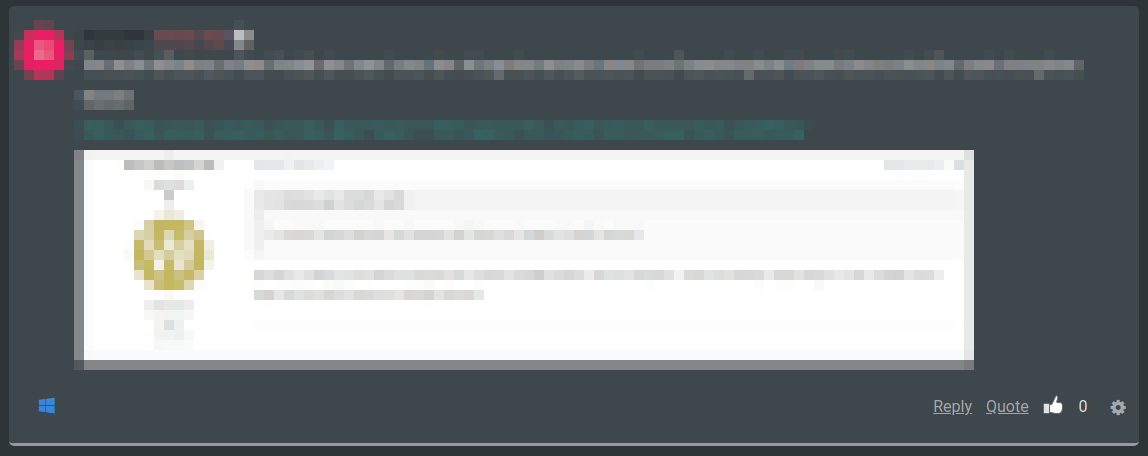
Cheers, mib