Vivaldi’s Blog gets a new look
-
@lars85 said in Vivaldi’s Blog gets a new look:
Vivaldi should also get a new polished look imo. There's a lot of inconsistancy between elements, and it could follow a few material design specs as it is based on Chrome, which greatly improved its looks.
There's some ideas to pick up there : https://material.uplabs.com/posts/google-chrome-redesignI agree that I think Vivaldi should get a design refresh/polish at some point. Not sure about the Material Design though. Things I do want in the design refresh is flattening of certain things like folders, the address bar(bringing it to the top, kind of like Safari/Brave, and yeah, Material Design-ish too)
And another thing I really want in Vivaldi is more and more rounded corners. They look so much more modern and friendly. When you have square corners, you tend to draw attention to them and bring a sense of alertness in a negative way. Why do you need to do that in software unless there's an emergency? I really like the way Apple and Sony of the past have made their designs all round and pretty. I would like it if Vivaldi could allow us to do that with rounded everything, including rounded edges of buttons like the arrows for back/forward, etc. I'm tired of this square trend that MS helped create.
I like how in Safari for Mac/iOS have the address bar forward with the drop shadow around it, and in the case of iOS, how flat it looks.
Eventually, if Vivaldi doesn't make the default design more refreshed/polished, then at least let us create skins for Vivaldi. I'd like to learn how to create my own skin so I can design it how I'd like it to be, and even share it with others.
-
@D0J0P: Rather than a different basic design, we will get more ability to customize the design ourselves. Everyone's tastes are different, so it's the wrong path to cater to any one person's or any one group's taste.
Volunteer Mod and tester on Windows 11 Home X64, i7-13700 @ 5.4 GHz turbo; Intel UHD 770 graphics; 1TB NV2 PCIe 4.0 NVMe SSD; 32 GB DDR4-3200 RAM. Community Code of Conduct
-
@helsten2 said in Vivaldi’s Blog gets a new look:
@dleon: No links here. No options at all. Can only type...
Me too... which is why i whinged. Yes, can still format a little in Forum [from which i'm writing this reply], but i was explicitly talking about the new Blog [the old blog allowed italics, bold, underline, size, colour -- via edit icons [not me having to "know" arcane markup codes; i'm not a programmer, so i do not know them]].
-
@helsten2 -- Agree.
-
@pafflick -- Ha! Thanks for your info. Possibly i'm more stubborn than you - i kinda insist [to myself] i'm not gonna unduly lower my standards, ie, i do mourn the loss of login capability now to the new Blog, but am not prepared to have to stop the 3rd Party blocking. If/when the Devs fix that, so i can once more login, then re the formatting maybe i'll try to get myself to apply the Markup method that iAN CooG mentioned [thanks Ian]. BTW, tis obvious by deduction, but i'll say it explicitly; am posting this from the Forum, not [unloginable] Blog.
♀ 🇦🇺
-
@Ayespy That would be good. If I can make it look like I want to aesthetically, share it with others or download other's designs, that would be great
")
-
@D0J0P said in Vivaldi’s Blog gets a new look:
And another thing I really want in Vivaldi is more and more rounded corners. They look so much more modern and friendly. When you have square corners, you tend to draw attention to them and bring a sense of alertness in a negative way. Why do you need to do that in software unless there's an emergency?
I think it's a subjective standpoint and I'm feeling exactly the opposite. IMO user interfaces with rounded corners look outdated and anything but modern (unless we're talking about circles - circles are OK in modern design). Roundness was considered "modern" some years ago, but nowadays it doesn't seem to be anymore. I'm not gonna talk about whether it's good or bad - things just come and go and design changes, whether we like it or not.
I haven't ever found myself drawing attention to some corner because of its sharp edges (such concept sounds a little bit odd for me, TBH), but I do pay attention to design a lot since I used to work as a graphic designer and web designer / web developer for a couple of years - and I still do that from time to time, but it's more of just a hobby now - sometimes I'm making some stuff for the company that I work for, but that's just it.
Anyway, I think the majority of both designers and end-users consider square shapes (and circles) stripped from gradients, shadows & other fireworks to be modern and fancy, whereas rounded corners seem to be the thing of the past. If you don't believe me, just ask Google how does modern UI look like...

@D0J0P said in Vivaldi’s Blog gets a new look:
I really like the way Apple and Sony of the past have made their designs all round and pretty.
I like how in Safari for Mac/iOS have the address bar forward with the drop shadow around it, and in the case of iOS, how flat it looks.I don't know about SONY (certainly you're not talking about their website, which follows the "square design" concept), but as for the Apple, their UI looks like it's been made in early 2000's (at least the one that I remember from couple of years ago - I haven't been on Mac for quite a while).
I do have iTunes on my PC and it follows Apple's UI design and that's probably the second thing I hate about it (the first being its eagerness to install services that I don't need nor use only to eat my resources while they launch automatically in the background
 ).
).I've had Safari on my PC a few years ago and it was just as ugly as iTunes at that time. Even its fancy start page never really convinced me - to me it somehow looked modern and ugly at the same time. I don't know about current versions of Safari and I barely do know anything about iPhones and iOS, but the little of design that I saw never really appealed to me.
Of course, all of the above is just my personal point of view. But I also need to mention that Vivaldi's UI was the first thing that I loved from the first sight when I discovered it 2 years ago.
 I agree, though, that Vivaldi should offer more visual customization settings so that the both of us could get the browser personalized to fit our tastes.
 -
@Steffie I'm posting on the forums exclusively and I'm glad that it was finally merged together because I never really liked the comments system on the blog. The only thing I miss on the forums is the threaded view.
But I don't care about logging into the blog issue - I kind of got used to the state where I was logged in on the forums at all times whereas on the blog I was always logged out.
 So, I don't bother posting comments and replying to them on the blog - I'm glad I can do that from here (the forums).
-
@pafflick -- yeah, like i said, i'm a stubborn ole cow. Anyway, my feeble little mind is still reeling from this new paradigm of blogs in forum & forum in blogs; the intermixing is making my head near explode in confusion. The non-login for Blog is just added icing on the explosive cake. Like you advocated, until it's fixed, i'll do my posts in/from the Forum [assuming i have not exploded first].
-
@pafflick I don't think rounded corners are really a fad. It's actually quite genius in design.
I read so many articles that talk about why rounded corners are friendlier, more modern, prettier, and generally easy on the eyes then square or edgy corners are. I'll show some of them to you if you're interested:
https://designmodo.com/rounded-corners/
ux.stackexchange.com/questions/11150/how-do-rounded-corners-affect-usability (also has many links within that link)
Contour Bias in Universal Principles of Design: Here
Why Rounded Corners are Easier on the Eyes: http://uxmovement.com/thinking/why-rounded-corners-are-easier-on-the-eyes/
Why Do We Love Rounded Corners: www.basement.org/2005/11/why_do_we_love_rounded_corners.html
What Makes Rounded Corners More Attractive than Sharp Edges:
http://www.wiliam.com.au/wiliam-blog/what-makes-rounded-corners-more-attractive-than-sharp-edges-In the Secret of Apple Design, it says in a paragraph: "Case corners were rounded, but to differing degrees: if the curve at the back of a computer had a three-millimeter radius, the one at the front had a two-millimeter radius, reducing the machine’s perceived size. In addition, the rounded corners and lines echoed distinctive features of the Mac user interface of the time: rounded screen corners and horizontal lines in the grab bars of windows."
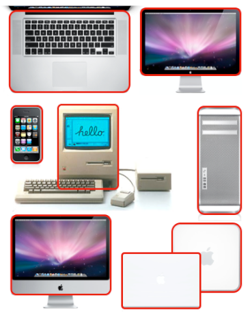
If you look at Apple products, literally EVERY single one of their products, in both hardware design and software design, are rounded, and have rounded corners.
As for Sony, it's more their older products, but you do see some of their more recent stuff, all having some very nice, sleek, rounded designs:
http://idg.bg/test/pcw/2016/3/16/25293-Sony_PlayStation_VR-2.jpg
Look at that. Quite beautiful. Not perfect, but very good. It almost reminds me of the Stormtrooper outfit, which is also quite rounded.
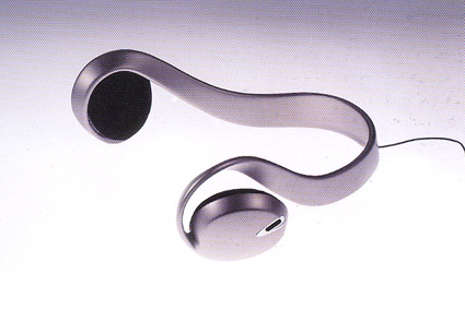
More Sony designs:
http://gemssty.com/wp-content/uploads/2012/12/sony-earphone-concept-1996.jpg
http://www.design42day.com/uploads/LED_bulb_Sony-4.jpg
http://www.sony.co.jp/SonyInfo/design/works/products/img/index_life_space_ux.jpg
As for having sharp edges in design, there's a time and a place of course, but when is there a right time and place for square corners in software design? I think that would make sense if there was something really important, like an emergency alert, trying to warn you of something, but other than that, things just look very nice when rounded.
Material Design is okay. It's nice and flat, it's got good drop shadows. If it were rounded, it would be nicer IMO.
I think we're just in a fad of sharp edges, which is fine, but I wish more people would copy Apple and Sony designs.
Yeah, I have pretty strong opinions on rounded corners. If you want, I can start a new thread just for rounded corners and design, just to give the Vivaldi designers some fodder to think over
-
@dLeon It doesn't have to be a fight. I like discussion like this if it grabs the dev's/designer's attention and gives them, and us, something to think about. Plus, it'd be another interesting topic to talk about in the forums.
-
please add the number of comments to the news overview at the blog page
-
After my first "shock" about all the missing options (changing formats, smileys, no edit!) I decided to turn my rant into hope that these things will be added soon.
Single-log on - finally! Thanks for that.And yes, the look is better - but the features need some updates.
someone
-
@D0J0P I do agree about the physical products design. There's no question that rounded corners are much better from sharp edges in that field - especially when it comes to usability (with a little exception for things that have to have sharp edges in order to be usable, like eg. scissors or things that have square edges because of the technology that they're made of, like eg. screens).
However, we're talking about User Interface design. That is a totally different thing and it hardly has to to do anything with physical products. So, I guess we can put them all aside.
Now, I admit that I haven't read all the articles that you've linked (I don't have time for that
 ), but from all that I saw in them, I found a few problems:
- They're old. The newest one was published in 2012 (if I'm not mistaken) and while some basic concepts presented there are true and valid despite the time when they were published, taking advice from design guidelines this old is probably not a good idea (considering the design samples presented there). That's because the overall guidelines for design can change quickly and rapidly in the fast evolving virtual world.
- They don't follow their own guidelines. I mean, the majority of the websites on which those articles were published use the "square" design for web elements such as navigation buttons, menus & other.
- Most of them don't seem to be written with UI design in mind - mostly they are just a basic set of rules for various things including physical products and the design in general. We can't apply all of them in the UI design.
- While not all of them are illustrated, some of the visual examples presented there are just ugly (those from Stack Exchange or Basement.org for example). But Uxmovement stands out with particularly terrible examples of the "spiked ball" and the diagram, which is so explicitly bad and counter-intuitive, that the supposedly worse, square diagram is actually much easier to follow and intuitive. I'm not sure if we've discussed this before, but I remember seeing this article with that terrible, rounded diagram before...
This is a difficult topic actually because there's no "black & white". UI design (like many other things) is a search for a compromise between the looks and usability. But rounded corners raise some issues on the technical side. For example, rounded buttons can be clickable only on their visible area or on all of their spatial area (meaning that you'll be able to activate the button by clicking on its corner as if it was squared). In the second case, there's no problem, but if the "clickable" area is stripped along with the visible area, then it's harder to click that button. This might not be a problem when the roundness is small (between 2-6 px), but larger radius makes the button less accessible - especially on touch screens which became so popular today.
There are also other factors, like personal experience or taste. For example, the concept of square objects reminding of alerts or danger is unfamiliar to me, though I'm talking about a personal experience here. But nevertheless, I won't dare to say that rounded corners are better for UI design or the otherwise. It's not that simple and it's not obvious. It's a matter of preference. We're all different, our perception differentiates, thus creating one, universal solution is impossible.
-
@kisunssi said in Vivaldi’s Blog gets a new look:
Whilst I like the look of the new design, I am experiencing some problems with it, some of which (e.g. being unable to log in/post directly to blog [this is via forum], excessive refreshes) have already been noted on this blog.
Please make sure that you're not blocking third party cookies or at least add login.vivaldi.net & forum.vivaldi.net (or the whole vivaldi.net domain with all of its subdomains, that is
[*.]vivaldi.net) to your exceptions list.@kisunssi said in Vivaldi’s Blog gets a new look:
I would also note that there has been a change to the voting system (which may, or may not, have been intended).
There was no change to the voting system, the whole commenting system was adopted from the forums, along with all of its features (text formatting, voting, replies etc.)
@kisunssi said in Vivaldi’s Blog gets a new look:
Previously, it was possible to up-(or down-)vote in the blogs without being logged in.
That was in the previous commenting system which was based on Joomla and now it's based on nodebb, thus everything has changed even though it may look similar.
-
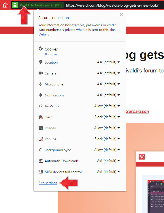
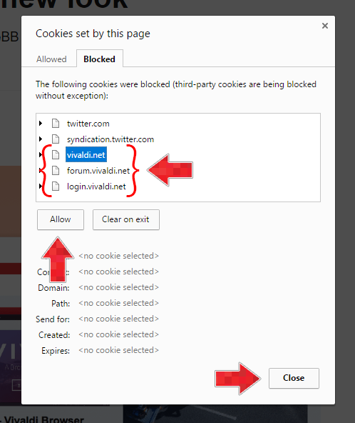
As people are still struggling to log in to the new blog platform, I've made a tutorial on how to allow cookies from vivaldi.net on the blog.
People are sometimes confused by this, so first of all, I need to explain that Vivaldi uses two different domains for their web services:
- Vivaldi.com which is the main website of the company. It's the place where you can download the browser, read articles about it, read the team blog (which was moved here recently from vivaldi.net), contact them and find other stuff related to the browser or the company.
- Vivaldi.net which is used for their community services, such as the webmail, the forums and user blogs.
The blog was moved recently to vivaldi.com, but the comments are loaded from the forums, which are located on vivaldi.net (that is a rough explanation, but it should give you an idea of what is going on here). A lot of people use the "Block Third-Party Cookies" setting, which can be accessed in the Privacy Settings (vivaldi://settings/privacy/). This causes the browser to block cookies from Vivaldi forum on Vivaldi blog page, as it is located on another domain.
Here's how to fix the login issue:
First, make sure that you're not using any extension that could block cookies from third-party domains (like uMatrix, Privacy Badger etc.). If you white-listed vivaldi.net & vivaldi.com domains there (or disabled the extensions) and you're still unable to log in or comment on the blog, then follow these instructions:
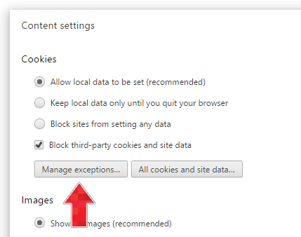
Add vivaldi.net to Cookie and site data exceptions through the Content settings page:
- Click on the site's info badge in the address bar and click on "Site settings" in the newly appeared menu below.
- Click on "Manage exceptions" below the Cookies settings.
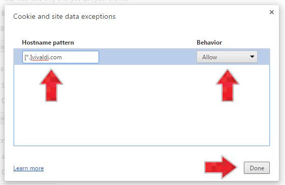
- Add
[*.]vivaldi.net, select "Allow" and press "Done".
Another approach:
- Click on the site's info badge in the address bar and click on "x in use" below "Cookies" in the newly appeared menu below.
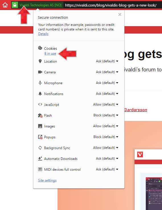
- Click on the "Blocked" tab.
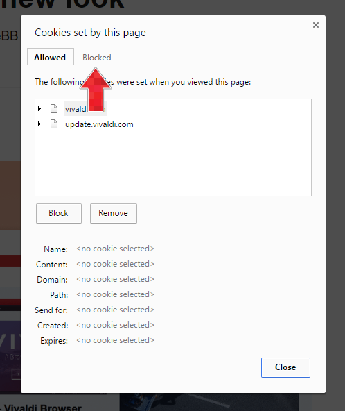
- Select all domains with "vivaldi.net" and click on the "Allow" button for each one. Click close when you're done.
-
@pafflick -- FABULOUS work on your part -- Onya!! [= Oz for good on you].
-
@pafflick said in Vivaldi’s Blog gets a new look:
If you white-listed vivaldi.net & vivaldi.com domains there (or disabled the extensions) and you're still unable to log in or comment on the blog, then follow these instructions:
Excellent guide.
As your screenshots already have vivaldi.com allowed - it is worth emphasising that one should end up with BOTH domains ( vivaldi.net & vivaldi.com ) in allowed area.
-
@TbGbe Yeah, I realized that when it was already too late to edit my post (I really hate that one-hour time frame for editing own posts). There's no need to add vivaldi.com there, but it won't break anything either...
-
@pafflick Excellent tutorial, now working like a charm. Used it to successfully solve problems with logging in into other websites. I wasn't even aware of that menu and all those options.
Thanks a lot for taking the time to write this so thoroughly!