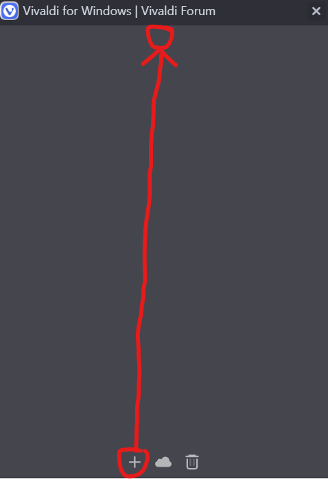
V 6.7 | Vertical Tabs | New tab button moved to end of side tab bar
-
@Edward802
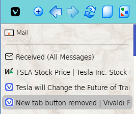
Hi, this is the new "design", for user with 30+ tabs the button under the last tab is useless.
Depends on your workflow Ctrl+T is maybe faster than moving the mouse. -
@mib2berlin
Feel like you did not read my post.There WERE two choices. Use the one YOU prefer. Now there's only one.
In the past, there was a floating new tab button that moved, and a fixed one that did not move.
The 30+ tab people have always had the fixed button option.
Why was the other option removed? Many of us have years of muscle memory going to the variable button.
At least provide an option to turn it back on. -
@Edward802
I read two choices but don't know what do you meant
Which version was this, this was Vivaldi 6.6:
-
@mib2berlin
I no longer have the old version, and I'm not going through the hassle to rollback.
I guess the old behavior made it seem like it was in both places, because if you maxed out the tab space it flowed into what is now the the new location.I don't understand when groups make breaking changes to the user experience.
If you want to add something new, fine. But the old code is there and many of your existing users love it. Write your new code, and a few more lines with a options in settings to give people the choice.
Especially when it comes to what is probably the MOST clicked button in the app.
Just why?!
-
@Edward802
I checked 6.5 too, it's the same but understand it is sometimes hard to change habits.
I use standalone installs, don't downgrade Vivaldi it break your user profile.Cheers, mib
-
@Edward802 I understand why the change was made, but it would have been better to move the recycle bin, synced tabs, and new tab buttons to the top of the tab list for easier access. Others may prefer it at the bottom of the tab bar, where the most recently opened tab is more like to be. I assume that people like me who open very few tabs prefer the tabs at the top; and users who use the vertical tab bar usually open lots of tabs.
- Create a new Command Chain for New Tab or New Top Level Tab
- Edit the theme to add a custom button for the new Command Chain
- Customise the Address Bar to drag the new button to the left of the toolbar
I hide the trash can and use a rocker gesture to show the closed tab list, but I guess you could make another Command Chain button for that too.

-
Im very disappointed with this change as a fan of vertical tabs. Please revert it or make checkbox in settings for this.
-
@terconn The change may evolve to button at the bottom of the tabs until they overflow, and then button added to the trashcan/sync cloud space.
In the meantime, I am changing to double-clicking the empty space below the tabs as long as there is any empty space. That way I still get the new tab without having to move my mouse to the bottom.
-
This is a massive UX fail. As soon as design introduces extra clicks, extra movement or extra hot keys means that something went sideways.
My biggest issue is that we don't have option to put it back to it's "original" place.
Talking about the trash that's another issue that we have to scroll down all the way in order to get it emptied. I hope to see a feature to disable it all together

-
Customization is what makes Vivaldi great. It's the #1 reason why I choose Vivaldi. So taking away a feature that we like makes no sense at all. If I wanted to have my options torn from me for the sake of some unknown person's UX theories, I'd be using Chrome. Please, Vivaldi, bring back the option to have the New Tab button directly under the vertical tabs.
-
Hi, you can only make a feature request to make it a setting or something, if enough user vote for it there is a chance it gets implemented.
https://forum.vivaldi.net/category/185/desktop-feature-requests
Cheers, mib
-
I use this button hundreds of times a day, and now it is moved to an inconvenient place. Is there a way to put it back where it was before the latest update?

-
To be clear, the "add" button at the bottom of the tabs that was hidden with overflow was never a feature. It was always a bug - one that received several bug reports. So moving the button to the immovable space at the bottom of a vertical column where it would always be visible (specifically requested in more than one report) was an effort to deal with that bug. I feel that was a non-optimum effort. While it did eliminate scrolling and searching for the button, it replaced it, in the case of low numbers of vertical tabs, with mouse movement. There's a better way to do it.
But in the meantime, as I say, I just use the double-click. This adds less than a tenth of a second (may even save time by not having to locate and precisely hit the button) to the new tab generation when there's empty space. The location of the new tab button saves time in all cases when there is no empty space.
I suspect an analog to the horizontal tab behavior will be developed.
-
When the tabs bar is placed on the left, the button for creating new tabs is now placed at the very bottom, next to the button for showing closed tabs. How to place the open new tab button next to the last tab, as it was before.
-
@Isorkin
Hi, this is not possible, to my knowledge this was a user request with many votes to make this button not a moving target.
You can double click in the empty field to open a tab as new workflow to open a tab.Cheers, mib
-
double-clicking the empty space below the tabs
Whooaaa Batman!
Talk about super unknown hidden feature.
Don't know of any other GUI's that use this kind of action.
Thanks for calling this out. -
Another comment on this breaking change...
After the update, the browser presents a new tab to the user:
https://vivaldi.com/newfeatures?hl=en-US&version=6.7.3329.17&os=W
Redirects to
https://vivaldi.com/new/There's nothing on that page today about this change.
When one of the most clicked buttons in the app is going to be changed, please write something about it on this page.
I would have been a-okay if I saw something there about this "double click blank space where the button used to be".
Confused, but at least my workflow could have continued... -
@Edward802 There are too many changes in the update to highlight every bug fix, which is what this is.
The Changelog on this page lists all of the fixes and new features.
- [Tabs] When the tab bar is on the left or right, the new tab button isn’t fixed (VB-17646)
-
Is it possible to add choice to the settings?
If the tab bar is located at the top, then the button is located immediately behind the tab. -
@brinkbolt New tab on top might be easy as long you move the whole buttons block. Unsure if easy to move it where it was before:

#tabs-container .resize {order: 1;}
