-
why such a strange choice ? For example, I use the search very rarely, but I need my account, there is more useful. On a mobile device very limited free space . Desiners decided to use a fashionable features CSS "sticky". Mobile browser not a place for training. There really isn't enough square for that.

-
@sphera Yes, sticky nav can waste too much space, i agree.
Is your post a feature request? Then https://forum.vivaldi.net/category/186/community-services-feature-requests is the correct place.
-
Yes, this is requests for forum
-
@sphera I do not understand, do you need a discussion on this or want to request a feature?
-
don't think out for me. Moderator may simply move it to "requests"
-
L LonM moved this topic from Forum on

-
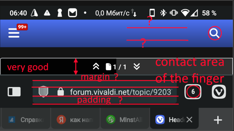
These are huge empty spaces that are completely unused. The contact area of the finger is about 5 mm. For what the rest ?
I can't find an explanation. Would you say it 's hard to get into the panel ? Which has only buttons Search or Login ???
I use a keyboard with an adjustable height of 50%. There EACH button is no more than 5 mm. I hit the buttons perfectly, I type huge texts from my phone, which I am constantly reproached for - they get tired of reading, they don't keep up with my thoughts. -
The height of the slider is good, except for one observation - it is not needed at all. On a PC , it will do on the right and does not interfere with the review . There is limited space on the mobile. Yes, it is here that little-used elements are needed, taking up useful area.
YES, I use the scale of the browser interface. This is a huge achievement in customizing the interface Vivaldi.