Edge-like Vertical Tabs
-
Hello,
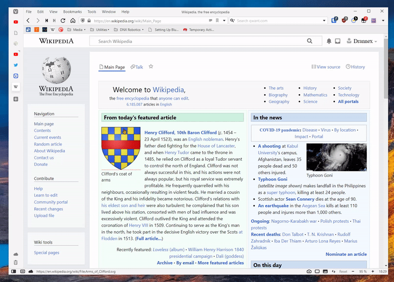
I have spent the last few hours working on a similar design (with almost pixel perfect recreation, and some goodies and cleanup) creating a sidebar tabs/vertical tab layout similar to what is being tested in the latest Microsoft Edge.
Personally, I absolutely love their design, the way they work, and everything about them. I have been trading Vivaldi/Edge on and off because of it. But, because they are an alpha only feature they disappeared recently. I spent the day redesigning them from visual only and it took about four or five hours.
This is the first time in years that I have modified Vivaldi, but I made sure that they work regardless if you use tabs to the left or right. should would work with any themes and look visually similar no matter your color preferences, everything that needs to be rounded, is rounded according to your specifications, hibernate and unread tab indicators are there, and if you have tab thumbnails enabled this will show them on hover of the vertical tab bar. I also went ahead and tested horizontal menus and the different application icons to make sure they all line up properly.
I hope someone else enjoys using this, I'm sure there are bugs but the CSS is fully operational for now.
I've posted it here: https://github.com/drannex42/vivaldi-mods/blob/master/edge_style_vertical_tabs.css
-
@drannex42 Welcome to our fabulous Vivaldi mod forum!

I think u need to add a margin equal to the thickness of the shrunken tabbar at the edge of the window to display the entire width of the webview content. Try this code:
#browser:not(.fullscreen).tabs-left #webview-container {margin-left:35px;}
#browser:not(.fullscreen).tabs-right #webview-container {margin-right:35px;}
You can study my version of automate vertical tabbar mod over here: https://forum.vivaldi.net/post/365881Have fun!
Sorry, I'm currently hiatus from updating any of my CSS mod until further notice...
-
Interesting... Edge is resurrecting an experiment that Chrome killed taking "a bit of inspiration" from V mods, it seems :3
-
@dude99 said in Edge-like Vertical Tabs:
#browser:not(.fullscreen).tabs-left #webview-container {margin-left:35px;}
#browser:not(.fullscreen).tabs-right #webview-container {margin-right:35px;}I tried a similar solution, but for the layout to be in position properly I had to shift the entirety of the #main container by fifty pixels.
-
@drannex42 Oh, I see. Now you mentioned that, i notice it's a much better solution to dealt with panel too. Thank you for your new idea!
-
I've fixed a number of things since yesterday, heres the quick and simple update log:
v1.0.1-1.1.0: Fixed tab positioning, roundness, notification icons, audio icons, improved theme colouring, tab overflow, scrolling, vivaldi/menu icon positions, and many other improvements.
v1.1.1: Added tab thumbnails (when enabled in settings) and the appropriate tab positions for when they are in use.
I'll try to keep this page updated as it goes. I will try to keep updates in the css file, as well as an updated version system.
-
This is a wonderful mod, thank you very much! I used it for a while, and I am definitely loving it!
One thing I wanted to notice is that the favicons of the internal Vivaldi pages (like Speed Dial or Settings) are white and not visible on the light theme, when the tab bar is minimized and these internal pages are opened in the background. I've recreated it on clean profile with no other mods enabled except this one (v1.1.1).
-
@Ararararagi I just fixed this for you! I had to set the importance of the color of the tab. I hope v1.1.2 works for you! Thank you for alerting me to the issue!
v1.1.2: Fixed favicon svg on internal pages on light themes.
v1.1.3: Fixes the coloring on the close buttons, no longer attached to the accent of the window, but on the foreground lightest color. This tends to be far less jarring. -
Thank you for the update.
It seems that the fix is do be working at least on the default 'Subtle' theme. But default 'Vivaldi' theme, for example, still has the same bug. It is reproducible after switching from the Subtle to Vivaldi theme and restarting the browser.
Also, I noticed that favicons don't dim when tabs are hibernated (and when that option is ticked in the settings, of course). It is a minor inconvenience really, but it would be great if you could implement it.
-
@Ararararagi I have updated the file for the newest changes described below, I am not able to reproduce the issue you are having with switching from subtle to vivaldi and restarting the browser. Quite a curious issue.
v1.1.4: Added hibernate (.isdiscarded) class (dims tab - if you change this option in settings, browser restart required), added unread tab indicator. Thanks @Ararararagi for pointing out these needed features!
-
@drannex42 It is really strange, but today I, too, couldn't reproduce the issue I had previously. I guess it was something on my end and it somehow fixed itself. Puzzles me. But now everything works fine!
Thank you again for your time and work.
-
v1.1.5: Minor update, notification badge has better positioning and padding, fixed the overflow menu and scrollbar overlay settings to be more native.
-
v1.1.6: Fixed fullscreen bug on some monitors as reported by /u/Tsopek on reddit, also added label to the synced tags button on the toolbar, fixed the overflow overlay, and the overflow scrollbar appearing in some cases when not hovered.
I am trying to figure out how to get the 'New Tab' button to be fixed to the bottom of the tab-strip container when the tab bar is overflowed, if anyone has any ideas on how to do this please let me know. I have tried a multitude of solutions, but none of them have really fared well. @dude99 do you have any suggestions?
-
@drannex42 This should work like you described:
#browser:is(.tabs-left, .tabs-right) #tabs-container.overflow .toolbar-tabbar {position: fixed; bottom: 0; z-index: 3;}
#browser:is(.tabs-left, .tabs-right) #tabs-container.overflow .newtab {top: 0 !important;}
If you don't want the tab list overlapped with newtab button you will need to reduce it's height with:
#browser:is(.tabs-left, .tabs-right) #tabs-container.overflow .tab-strip {max-height: calc(100% - 30px);}Also, u can remove
.overflowif you want the newtab button to be fixed at bottom permanently.
Then, another solution would be using js to move the newtab button into.sync-and-trash-container, this would be the best solution if you don't mind using js mod along with css mod, because this will allow all 3 buttons to stack nicely in a row when the tabbar is shrunken into 50px.Hope this help. Enjoy!
")
-
v1.1.7: Removed absolute positioning on tabs, and made the new tab button sticky to the bottom of the overflow tab container!
I had to force the tabs to no longer use an absolute position for their placement, and instead of make them to be static (as they should've been). I then set a size of the overflow menu to have a max height of 85% of the view, and then set the newtab toolbar group to have a 'position: sticky;' attribute and bonded it to the bottom.
I had to add additional padding to the bottom so that the newly created tab does not go below the new tab button, and is instead in view, and so I had to create a bottom offset and a different padding to get that effect.
-
v1.1.8: Realigned new tab button to be alongside the trash and sync buttons (when tab overflow happens), added config section below, fixed trash & sync svg sizes.
If you have the statusbar disabled (or hidden) you can now uncomment/toggle a line at the top of the CSS to remove the whitespace between the new tab button and the sync/trash buttons the bottom as well.
-
v1.1.9: Fixed tab stack visual (better alignment of tab indicators).
v1.2.0: Centered (vertically and horizontally) the tab title in the header bar at the top of the window when you have the horizontal menu enabled.
I was going to make that text a hair bigger to make it more inline with the horizontal menu font-size, but I feel that the vivaldi team made the right move to reduce the size of the font. I disagree with their bottom aligning positioning for the header, so I did end up fixing that.
-
The latest Vivaldi Snapshot added some new features and broke things (for the better)!
v1.2.1: Updates for latest vivaldi snapshot changes: added styling for additional tabbar container, readded border width, added removal of the new tab bar container width, fixed sync and trash container from being offset.
Someone messaged me asking to flip a few things for the right side (previous use case: when on the right side when you clicked where the favicon was, you would click the close button). I have come up with a simple and great solution for those users, and now that will no longer happen.
v1.2.2: Flipped how the favicon and close button are displayed for users using this on the right side of the screen.
You can get the new css styling here!
-
v1.2.3: Updated the tab selection svg size/border positioning as latest vivaldi changed how they handled tab selections .
Vivaldi changed how they handle the tab selection display, since it is no longer class based and has shifted to an svg icon, I had to update the positioning on it to be in line with the rest of the tabs. Click here to download the latest version.
-
@drannex42 Thank you for this update. Now I don't have to catch new tab previews before they disappear after the tab bar collapses!