(History of) Vivaldi Feature Requests
-
Is the source editor on the roadmap to be added to Vivaldi? This is one of two missing features keeping me on O12 (the other being mail which I know is coming).
For those who missed out on the joy of Presto-Opera the source editor gave the ability to view the local copy of the page source (not load the remote source again), edit the raw html then press Ctrl+R to immediately view the changes.
-
Vivaldi Feature Request
Third interface color theme: contrasty dark gray

Like this

-
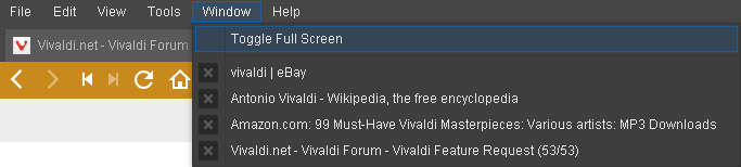
Add the ability to close tabs from the "Window" drop down in the menu bar:
[attachment=1504]WindowMenu.jpg[/attachment]
Like this, or maybe close icon just appears when hovered over.
Attachments:
-
I have to wonder why. Are you trying to work without the Tab Bar?
Even the old Opera cannot do this, BTW.
-
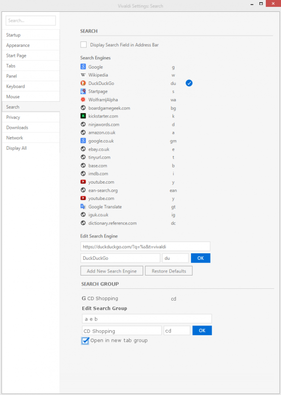
I've mentioned the idea of a "Search Group" before, but here I will attempt to illustrate exactly how I think it should behave. The additional user interface requirements are minimal, and this could be a unique power-user selling point for Vivaldi. The idea is simple: a single "search" opens multiple tabs of results. For example, instead of searching for the same product multiple times on multiple sites, a single command does it all for me. At the moment, to get the best price for a CD my actions would be:
- Ctrl+T. Type "a Dark Side of the Moon". Highlight "Dark Side of the Moon". Ctrl+C. Return.
- Ctrl+T. Type "b ". Ctrl+V. Return.
- Ctrl+T. Type "e ". Ctrl+V. Return.
This would open three tabs for the sites amazon, ebay and base, each with the results I was looking for. The alternative:
- Ctrl+T. Type "cd Dark Side of the Moon". Return.
The new tab is replaced by a tab group containing three tabs, each with the results I was looking for.
The user interface requirements are minimal. Simply extend the "Search" section of settings with a "Search Group" section, where each Search Group has a name and a keyword (like a normal search), but the "URL" is instead replaced with a list of existing search aliases. To illustrate my point, I have created a mock up of this:
[attachment=1511]SearchGroupMockUp-2.png[/attachment]
I have a feeling that when people get used to this and set up their groups of commonly used searches, they will wonder how they ever lived without it… The closest a Chrome extension has come to this is the "Search Center", however it does not permit assigning keywords to the search, the UI to configure searches is clunky and, of course, it cannot take advantage of tab groups. The proposal I have made above should be very easy to implement, easy to configure and introduces virtually no clutter to the UI.
Attachments:
-
The Chromeless Menu is neat, taking up no space on the Windows title bar.
It might be neat if the Alt key would show/hide the menu in both Chromeless and Window mode.
[attachment=1520]ChromelessMenu.png[/attachment]
Attachments:

-
Vivaldi's getting better every day - soon I'll be able to ditch my old Opera 12…
")
One of the features I've been waiting for a long time is RMB+wheel to switch tabs - but! might it be possible to change/customize the direction of the scrolling? I've been using RMB + wheeldown to get to the next (right) tab for ages
-
Vivaldi's getting better every day - soon I'll be able to ditch my old Opera 12…
One of the features I've been waiting for a long time is RMB+wheel to switch tabs - but! might it be possible to change/customize the direction of the scrolling? I've been using RMB + wheeldown to get to the next (right) tab for ages
Hi Morg, this is already working
I'm not sure what version you are on, but for some time now, I've been able to do this. Go to the team blog and download the latest snapshot! -
noshankus - I think you missed the import of Morg's comment. I think he a) celebrates the fact we have rmb+scroll switching. However, he wants it to be reversible, so that when you roll the wheel down, you go to the NEXT tab, not the PREVIOUS tab.
-
noshankus - I think you missed the import of Morg's comment. I think he a) celebrates the fact we have rmb+scroll switching. However, he wants it to be reversible, so that when you roll the wheel down, you go to the NEXT tab, not the PREVIOUS tab.
D'Oh! :pinch:
You're completely right Ayespy, I misread that for sure! -
I would love a feature that shows the url when you hover over a link. Something like this: http://i.imgur.com/P5FQjax.png .
I'd also want the tabs to show a loading indicator because it always feels like the tab stopped loading/froze. -
I would love a feature that shows the url when you hover over a link. Something like this: http://i.imgur.com/P5FQjax.png .
I'd also want the tabs to show a loading indicator because it always feels like the tab stopped loading/froze.The URL does show in the status bar when you hover a link.
-
I would love a feature that shows the url when you hover over a link. Something like this: http://i.imgur.com/P5FQjax.png.
Agreed. The tooltip is in the right place. The status bar hint is not visible if you're looking at the mouse cursor. The status bar can also be disabled, but there's still no tooltip.
I think it's intuitive to have a tooltip next to the link, as we always used to years ago, but if the link is a long one, it will usually still fit in the status bar. I wonder what the cutoff point should be for how long the tooltip is, and how much other page content it should cover, every time you hover a link. I think there's a point at which it could become a distraction and disruptive of good browsing.
For instance, there are these articles one finds (usually in tech or trade journals on line) which pop up a link or some often irrelevant information, every time you accidentally pass a cursor over one of the underlined words in the text. Drives me absolutely mad. So I guess there's more than one thing to consider regarding tooltips.
-
I would love a feature that shows the url when you hover over a link. Something like this:
Agreed. The tooltip is in the right place. The status bar hint is not visible if you're looking at the mouse cursor. The status bar can also be disabled, but there's still no tooltip.
I think it's intuitive to have a tooltip next to the link, as we always used to years ago, but if the link is a long one, it will usually still fit in the status bar. I wonder what the cutoff point should be for how long the tooltip is, and how much other page content it should cover, every time you hover a link. I think there's a point at which it could become a distraction and disruptive of good browsing.
For instance, there are these articles one finds (usually in tech or trade journals on line) which pop up a link or some often irrelevant information, every time you accidentally pass a cursor over one of the underlined words in the text. Drives me absolutely mad. So I guess there's more than one thing to consider regarding tooltips.
The cutoff point should be customizable.
-
Two things I like about Opera are the ability to have multiple rows of tabs, with no reduction in their width as you add more (I never did like stacking), and the View/Style/User Mode facility to get over-formatted web pages back to something like the old days of Mosaic (black text on white background, blue links, purple visited links). Any chance of porting those features across to Vivaldi?
[P.S. I do like what I see so far - nice work!] -
View/Style/User Mode facility to get over-formatted web pages back to something like the old days of Mosaic (black text on white background, blue links, purple visited links).
See Page Actions at bottom right of the status toolbar.
-
See Page Actions at bottom right of the status toolbar.
Thanks Pesala. As far as I can see, it lets you choose colours but not things like disabling CSS to get the page back to basics. Or am I missing something?
-
I would really like to see Vivaldi's boot up time to decrease. It takes significantly longer than most other browsers to open up.
-
It takes significantly longer than most other browsers to open up.
That's to be expected with alpha/beta versions before first release.