Get Tab Grid layout flag back(Option to change how tab switcher looks).
-
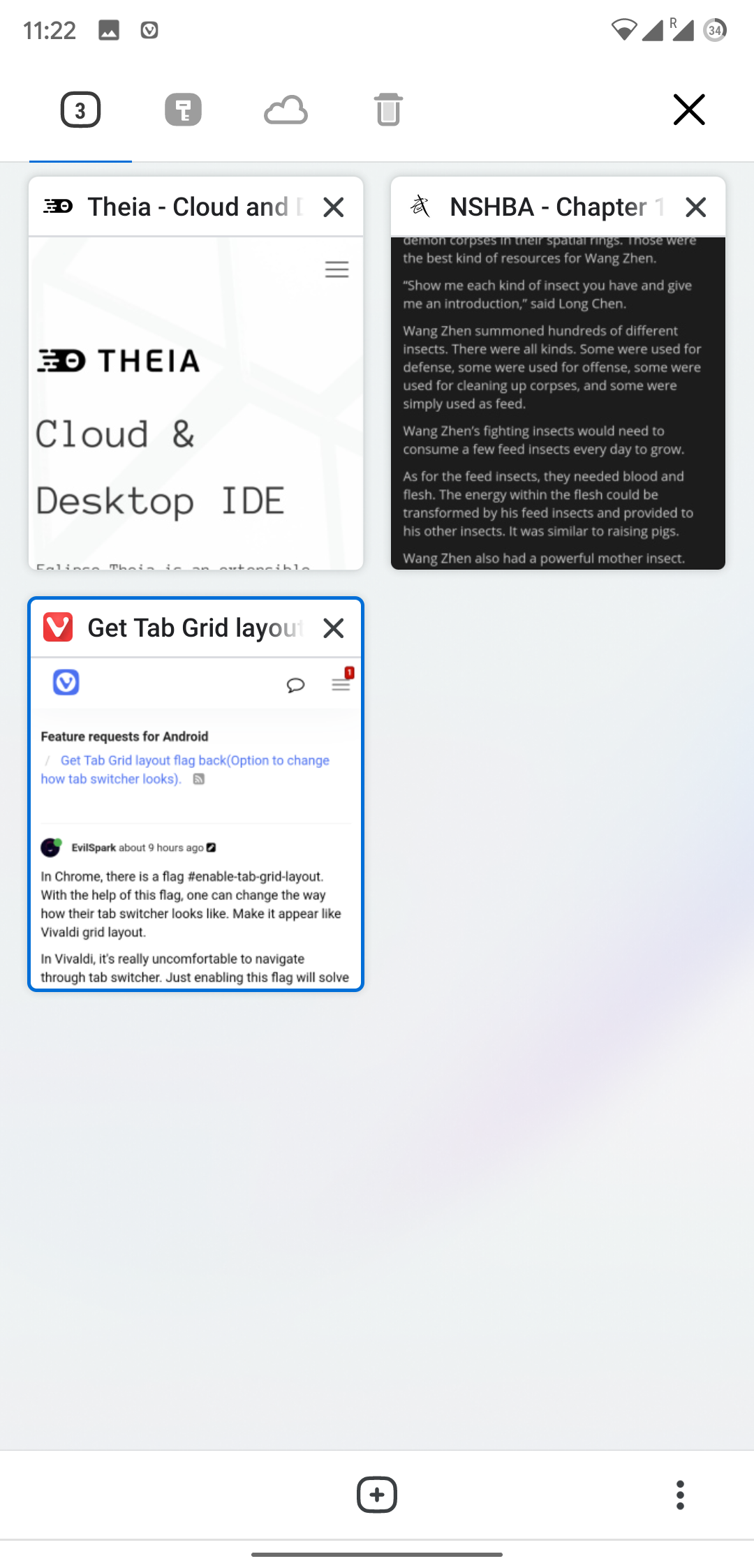
In Chrome, there is a flag #enable-tab-grid-layout. With the help of this flag, one can change the way how their tab switcher looks like. Make it appear like Vivaldi grid layout.
In Vivaldi, it's really uncomfortable to navigate through tab switcher. Just enabling this flag will solve lots of problems for me at least.
I prefer the original chrome tab switcher most due to its easy operation.
The tab strip looks good but to be fair, it's pretty useless. No one's gonna move their fingers to the top of big screens mobile phone. It was only good until 5 inches of phones were used.
-
Can you please provide a screenshot of the Chrome layout you are talking about, to give a better understanding of what you mean?
-
Vivaldi is like this
Chrome is like this

-
@EvilSpark Thanks for your request. Unfortunately we inherited this flag from Chromium and since they removed it, we're not able at this stage to bring it back. Thanks for your understanding.

-
Thank you for your request. As this post has had less than 5 votes over 4 years it will now be archived.
-
 LLonM moved this topic from Mobile Feature Requests on