Opera GX Mod
-
Hi, I recently start working on this mod for personal use only, but when I saw that Opera received a prize for the browser design, I decided post my mod here.
The code, theme and some instructions is available here: https://github.com/GabeVilela/Vivaldi-GX/tree/master/ModActual version: 1.4


Special thanks to:
@tam710562 -
@gabevilela I like the way you handle effects with tabs. Good job
-
Hey there,
I love your mod !!! this is really good,
I noticed some bugs :- there is 1 pixel oen the left of the panel :

- Can the panel background (blacked) can fill all the way to the top ?
- there is a color difference between adress bar/bookmark bar and extension area/home, return button


thank again for this mod, love it
- there is 1 pixel oen the left of the panel :
-
@remi-flores Hi, sorry for the late reply. Anyways, fixed that 1px bug in the sidebar on release 1.3
-
-
@Phosphorus If you want people to be able to read your asterisks, you need to "escape" them with a backslash:
*..... this is *..... awesome.
modedit removed language
-
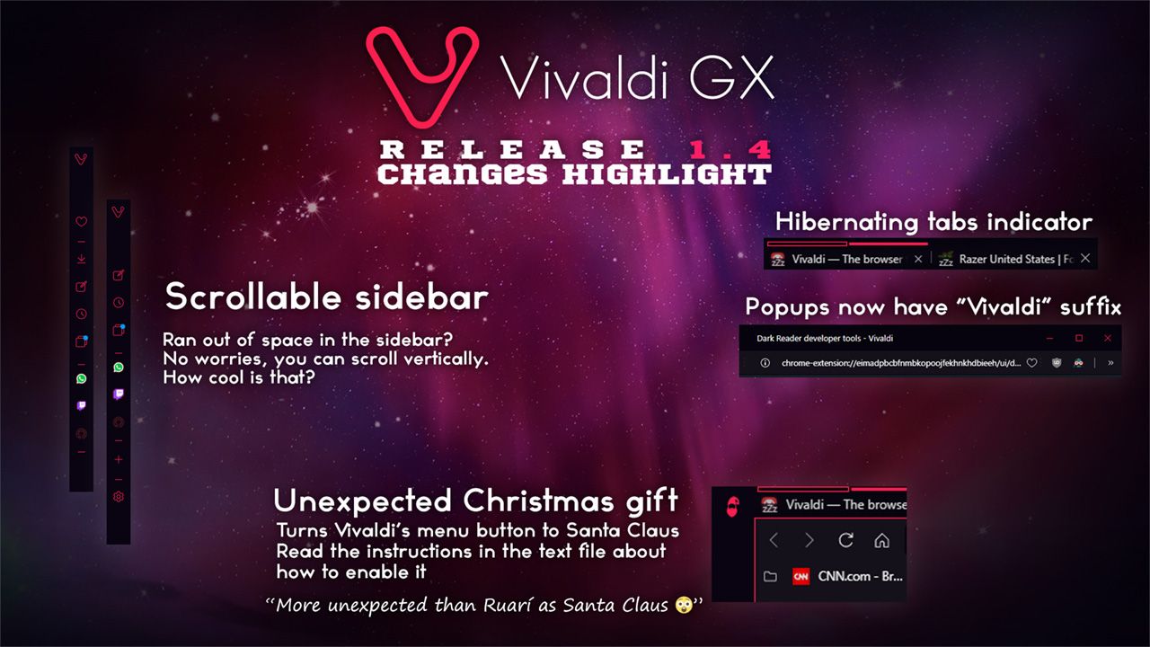
I've updated the mod to version 1.4
Hope you guys enjoy it
BTW, I had to flip the input of "add web panel" dialog in -90°, and remove the suggestions & header. The way that dialog is located, in the HTML structure, makes things really harder, so this workaround was the best solution I found.Also, Merry Christmas and happy new year

-
This post is deleted! -
@sgunhouse Thanks!
-
Nice work! It looks great

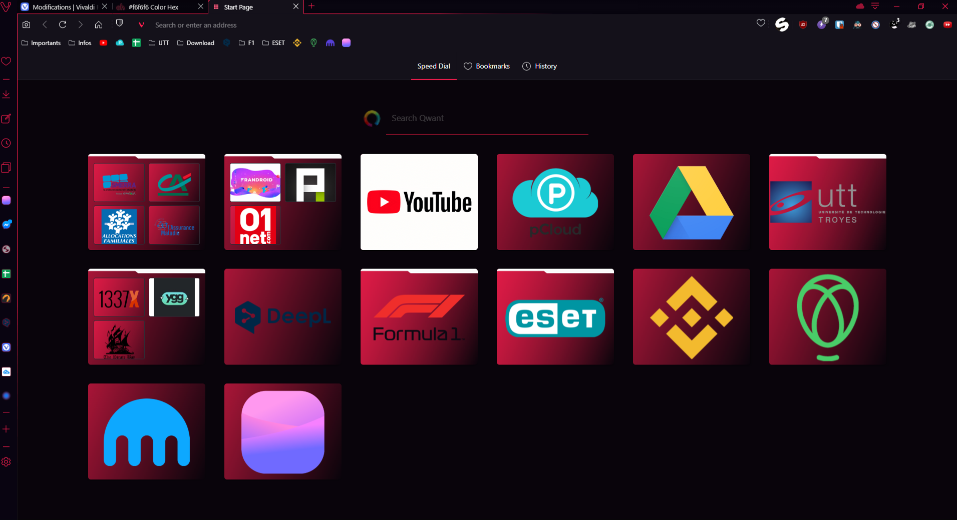
Sorry for the plug, but if any of you want to create more Speed Dial Thumbnails like the ones you can see on the screenshot, you can do so using this tool I recently created: Vivaldi Thumbnail GeneratorIt allows you to generate nice-looking, easily readable thumbnails.
- batch create thumbnails for all your bookmarks at once
- change icon size and background color
- automatically find a good image based on bookmark url
-
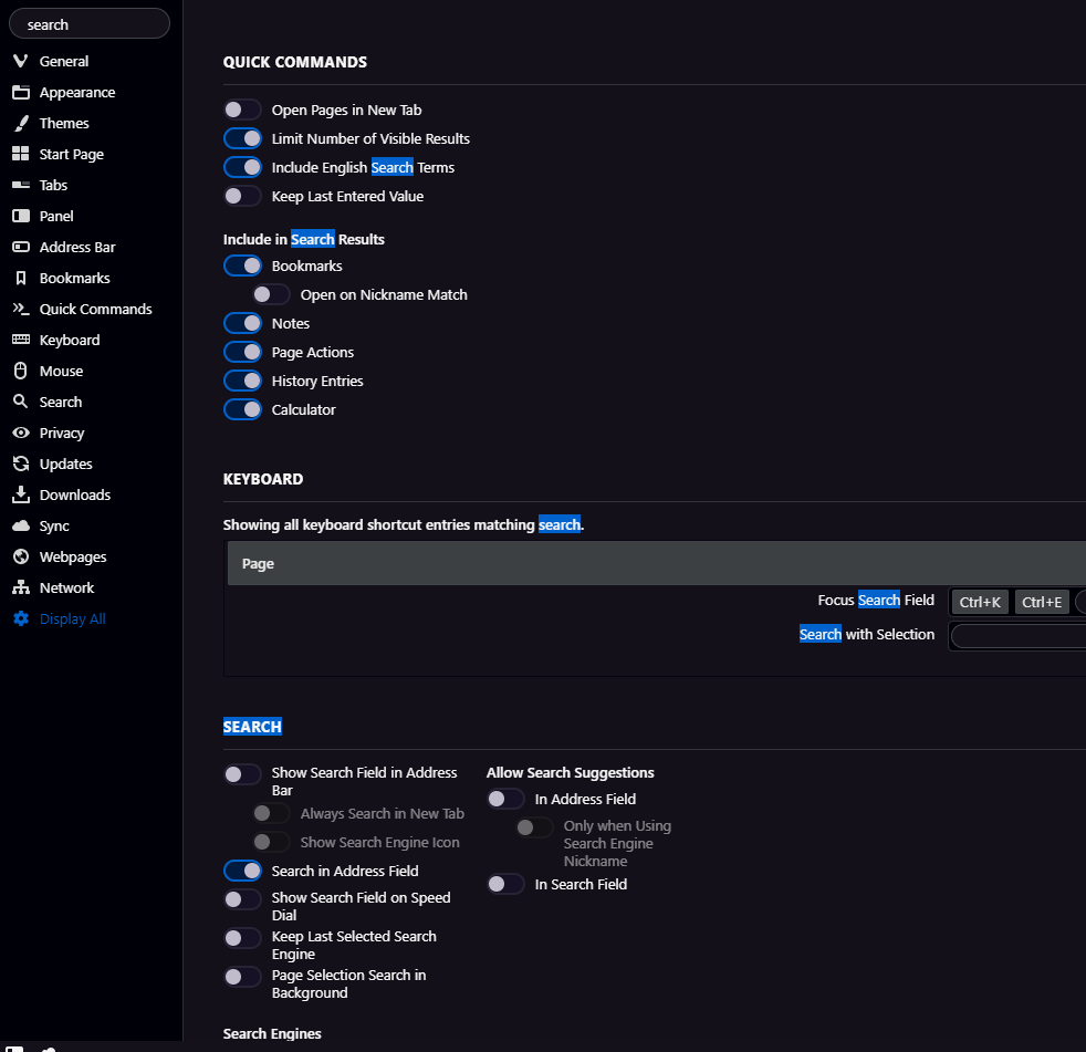
Found out that this issue is caused by this mod (v1.4 in the github).
I fixed it by removing this style:
.vivaldi-settings section {
  background-color: #131218 !important;
  border: 1px solid #333435 !important;
  border-radius: 4px !important;
  padding-left: 50px !important;
  padding-right: 50px !important;
  padding-bottom: 50px !important;
  margin-bottom: 25px !important;
}
Commenting out that style removed the boxes and margins around the sections, but that's okay.

-
@gabevilela good
-
@Sillvva Thanks for reporting. That happens because Vivaldi doesn't remove the sections that have no match, it only hides its children.
The only "fix" for that is the one you've suggested -
Hey there,
is it possible to remove that shade of red (in my case red) in the speed dial behind the thumbnail ??
it could be mush more cleaner if there was like no border and my icons are like floating !

-
Love this theme! Would like to know how to get it to display the unread count number on the web panels, like it was doing before I applied the theme. It used to show like I have 3 new messages in that panel, now it just shows me a circle (indicating an unread message) but no idea how many.
Thanks! Keep up the great work.
-
-
@remi-flores I don't use this mod, but this might be the solution:
You need to remove the background-image from the thumbnail-image styling. There is a linear-gradient that is probably creating the red background. (The style is near the end of the
cssfile in the beginning of the speed dial section.).speeddial .thumbnail-image { background-color: transparent !important; /* Remove the commented out line below */ /* background-image: linear-gradient(112deg, var(--colorAccentBg) -50%, transparent 100%); */ }Then, if you want the folders to look like they are floating also, you could get rid of the white folder flap by adding this:
.speeddial .dial.folder .folder-flap { display: none; } -
I love this mod and was using it since the beginning! I'm wondering if you'll update it again because the latest Vivaldi Snapshot broke the theme a little.
Thanks again!
-
@jonesjon Even though I have never learned CSS, I still try to upgrade it for V3.3.The forum limits the number of code words,so I put it on here:https://github.com/aopscja/-GX-mod/blob/master/GX.css. If it have any wrong,please tell me.
-
@embryo626 It's working perfectly! Thank you so much, this really means a lot!
