Vivaldi Forum mod
-
@luetage May I offer this Vivaldi logo to you as a replacement for the current logo-white.png:

Without the white border it looks better on dark themes (IMHO):
Thanks to you and everybody who contributed to this extension!
-
@Rexfahrer Of course you may. I believe @sjudenim is working on new black and white logos too right now, so there is reason to believe I did a sloppy job with them. Couldn't really spend time on it, could be the compression level is too high. One difference is that your logo uses 3 times the storage space – but maybe that's needed. Will look into it.
-
Why don't you guys just use the official SVG logo?
 It's just 1,24 KB and it's the best quality...
//EDIT: I just noticed you use a logo with white letters for the dark background (which makes sense
 ), so by adding just 2 extra characters to the original file, you get a nice logo for dark themes:
<svg xmlns="http://www.w3.org/2000/svg" viewBox="0 0 144 24"><defs><style>.cls-1{fill:#ef3939;}*,.cls-2{fill:#fff;}</style></defs><path class="cls-1" d="M12.1,24c5.26,0,8.18,0,10.09-1.91S24.1,17.29,24.1,12s0-8.18-1.91-10.09S17.36,0,12.1,0,3.92,0,2,1.94.1,6.77.1,12,.1,20.21,2,22.12,6.84,24,12.1,24Z"/><path class="cls-2" d="M19,8.6q-2.79,4.82-5.56,9.64a1.85,1.85,0,0,1-1.53,1,1.76,1.76,0,0,1-1.76-.93q-1.75-3-3.49-6L4.56,8.58A1.86,1.86,0,0,1,6.08,5.76a1.77,1.77,0,0,1,1.72,1L9.35,9.4c.38.65.74,1.3,1.12,1.94a2.93,2.93,0,0,0,2.46,1.51,3,3,0,0,0,3.15-2.65,2.11,2.11,0,0,0,0-.31,3.16,3.16,0,0,0-.32-1.39,1.87,1.87,0,1,1,3.49-1.16A2,2,0,0,1,19,8.6Z"/><polygon points="43.83 20.99 51.42 4.71 47.38 4.71 43.83 12.76 40.27 4.71 36.23 4.71 43.83 20.99"/><rect x="56.88" y="4.71" width="3.63" height="16.1"/><polygon points="73.57 20.99 81.17 4.71 77.13 4.71 73.57 12.76 70.01 4.71 65.98 4.71 73.57 20.99"/><path d="M88.72,15.36,90.24,12l1.52,3.35ZM82.3,20.8h3.81l1.16-2.49h5.94l1.16,2.49h3.8L90.24,4.53Z"/><polygon points="103.5 20.8 113.38 20.8 113.38 17.2 107.12 17.2 107.12 4.71 103.5 4.71 103.5 20.8"/><path d="M119.7,20.8h5.64a8,8,0,1,0,0-16.09H119.7Zm3.62-3.31V8h2a4.54,4.54,0,0,1,4.54,4.74,4.54,4.54,0,0,1-4.54,4.73Z"/><rect x="139.14" y="4.71" width="3.63" height="16.1"/></svg>Much higher quality than PNG and much more lightweight in size - that's the beauty of vector graphics.

-
@luetage said in Vivaldi Forum mod:
One difference is that your logo uses 3 times the storage space – but maybe that's needed.
Well, this one might be better, I forgot to prevent GIMP from embedding a preview into the file
 , now it's only 3 KB:

-
@pafflick That's not the current forum logo. I use the svg for the "mobile" version (below 420px), which omits the text altogether and has the correct squircle. But yeah, gonna check if there is an svg for the current forum logo too.
-
@luetage So, there's some inconsistency there, as the vivaldi.com page shows the logo I posted above. But I have the forum logo too, here's the code (for dark themes):
<svg xmlns="http://www.w3.org/2000/svg" viewBox="0 0 459 100"><defs><style type="text/css">.cls-1{fill:#ef3939;}*,.cls-2{fill:#fff;}</style></defs><path d="M114.5,25.7h12.4l10.9,24.7l10.9-24.7h12.4l-23.3,49.9L114.5,25.7z"/><path d="M176.5,25.7h11.1v49.4h-11.1V25.7z"/><path d="M203.3,25.7h12.4l10.9,24.7l10.9-24.7h12.4l-23.3,49.9L203.3,25.7z"/><path d="M275,25.1l24.3,49.9h-11.7l-3.5-7.7h-18.2l-3.5,7.7h-11.7L275,25.1z M279.7,58.4L275,48.1l-4.7,10.3H279.7z"/><path d="M315.1,25.7h11.1V64h19.2v11.1h-30.3V25.7z"/><path d="M367.1,25.7h17.3c13.9,0,25.1,11.1,25.1,24.7c0,13.6-11.2,24.7-25.1,24.7h-17.3V25.7z M384.5,64.9c8.3,0,13.9-6.6,13.9-14.5s-5.6-14.5-13.9-14.5h-6.2v29.1H384.5z"/><path d="M431.3,25.7h11.1v49.4h-11.1V25.7z"/><path class="cls-1" d="M50.9,83.6c14.5,0,22.6,0,27.9-5.3c5.3-5.3,5.3-13.4,5.3-27.9s0-22.6-5.3-27.9c-5.3-5.3-13.4-5.3-27.9-5.3s-22.6,0-27.9,5.3c-5.3,5.3-5.3,13.4-5.3,27.9s0,22.6,5.3,27.9C28.3,83.6,36.4,83.6,50.9,83.6z"/><path class="cls-2" d="M68.4,32.9c-9.7-9.7-25.4-9.7-35.1,0c-9.7,9.7-9.7,25.5,0,35.2c9.7,9.7,25.4,9.7,35.1,0C78.1,58.3,78.1,42.6,68.4,32.9z M66.9,44.3c-4.1,7.1-8.2,14.3-12.3,21.4c-0.8,1.3-1.9,2.1-3.4,2.2c-1.7,0.1-3-0.6-3.9-2.1c-2.6-4.5-5.2-9-7.7-13.4c-1.6-2.7-3.1-5.4-4.7-8.2c-1.6-2.8,0.2-6.1,3.4-6.3c1.7-0.1,3,0.7,3.8,2.1c1.2,2,2.3,4,3.4,6c0.8,1.4,1.6,2.9,2.5,4.3c1.2,2.1,3,3.2,5.4,3.4c3.4,0.2,6.6-2.3,7-5.9c0-0.3,0.1-0.5,0.1-0.7c0-1.2-0.2-2.2-0.7-3.1c-1.3-2.5,0.1-5.4,2.8-6c2.2-0.5,4.6,1.2,4.9,3.4C67.6,42.5,67.4,43.5,66.9,44.3z"/></svg>That extra shape makes it 1,44 KB in size.
-
@pafflick Yeah, I noticed. It could be the logo without white circle will be used in future. Vivaldi help pages have the forum/browser version too. It's a little inconsistent, hard to tell what's right.
-
@luetage said in Vivaldi Forum mod:
First of all the new menus, which have to be styled separately, they're not normal dropdown menus and shouldn't be treated as such.
Sorry to be a pain in the neck...
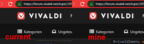
I don't know if this is included into what you are mentioning here or not. I noticed that the 'basic' forum has now additional sections on the top (Features and Download) that are hidden while using the VF Mod.

I also noticed that the numbers (Unread messages and Notifications - apart from the Standard mode I guess) are now black on a white bubble instead of white on a red bubble which was visually more attractive for my eyes.


Santa Claus, is it something you are preparing for us?
-
@Ornorm That's not really true, Vivaldi had additional entries for a long time in the header. Furthermore the other entries changed too. Maybe the biggest change are the menus.
You are using the compact header modification, which removes the somewhat redundant download and features entries and reduces the height – try without.
And about your second point – I simply changed the theming and decided to go from red notifications to blue on white for the mod theme. If you don't like that, you can either choose another theme, create your own custom theme, or simply write 2 lines of User CSS to make the unread notifications red again. I'd go for option 3.
-
@potmeklecbohdan said in Vivaldi Forum mod:
But I have one small issue: unchecking “User CSS” doesn't disable it.
I have reintroduced the toggle functionality. It will be back in next update. I had in mind to simplify it, but I can see how this is useful.
-
@luetage Shame shame shame shame shame shame shame. Shame on me...
I forgot I did activate the 'Compact header' a while ago...
Sorry Santa Claus. I disturbed you for nothing.
Thank you for the time you've taken to give a reply to a foolish kid who is not able to use the present he received correctly...
-
It looks like hiding header is a bit buggy (because it's only minimized?):

(the white line is 1px higher than top of the page) -
Are you running compact header besides auto-hide header on scroll? Is this a custom theme without additional user css affecting the header?
-
We now appear to have dark monokai code display as standard in Vivaldi Forum. I'm gonna remove the railscasts style for dark themes, as it isn't needed anymore. The question is, if we should make new code markup for light themes… Any suggestions?
-
@luetage Yes, I use compact header. Theme is custom (your Dracula with changed background). No custom CSS.
-
Then I can't really explain it. There should be no white line. I know you can force that white line when you uncheck
#submenu {box-sizing: border-box}in devtools, but this can't be your issue, since you have no user css running. Besides, some other stuff would break too, if you unset that somehow. Strange. -
@luetage Oh, sorry, I've explained it absolutely bad. The white line is added in image editor for better orientation. I'm talking about the menu showing when the menu bar isn't visible.
-
Oh ok. Well, the auto-hide header mod triggers when you scroll down. When you are still over the header navigation dropdown with your mouse, the dropdown will continue to show. I don't really know what to do about that. If you move your mouse away from it it should disappear.
-
@pafflick I looked into this a bit now. The second logo has the right dimensions, but is too small. But it doesn't matter, because we can go with the logo as presented on the community page – I somehow like it better anyway. Wouldn't surprise me if they switched it up at some point, even for the browser. We were ahead of time with using the squircle on forum too a year ago, maybe history repeats itself.
-
@luetage This is how I understand and reproduce the problem: With 'Compact header' and 'Auto-hide header on scroll' active I scroll down until the header is hidden. Then I place the mouse cursor over the 'Recent' item in the forum menu and slowly move up the pointer. Shortly before the mouse pointer leaves the page the header dropdown opens although the header is invisible and the pointer is still over the 'Recent' button.
Even when 'Auto-hide header on scroll' is inactive, but 'Compact header' active, the header dropdown opens when the pointer is still over the 'Recent' button, a few px under the header. It seams to me like the area where the header notices a mouseover doesn't get 'compacted', if you allow this uneducated guess .
.