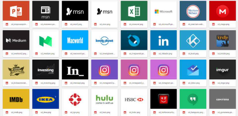
Power of thumbnails
-
Power of thumbnails in the gift for friends was shared by @D0J0P - our forum mate.
Link to the collection below:
https://drive.google.com/drive/folders/0BwcOkwtCjr51T0psOHJXb0M4VmM
-
Thanks so much for getting the word out!
")
If you have any requests for websites you want a thumb for, I could do that and upload it into the file.
I made a huge thumbnail pack: https://drive.google.com/drive/folders/0BwcOkwtCjr51T0psOHJXb0M4VmM?resourcekey=0-PX-P0JJhsL7aSv2D3EQGHA&usp=sharing
Request your own here -
@D0J0P
In case you have some spare time would you mind creating a thumbnail for theguardian.com ? -
@zaibon theguardian.com is a thumbnail already covered by the Vivaldi team on their own thumbnail folder, which can be found in vivaldi/applications/versionnumber/resources/vivaldi/resources folder. If you want, you can also find all Vivaldi stock SD thumbnails they've made in a folder I pasted them in for easy access: https://drive.google.com/drive/folders/0BwcOkwtCjr51ZVNOX0U0SFhjbzA?usp=sharing
If you'd like, I can create a different thumb anyway for The Guardian. Let me know.
I made a huge thumbnail pack: https://drive.google.com/drive/folders/0BwcOkwtCjr51T0psOHJXb0M4VmM?resourcekey=0-PX-P0JJhsL7aSv2D3EQGHA&usp=sharing
Request your own here -
Is there any way to get larger SD thumbs to fit the box they're in?
I am used to the excellent "Speed Dial" extension on Firefox and there you can choose different methods to fit the images, like fit horizontal, vertical or both/no fit. I usually have fit both for larger thumbs. It's silly to have to edit images to fit a specific dimension when people are using different resolutions and scaling in the OS.
I assume the devs are working on this, and I guess there is a way to do it in the custom css, if so where/what to change?
-
@D0J0P Oh my gosh this is totally awesome! Great work! I'm using a lot of them right now!
If you don't mind, these are my thumbnail requests:
- TweetDeck
- Instapaper
- Inoreader
- YouTube Gaming
- qBittorrent
- Box
- GitLab
- Major Game Devs/Pubs (e.g., Nintendo, PlayStation, Xbox)
- Cisco and/or Linksys (web interface/UI of my routers)
Thanks!

-
@D0J0P But the standard vivaldi thubnails don't load auto?
-
@Xypher That's good to hear! Which thumbs of mine are you using right now?
Alright, I did all of the thumbs that you requested. The gaming companies I did were: Nintendo, Playstation, Xbox, Square Enix, Ubisoft, Konami, EA, Namco Bandai, Activision, and Sega. Those are all the big names of the gaming industry. If you have any other gaming devs/pubs sites that you would like me to create thumbs for, let me know.
The TweetDeck looks pretty much like Vivaldi's Twitter thumb, but with a black bird. It's actually taken from TweetDeck's Twitter account, so I made sure to go official.
I did both Cisco and Linksys, just in case you wanted both.
They mostly look really good. And I never heard of instapaper and inoreader before. Maybe I should check them out.
Anyway, look for the following:
sd_tweetdeck
sd_instapaper
sd_inoreader
sd_youtubegaming
sd_qbittorrent
sd_box
sd_gitlab
sd_nintendo
sd_playstation
sd_xbox
sd_squareenix
sd_ubisoft
sd_konami
sd_ea
sd_bandainamco
sd_activision
sd_sega
sd_cisco
sd_linksyshttps://drive.google.com/drive/folders/0BwcOkwtCjr51T0psOHJXb0M4VmM?usp=sharing
Any more requests?
I made a huge thumbnail pack: https://drive.google.com/drive/folders/0BwcOkwtCjr51T0psOHJXb0M4VmM?resourcekey=0-PX-P0JJhsL7aSv2D3EQGHA&usp=sharing
Request your own here -
BTW, I created a separate thread where people can come check out the collection and request to have some made. It's right here: https://forum.vivaldi.net/topic/17568/i-made-a-huge-thumbnail-pack
-
@utkarsh Done! I created 2 to let you decide which you like best, the icon or the logo. Look for the following:
sd_udemy
sd_udemy2https://drive.google.com/drive/folders/0BwcOkwtCjr51T0psOHJXb0M4VmM?usp=sharing
Any other websites you'd like me to do?
-
Okay, understanding. Here some thubnails from me. You can ad them to your folder.
https://drive.google.com/drive/folders/0ByZ2eh6nMbsCbVh6WWtVblVmTzQ
-
@D0J0P Thank you very much! This would surely fill up most of my Start Page thumbnails! Aside from the some news sites, I think I'm using about 40% of your thumbs right now xD You even used Ubisoft's new logo! Sweet!
I'll let you know if I have more requests. Awesome work! Next time I'll comment on the new thread you made.
-
@utkarsh You're welcome! And I just did your next request.
I did two for WolframAlpha, just to see which one you prefer. I like the first because it's the site's logo, but the second is the app's icon.
Look for the following:
sd_wwe
sd_flipkart
sd_wolframalpha
sd_wolframalpha2Let me know if you have any other requests
https://drive.google.com/drive/folders/0BwcOkwtCjr51T0psOHJXb0M4VmM?usp=sharing
-
@utkarsh Thank you! And done!
Look for the following:
sd_snapdeal
sd_in_amazon
sd_freecharge
sd_edxhttps://drive.google.com/drive/folders/0BwcOkwtCjr51ZVNOX0U0SFhjbzA?usp=sharing
How I make these thumbs is pretty simple. First, I look through different sources for the logo. Google Play Store, the website for it's logo it displays, and if it has a branding assets page where you can download the official and most current logo, even better. Another source I'll go if both those ways fail is Logopedia, which will usually have a logo if it's a fairly big site.
So I copy and paste it into MS Paint. In MS Paint, I've set an automatic size of 440 x 360, which is the exact size that Vivaldi's stock thumbs are, and that size looks best for scaling inside the StartPage.
I'll center the image in MS Paint. I'll make sure to set the gridline, and count each grid up and down from the image, and left and right from the image to make sure they're all equal on all sides.
Usually if I'm using a logo/icon from the Google Play Store, I'll have no sizing modifications necessary(Play Store icons are 300 x 300, so I just copy, paste, center it, and put a background or erase the background if I can't put a good one and I'm done). Usually I might want to put a different background if the background turns out to be black from copying from the Google Play Store or from somewhere else, as the background turns out to be transparent.
Maybe I'll pick a color on the logo. If the website has a color not seen in the logo, then that probably suits it as well, and I may get the hex color by using V's screenshot feature to capture that, then opening up Paint 3D and using the eyedropper tool to get the exact hex code.
Then I'll open that image in Paint 3D, and bucket that color into the background, or a color that can be seen in the logo/icon itself.
If I didn't get the image from the Google Play Store, and the image is really big, I'll resize it to something lower than 440 x 360 in Paint 3D, save it, then open it in MS Paint, copy that image, open a new file in Paint that is 440 x 360, then paste that picture on. I'll do the usual: center it as perfectly in the grid as possible, then save.
Then I'll reopen it in Paint 3D and resize the image itself until it's in a scale that's similar to how Vivaldi would scale it's images to the background. I have no formula for this, only my instinct. In V's stock thumbs, some of them like the Twitter and Vivaldi thumbs, the icon is quite a fair bit smaller than the rest of the background. You can see there's a lot of background space. Some of them, if it's a lot of text, can take up more space, but not the entire picture, and there should be a tasteful amount of space on the sides. You can see these in V's stock thumbs like The New York Times and Tech Crunch how much space is on the sides. Maybe if I had a more advanced program, I could figure out a specific way of really finding out. It usually takes some playing around to finding that perfect size of the image in the middle of the thumbnail, and I normally stare at it for a second or two and either say "No, too big" or "No, too small", until I get "That's good!".
I'll then do the usual in picking a good background color: either from the icon/logo itself, or if it won't look good(could be that a color from the background would be the same as the image, and touching it. Only if there's something like a white circle around the image like in my Pinterest and OneDrive thumbs would the same color work all around), then I'll pick a complementary main color from it's website, or usually just white. Sometimes I might just take the hex code of the color from the icon and go a few shades darker or lighter.
That's pretty much how you do it. My goal in designing the thumbnails is to be 1) in the same aesthetic style as V's stock thumbs, and 2) to be as accurate as possible to the website's/company's logo/icon/wordmark as possible, and use the most current official icon/logo if possible. You can see V's stock thumbs have been really good about having only the official logo/icon of the website.
If you'd like, you can always request more thumbs and I can try doing them in that way, as they're not too shabby I guess
I made a huge thumbnail pack: https://drive.google.com/drive/folders/0BwcOkwtCjr51T0psOHJXb0M4VmM?resourcekey=0-PX-P0JJhsL7aSv2D3EQGHA&usp=sharing
Request your own here -
This might be a stupid question, but why do you use the dimensions of 440 x 360?
When I look at my speed dial, the dimensions are 220x170, and if you're doubling up the resolution, surely that would make it 440x340.Perhaps something has gone screwy with my installation.
💻 Windows 10 64-bit Sopranos Builds • en-GB • 🗳 vote for features • 🕵️♀️ Code of Conduct • 🐞 Report bugs
-
@LonM said in Power of thumbnails:
This might be a stupid question, but why do you use the dimensions of 440 x 360?
The default thumbnails in \Vivaldi\Application\1.11.880.3\resources\vivaldi\resources are that size.
I create my thumbnails @ 220 x 170 for the reason that you noticed.
Blog • Vivaldi Review • Server Status
Specs: AMD Ryzen 5 3400G, 8 Gb • Win 10 64-bit build 19045.2486 • Snapshot 6.7.3329.14 (64-bit) -
@Pesala I've been making my own thumbnails for a while, and I noticed they were off-balance several versions ago. Ones I make now are x340 and my older ones, that looked off-balance, were x360. I guess at some point the vivaldi devs decided to change the height of the tiles, but I can't remember when that happened.
-
Here's my tiny collection with some alpha channel if anyone needs: translate.google.com, google.com/imghp, habrahabr.ru, geektimes.ru, kinopoisk.ru, rsdn.org, vk.com, yota.ru, online-life.club
Combining alpha thumbnails with some background image makes SD look really nice.
These have different sizes (even too big, sorry) cause i'm not good in a proper resize of alpha images. But the 440/360=1,222 proportion is kept.
Use and change them as you wish.
https://drive.google.com/drive/folders/0B9DHmG895d70bXYwOW5oc2pwZVE?usp=sharing