Changing icons with css
-
If you change a color with devtools the change cannot stick. But you can potentially style the svg with css. Could also work for dark/light. For the back button you would also have to code the inactive state. Haven't tried it, let me know how it goes.
-
@luetage said in Changing icons with css:
If you change a color with devtools the change cannot stick
Yup, I've noticed it xD
But you can potentially style the svg with css.
Yes, probably as the image has a
fill=hexcolorto set the color, but I don't know change it by css state.
Taking this in consideration, how can I make switch its colour white (on dark) to black (on light theme)? Or I always need two background images, eg: back_light, back_dark?.button-toolbar.back svg { display: none; } .button-toolbar.back { background-image: url(/hooks/back.svg); background-size: 22px; } -
Give me a link to your back svg file and I try. The problem I see is that it's a background image, don't know how to talk to that -- could as well be that you need to make an extra file for all possible states/colors and load them extra. In this case it wouldn't matter if you use a svg file or a png.
How did you change the color in devtools, and what did you change exactly?
-
@luetage I take back from here - svg download with white "fill" color.
The full code I used in dev tool to switch color in back was this, but strangely now seems not to work anymore (also in dev tools); I'll try also to disable the whole toolbar tweaks.css code to know where is failing now
")
.button-toolbar.back svg { display: none; } .button-toolbar.back { background-image: url(/hooks/back.svg); background-size: 22px; } .acc-dark .button-toolbar.back svg { display: none; } .acc-dark .button-toolbar.back { background-image: url(/hooks/back.svg); background-size: 22px; } -
Testing with dev tools.
This seems to bring some changes.. I'll see at restart what happens.
Themes without accenting options in themes works fine.
About vivaldi stock themes, only olive and redmond to get the right color (still had them as workaround) need a duplicate of the same theme, with the same colors but without accents on in-theme..acc-light .button-toolbar.back svg { display: none; } .acc-light .button-toolbar.back { background-image: url(/hooks/back-light.svg); background-size: 22px; } .acc-dark .button-toolbar.back svg { display: none; } .acc-dark .button-toolbar.back { background-image: url(/hooks/back-dark.svg); background-size: 22px; }This way probably works well. Testing hooked. Seems ok.
Not direct, using two files for the same button, but it seems to work if one don't use accent options in themes.Vivaldi Stable+Snap | Patience Is The Key To Get The Vivaldi Spree | Unsupported Extensions | Github | windows 11 | Manjaro KDE | Q4OS Trinity | Android 13
-
@Hadden89 You can also use
.color-behind-tabs-onto target themes where the accent is applied to the window. Something like this would cover states where the overall theme is light but the accent is dark and applied to the window, or where the theme is dark:.theme-light.acc-dark.color-behind-tabs-on .button-toolbar.back, .theme-dark .button-toolbar.back { background-image: url(/hooks/back-dark.svg); background-size: 22px; } -
@Tiamarth Yes, I was just wondering how do that. I'll try.
The arc.css was a very useful lecture for this purpose xDThis seems to work with any combo of accent/theme/color.
A bit ugly maybe, but works
.acc-light .button-toolbar.back svg {
	display: none;
}
.acc-light .button-toolbar.back {
	background-image: url(/hooks/back-light.svg);
	background-size: 22px;
}
.theme-light.color-behind-tabs-on .button-toolbar.back svg {
	display: none;
}
.theme-light.color-behind-tabs-on .button-toolbar.back {
	background-image: url(/hooks/back-light.svg);
	background-size: 22px;
}
.acc-dark .button-toolbar.back svg {
	display: none;
}
.acc-dark .button-toolbar.back {
	background-image: url(/hooks/back-dark.svg);
	background-size: 22px;
}
Nightly noob question:
there is any difference from
.example1.example2to
.example1.example2in css?
I usually put a space on every dot, but for.theme-light.color-behind-tabs-ondidn't work with that.Vivaldi Stable+Snap | Patience Is The Key To Get The Vivaldi Spree | Unsupported Extensions | Github | windows 11 | Manjaro KDE | Q4OS Trinity | Android 13
-
@Hadden89 I'm glad it was helpful
Although I'm changing the window buttons with Arc using a slightly different method than the one luetage describes here. As he mentioned, my method requires a bit of extra javascript and his only requires css. (I'm modifying the contentattribute where he's modifying thebackgroundattribute.) -
Just as a general idea: if you only want to use one single picture, why not style it with CSS filters?
")
-
@Christoph142 Interesting idea, problem is that the hover will be inverted too. You can circumvent this by setting the background color to the inverted initial color by hand for the button you change, but this would have to be done for every single theme. Couldn't find a way to automate the inversion of the hover background color, because the image is part of the background and will therefore be inverted too. I'm probably overlooking something though.
-
deleted, solution had already been provided by Tiamarth, I didn't pay attention

Just as an addition: the toolbar buttons also have to be scaled in the :active state.
e.g..button-toolbar.home:active {transform: scale(0.85)}
Overall I think it's reasonable to exchange buttons with css (and I will continue running code for it), but probably not worth the trouble. Especially when using VivaldiHooks it should be better to use javascript for this, as it automatically scales and chooses color depending on the used theme (-- not limited to dark/light). -
Another little tweak; quite useless, but nice
/* Shift color on mouse hover */ .button-toolbar:hover, .vivaldi-addressbar:hover { filter: hue-rotate(90deg); } /* Same for panel buttons */ #switch button:hover { filter: hue-rotate(320deg); } -
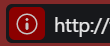
Now that we have a new addition to the addressfield (that works and looks good), I noticed that they've changed the icon for non secure pages

But I don't think that emphasises the issue. Simply flipping it does (by default it uses
redinstead of the highlight colour in the image)

.SiteInfoButton.warning { transform: rotate(180deg); }Secure pages still features the padlock though which looks inconsistent now, so let's try this

.SiteInfoButton.secure svg path, .SiteInfoButton.certified svg path { d: path('M8 1C4.131 1 1 4.131 1 8s3.131 7 7 7 7-3.131 7-7-3.131-7-7-7zm0 1.094A5.903 5.903 0 0113.906 8 5.902 5.902 0 018 13.906 5.904 5.904 0 012.094 8 5.904 5.904 0 018 2.094zm3.035 2.908c-.12 0-.239.054-.33.164L6.99 9.645 5.297 7.602a.414.414 0 00-.66 0 .644.644 0 000 .794l2.021 2.44a.43.43 0 00.33.164c.12 0 .24-.054.332-.164l4.043-4.875a.647.647 0 000-.795.422.422 0 00-.328-.164z') } -
@sjudenim I'm curious, what kind of tools do you use to generate nice paths?
Vivaldi Stable+Snap | Patience Is The Key To Get The Vivaldi Spree | Unsupported Extensions | Github | windows 11 | Manjaro KDE | Q4OS Trinity | Android 13
-
I use a combination of things as some seem to be easier (for me) for some tasks than the other: an older Adobe Illustrator (CS6) with Inkscape. I then load them into this site https://jakearchibald.github.io/svgomg/ to help compress the path
This site is a good resource for pre-made svg icons https://www.flaticon.com. You can load them into your editor and work off of them rather than starting from scratch.
-
@sjudenim Thanks, I already have inkscape portable.
Very happy a tool exist to remove a lot of (not need for modding) metadata it adds to svg files -
I feel like such a noob, the icons I made myself I either used simple geometrical shapes like circles, or I drew them on graph paper by hand and translated the points to code, lol.
-
Some really good tips here!
Personally I really dislike the new style of padlock so I reverted to the old, IMO it looks much better: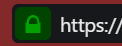
.SiteInfoButton.secure, .SiteInfoButton.certified {
	border-radius: var(--radius);
	background-color: #004400;
	fill: #00a100;
}
But messed around a bit just now using the tip given for using SVG and decided to just use the standard Vivaldi icon for "insecure" sites. In my opinion, not all sites absolutely need SSL and I'm perfectly capable of seeing whether a site is secure or not without being having a "oooh this is scary" icon in my face

.SiteInfoButton.warning svg path {
	d: path("M 10.4 5 c -0.4 -0.8 0 -1.8 1 -2 c 0.7 0 1.5 0.4 1.6 1.2 a 1.4 1.4 0 0 1 -0.2 1 l -4 7 c -0.3 0.5 -0.7 0.8 -1.2 0.8 c -0.6 0 -1 -0.2 -1.3 -0.7 L 3.8 7.8 L 2.2 5 c -0.5 -0.8 0 -2 1 -2 c 0.7 0 1 0.2 1.4 0.7 l 1 2 l 1 1.4 a 2 2 0 0 0 1.7 1.5 a 2.2 2.2 0 0 0 2.3 -2 V 6 c 0 -0.3 0 -0.6 -0.2 -1 Z");
}
For those who feel they need it maybe something like this will work:
.SiteInfoButton.warning {
	border-radius: var(--radius);
	background-color: darkred;
}
I need the
border-radiusotherwise it looks fuglyI've also removed the EV text because there's no need for that extra information taking up space in the address bar, and some sites have really long text there. It's still available in the dropdown anyway.
/* Hide EV certificate text */ .siteinfo-text { display: none; } -
@luetage Still better than what happens when I have to edit a bigger SVG—I open it in Inkscape, select the path I need and then edit it from the XML editor… (and sometimes I get angry that IS tries to reduce the paths to the shortest possible form).
-
 Ppafflick moved this topic from Modifications on