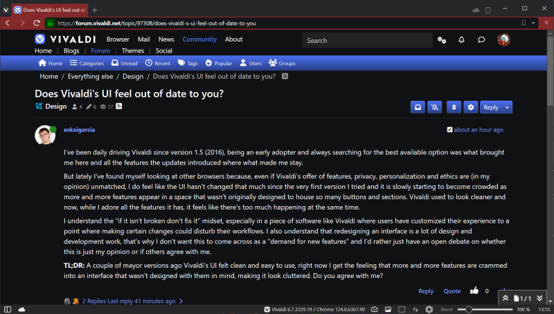
Does Vivaldi's UI feel out of date to you?
-
@eskaigarcia My uncluttered UI:
-
@Zalex108 said:
You may receive more comments adding some Screenshots to explain your point.
I don't want it to sound like I'm complaining about Vivaldi's current design but I'll provide a couple of the things I have in mind when I say "Features being added to spaces that weren't thought for it" or "Many features in the same visual section"
I know there are ways to customize and "change" many of these examples, I'm just throwing in some examples

Vivaldi's tab management is magestic, the way tabs and tab stacks (in the their different design options) are designed is great, so when I see the sync and trash icons just "floating there" and the Workspaces feature being included as just a dropdown list when it has many more possibilities I am slightly underwhelmed, especially since I really use them and would love to customize them more. It feels like they did it the "easy to code" way.
The sidebar is another one of Vivaldi's masterpieces that I feel could also get a little bit more of love. It's been all these years with the same "list of icons". I'm aware we can now both personalize the sidebar and add an icon pack, but looking at how Edge and especially Opera are implementing sidebars I can't help but feel like it could do more, it feels like Opera (even if I don't particularly like their style) manages to get a bit more of hierarchy on theirs.
And the adress bar is another design element that slowly gets more icons added to it, with the feed reader, reading more, QR code, translator... some fields keep getting more features but they all come at the same visual level, again I sometimes lack a little bit of hierarchy.I guess my only complaint here is: There are four bars to put information into by default (tabs, side, address and status) plus bookmarks if you turn it on, and sometimes I feel like the information / options they have are always at the same hierarchy level.
@Zalex108 said:
Those other Browsers you mention may not be known by some here.
I wasn't talking about any specific browser because I feel that comparing Vivaldi to those new-gen ai-powered ones like Sigma OS and Arc is unfair since they have clearly different objectives. But I do have them in mind along with Edge, Chrome, Firefox and especially Opera who manages to maintain a design language that's clearly recognizable despite the changes it receives through updates.
-
@Catweazle I love your layout.
It feels like we're going in the exact opposite directions. I'm trying to separate options to add hierarchy and you've fused together the adress and status bar in a way only you know where each section is.But honestly this is why Vivaldi is great, users that are so different can both create the environment where they thrive and we're not all stuck in one identical Chrome UI for everyone.
-
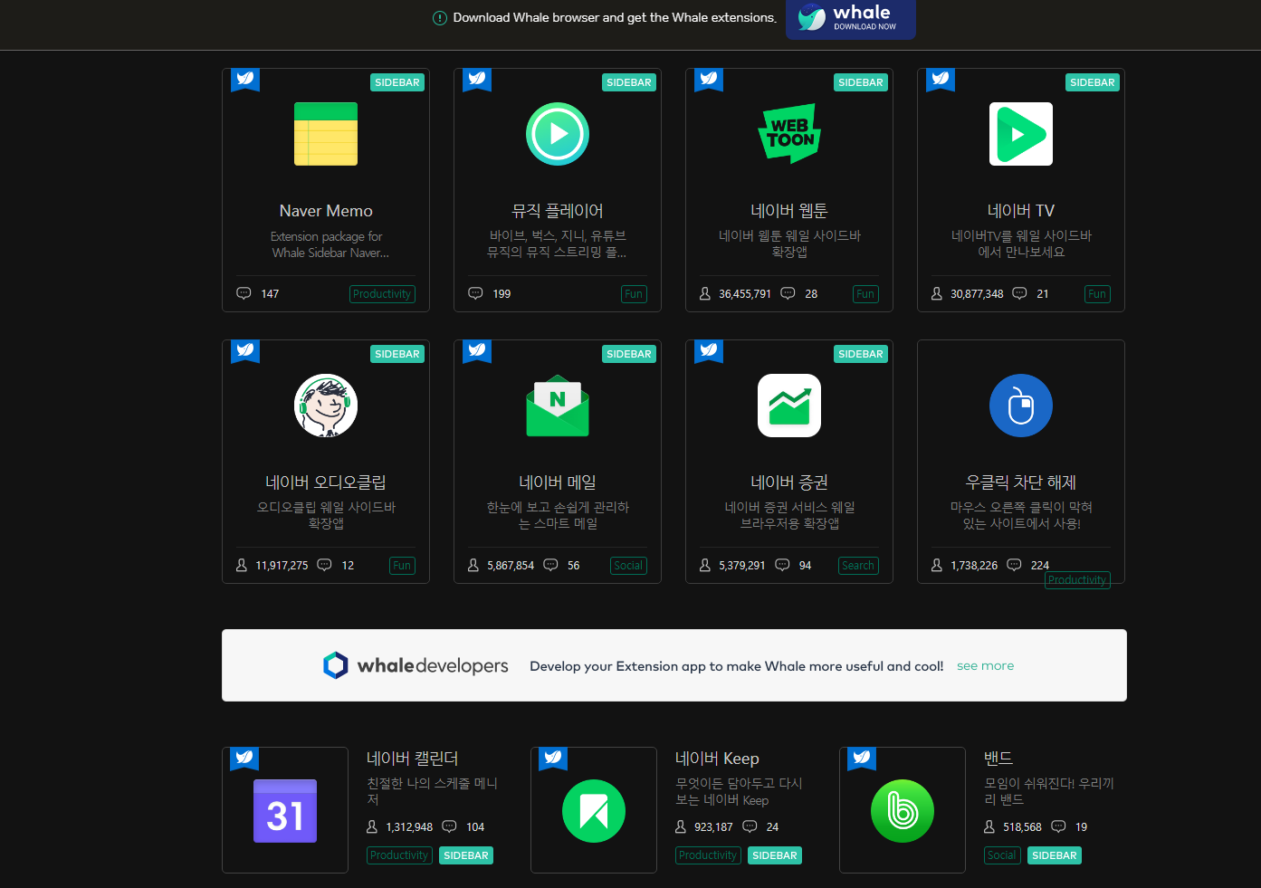
@eskaigarcia, the only browsers I know which is comparable to Vivaldi, at least respect customization an features, the Naver Whale, it's an option if you are in Corea. It has even a own web store, but..
and the Cent Browser
>Laptop Lenovo V145 15AST, AMD A9- 9425 Radeon R5 - 5 cores 3,1 GHz RAM 8GB, GPU 2+1 GB SSD 256GB -Win10 64 v22H2| Vivaldi last stable|
-
@Catweazle Thanks! I'll take a look at it and learn from how they handle the UI.
But I'll definitely stick to Vivaldi, right now I'm thinking about looking into Vivaldi's CSS modifications and working with them rather than changing to another browser. -
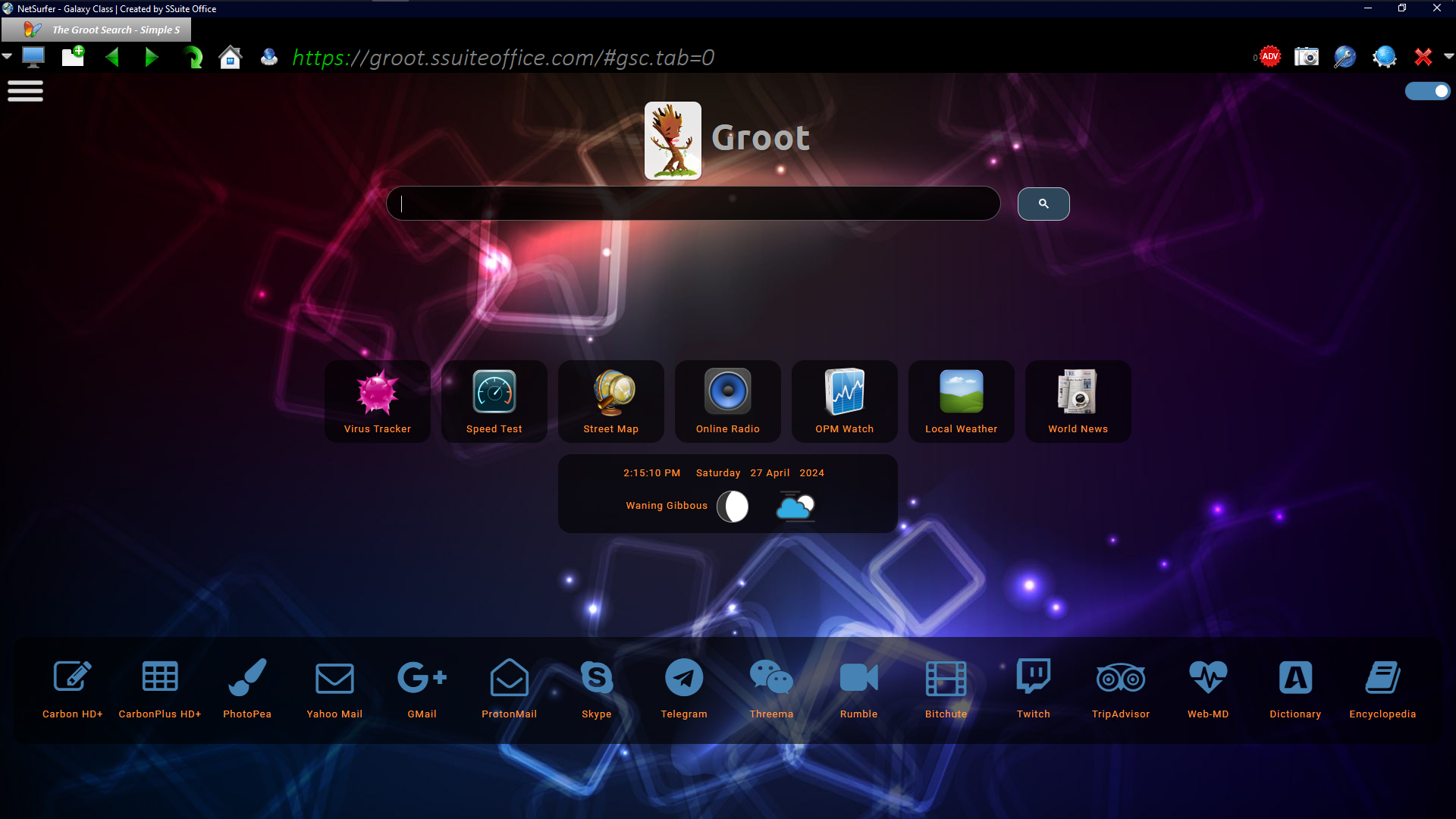
@eskaigarcia, I use Vivaldi since 8 years and I don't think to change this, but I also have at hand other browsers in test, to compare and in occasions to determinate if an issue is one of Vivaldi or general for other browsers with different engines. So I have also the Mullvad Browser (Gecko) Otter (Qt5) and the SSuite Netsurf (WebView), all in default settings (well, Netsurf has a very nice UI, but no much settings, not even to use other than the default search engine, on the other hand a good and private one, Groot search, with own index.)
Netsurf default aspect
-
@eskaigarcia Yes, I agree that Vivaldi is cluttered, very cluttered, but it can be customised to remove any menu items, toolbar buttons, speed dials, or panels that you never use. Its wide range of features is what makes it attractive, and there is a long list of over 5,000 feature requests, so at least some users clearly want more.
Out-of-date UI Design is highly subjective. Retro is often fashionable.
Try the Opera 9 Classic Theme for example.
Blog • Vivaldi Review • Server Status
Specs: AMD Ryzen 5 3400G, 8 Gb • Win 10 64-bit build 19045.2486 • Snapshot 6.8.3371.4 (64-bit) -
@Pesala, or Otter
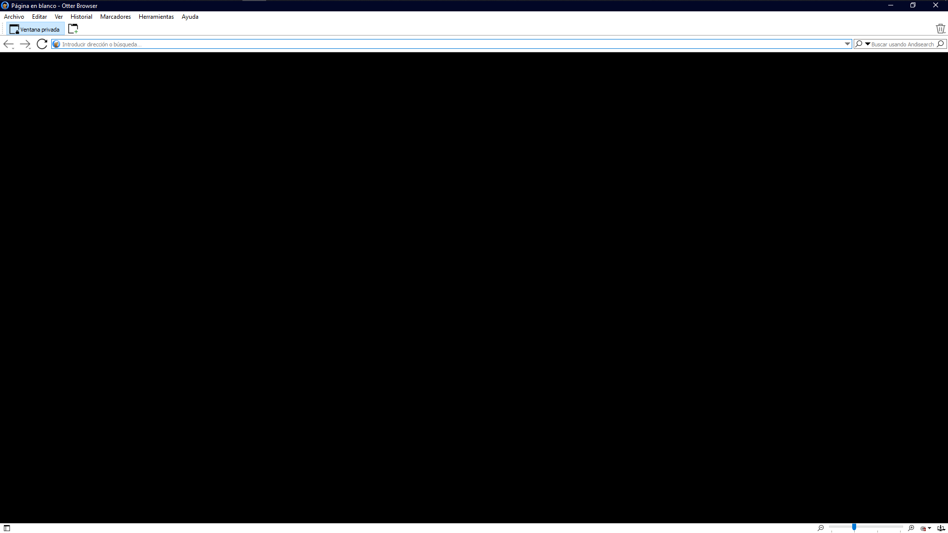 ,
,but in change it's blazing fast, it opens as fast as the file explorer in Windows click on the icon and it is open in a 1/4 second. (Netsurf isn't also not much slower)
-
No! Vivaldi is on the cutting edge!
-
Out of date, not sure - I think it does have a bit of a mid-2010's vibe to it. The main menu definitely looks dated, maybe due to the file/edit/view headings, compared to other browsers trying to save clicks and having more showing on the first click. Context menu to a slightly lesser degree. Not sure the update has really helped with that though.
In terms of the rest of the UI, it's definitely functional. Not really sure what else can be done, there's only so many ways to interact with a program. Finding places to put an extra button for a feature doesn't give you that many options unless you want to completely change the browser UX... like what Arc is doing.
@Pesala said in Does Vivaldi's UI feel out of date to you?:
I agree that Vivaldi is cluttered, very cluttered,
Maybe if you enable every bar, button, sidebar etc. I would imagine most people would click the right option during install for their use case so the browser works best for them and it doesn't overwhelm them with options.
@Pesala said in Does Vivaldi's UI feel out of date to you?:
Its wide range of features is what makes it attractive, and there is a long list of over 5,000 feature requests, so at least some users clearly want more.
Yes, but thankfully a bunch of those options won't be a new button, bar or sidebar. A new option in settings that should be a case of enable/disable and then forget about it.
@eskaigarcia said in Does Vivaldi's UI feel out of date to you?:
it feels like there's too much happening at the same time.
I think you need to look at what you have enabled/displayed and decide if you actually need them. If it's something that doesn't get used, hide it. That said, i agree, the trash/sync buttons always bugged me, felt very out of place. But as mentioned, where else could they go? They're tab related, so tab bar makes the most sense, but maybe a dropdown?
I'd be curious to know your ideas on what, how you would change things.
-
@eskaigarcia no
-
@7twenty said:
In terms of the rest of the UI, it's definitely functional.
It definitely is, and it much more functional than you'd think when presented with the amount of features it includes. But I still like to think about what could be improved
@7twenty said:
I think you need to look at what you have enabled/displayed and decide if you actually need them. If it's something that doesn't get used, hide it.
I understand how this is a punctual solution but I think that Vivaldi should be great with both a simple / minimalist setup and a poweruser setup that has everything turned on. After all it still is native Vivaldi, it's not like someone added toolbars, extensions or mods that made it less visually pleasing.
@7twenty said:
I'd be curious to know your ideas on what, how you would change things.
I do have some ideas but I wanted to hear other people's opinions and get a good look at references before making any serious sketches. I always attempt to make proper resesarch before spending hours on a design that tries to fix a nonexistent problem haha. I'll remember to tag you whenever I share any ideas on this topic.
-
Not keeping up with the latest trends isn't a huge issue for me - but it's also not exactly refined in its own style.
Some parts come from Chromium, some from GTK so it's not consistent either.
The Mail and RSS reader's layouts and look is especially confusing and, in way "uncomfortable" . -
@voyager1sun said in Does Vivaldi's UI feel out of date to you?:
but it's also not exactly refined in its own style.
Completely agree. I feel like most of that "clutter" we've mentioned comes from components that feel out of place. I can't help but feel like some icons don't belong next to each other, the same goes for some menus, dropdowns and dialongs that have a style that doesn't match up.
@voyager1sun said in Does Vivaldi's UI feel out of date to you?:
The Mail and RSS reader's layouts
Yeah, those are a problem for me too. I used the Mail feature a lot because I liked having all my inboxes together, but ended up turning it off because of the UI being uncomfortable. I'd love to go back to it but I would have to mod it first.
-
@eskaigarcia Not really.
I actually don't even get the whole "up to date" versus "out of date" thing, especially when speaking of an interface one can make look any way they want.
My only criteria are whether too much space is consumed by the UI, and whether I can have each function I want just a click away.
For me, the answer to the first criterion is "no," and to the second, "yes." Everything I don't want or need in the UI, I remove. Everything I do want, I place where it will be comfortable for me to access. Then I pick a color scheme and degree of rounding and transparency of elements that strikes my fancy, and go to work. It suits me right down to the ground.
If you want to see "dated," by all means look at Otter Browser. The UI looks like opera did 25 years ago, only more bleak, drab and featureless. I guess it's fast, but it does pretty much nothing I want, so who cares if it does it at lightning speed? I need my functions (email, moveable bars and tabs, customizable appearance, etc.) and I'm flexible as to how they are presented. All else are non-issues to me.
Volunteer Mod and tester on Windows 11 Home X64, i7-13700 @ 5.4 GHz turbo; Intel UHD 770 graphics; 1TB NV2 PCIe 4.0 NVMe SSD; 32 GB DDR4-3200 RAM. Community Code of Conduct
-
@Ayespy your criteria is the exact same as mine.
I want the UI to take up the least space possible, yet still have all the features easily accessible. Vivaldi easily meets these.
-
@Ayespy The up to / out of date thing was just a way to start the conversation. After all the points we're making are more or less all about clutter, ease of use and the cohesiveness of the appearance.
I know Vivaldi isn't dated like Otter and many others. It may not have a "super modern" look but it also isn't dated like that.
-
Arc is my daily driver because of its clean UI and the way it handles profiles (one Arc instance holding multiple profiles).
I know that most of the rest I like about Arc (tab management, sync(?)) can be achieved with Vivaldi as well. I tried Vivaldi because it’s the only decent browser available on Mac, Android, iOS and Linux, but it was A LOT of work to make it look and feel like Arc. And Stella then I got stuck at having multiple instances of Vivaldi open to support my different profiles. -
@Toontje One might wonder why you didn't use a single instance of Vivaldi with multiple profiles. Certainly, a lot of people do.
Volunteer Mod and tester on Windows 11 Home X64, i7-13700 @ 5.4 GHz turbo; Intel UHD 770 graphics; 1TB NV2 PCIe 4.0 NVMe SSD; 32 GB DDR4-3200 RAM. Community Code of Conduct
-
@Ayespy I did have two profiles configured in Vivaldi (annoying that apart from two Google accounts I also have to have two Vivaldi accounts), but to be able to easily switch I have to have two Vivaldi windows open all the time. Where as in Arc I can just switch profiles within the same window.
Now you are going to say: “But you can do the same in Vivaldi!” I don’t know, I think that the way Arc has implemented it is much more natural, easy, slick, don’t know. Try it and you’ll see what I mean.