Blocker polish – Vivaldi Android Browser snapshot 1884.17
-
Today’s snapshot features some more blocker fixes.
Click here to see the full blog post
-
First! Jay
-
@olli: But you failed to get first post on the snapshot that came out after this. Yes we published dual snapshots (desktop and mobile) simultaneously just to thwart you! And it worked! [evil laugh]
-
@ruarí: You are evil....
-
The reload button is still missing...
-
Copy to notes completely crash.
As soon as I click the button, it quits, and reinstalling vivaldi doesn't fix it.
This version also remains the same, my snapshot for android is now completely unusable with copy to notes
https://forum.vivaldi.net/topic/45435/snapshot-crashes-when-clicking-copy-to-notebug report:VB-65389
-
@poto
Hi, crash for me, too.
Can you add the bug number VB-xxxx to your original thread, please?
May one of the moderators can verify and update the bug report.Cheers, mib
-
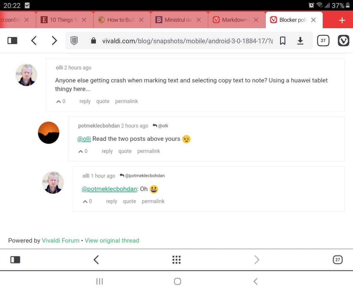
Anyone else getting crash when marking text and selecting copy text to note? Using a huawei tablet thingy here...
-
@olli Read the two posts above yours

-
@potmeklecbohdan: Oh

-
Guys, I don't want to sound pushy, but when will you finish polishing the UI for the Android version, tablet portrait layout?
I mean, just look at it! Two sets of two buttons with the same functionality. Two panel buttons and two tab switcher buttons. Just look at how ugly this is:


(The above photo was partially cropped for dramatic effect (it was shot in portrait layout). Because it definitely is dramatic enough to my poor eyes.)
Since Vivaldi is all about options, I'd be glad if you could make users able to opt out of one or both of the two buttons in the future. Or to switch functionalities between buttons. Imagine having a new note button on the button bar instead of the useless tab switcher button!
I rarely need the tab switcher anyway, because I rarely bring tabs from my PC to my tablet. I don't even need one button. Why is my UI, then, cluttered with 2 of them?
In my opinion, it would be better if the button for synced tabs would be in the tab bar in the mobile version, tablet layout. Just as it is on PC. Or at least let us choose between a cloud tabs button which leads to cloud tabs by default and a tab switcher button.
I know you guys are at the beginning with the mobile version. But I'd be glad if you could at least provide a low-effort solution to the problem for now. At least that would be better than having no solution, as it is currently.
