Opera Neon - What is it?
-
Has anyone seen the Opera Neon? What is it?
-
The link gives a 404 error currently. Maybe it was something that was leaked accidentally.

-
@kumiponi said in Opera Neon - What is it?:
The link gives a 404 error currently. Maybe it was something that was leaked accidentally.
Hmm ... Opera delete files
")
-
Here are some images:
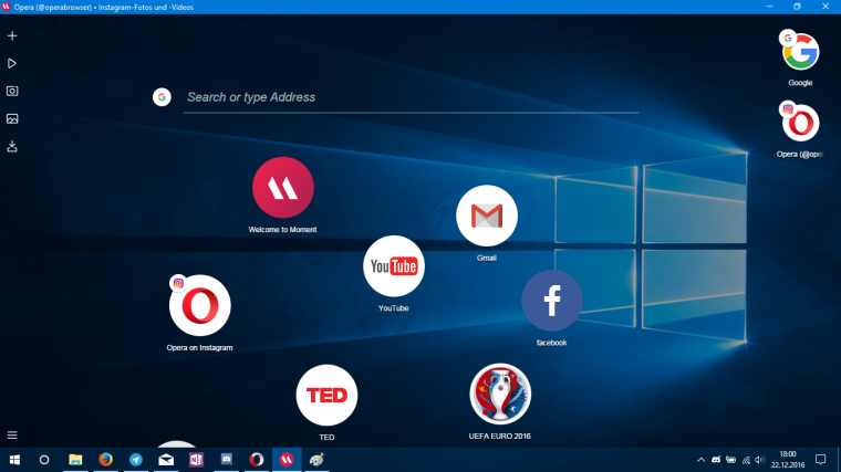
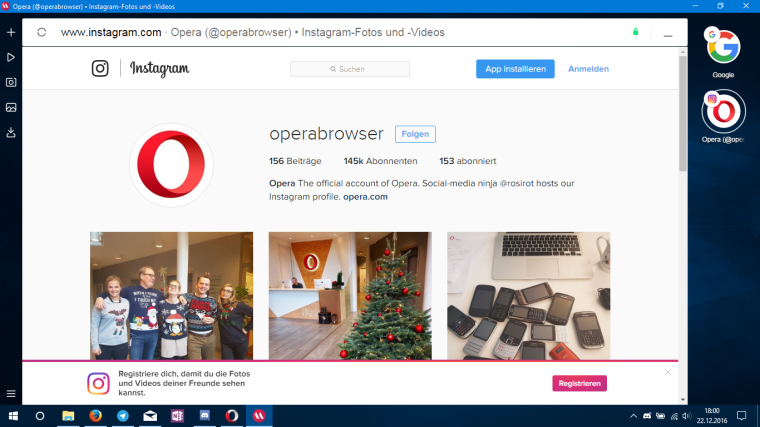
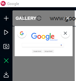
It says in about: "The fast, easy and safe browser". It's also codenamed "Opera Moment" in "about:version":
-
It's looks like UC Browser + Yandex Browser with new interface Calipso
-
It's officially out now
-
I see the blog post is written by my old boss and makes a few dubious statements, like
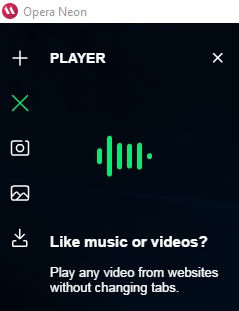
Here are some new features you won’t have seen in a browser before
and then listing things like
Vertical, visual tab bar on the right side
Not only do we have this but you can have them on the top, left, bottom, or no visuals, or show only favicons, or removed completely…
They also talk about things like Split screen mode, which I consider to be a signature feature.
P.S. Our latest snapshot lets you copy the screen shot directly to the clipboard.
-
They seem to be doing their best to alienate *nix users, not even a mention about it in the release. Even their stable and beta versions force a choice between a deb/rpm.
-
@ruario Didn't old opera have vertical visual tabs too? Neon seems like Opera trying to get back to it's roots via Vivaldi features. They do have something with the snapshots accessible from the side menu though.
-
Huh. Kind of an interesting approach. The extreme scarcity of keyboard shortcuts means it's still a toy for me for now, but it's certainly clever.
-
Having read the descriptions, and user comments on their blog, I can't bring myself to try it. It would be totally incompatible with my work flow. And I can hardly imagine anything worse than tabs that re-position themselves.
-
It's just a concept, I think it's nice they are trying something new with the layout. That being said... the browser is just a waste of screen space. The actual content of the webpages is displayed painfully small. Instead of maximising vertical viewing area, which oughta be natural because they already got rid of tabs and address bar on top, they manage to put it all to waste by displaying a big title bar for webpages. They also should have made the speed dial transparent instead of copying the wallpaper, would have made much more sense.
-
Just tested it and for me it seems like a browser inside some form of a System. I would say, even though I never tried it, this should hint at a possible competitor to Chrome OS more than a desktop browser.
As a desktop browser the UI, even though is beautiful, it is not practical.
Also it seems that one of big boasts about this new browser in Opera site and the media is the ability to split screen tabs. They never heard of Vivaldi for sure.
Curious to see were they take it or if it will only ever be a concept, but a desktop browser it is not for sure
-
- Houston we have a problem!!

- OK! Please use Vivaldi.


- Houston we have a problem!!
-
@dLeon It's okay to copy but it makes them less new/innovative if they do.
-
Well, Opera Reborn just hit the developer stream, and it's the practical take on Neon -- speak: what they will actually make of it. And it looks very much like Vivaldi did 2 years ago. Black panel, grey tab background and the tabs are not as rounded any more -- more rectangular and sharper. They also have fixed webpanels, whatsapp and messenger, but no custom webpanels so far.
-
@notevenwrong What is it about Neon you like?
-
 Ppafflick unlocked this topic on
 -
Ppafflick moved this topic from Browsers on