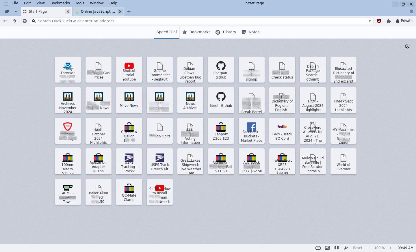
Better structure and usability for Speed Dial
-
If i have many bookmarks in Speed Dial i can not distinguish them good.
- Bookmarks on Speed Dials do not show a information panel to get more information
- As symbols, most from same subdomain with same icon, titles too short, extended information not available

- Thumbs have short titles
- Speed Dial Folders need too much keypresses
- Bookmarks Panel or Manager is not easy to use as Speed Dial by keyboard
- Widgets on Dashboard less usable by keyboard
- Moving Speed Dial groups is to much keystrokes to select these speed dials on internal navigation bar
 Grouping by rows, with separators would be nice to get more structure but not existing yet.
On Android Vivaldi 7.0 i can use list with more information

 Any modification to get better information on Speed Dial bookmarks while using with keyboard?
 Why is this browser so much mouse-user orientated!?

#UsabilityFirst #AccessibilityFirst -
- Status Bar shows URL of Speed Dial Thumbnail that is under the mouse cursor, not the one that has focus using the keyboard
- Navigation of Start Page is easier in the Bookmarks Panel
- Assign shortcuts such as Ctrl+1 … Ctrl+0 to toggle the panels. Then Ctrl+1, Home focuses the Speed Dial folder. Cursor keys to navigate
- I hide the Speed Dial titles because they are not much help. Custom Thumbnails make them easy to recognise
- Opening a Start Page folder with Enter loses focus on the page. One has to press Tab twice to focus the thumbnails in the folder
- Tab to focus the back to parent button, then Enter returns to the Start Page. However, the Start page folder thumbnail has lost focus. Tab needed again, to focus the first thumbnail, then cursor keys to get back to where you were focused before, on the Start Page folder
- Nomenclature is wrong. The Start Page contains multiple Speed Dials, and Speed Dial Folders. “The Start Page” is not “The Speed Dial.”
-
@DoctorG This is what mine looks like using a css mod. It's just for the Icon view, don't know what happens using the other settings. I'll post the css mods (could use more work) if there's any interest in duplicating it...


-
@DoctorG For titles you might extend the box to show more text. Settings for two rows.
.dials .dial .button-title {
    text-align: center; text-overflow: clip; white-space: pre-wrap;
    height: 31px; line-height: 11px; margin-top: -5px;
}
