Windows 7 not supported? (only Metro-style GUI)
-
I run a Windows 7 system, and I really do like the Aero look or visual effect. That said, I run a wide variety of software applications on the system besides a browser, and few of them provide much of an Aero "look", either native or as an option. In the grand scheme of things browser-related, for me, whether or not a browser conforms to the Aero "bling" pales to insignificance compared with its configurability, speed, and browsing capabilities.
Beyond that, it's extremely early in the game for Vivaldi. I firmly believe the best is yet to come over the coming weeks and months.
-
Yes, that's what I mean. So I'm asking if they plan to support Windows 7. This is called backward compatibility.
I can't agree that Vivalid's look doesn't conform to any system-wide visual style. It clearly resembles the Metro UI known from Windows 8/10, which makes it suitable for Windows 8/10 desktop, but a pain to use in Windows 7 desktop (especially with "classic" theme). Imagine an app that would force Win'95 look in Windows 8/10 - I'm sure you would hate it.
Sorry, but no. That's not what "backward compatibility" means. It means that an app is fully capable of running on older systems. Which Vivaldi has absolutely no problem with (even if you consider Win 7 to be an older system, which I personally wouldn't). It doesn't really matter how that app looks from the compatibility point of view, as long as it runs properly and all (or as much as possible) of its features can be used. Again, Vivaldi has no compatibility problem with Win 7 here.
Also, no, it doesn't conform to any system-wide visual style. Not even on Windows 8, 8.1 or 10. The key word here is "resembles". Yes, you might indeed say that Vivaldi UI and its window, as it is right now, does RESEMBLE a Metro-style app, but even on Windows 8.x/10 it looks different than other apps and its window style does not conform to how most of the other apps look, be it modern or legacy apps. As I've said, it simply uses its own style altogether, ignoring the system settings (at least for now). It looks the same way on any Windows system you can run it to, it pretty much looks the same in Linux and I expect it also looks pretty much the same on OS X. Why that is was explained in detail by AlexRuppert.
And, as I've noted, it's far from the only app that ignores the system-wide appearance settings and uses its own. See for example any Adobe product. Or Steam client. Or plenty of other apps.
BTW, my main Windows system is Win 7, even though I also have other systems available. And while I'm not overly fond of Vivaldi UI for a multitude of reasons and I'm hoping that there will be some changes coming, I think saying that it's "a pain to use" because it uses its own style is a bit exaggerated, let alone saying that it's "not supported", which does mean something else entirely.
-
OK, I admit I was wrong. When I started this thread, I wasn't aware that they moved entire GUI to CSS. I thought it was something different. Nevertheless, given this is all about the skin, I hope we will get an improved one, designed to be more friendly for legacy desktop.
-
The current GUI looks dreary and incompatible with every OS. The move to CSS seems like an arrogance of the designer who wants to impose a Vivaldi house style to replace our chosen OS desktop style. This is not good enough.
-
Thank you Vivaldi developers.
The spirit of Presto-based Opera (speed, configurability, etc) with a modern engine.
CSS seems like a good idea, I'm sure either:
1. someone can come up with a win7 CSS file to replace the default.
2. a future build will support a default/site/user CSS tree for endless tweaking")
Good luck with future developments! -
The current GUI looks dreary and incompatible with every OS. The move to CSS seems like an arrogance of the designer who wants to impose a Vivaldi house style to replace our chosen OS desktop style. This is not good enough.
I think 'imposing' their style is far from their goal (they are not Microsoft
") ). If you want to impose something, you don't need to use CSS, etc.
). If you want to impose something, you don't need to use CSS, etc.There are some benefits of using web technology:
- Easily customizable, skins can be created easily, lots of possibilities
- Less effort to maintain (i.e. it looks and behaves the same everywhere)
- Faster development (especially helpful for a small team)
Of course adaption to the existing environment is a problem. But this again can be solved/alleviate by skins and/or attribute injections (i.e. read out the color scheme of the OS and inject it)
-
Frankly Vivaldi theme is very close to what I'm used to on Opera 1x, so I'm very happy with it.

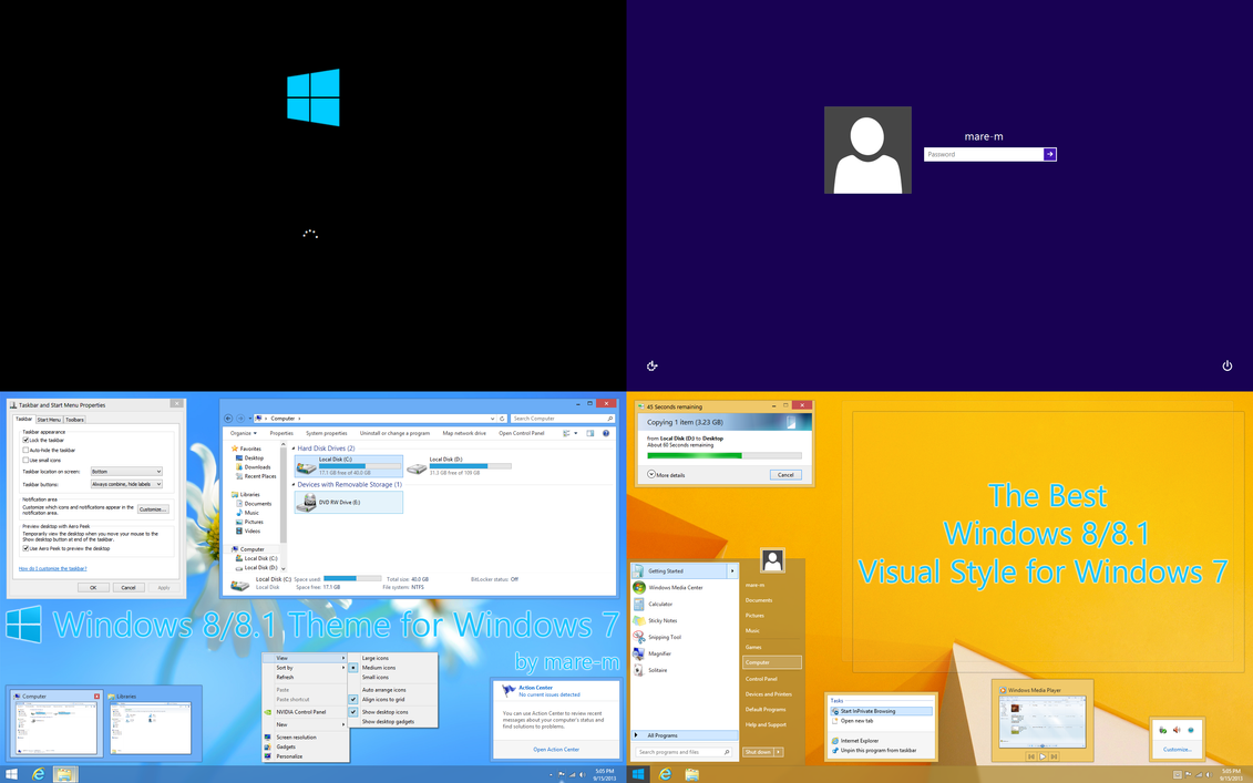
If you want more coherence with the win 7 UI just actualize the win 7 theme (you will retain the transparency, like in win 8 build 8400)
http://mare-m.deviantart.com/art/Windows-8-8-1-Theme-for-Windows-7-318932206
-
P.S.
And BTW, transparency in the browsers, especially when they aren't windowed, is not so a good Idea.
Try (on win 7 or win 8/10 with the transparency enabled) to launch Opera 12 with dozens of tabs opened and then launch Opium on top of it with just 2/3 tabs.
You will get a visual mess, because the tabs on background browser will be visible from the one in foreground….
-
Personally I think this browser is pretty damn sexy and I looooove the fact that it isn't "the same" as everything else in Windows. It's got style. If you're not a person that likes the "flat UI" type of style, fair enough, generally I don't like it all over the place either but it certainly can look nice in independent components, such as a browser.
I don't have a whole lot else to say other than to repeat what everyone else has already said about the simple fact of the browser not looking like the standard UI of everything else in Windows meaning that it doesn't support Windows 7.
Have you looked at recent versions of Microsoft Office? They have the flat UI as well, yet are fully "supported" in Windows 7 even though they don't look like Windows 7.
Anyway, I think the browser looks quite gorgeous, stylish and modern. I like where Vivaldi is going. I used to be a lover of Opera as well but in recent times it because faaaar too Chrome like - so much so that it just seemed like an Opera themed version of Chrome.
Keep it up Vivaldi Tech. Keep it up.
-
I was hoping that Vivaldi is not force us to use their flat style whatever it names.
It would be good if Vivaldi follow the GUI that set by user in their own Windows.So its going to looked like the rest of the other apps.
However If you want flat UI style you can use 3rd visual style.
BTW i am using Win8 with aero enabled.
-
BTW The UI coherence inside a single operating system, means by definition that a SW becomes incoherent with itself, when switching OS.
Once windows was the king of the OSes aimed to the end users, and the browser was just an "utility".
Nowadays the outlook is different.
Macos gained market share, Linux too.
There are a lot of Mobile operating systems, and more important some kind of programs gained a greater importance.
The browsers are one of them.
Practically nowadays the browser IS the operating system, many poeople uses an IT device just to use it.
Multimedia SW dedicated to the HTPCs is another type of this class of programs.
Now while could be nice to have a SW who respect the undeliyng GUI, could be nicer to have a SW that one uses 99% of the time coherent with itself.
Think to XBMC/Kodi. It looks exactly the same On macos, linux, windows whatever and its look has nothing to do with the underlying GUI.
I consider this a pro more than a con, and the same goes for the browser.
That said when the tabs where introduced they break some UI guidelines, and looked awkward to anyone was used to more standard looking programs. And was a good thing.
Even MS itself doesn't respect always it's own guidelines, think to media player, think to te ribbons when where firstly introduced, think to the Windows Media Center.
Sometimes the rules needs to be broken/rewritten.
vivaldi will gain surely some skinning capabilities and more and more customization options but for now I hope thei focus their efforts on more important things (mail client, sync capabilities, and small little features not yet implemented like the paste and go)
-
I really like the current design of Vivaldi as it is, but looking at the forums and what community has already done with the skin I'm sure it's not impossible for Default Aero skin to come.
-
@The_Solutor that's not how Opera 12 looked for me. This is how:

or this

But what the hell is THIS?

I cannot even tell where the window starts, it all bleeds together. I have never understood the purpose of that flat, borderless design. Perhaps it's good for tablets, but it certainly doesn't pass the test on desktops.
-
@The_Solutor that's not how Opera 12 looked for me. This is how:
…
or this
...
But what the hell is THIS?
Is a theme in line with the times.
I'm aganist the pointless innovations, but I'm well aware that the tastes are evolving.
Think to a rounded car from 1960 or so and look it with the eyes of a person from 1970.
A good car is always a good car, but its look is also important.
Now, my opinion is that while the MetroUI itself is oversimplified and mostly unnecessary, the refreshed look of the win8 desktop section is way better than the one of win 7, (letting aside the "baroque" one from Vista).
Non all from the past is bad, but this is true also for the novelties.
Integralism is pointless on both sides.
-
… Is a theme in line with the times. I'm aganist the pointless innovations, but I'm well aware that the tastes are evolving. ... Now, my opinion is that while the MetroUI itself is oversimplified and mostly unnecessary, the refreshed look of the win8 desktop section is way better than the one of win 7, (letting aside the "baroque" one from Vista). Non all from the past is bad, but this is true also for the novelties. ...
A major conceptual flaw with the "lineless" or borderless themes d'jour is that they force a user to more carefully study the screen in positioning his mouse. The borders of the various elements, tabs, and such give the user faster and more exact perspective about where to click and when it's safe to click. This is especially true when the browser is necessarily open at less than full-screen and overlaid to any extent upon other apps that may have similar white or gray backgrounds as well. The continual necessity to look carefully to avoid clicking outside non-existent lines, else loosing focus or opening the wrong thing, slows down the user's browsing experience. After heavy bouts of usage, it becomes downright tedious and taxing. This is not a Vivaldi issue alone, but is an increasing nuisance among other software as well.
My point is that borderless themes are not merely a cosmetic "taste" thing for many users, it impacts functionality and efficient usage. Clear bordering is a functional visual cue for many intensive users. From that perspective, the ability to at least supply a user choice of outlining of these various elements is an important option - regardless of what theme is delivered as default.
-
My point is that borderless themes are not merely a cosmetic "taste" thing for many users, it impacts functionality and efficient usage. Clear bordering is a functional visual cue for many intensive users.
The drop shadow applied by win7 is a clear enough border for me …
-
"My point is that borderless themes are not merely a cosmetic 'taste' thing for many users, it impacts functionality and efficient usage. Clear bordering is a functional visual cue for many intensive users. From that perspective, the ability to at least supply a user choice of outlining of these various elements is an important option - regardless of what theme is delivered as default."
^^^^^
ThisOne of the first things I posted to the forums regarding usability was that it's hard to tell one tab from the next with tabs at side, which literally slows me down, and so some sort of outlining or drop-shadow is in order. That said, offered the choice to have integrated mail or UI improvements first, I would take the integrated mail. Just sayin'
-
My point is that borderless themes are not merely a cosmetic "taste" thing for many users, it impacts functionality and efficient usage. Clear bordering is a functional visual cue for many intensive users.
The drop shadow applied by win7 is a clear enough border for me …
Perhaps it has to do with our individual visual perceptions. For me, the ability to quickly recognize a drop shadow against certain background colors or complexities (especially greys) is signficantly lower than if there is an additional apps-bordering color bar or line inside of the drop shadow.
-
I'm with Blackbird on this. We old folks need clear visual cues.
-
One of the first things I posted to the forums regarding usability was that it's hard to tell one tab from the next with tabs at side
That's why my proposal of an option to reverse the colorization behavior.
The active tab in white, all the others in their own color.
Look and functionality are not mutually exclusive.