What do you think would be the best Save Icon instead of the old Floppy?
-
In the 1970s, with the introduction of the Floppy Disk, it was also used as an icon to save a file, which today naturally is a complete anachronism (despite the fact that US nuclear missile stations continued to use these Floppies until 2019 and on 747 aircraft even today als Backup). For younger users, who are not familiar with this storage medium, this icon will therefore be very unintuitive and perhaps it is time to devise a new icon in this regard, which is more suitable for the function of saving a file. Some ideas?
Maybe something like this

>Laptop ACER, AMD Ryzen, GPU AMD Radeon RAM 16GB, SSD 512GB -Win11 Home 64 v24H2| Vivaldi last stable|
-
@Catweazle Well, for a test i just remove text below icons and nobody know what this could be.
Without test it looks more like entry and exit for me.
Icons which are not recognisable without text are not really symbols to be used for interfaces.
ym2¢ -
@Catweazle
piggy bank

-
@Catweazle
Hi, I guess legions of designer think about how a save/load icon should look.
I found one very similar to yours: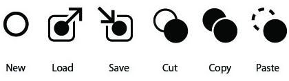
My image search for "Save" found many disks but also the Vivaldi bookmark icon.

If one use this for "Save" what is the complement for "Load"?
-
In the end, it boils down to what we agree on, then this becomes the accepted symbol. If we agree a floppy disk is a perfectly good symbol representing save/load it doesn't matter if people know what it's actually meant to symbolize historically.
Like someone said: "There's nothing intuitive about computer interfaces" - it all has to be learned.
For instance the "three dots" or "hamburger" menu:

Most anyone under the age of 40 at least knows that this means "menu".
Many older users have no idea at all there's even a menu there.
But who decided this was the most "logical" way to represent it? We all just have to learn that's what it means.Another example is the "Menu button" in Vivaldi. By default, this is just the logo - there's no indication there's a menu there and no helpful "Click here for menu" popup. People used to computer interfaces knows that usually that's the first place to look because that's where it's been for a lot of other programs. Or just try pressing the Alt key, which again is the agreed-upon way to focus a dropdown-menu and has been for several decades.
Recently of course, other browsers have started using a "three-dot/hamburger" menu button on the right of the address bar. Users coming to Vivaldi from these browser risk not understanding there even is a menu in Vivaldi. Unless they accidentally hit the Alt key or have the understanding of interfaces to at least try clicking the icon.
-
New UI icons/signs need A/B tests with a group of testing people from all ages and cultures.
But that is what most "cool" designers do not think about. I do not know what they learn about industrial design and usability.I think, if you can not see fast what a sign means, you steal people seconds from their life time which users are not paid for and do not get this time back in reality.
Bad UI and OS design is so familiar to us that we accept such shit. Oh, and i am ranting on bad usability of technical devices, IT and other since decades.
-
@Catweazle For me your symbols looks like Input and Output.
-
@Catweazle I had the same debate when discussing a new theme for an application some months ago (one icon for saving a file and another for downloading)
The designs that were better recognized by most people I asked for opinion were something on the lines of an arrow indicating content being moved somewhere:
Here are some of the designs that served as inspiration:
 https://cdn-icons-png.flaticon.com/512/6324/6324597.png
 https://www.citypng.com/public/uploads/preview/save-to-folder-download-icon-png-116645005514cvquvxxqr.png
 https://cdn.iconscout.com/icon/free/png-256/free-save-1779882-1518534.png?f=webp
 https://cdn.dribbble.com/users/71134/screenshots/1020838/save-icon.png
-
@pauloaguia for me with a fast look - the first two: "put in folder"; the last two : "throw away"; the last "Recycle".
perhaps woman and men and different cultures have different perception on what is what.
-
-

>Laptop ACER, AMD Ryzen, GPU AMD Radeon RAM 16GB, SSD 512GB -Win11 Home 64 v24H2| Vivaldi last stable|
-
@Catweazle And for Open:

🎻Volunteer helper · Forum moderator · Sopranos tester 🛠️Troubleshooting 🐛Report a bug 📜Markdown help
🦆"With a rubber duck, one's never alone" -Douglas Adams🦆 -
@Pathduck Kind of large for an icon.

I like the old arrow into a folder for Save, and of course arrow out of a folder for Open.
-
This post is deleted! -
@jahir2181, nice page, but nothing to do with the threat. All images there tagged with #z, Zara, zebra, zombie...and so on. Better search on one of the clipart galleries out there (svg, png...)
-
„The floppy disk icon is a - language, not a metaphor. It doesn't matter that we stop writing files to 1.44 MB 3.5-inch hard drives. It doesn't matter that many users don't even know what a floppy disk is. Importantly, users associate the icon with saving.“
And today, today you would probably have to use an SSD icon.

https://miisa-k.blogspot.com/2021/04/ssd-icon-931207-ssd-icon-mac-os-x.html
-
@Thot, with this metaphor argument, it could be used with the same logic to use a punched card, a magnetic tape, a 5 3/4 disk or a pendrive.
All the icons used are metaphorical, but all of them, apart from the one mentioned, are much more generic and intuitive than this Floppy, which in the future is not even understandable for the youngest as a storage medium..>Laptop ACER, AMD Ryzen, GPU AMD Radeon RAM 16GB, SSD 512GB -Win11 Home 64 v24H2| Vivaldi last stable|
-
@Catweazle said in What do you think would be the best Save Icon instead of the old Floppy?:
which in the future is not even understandable for the youngest as a storage medium..
Maybe, but as a youngest, which I’m by far not anymore, I think it’s important to know also something about Computer History. Said: Where does it all comes from? Not everybody is willing to do this, but computers didn't come into being out of nowhere.
But the younger ones should already know an SSD icon for saving a file, for instance?
")
-
@Thot, we are not the only ones here who discuss this topic, there are similar discussions on many other networks.
For us who still know what a floppy is, it is intuitive to associate the save with using it as a symbol, but this can change quickly in the future.
I am from the generation that still knew punched tapes and punched cards as a storage medium, but young people today would surely not associate an icon of a punched card to save a file, the same thing will happen with the floppy sooner or later.- https://www.hanselman.com/blog/the-floppy-disk-means-save-and-14-other-old-people-icons-that-dont-make-sense-anymore
- https://www.reddit.com/r/UI_Design/comments/sn9qt8/what_symbol_could_replace_the_floppy_disk_as_the/
- https://graphicdesign.stackexchange.com/questions/323/new-generation-of-save-icon-that-is-not-a-disk
- https://uxdesign.cc/the-floppy-disk-save-icon-visual-language-of-an-era-long-gone-93f74efc9f9
- https://medium.com/@kmohl/a-new-save-icon-and-more-e7a1d39cec38
etc.
>Laptop ACER, AMD Ryzen, GPU AMD Radeon RAM 16GB, SSD 512GB -Win11 Home 64 v24H2| Vivaldi last stable|
-
@Catweazle said in What do you think would be the best Save Icon instead of the old Floppy?:
young people today would surely not associate an icon of a punched card to save a file, the same thing will happen with the floppy sooner or later.
True, so why not ask them themselves? I think we can’t decide this for them. And time will tell, if the icon will change in fifty or hundred years from now on, or not.


