Tab Loading Indicator
-
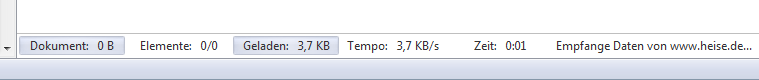
If the fix were simple, it would have been implemented already. Both developers and testers have been tossing around ideas for a better implementation. As it stands, there are now (in the new snapshots) two instantaneous indications that "something is going on." As soon as the browser sends a request for a website, the entire address bar changes color and the reload button turns to a stop button. Then as soon as the browser begins to receive data, the progress bar crawls across the address bar, and the data and element counters begin to increment. For my part, these are painfully obvious indicators of what the browser is doing in real time. There may yet be a better design.
I don't think you're going to convince people to stop desiring a throbber or animation of some sort. People have been accustomed to it in browsers for decades, as a familiar "something is working" representation. There's a reason why such animations caught on in the beginning and why they have held on for two decades – they still feel reassuring, and the movement catches one's attention even when seen in peripheral vision.
For tabs that are downloading the page, I already made for myself clockwise-spinning favicon CSS mod:
@keyframes spin {
   from {transform:rotate(0deg);}
   to {transform:rotate(360deg);}
}
.tab-header .progress-indicator.progressing + span.favicon {
   animation-name: spin;
   animation-duration: 1000ms;
   animation-iteration-count: infinite;
   animation-timing-function: linear;
}
… but that only goes into effect one data is being received, because Vivaldi only adds the "progress" class to the tab's progress-indicator after the server starts sending data. So I thought of adding a slower, counter-clockwise spin (taking a cue from Chrome and Firefox's counter-clockwise-circling waiting-for-server throbbers) while Vivaldi waits to get a server response:
.tab-header .progress-indicator:not(.progress-done):not(.progressing) + span.favicon {
    animation-name: spin;
    animation-duration: 3000ms;
    animation-iteration-count: infinite;
    animation-timing-function: linear;
    animation-direction: reverse;
}
but I discovered that the problem with this idea is that the ":not(.progress-done):not(.progressing)" also gets triggered by tabs that do not yet have loaded pages due to Vivaldi's lazy-loading of background tabs from previous sessions. The tabs currently get no temporary, more specific "progress-waiting-for-server" class that CSS could latch onto.
What one can do already, however, is a mod like pulsing the X button or the addressfield, because those get added classes as soon as the request is made
@keyframes fade{
    from {opacity:1}
    to {opacity:0.4}
}
/* Either pulse the "X"... */
.button-toolbar.reload.loading svg{
    animation-name: fade;
    animation-duration: 400ms;
    animation-iteration-count: infinite;
    animation-timing-function: ease-in-out;
    animation-direction:alternate;
}
/* ...or pulse the addressbar: */
.addressfield .progressing{
    animation-name: fade;
    animation-duration: 400ms;
    animation-iteration-count: infinite;
    animation-timing-function: ease-in-out;
    animation-direction:alternate;
}
I don't know if it's to Vivaldi team's aesthetic taste, but I'm guessing that something like the above pulsing "X" or pulsing address bar solution would satisfy many of the people complaining.
P.S.: Googing turned up a site handy for testing a long wait for a server response: https://fake-response.appspot.com/api/?sleep=20
Edit: I just noticed that when I click on the link above (which in this forum, pops it as a new tab), the CSS effects don't happen for a new tab. But for that matter, there's a bug that the usual "X" button and shaded addressbar you mentioned aren't showing up in the a new tab either. Apparently the reload button's "loading" and the addressfield's "progressing" classes aren't being set.
2017.04.05 edit, now that some of us apparently can edit old posts: code formatting in this post, that gone mangled in the forum switchover, should hopefully be all fixed now.
-
+1, again.
This is huge pain at work where Vivaldi's my main browser. -
As it stands, there are now (in the new snapshots) two instantaneous indications that "something is going on." As soon as the browser sends a request for a website, the entire address bar changes color and the reload button turns to a stop button. Then as soon as the browser begins to receive data, the progress bar crawls across the address bar, and the data and element counters begin to increment. For my part, these are painfully obvious indicators of what the browser is doing in real time. There may yet be a better design.
Unfortunetaly there are some occasions, where you clicked a link or pressed return from the address-bar where nothing happens. The addressbar doesn't change the color (maybe the icon switches). I begin to think if I have clicked correctly, then do it again.
So there are times when you think nothing happends. Normally I look at the status bar or adressbar. Muscle memory lets me look at the tabs (for a spinning wheel ;)). I think it would be clever to make it more obvious. The toolbar is too flat and shy for that.
-
while waiting for Vivaldi team to implement something better, you can use den_po mods
https://vivaldi.net/en-US/forum/modifications/15473-vivaldihooks-more-useful-mods -
As it stands, there are now (in the new snapshots) two instantaneous indications that "something is going on." As soon as the browser sends a request for a website, the entire address bar changes color and the reload button turns to a stop button. Then as soon as the browser begins to receive data, the progress bar crawls across the address bar, and the data and element counters begin to increment. For my part, these are painfully obvious indicators of what the browser is doing in real time. There may yet be a better design.
Unfortunetaly there are some occasions, where you clicked a link or pressed return from the address-bar where nothing happens. The addressbar doesn't change the color (maybe the icon switches). I begin to think if I have clicked correctly, then do it again.
So there are times when you think nothing happends. Normally I look at the status bar or adressbar. Muscle memory lets me look at the tabs (for a spinning wheel ;)). I think it would be clever to make it more obvious. The toolbar is too flat and shy for that.
I can confirm that in the snapshot version 1.5.618.8 the URL does change colour as soon as you send a request, which is infinitely better than the situation with the current stable release. The sentence from Ayespy about what happens once the response starts coming back is irrelevant to this thread.
I'm not sure if I prefer this option over an animation of some sort, I'd have to use it for a while to make up my mind. On the other hand, I'm certain that I would be satisfied by an animated graphic of some sort in a sensible position such as near the URL bar on on the tab itself.
-
I still don't like Vivaldi's behaviour. In 1.6.689.46 stable, the grey colour is too light to easily notice and the animation is over so quick that if you blink you'd miss it. I still find myself repeatedly mashing links and buttons thinking that the initial click did nothing occasionally. The colour change needs to be more extreme. Or better yet use an animation, now there's an idea!
-
@samhall said in Tab Loading Indicator:
I've just tried the snapshot and there is still no indication that a request has gone out and the browser is waiting for the response to begin (other than the stop button).
And the fact that the address bar suddenly morphs into showing you megabytes and the # of elements transferred, pretty noticeably.
-
@axxl said in Tab Loading Indicator:
As it stands, there are now (in the new snapshots) two instantaneous indications that "something is going on." As soon as the browser sends a request for a website, the entire address bar changes color and the reload button turns to a stop button. Then as soon as the browser begins to receive data, the progress bar crawls across the address bar, and the data and element counters begin to increment. For my part, these are painfully obvious indicators of what the browser is doing in real time. There may yet be a better design.
Unfortunetaly there are some occasions, where you clicked a link or pressed return from the address-bar where nothing happens. The addressbar doesn't change the color (maybe the icon switches). I begin to think if I have clicked correctly, then do it again.
Yes, that happens to me from time to time. It's frustrating. I think that some animated icon or some animation should be "in motion" as soon as the user clicks on a link.
So there are times when you think nothing happends. Normally I look at the status bar or adressbar. Muscle memory lets me look at the tabs (for a spinning wheel ;)). I think it would be clever to make it more obvious. The toolbar is too flat and shy for that.
That likely explains why I'm often unsure whether I have clicked the link or not.
Ryo
-
@rseiler said in Tab Loading Indicator:
@samhall said in Tab Loading Indicator:
I've just tried the snapshot and there is still no indication that a request has gone out and the browser is waiting for the response to begin (other than the stop button).
And the fact that the address bar suddenly morphs into showing you megabytes and the # of elements transferred, pretty noticeably.
Have another read through the thread. The issue is when the request goes out, not when the response starts coming back. Web applications tend to take a while to start responding in certain circumstances when lots of processing is required and in these cases Vivaldi does a poor job of giving the user adequate feedback that it's waiting for the start of the response.
-
Ack -- I see that my previous post in this thread got quite mangled during the forum software switchover. (To my annoyance) I can't edit it now, so I'm quoting it below with (I think) all of the corruption fixed. Also, I had to insert ```[space]``` marks in the quoted post's markdown to separate paragraphs, because quoted paragraphs otherwise get no line space displayed between them, at least as its showing up in preview right now.
@Isildur said in Tab Loading Indicator:
If the fix were simple, it would have been implemented already. Both developers and testers have been tossing around ideas for a better implementation. As it stands, there are now (in the new snapshots) two instantaneous indications that "something is going on." As soon as the browser sends a request for a website, the entire address bar changes color and the reload button turns to a stop button. Then as soon as the browser begins to receive data, the progress bar crawls across the address bar, and the data and element counters begin to increment. For my part, these are painfully obvious indicators of what the browser is doing in real time. There may yet be a better design.
I don't think you're going to convince people to stop desiring a throbber or animation of some sort. People have been accustomed to it in browsers for decades, as a familiar "something is working" representation. There's a reason why such animations caught on in the beginning and why they have held on for two decades – they still feel reassuring, and the movement catches one's attention even when seen in peripheral vision.
For tabs that are downloading the page, I already made for myself clockwise-spinning favicon CSS mod:@keyframes spin { from {transform:rotate(0deg);} to {transform:rotate(360deg);} } .tab-header .progress-indicator.progressing + span.favicon { animation-name: spin; animation-duration: 1000ms; animation-iteration-count: infinite; animation-timing-function: linear; }… but that only goes into effect one data is being received, because Vivaldi only adds the "progress" class to the tab's progress-indicator after the server starts sending data. So I thought of adding a slower, counter-clockwise spin (taking a cue from Chrome and Firefox's counter-clockwise-circling waiting-for-server throbbers) while Vivaldi waits to get a server response:
.tab-header .progress-indicator:not(.progress-done):not(.progressing) + span.favicon {
    animation-name: spin;
    animation-duration: 3000ms;
    animation-iteration-count: infinite;
    animation-timing-function: linear;
    animation-direction: reverse;
}
but I discovered that the problem with this idea is that the ":not(.progress-done):not(.progressing)" also gets triggered by tabs that do not yet have loaded pages due to Vivaldi's lazy-loading of background tabs from previous sessions. The tabs currently get no temporary, more specific "progress-waiting-for-server" class that CSS could latch onto.
What one can do already, however, is a mod like pulsing the X button or the addressfield, because those get added classes as soon as the request is made@keyframes fade{ from {opacity:1} to {opacity:0.4} } /* Either pulse the "X"... */ .button-toolbar.reload.loading svg{ animation-name: fade; animation-duration: 400ms; animation-iteration-count: infinite; animation-timing-function: ease-in-out; animation-direction:alternate; } /* ...or pulse the addressbar: */ .addressfield .progressing{ animation-name: fade; animation-duration: 400ms; animation-iteration-count: infinite; animation-timing-function: ease-in-out; animation-direction:alternate; }I don't know if it's to Vivaldi team's aesthetic taste, but I'm guessing that something like the above pulsing "X" or pulsing address bar solution would satisfy many of the people complaining.
P.S.: Googing turned up a site handy for testing a long wait for a server response: https://fake-response.appspot.com/api/?sleep=20
Edit: I just noticed that when I click on the link above (which in this forum, pops it as a new tab), the CSS effects don't happen for a new tab. But for that matter, there's a bug that the usual "X" button and shaded addressbar you mentioned aren't showing up in the a new tab either. Apparently the reload button's "loading" and the addressfield's "progressing" classes aren't being set. -
@Isildur Thanks, that CSS actually works great on the snapshot version as the address bar colour is a nice bright colour, I like it. It would be perfect if the "X" changed to a throbber and the addressfield throbbed a little slower (about 600ms is a bit more calming).
On the stable version, the addressfield is a very light grey, you can't really tell anything is going on there. I can't figure out the CSS required to change the whole bar's background to something darker.
Update: Never mind, I was using Subtle theme in my stable version. Once I changed to any other theme I was very happy with the result. I guess if someone selects the Subtle theme, they shouldn't really complain if that's what they get!
")
Your CSS as it is now would certainly get my vote for inclusion in the product. Someone with more time on there hands might also want to consider looking at something like this though... http://tobiasahlin.com/spinkit/
-
@samhall said in Tab Loading Indicator:
On the stable version, the addressfield is a very light grey, you can't really tell anything is going on there.
[ . . . ]
Update: Never mind, I was using Subtle theme in my stable version. Once I changed to any other theme I was very happy with the result. I guess if someone selects the Subtle theme, they shouldn't really complain if that's what they get!I'm not sure what "Subtle" theme means here (sorry I haven't followed the thread closely), but the change in the address field color is so subtle that it's not easy to tell the change. I'm just using one of the official themes.
I'm not asking how to customize the theme. I'm just saying that official themes should work better out of the box.
-
@ryofurue When navigating to Tools | Settings | Themes, Subtle is the second theme in the list. The existing background animation and colour change of the address bar when the request is fired off is a lighter (transparenter?) version of the tab colour.
I've just had a play with theme settings. It's a fact that if the theme settings background and accent are the same or very close, then the address bar colour change and short animation that currently occurs before the HTTP response begins to return will be impossible or very difficult to perceive. This makes it hard to know if a click on a link or button actually registered or not when the response is delayed, such as the behaviour simulated by the link posted above... http://www.fakeresponse.com/api/?sleep=20
Two things could be addressed here to improve the user experience:
- Address bar background should change to a colour that contrasts with theme's Background value, not be tied to the Accent value (or do something more creative entirely to indicate the request was fired)
- Current animation is too short, should be infinite (like the CSS example above, or do something more creative)
-
I've settled on this in my custom.css which uses the spin animation CSS Isildur posted above, but applied to the stop button. Works just fine in Subtle theme, though it's a little on the wacky side...
@keyframes spin{ from {transform:rotate(0deg);} to {transform:rotate(90deg);} } @keyframes fade{ from {opacity:1} to {opacity:0.2} } /* Either pulse the "X"... */ .button-toolbar.reload.loading svg{ animation-name: spin; animation-duration: 1200ms; animation-iteration-count: infinite; animation-timing-function: linear; } /* ...or pulse the addressbar: */ .addressfield .progressing{ animation-name: fade; animation-duration: 600ms; animation-iteration-count: infinite; animation-timing-function: ease-in-out; animation-direction:alternate; } -
I'd like to see what's happening, so you see if vivaldi is still connecting
or already receiving data. I loved the pupup-bar in Opera.
-
@Nordlicht said in Tab Loading Indicator:
I'd like to see what's happening, so you see if vivaldi is still connecting
or already receiving data. I loved the pupup-bar in Opera.
Yes, I liked getting those details in Opera. I recall that in the early Web years, many other browsers also tended to similarly show more details about connection state and progress (e.g. "Connecting to http://www.lycos.com/" ... "Connection established" ... "Downloading item 3 of 12 -- 1.2kB/s."). Over time they moved to just having progress bars, and by now most don't even have the full status bars that such info used to be shown in.
-
@Isildur Lycos.... now that's a name I haven't heard in ages ^^
And yes this popupbar was pretty cool.
Anyone know if something like this or at least the included informations are already requested?
I'd vote for it -
@Ayespy I have the address bar hidden as I like the minimalist approach. So the only thing I see is the tab bar. It would be nice to see that my current tab is not standing still but is actually doing something.
-
Any update on this? If i upload some file or import something heavy and move on to next tab. I don't know what is happening in that tab. Its impossible to keep my eye reload/stop indicator. This power user browser should add an option whether user want to keep seeing favicon or replace it with a loading indicator while page is waiting for response.. I have been using Vivaldi since last 2 days and this is a huge annoyance as i can't see what is happening to page while working on something else.
-
@cagalindo said in Tab Loading Indicator:
This works for me, May 2017.
@keyframes spin {
from {transform:rotate(0deg);}
to {transform:rotate(360deg);}
}
.tab-header .progress-indicator.progressing + span.favicon {
animation-name: spin !important;
animation-duration: 1000ms !important;
animation-iteration-count: infinite !important;
animation-timing-function: linear !important;
}
.tab-header .progress-indicator:not(.progress-done):not(.progressing) + span.favicon {
animation-name: spin;
animation-duration: 3000ms !important;
animation-iteration-count: infinite !important;
animation-timing-function: linear !important;
animation-direction: reverse !important;
}
/* Remove Buttons */
button.button-toolbar.home,button.button-toolbar.reload,button.button-toolbar.next,button.button-toolbar.rewind{
display: none;
}Tab icon will keep spinning until loaded.
Huh?
Except for the /*Remove Buttons*/ part at the end, which just removes buttons, rather than addressing anything discussed here, that's just taking the exact CSS I already devised and gave earlier in the thread and just adding unnecessary "!important" directives to the end of most lines. ("!important"s are only necessary when you need to preemptively override CSS statements that would otherwise be stated subsequently in CSS rules with the same specificity. There are no conflicting CSS statements in this case, so the "!important"s are not needed.)