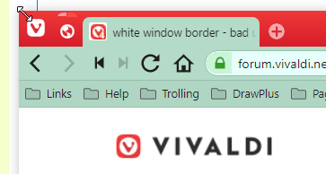
white window border - bad usability
-
sadly vivaldi uses a color scheme that makes it awfully hard to distinguish betwen elements.
At least once a day I am forced to find the edges of the vivaldi browser window. On my windows7 its just plain white with no other border. Some websites open popups in front of the white website in vivaldi. the new white vivaldi window is indistinguishable from the website or other white contend behind.
At home I use a display with very large resolution, so vivaldi runs in a floating window. Here the problem is even more prominent. My other applications show proper edges (in my case grey), so this must be a vivaldi specific issue.Also the handles to resize the window are awfully tiny, especially in the cornes. Why did the classic window-resize corner gone missing? The bottom bar of vivaldi contains a huge amount of free space. Just move the stuff from the sides some pixels to the center and provide proper handles, please!
I just noticed the white-on-white color scheme in the forums too. This 'new topic' form has no/white or light grey borders aound the input fields. I needed to click differnt white areas do find input fields. That can´t be a valid solution.
greetings
-
Exactly. I'm complaining about borderless windows for ages, but there are still some users that they are working with only one window at the same time which is maximized and will try to convince me that it is far better to have borderless windows than with border. I'm noticing in every build that borders are still missing.
-
No problem here if the Window is not maximised. The drop shadow makes the border easy to distinguish and grab.
-
If i'm not mistaken, was a border not added in one of the snapshots? I remember modifying the CSS so that I could change its colour.
I never noticed it getting removed, but it must have been at some point if it's not there any more.
In the meantime you could always enable the "use native window" option in settings > appearance
💻 Windows 10 64-bit Sopranos Builds • en-GB • 🗳 vote for features • 🕵️♀️ Code of Conduct • 🐞 Report bugs
-
@lonm said in white window border - bad usability:
was a border not added in one of the snapshots?
I think there was. This change was not universally liked, so maybe they reverted the change for now, until they can make it optional?
Ideally, users should not have to edit CSS, but if we don't wish to wait for features that is the only way. I edit my CSS with every update to get transparent speed dials, and to hide the navigation bar in the Start Page.
.startpage .dial .thumbnail-image {
background-color: transparent;
}
.thumbnail-image {box-shadow: none !important;}
.startpage-navigation {
display: none !important;} -
@yo_dude Regarding the missing window border look at this topic: https://forum.vivaldi.net/topic/25660/nicht-vorhandener-fensterrahmen/10 – it works for me perfectly!
-
 P pafflick unlocked this topic on
-
P pafflick moved this topic from Vivaldi for Windows on