Vivaldi UI Customisations
-
If someone's already done something similar I apologize for duplicating, but a quick search didn't turn up anything obvious.
I wanted tabs to be rounded with a bit of shadow above. I settled on this:
[attachment=3225]roundedtabs.png[/attachment]! ```
.tab-position .tab:not(.tab-group) {
border-radius: 5px 5px 0px 0px;
box-shadow: 0px -1px #ccc;
}
! .stacks-on .tab-strip .tab .tab-group-indicator .tab-indicator {
border-radius: 4px 4px 0 0/50% 50% 0 0;
border-top: 1px solid #bbb;
}Edit: By the way those little caps at the top left corners don't always show up: Those are just the "unread tab" indicators. I rounded it a little less than might otherwise have done, to make sure that those indicators wouldn't get cut off too much. Attachments:  -
If someone's already done something similar I apologize for duplicating, but a quick search didn't turn up anything obvious.
I wanted tabs to be rounded with a bit of shadow above. I settled on this:
[attachment=3225]roundedtabs.png[/attachment]! ```
.tab-position .tab:not(.tab-group) {
border-radius: 5px 5px 0px 0px;
box-shadow: 0px -1px #ccc;
}
! .stacks-on .tab-strip .tab .tab-group-indicator .tab-indicator {
border-radius: 4px 4px 0 0/50% 50% 0 0;
border-top: 1px solid #bbb;
}Edit: By the way those little caps at the top left corners don't always show up: Those are just the "unread tab" indicators. I rounded it a little less than might otherwise have done, to make sure that those indicators wouldn't get cut off too much.
I've done something similar in my own personal css, but I've not shared it before (it's a mess and I'm always tweaking it) because I'm not perfectly happy with it yet (when using "Remove Tab Spacing in Maximized Windows"):
[attachment=3240]tabs-unread.png[/attachment]
! ```
/[Tabs]/
.tab-position .tab {
/[Round Tabs]/
border-radius: 8px 8px 0 0;
/[Define Tab Border/Edge]/
border-left: solid rgba(255, 255, 255, 0.1) 0.5px;
border-top: solid rgba(255, 255, 255, 0.1) 0.5px;
border-right: solid rgba(200, 200, 200, 0.1) 0.5px;
}
.tab-position .tab.active .tab-header {
/[Round Active Tabs]/
border-radius: 7px 7px 0 0;
/[Give active tab somewhat 3D appearance]/
background-image: linear-gradient(to bottom, rgba(255, 255, 255, 0.22), rgba(255, 255, 255, 0.11) 25%, rgba(255, 255, 255, 0) 45%);
/[Define Tab Border/Edge]/
border-left: solid rgba(255, 255, 255, 0.35) 1px;
border-top: solid rgba(255, 255, 255, 0.35) 1px;
border-right: solid rgba(200, 200, 200, 0.2) 1px;
}
.tab-position .tab.unread {
/[Tweak unread tab indicator (Light UI)]/
background-image: linear-gradient(-135deg, rgba(0, 0, 0, 0.57) 0, transparent 10px);
}
.ui-dark .tab-position .tab.unread {
/[Tweak unread tab indicator (Dark UI)]/
background-image: linear-gradient(-135deg, rgba(255, 255, 255, 0.57) 0, transparent 10px);
}
! /[Group Indicators]/
.tab-position .tab.tab-group, .tab-position .tab.active.tab-group {
border-top: 0;
}
.tab-position .tab.active.tab-group .tab-header {
/[tweak active tab border and blend it into group-indicator]/
background-image: linear-gradient(to bottom, rgba(255, 255, 255, 0.22), rgba(255, 255, 255, 0.11) 25%, rgba(255, 255, 255, 0) 45%);
border-image: linear-gradient(to bottom, transparent, rgba(255, 255, 255, 0.33)) 1 100%;
border-bottom: 0;
border-top: 0;
}
.maximized.tabs-at-edge #tabs-container.top .tab-group-indicator {
/[when maximized, keep group indicators below tabs]/
z-index: 0;
}
.maximized.tabs-at-edge #tabs-container.top .tab-group-indicator .tab-indicator {
/[when maximized, adjust size and position of group indicators]/
height: 5px;
margin-top: 2px;
}
.stacks-on .tab-strip .tab .tab-group-indicator .tab-indicator {
/[adjust size and position of group indicators]/
margin-top: 3px;
height: 10px;
z-index: -1;
/[Define Tab Group Indicator Border/Edge]/
border-left: solid rgba(255, 255, 255, 0.1) .5px;
border-top: solid rgba(255, 255, 255, 0.30) 1px;
border-right: solid rgba(200, 200, 200, 0.1) .5px;
border-bottom: 0;
}
.stacks-on .tab-strip .tab .tab-group-indicator .tab-indicator.active {
/[Give active tab group indicator somewhat 3D appearance]/
background-image: linear-gradient(to bottom, rgba(255, 255, 255, 0.28), rgba(255, 255, 255, 0.1));
}
.stacks-on .tab-strip .tab .tab-group-indicator .tab-indicator:first-child {
/[round left-most group-indicator]/
border-top-left-radius: 7px;
}
.stacks-on .tab-strip .tab .tab-group-indicator .tab-indicator:last-child {
/[round right-most group-indicator]/
border-top-right-radius: 7px;
margin-right: -1px;
}Also shown in the screenshots, I've removed the white box around the favicons and added a slight 3d shadow with:.tab-header .favicon {
/[Remove border around favicon(tab icon) and add shadow]/
box-shadow: none !important;
background-color: transparent !important;
-webkit-filter: drop-shadow(-1px -1px 0px rgba(200,200,200,0.9)) drop-shadow(1px 1px 1px rgba(0,0,0,0.7));
}* * * Additionally, if you're using the horizontal menu or you've moved your V menu button to the right using the code posted a few pages back; you may be interested in adding a border to the toolbar to match the active tab:.toolbar.toolbar-addressbar {
border-left: solid rgba(255, 255, 255, 0.35) 1px;
border-right: solid rgba(200, 200, 200, 0.2) 1px;
}* * * Personally I feel like the default addressbar feels out of place with the new rounded tabs and I use this too: [attachment=3239]rounded-addy.png[/attachment] >! ``` /****[Address Bar]****/ .addressfield, .searchfield { margin: 5px; height: 24px; border: 1px solid; } .addressfield, .searchfield, .addressfield:after, .searchfield:after { border-radius: 4px; } .addressfield .addressfield-siteinfo, .addressfield .addressfield-siteinfo:before { /**[round the site-info/ssl button]**/ border-radius: 3px 0 0 3px; } .addressfield form input.url { box-shadow: none; } >! ``` * * * @sdfg: > This is good, thank you, but is there any way to make the address bar selected by default on a new tab? Right now when I open a new tab I have to scroll over and click on the address bar before I can start typing :-( A lot of people have been requesting things regarding the intelihide panels, so I intend to go back and play around with it soon. Some of the requests have been for things that might not be possible with pure css, but I think this might be because we're setting the toolbar visibility to hidden. Attachments: 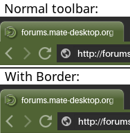,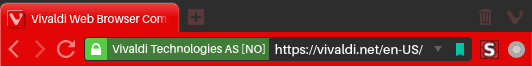,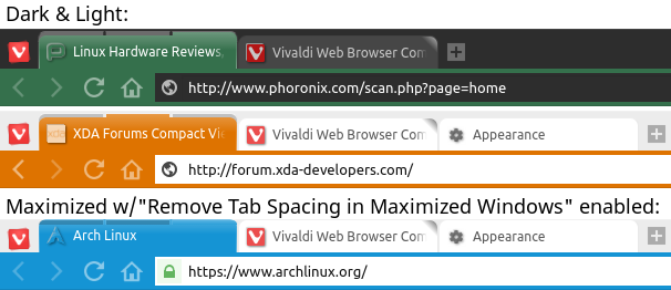 -
Also shown in the screenshots, I've removed the white box around the favicons and added a slight 3d shadow with:
.tab-header .favicon {
	/**[Remove border around favicon(tab icon) and and shadow]**/
	box-shadow: none !important;
	background-color: transparent !important;
	-webkit-filter: drop-shadow(-1px -1px 0px rgba(200,200,200,0.9)) drop-shadow(1px 1px 1px rgba(0,0,0,0.7));
}
Thank you for the code for the favicon white box! It normally looks a lot better, but the problem is that the current tabs still have a white box sticking out of the left and top side, like the favicon isn't totally centered. Is there a fix for that?
-
Thank you for the code for the favicon white box! It normally looks a lot better, but the problem is that the current tabs still have a white box sticking out of the left and top side, like the favicon isn't totally centered. Is there a fix for that?
I think you're referring to the non-blurred white shadow I added to contrast the icon and make it appear embossed. I played around with several types of shadows to try and make sure the icon was always visible even when the icon is the exact same color as the tab.
This is the line that adds the shadow:
-webkit-filter: drop-shadow(-1px -1px 0px rgba(200,200,200,0.9)) drop-shadow(1px 1px 1px rgba(0,0,0,0.7));
```This is the portion that's defining the white shadow that's pulled up (-)1pixel and left (-)1pixel, the third number (0px) is the blur factor. The next portion RGBA(x,x,x,x) defines Red, Green, Blue,(0-255) and Alpha/Transparency(0.0-1.0) of the shadow.
drop-shadow(-1px -1px 0px rgba(200,200,200,0.9))
EDIT:

* * *

If you're interested, some of the other shadows I played around with and saved were:

A```
-webkit-filter: drop-shadow(0px -1px 0px white) drop-shadow(1px 1px 1px black) drop-shadow(-1px 0px 0px white);
B (This is probably the least obnoxious)```
-webkit-filter: drop-shadow(-1px 0px 1px rgba(0,0,0,0.4)) drop-shadow(1px 1px 0px rgba(200,200,200,0.6));* * * C``` -webkit-filter: drop-shadow(0px 2px 1px black) drop-shadow(0px -1px 1px black ) drop-shadow(0px 0px 2px white); -
So I removed the following from the css code: drop-shadow(-1px -1px 0px rgba(200,200,200,0.9))
And it looks much better!
It's perfect. And I hope Vivaldi changes their current favicon design to take away the white background box in the 1.1 version, to polish it up.
-
Did I miss something somewhere, or, what makes the browser to "gray out" when it's an inactive window.
Currently i have:#browser.ui-dark, #browser.ui-light {
background-color: #9ac5c5 !important;
}To give base color for the browser, but how can i make that to dim out like tabs and icons do, when the browser is not the active window?
the "isblurred" class
ie; #browser.ui-dark.isblurredAlso, !important shouldn't be necessary. A properly defined selector should rarely need it, unless you know exactly why you're using it. Overuse can create problems.
")
-
the "isblurred" class
ie; #browser.ui-dark.isblurredAlso, !important shouldn't be necessary. A properly defined selector should rarely need it, unless you know exactly why you're using it. Overuse can create problems.
Ah, thank you.
And yeah, that was from some copy-paste, i usually do clean up unnecessary stuff at some point ;p -
@Merlin_:
Hey all, Is there a way using the custom.css to cause loading webpages to display a black/dark background instead of a blinding white one?
To assign CSS to all pages, the easiest thing to do is probably to use an extension like Stylish,
and set the css to apply to all pages. (Note that the "//" comment-out-to-end-of-line commenting in your post is not correct. Unlike JS, CSS comments are only "/* … */"-enclosed comment blocks. Some "//"-type comments may cause no problem simply because the browser tries to ignore invalid CSS, but it's not a good idea generally.);Any CSS-adding extension you chose would need to be one that injects the CSS immediately, obviously.
Alternatively, you can make your own custom extension. If you want to go the route of making your own extension, expand the instructions below:
!
1. Make a new directory "ChangeBGExtension"
In that folder, make a CSS file "bg-change.css":html, body{ background-color:#000000; /*This sets the background color to black*/ color:#0000FF; /*This sets the text to blue, so you can read it on webpages set to use defaults; white is too hard on my eyes and if you dont put this it will be black on black*/ }In the same folder, make a "manifest.json" file:
{
    "manifest_version": 2,
    "content_scripts": [ {
        "css":               [ "bg-change.css" ],
        "matches":          [   "<all_urls>" ]
    } ],
    "description":  "bg change",
    "name":         "bg-change",
    "version":      "1.0"
}</all_urls>
Go to vivaldi://extensions , enable developer mode, go to "Pack Extension…" select the extension folder, click "Pack Extention", and in drag the .crx file that gets created (it should appear in the parent directory of the ChangeBGExtension directory) from Finder/File Manager into the vivaldi://extensions browser page.
However, that doesn't eliminate the flash of white when you click on a speed dial entry. For that, you'd have to do something like go find the Speed Dial file ( in OS X, it's in [APPLICATIONSDIRECTORY]/Vivaldi.app/Contents/Versions/[CURRENTVERSIONNUMBER]/Vivaldi Framework.framework/Resources/vivaldi/components/startpage/startpage.html )
and change
to -
By the way, in case this idea helps anyone, on my OS X computer what I just started doing is having a script to quickly re-apply my css to the Vivaldi directory after an update wipes away the customization
In my case I've called the css file vivaldi-custom.css and kept a copy in my home directory, and I have Vivaldi.app in at ~/bin/Vivaldi.app . Since the directory names change by snapshot, ( Vivaldi.app/Contents/Versions/[SomeVersionNumber]/Vivaldi Framework.framework/Resources/vivaldi/ ) I use the find command.
#!/bin/bash # Copy the css file to whatever the right directory is for this version of Vivaldi cp ~/vivaldi-custom.css "`find ~/bin/Vivaldi.app -name Vivaldi\ Framework.framework`"/Resources/vivaldi/style/ # Find the path to browser.html and save that to a variable. browserHtml="`find ~/bin/Vivaldi.app -name Vivaldi\ Framework.framework`"/Resources/vivaldi/browser.html # insert in the stylesheet reference if it's not there and save that to browser.html.htmp sed 's| | |' "$browserHtml" > "$browserHtml".temp # Save a backup (why not). cp "$browserHtml" "$browserHtml".bak # Overwrite the browser.html file. mv "$browserHtml".temp "$browserHtml" -
Take a look at the top picture in this article here: http://fieldguide.gizmodo.com/5-reasons-to-use-to-vivaldi-instead-of-chrome-or-firefo-1771284757?utm_campaign=socialflow_gizmodo_facebook&utm_source=g
How do you make the folders look the way they do in the bookmarks bar in that picture? They look so much nicer, more Apple-esque, flatter in that picture than they do in the real app.
-
Take a look at the top picture in this article here: http://fieldguide.gizmodo.com/5-reasons-to-use-to-vivaldi-instead-of-chrome-or-firefo-1771284757?utm_campaign=socialflow_gizmodo_facebook&utm_source=g
How do you make the folders look the way they do in the bookmarks bar in that picture? They look so much nicer, more Apple-esque, flatter in that picture than they do in the real app.
For reference, by default It's using the file
/$VivaldiInstallDir$/resources/vivaldi/resources/folder_selected.png
or in OS X: /Applications/Vivaldi.app/Contents/Versions/$last version$/Vivaldi Framework.framework/Resources/vivaldi/resources/folder_selected.pngA CSS override could be
.bookmark-bar button img.selectedfolder {background-image: url('data:image/png;base64,iVBORw0KGgoAAAANSUhEUgAAABAAAAAQCAQAAAC1+jfqAAAAQUlEQVQoz2P8z8iAFzAxEAAsDIkM4XDeNYYiTBPCkXhaDLXoChj/78RrwxFCbrAh6MjhoqCb4RtO2d8MXYwUxyYAnacK3C6BOQMAAAAASUVORK5CYII=');}Explanation: I used dataurl.net to convert the attached translucent white png file into a data URL. It's already somewhat transparent, but if you want to make to make it a bit more transparent, you could make it:
.bookmark-bar button img.selectedfolder{ background-image: url('data:image/png;base64,iVBORw0KGgoAAAANSUhEUgAAABAAAAAQCAQAAAC1+jfqAAAAQUlEQVQoz2P8z8iAFzAxEAAsDIkM4XDeNYYiTBPCkXhaDLXoChj/78RrwxFCbrAh6MjhoqCb4RtO2d8MXYwUxyYAnacK3C6BOQMAAAAASUVORK5CYII='); opacity: 0.7; } ```Attachments:  -
Thanks, but none of those changed the folders to look like the ones in the picture. Is there something else I can try?
-
Thanks, but none of those changed the folders to look like the ones in the picture. Is there something else I can try?
Oh, you might need to add "!important" before the semicolon, if you're adding CSS by using the option #1 ("@import") that An_dz described.
That is, if the @import is at the beginning of the common.css file, the declarations of CSS rules imported in at that point can get overriden by already-existing CSS rules (with the same level of specificity) appearing afterward.
So, some options are:
1. use An_dz's first method but move the @import statement to the end of common.css,
2. use An_dz's second method instead, (Open browser.html and add after the first tag: )
or
3. leave the @import as is, but in the individual CSS declarations, use "!important" directives, as in the following:.bookmark-bar button img.selectedfolder{ background-image: url('data:image/png;base64,iVBORw0KGgoAAAANSUhEUgAAABAAAAAQCAQAAAC1+jfqAAAAQUlEQVQoz2P8z8iAFzAxEAAsDIkM4XDeNYYiTBPCkXhaDLXoChj/78RrwxFCbrAh6MjhoqCb4RtO2d8MXYwUxyYAnacK3C6BOQMAAAAASUVORK5CYII=') !important; opacity: 0.7 !important; }(Explanation: In CSS, conflicting declarations originating from the same "origin" are generally decided depending first upon how specific the rules' selector is (in this case, the selector part is ".bookmark-bar button img.selectedfolder"). If that's the same, whatever appears later wins. However, the "!important" directive is an override mechanism. As a general warning, though: When writing extensive CSS, appending "!important" to force rules to take effect is generally discouraged, because it adds an extra layer of confusing exceptions. )
Edit: Strikethrough added. Do NOT bother trying to put @import at the end as I suggested. That's wrong,according to current CSS standards, and doesn't work.
-
Thank you!!! I tried the 3rd option, and it worked right away!
I then checked the bookmarks panel and the notes panel, and it doesn't seem the changes effected those. What do I have to write to make the change on those ones?
I'm on the light theme with color, by the way, so I'm wondering if there's a way to make it look good with that and possibly have it look good in all cases.
-
Another user pointed me to this thread, so I ask again the question I asked in another thread: is there any way to move the "Search in page" bar to the bottom of Vivaldi window so that the web page is not shifted down when that bar appears?
It would be enough a hint if it's possible.
")
-
Thank you!!! I tried the 3rd option, and it worked right away!
I then checked the bookmarks panel and the notes panel, and it doesn't seem the changes effected those. What do I have to write to make the change on those ones?
I'm on the light theme with color, by the way, so I'm wondering if there's a way to make it look good with that and possibly have it look good in all cases.
Those have different selectors. By default they're using folder.png and folder_open.png in the "resources" directory.
Those cases can be overriden by:
.vivaldi-tree .folder>label>img {
    content: url('data:image/png;base64,iVBORw0KGgoAAAANSUhEUgAAABAAAAAQCAQAAAC1+jfqAAAAAmJLR0QA/4ePzL8AAAAJcEhZcwAACxMAAAsTAQCanBgAAAAHdElNRQfgBBwSHCdpAGDtAAAAXElEQVQoz2P8z8iAFzAxEACMDDYMDgwsUN4Thvn//6Gb4MCAsESGwRPdBBYGFoa/SHwTRkM4+zfDVYbNmG5ghkNWBmMiHDlEFPzFI/uXgYGJ4QgeBUcYGBgpjk0A+5AOeUfOIEUAAAAASUVORK5CYII=') !important;
}

.vivaldi-tree .folder[data-expanded]>label>img, .vivaldi-tree [data-expanded]>.folder>label>img {
    content: url('data:image/png;base64,iVBORw0KGgoAAAANSUhEUgAAABAAAAAQCAQAAAC1+jfqAAAAAmJLR0QA/4ePzL8AAAAJcEhZcwAACxMAAAsTAQCanBgAAAAHdElNRQfgBBwSHxj0Sx4TAAAAmUlEQVQoz6WRMQrCUBBE3262U7CwsbESBO1MKRZpvZ03sPNWgmgKCRYWJooQv02IIf4fC6faZYYZdlac0AnlB4QVCVZtKVv3ajskfEIK1m0HwyjrbQqyaLB7dvYVGjXmCVX6hhG+axwzAx7MWdL3CEoiBS4MvXTdQ04vWEOmQNEhuCl3royDgpOSMQjST1LlQBwUHDnL3998AwfgHGVJWp/sAAAAAElFTkSuQmCC') !important;
}
(I'm finding these CSS selectors with the method described by An_dz in the beginning of this thread:
Opening Vivaldi with the command line switches "–flag-switches-begin --debug-packed-apps --silent-debugger-extension-api --flag-switches-end", then right clicking in the browser on the thing in question, choosing "Inspect Element", and in the DevTools window looking at the CSS inspector for that element.)I made the following icons for this. If you don't like those, you can modify them and data-url-ify your modified version.
[attachment=3418]folder.png[/attachment] [attachment=3419]folder_open.png[/attachment]I'm not sure what you mean about looking good in all cases, but I found these to look ok with both the Light and Dark themes.
Attachments:
 ,
,
-
Thank you! They look much better, but it's a little bit dark. Is there a way to make them look exactly like the bookmarks bar folders?
By all cases, I mean like what you said, light theme, dark theme, no colors, colors. I'd like to see if having them look exactly like the folders in the bookmarks bar would look alright in the panel, so I'd like to try that.
-
You can make them fainter by setting opacity to, say, 0.7 (or something like 0.5 if you want it even fainter):
.vivaldi-tree .folder>label>img { opacity: 0.7; } -
Perfect! Now it looks like the one on the bookmarks bar! Thank you so much!
Now, when I take away the color theme on the light theme, the folders on the bookmarks bar inverts and would look nicer if it didn't. If this could be done, then it'll look nice no matter what theme or color you use.
Other than that, is there a way to make the trashcan in the bookmarks and notes panel look exactly like the one in the tab bar? I wish Vivaldi had just used the trashcan icon on the tab bar for the bookmarks/notes panel.
Sorry for asking for so much. I'd just love to make the browser exactly how I want it, and it's looking much nicer than stock right now.