Logo is so ugly
-
vivaldi browser UI design is good, but the logo is so ugly though. Hope to see a completely new logo soon.
modedit Word in title changed, added tags
-
@Edges Hi,
Good to hear you like browser design at least. In what way is the logo ugly? How could it be improved?
-
Anyway, back to the original point: I find that Vivaldi's logo is very nice, so personally I would not want to see it changed.
-
Could I please ask everyone to keep on-topic please: This is about vivaldi's logo.

If you have concerns about upvoting, forum moderation or similar please make another thread in the Forum feedback sub-forum.
-
I, personally, find the logo pleasing. Plus, I'm used to it. No changes, please.
-
It is hard to get excited about a logo, one way or the other. My main gripe from an aesthetic POV is that some logos have a different background colour to most. A few legacy icons are clearly out-of-date, but that is to be expected.
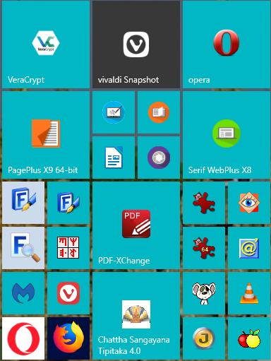
The icons for Vivaldi, FontCreator, MainType, Opera, and Firefox do not fit the Windows colour scheme.
I think that Firefox is the only logo that has a larger logo for the medium setting. Apart from the black background, it looks good.

The Vivaldi Logo does not have a larger icon for the medium setting.

Blog • Vivaldi Review • Server Status
Win 10 64-bit build 19045.2486 • Snapshot 7.4.3671.3 (64-bit) -
@Pesala I think this is a reasonable complaint, especially about the firefox logo resizing to full.
Though personally, I see it the other way round - I would prefer if all apps would support the new style with their own styled backgrounds. In my case that seems more like a problem for windows to solve than Vivaldi.
Strangely, after the recent snapshot, my windows icons for vivaldi are broken but only in the start menu:

-
@Gwen-Dragon said in Logo is so ugly:
The old one from 1.0 was too cubic,
I always thought it seemed like a stack of cards. It didn't fit very nicely with the browser, but I felt it worked well enough on the website, for vivaldi.net.
-
@2635599 I am not talking about the colour of the logo, it is the background that should be transparent to fit any colour scheme.
Compare the Vivaldi Stable Logo, which fits, with the Vivaldi Snapshot Logo, which does not fit.
-
@2635599 The logo is copyrighted. Editing and sharing it is not permitted. The Vivaldi Stable Logo is fine, so why fix something that was not broken?
-
It should be changed in the future. After all, the logo is not something that has changed.
-
@TranslucentTB Look at the 10th post of this thread.
") And how should it be changed? If you don’t at least describe your feelings (better would be directly coming w/ an idea), there’s only a very little chance that you’ll be excited from the new version.
And how should it be changed? If you don’t at least describe your feelings (better would be directly coming w/ an idea), there’s only a very little chance that you’ll be excited from the new version.A simple example (my PoV), far from being ideal: I feel the colour is too cold/dead. The red used in the old icon was live; but doesn’t fit to the new shape. I also like the transparency of the old icon. And these squares that don’t have even a single piece of border straight (?) are not my cup of tea. Simple squares w/ a little bit (3 to 5 px) rounded corners are better IMO.
And please be prepared that not everyone will agree with you: for example, I’m nearly 100% sure Gwen-Dragon doesn’t share my opinion on the shape, as she wrote above.
-
A logo of a product never likes everyone equally and that of Vivaldi is naturally no exception.
But, just like the logos of other browsers, it evolves with small changes over the years.
I think Vivaldi is a community project and everyone is free to present suggestions and ideas for the browser and add some transparency to the logo, for practical purposes it is perhaps not such a bad idea.
That the logo is copyrighted is normal, to prevent from using it for another product, but at the level of personal use for the Vivaldi of the user, there is no problem of applying the custom changes -
The issue that I reported has been fixed. The background on the Start Menu is now transparent, like most other logos.
-
@TranslucentTB said in Logo is so ugly:
After all, the logo is not something that has changed.
It has changed. A new squircle icon was added for version 1.11
-
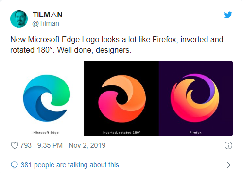
I wonder what it would look like if styled in a similar way to Microsoft Edge's new icon (I like it).
💻 Windows 10 64-bit Sopranos Builds • en-GB • 🗳 vote for features • 🕵️♀️ Code of Conduct • 🐞 Report bugs
-
-
>Laptop ACER, AMD Ryzen, GPU AMD Radeon RAM 16GB, SSD 512GB -Win11 Home 64 v24H2| Vivaldi last stable|
-
@Catweazle Hey! This is sooooo original

-
@Catweazle OK, now that was just mean. :smiling_face_with_open_mouth_closed_eyes: